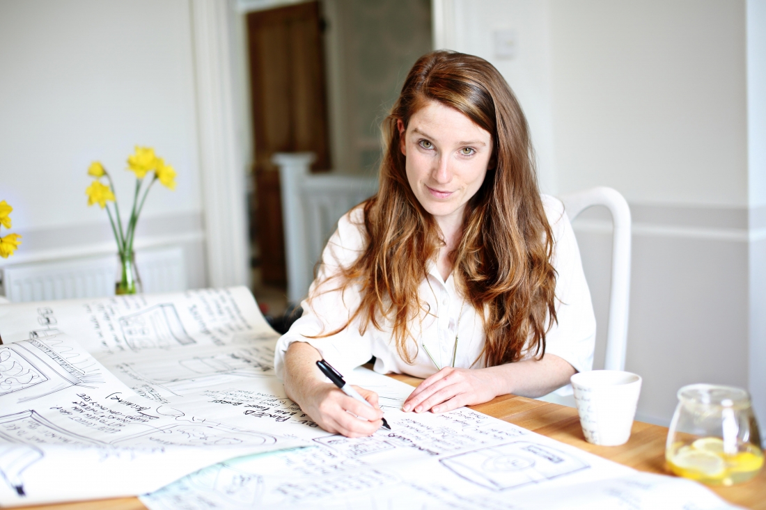
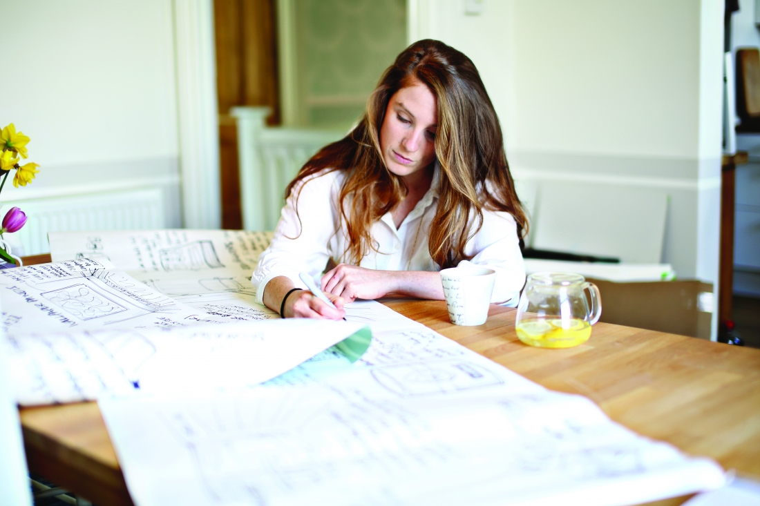
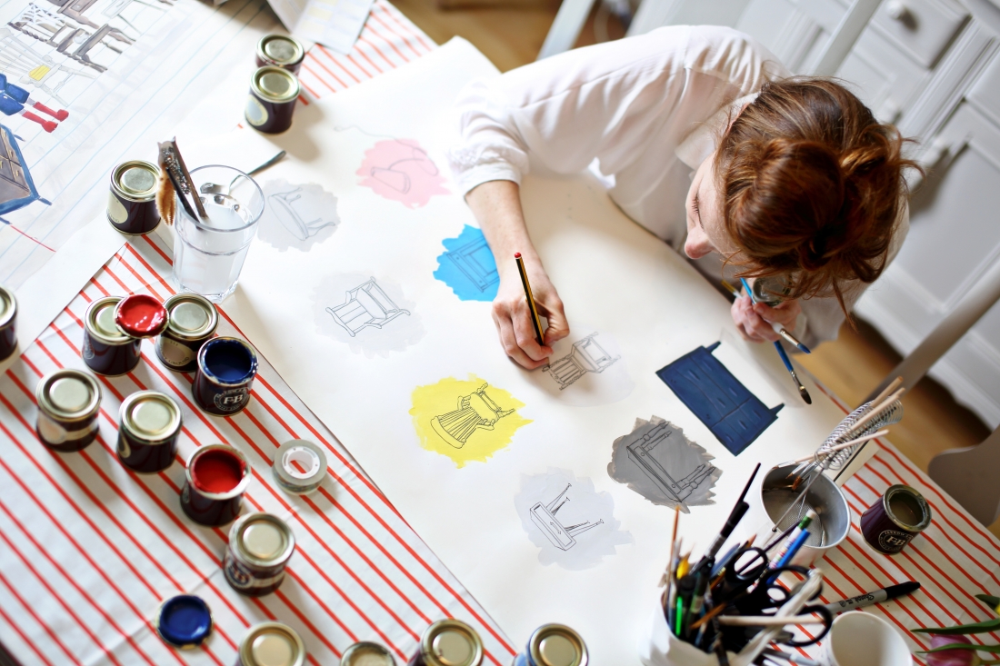
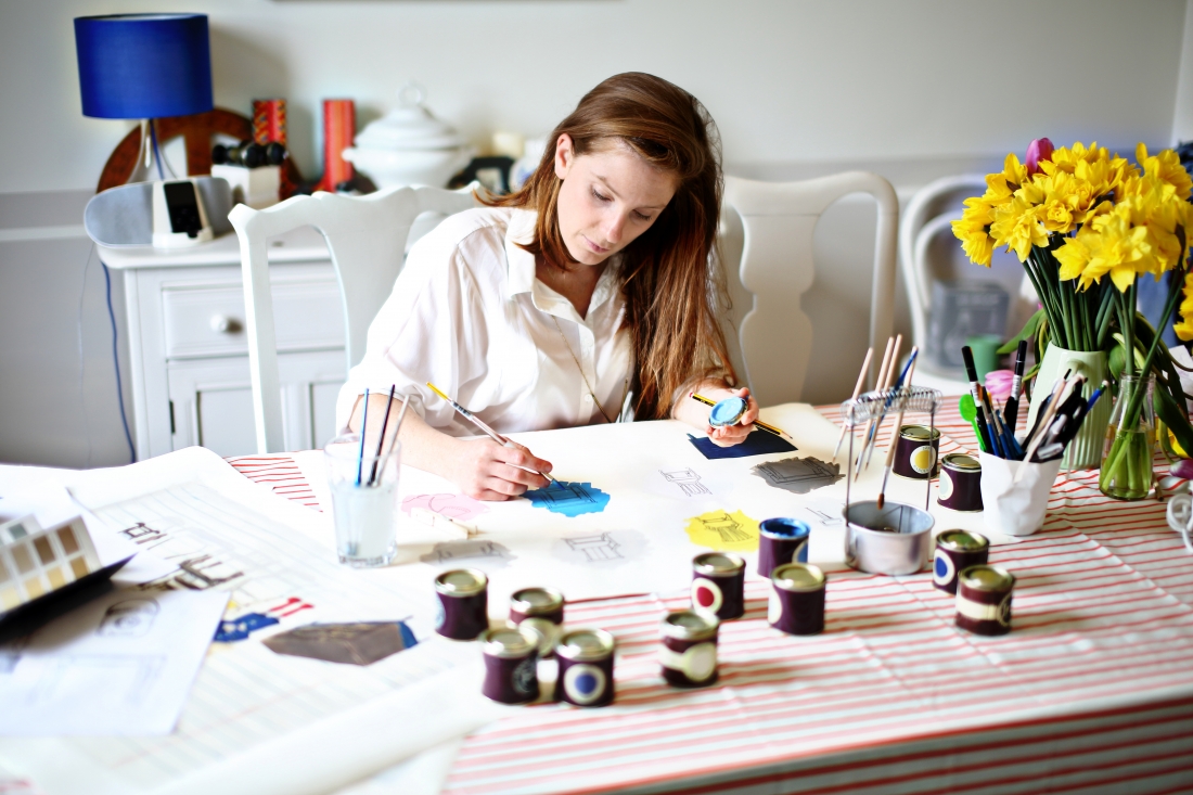
Charlotte Cosby on design at Farrow & Ball, how they choose colours and the next big trends
Mention the word 'Mizzle' or 'Elephant's Breath' to any discerning homeowner or interior designer and they'll instantly know what you're talking about.
They are, of course, much-loved and iconic colours crafted by one of the most renowned and respected English manufacturers of luxury paints and wallpapers, Farrow & Ball.
Having just launched nine rich paint shades earlier this year, the first from the Dorset-based brand since 2016, we wanted to discover more about the colour institution.
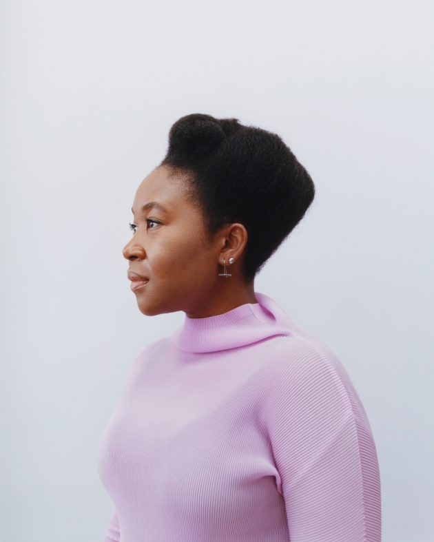
From an exotic pink and a deep red to a soft off-white and down-to-earth blue, we spoke to Charlotte Cosby, Head of Creative at Farrow & Ball, to gain some insight into the process of choosing a new paint shade – from inception to finished product.
How on earth do you begin the process of creating nine new colours?
We only introduce new paint colours every two or three years, as the whole process takes around that long! There is a small team that considers long-term decorating trends and talks to our colour consultants and customers to see which colours we feel need to be added to the card. We only ever have 132 colours on our colour card so each and every one has to really earn its place.
Every update to our core palette begins with the intention to fill any gaps we’ve spotted in our range, and this year’s new colours are no exception. Paean Black, for example, has black for red tones, something that was missing from our palette until now. Jitney is a warmer, softer brown neutral and a nod to consumers’ move away from grey, while Sulking Room Pink is an update for the newly archived Smoked Trout, tweaked ever so slightly to bring it up to date. Each of our colours has a raison d’être, and we hope these demonstrate our expertise and passion for bringing all kinds of homes to life.
Do trends inform the final choices?
Rather than following trends, we prefer to stay a timeless and trusted source of inspiration no matter what’s in fashion.
We could probably go a few years without changing anything and still have a collection that works for homes of all sizes, all over the world.
That said, we still want to stay current and offer shades that will really bring contemporary homes to life, so we do keep our ears to the ground when it comes to considering what people want in their homes.
When it comes to names, how do you go about choosing them?
The inspiration for our colour names comes from all sorts of places. Often, we look to nature (Treron is named after a beautiful green member of the pigeon family); to our roots in Dorset (Preference Red is named in honour of our original trade name, Preference Paints); or to people and places that inspire us.
We hope that our names spark curiosity and intrigue, but they are never invented just on a whim – each story is meticulously researched.
Were there any new colours that didn't make the final cut? Tell us more!
That is a closely guarded secret for potential future colour launches!
With Farrow & Ball having such a dedicated, loyal following, are you ever nervous about how new colours will be received?
Colour is an emotional subject, so we know people will have different opinions, but I’m never nervous. I’m always more excited to find out which are the favourites and whether people use them in the ways we expect.
We’re fortunate in that our customers are always eager to share their results with us, so I love the first few weeks after a launch where we get to see all their decorating projects.
Do you have a particular favourite F&B colour, existing colours included?
I love them all, I couldn’t possibly pick a favourite!
Can you tell us more about your own career?
My first job was at a bank but, as it turns out, I wasn't that interested in Swiss market intelligence. So, after packing my bags and heading for a London ad agency, then working for a freelance interior designer and gallery owner, I finally settled at Farrow & Ball at the tender age of 23. I was like a kid in a sweet shop full of colours and patterns and have spent the last 11 years growing up with the brand.
What do you love most about your job at F&B?
I love the variety of work and all the travel I do. From research trips to the States to attending trade shows across Europe, I journey anywhere and everywhere for Farrow & Ball – no two days are the same!
Working with the product and experiencing how creative you can be with paint and wallpaper is brilliant, but it’s also the people – I’m fortunate enough to work with incredibly talented, kind-hearted and hardworking people.
Moving on... How is F&B thinking about sustainability?
At Farrow & Ball, we’re always doing as much as we can to reduce our impact and protect the environment – it’s something we value and live by.
We were one of the first to move our entire range over to an eco-friendly water base back in 2010, which means that, as well as giving off much less odour and being quicker to dry than paints with a solvent base, they also have much lower levels of VOCs (or Volatile Organic Compounds).
Right now, we’re looking at everything from cutting down on the carbon footprint of our deliveries to increasing the already high proportion of recycled material in our cardboard packaging.
There’s also something that people might not know about our iconic tins – they’re 100% recyclable, right down to the plastic handle, so they can be used again and again.
Finally, what's next for you at F&B?
I’m working on a few exciting projects but I’m not at liberty to share them yet!