


Colour psychology in practice: Designing inclusive commercial environments.
By Jemma Saunders, Colour Specialist, Crown Paints
Colour in commercial design has long been treated as a visual finishing touch – something to express brand and create impact. But it’s becoming much more than that. Colour shapes how a space feels and how well it works for the people using it. Used with intent, it can support wellbeing, strengthen navigation cues and create environments that are more inclusive by design.
From aesthetics to experience
Designers have always understood, instinctively, that colour affects mood. But today, that intuition is increasingly being supported by research – and by real-world feedback from users.
In commercial settings especially, spaces must now do more. Workplaces should feel focused and functional while still encouraging collaboration; healthcare environments should be calm and reassuring while maintaining compliance, cleanliness and clear wayfinding; and hospitality spaces need to balance atmosphere with comfort, creating spaces that feel welcoming, distinctive and memorable for every guest.
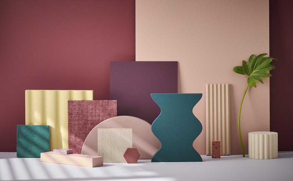
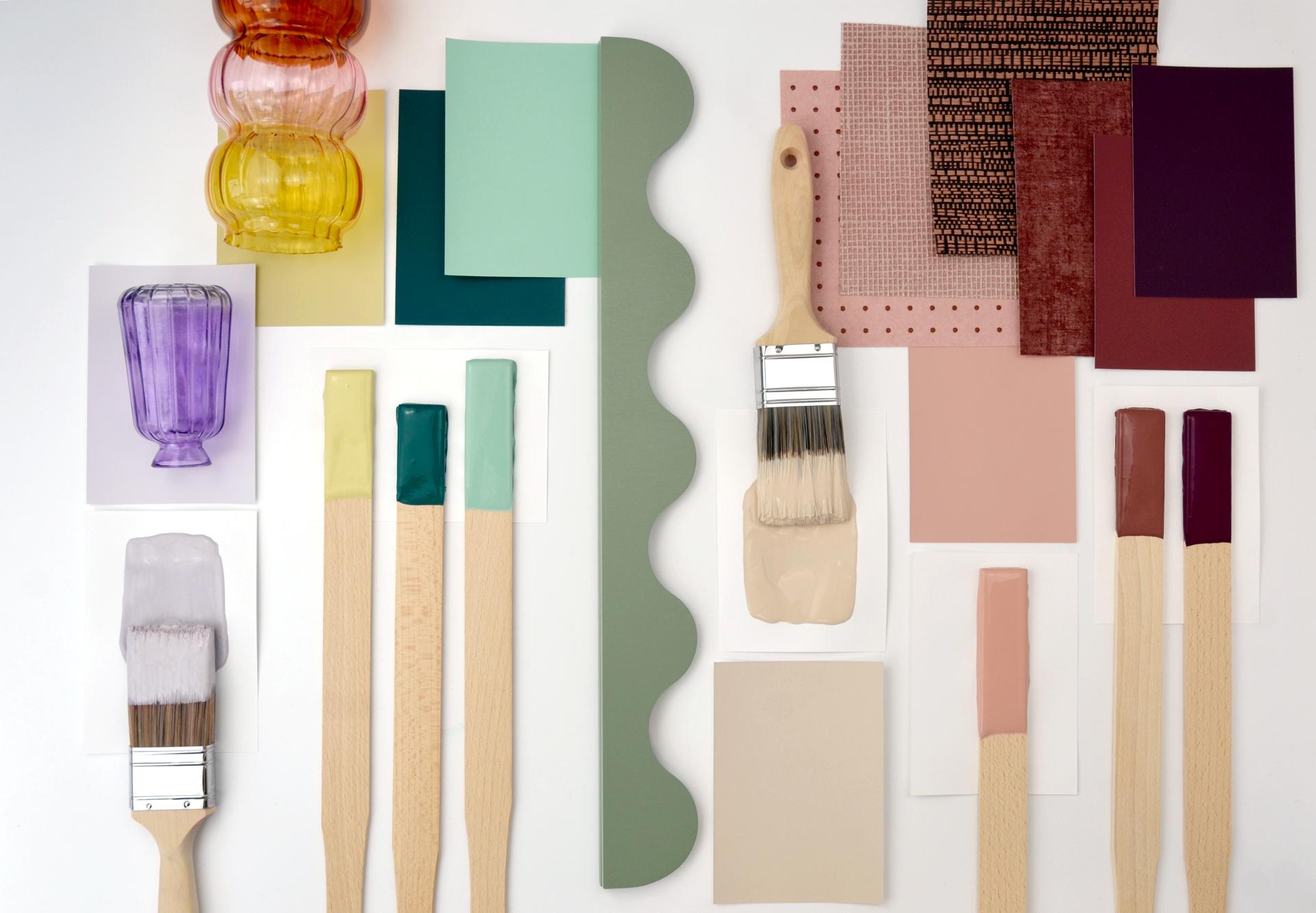
Colour is central to achieving that balance. Subtle shifts in hue, saturation and contrast can transform how a space is perceived and experienced – influencing everything from stress levels and concentration to a clearer sense of flow through the space and ease of navigation. When applied with intent, colour becomes a means of shaping experience rather than simply decorating it.
Neurodiversity and the sensory conversation
One of the most significant developments driving this change is the growing focus on designing neuro-inclusive environments. With an estimated one in seven people in the UK identifying as neurodivergent*, there is increasing awareness that environments are experienced very differently depending on sensory sensitivity, cognitive processing and perception.
What became clear was both a strong appetite to design more inclusively – with 92% saying neurodivergent-inclusive design is becoming increasingly important* – and a genuine knowledge gap around how elements such as colour, contrast and sensory stimulation affect people in practice. These findings come from Crown Paints’ Designing for Neurodiversity report, informed by research with architects and specifiers.
Neuro-inclusive design challenges us to move away from designing to a single ‘norm’. Yet many practitioners say they’re still building confidence in how to apply this in practice: 79% of architects and specifiers report a knowledge gap within their own organisations around the impact of colour, contrast and sensory stimulation*.
It underlines the need for a more considered approach – looking at colour in context, and how it works alongside light, texture and acoustics to reduce sensory load and make spaces easier to use.
Highly saturated palettes and visually busy schemes may energise some users, while causing discomfort or fatigue for others.
This doesn’t mean designing bland or neutral spaces. Rather, it’s about balance, choice and clarity – understanding when colour should stimulate, when it should calm, and how different zones within a space can respond to different needs.
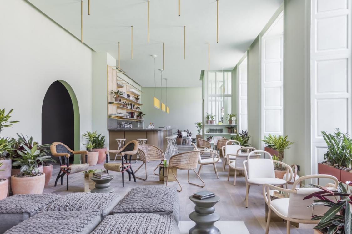
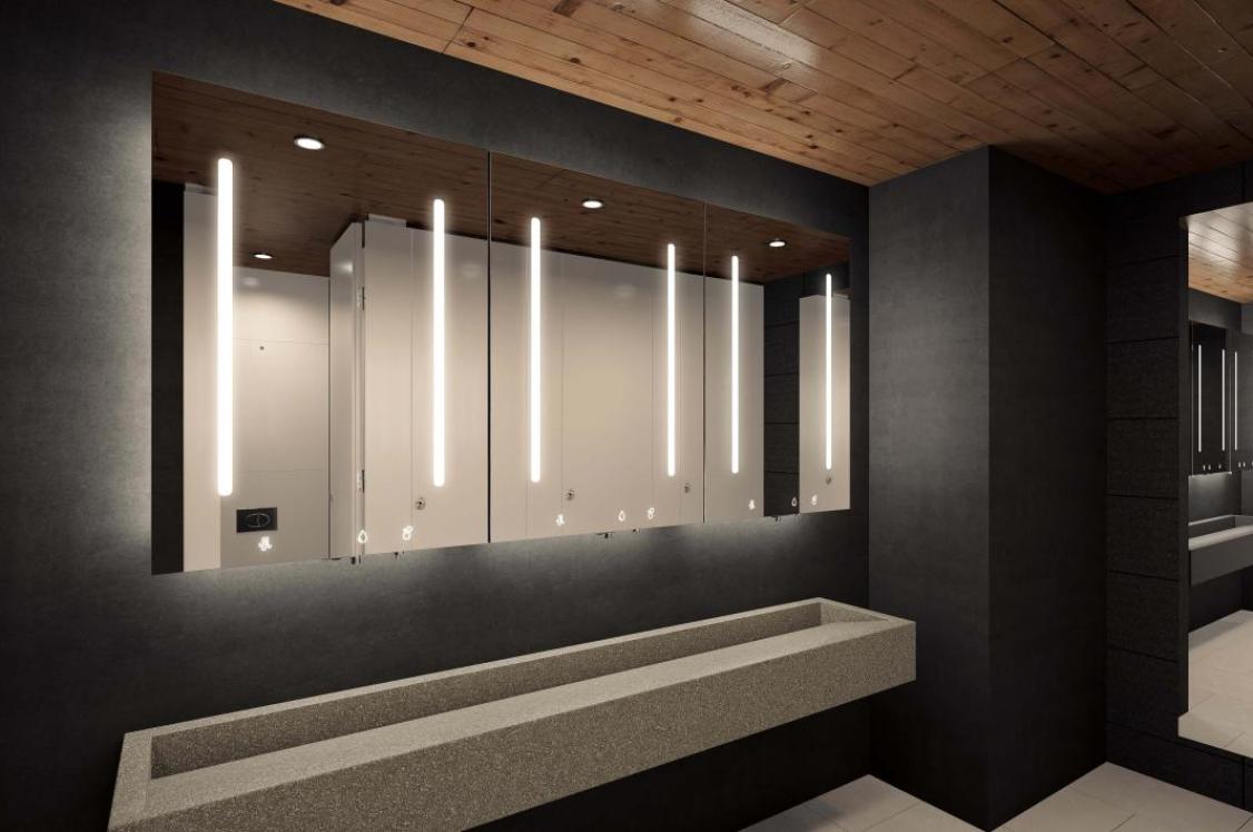
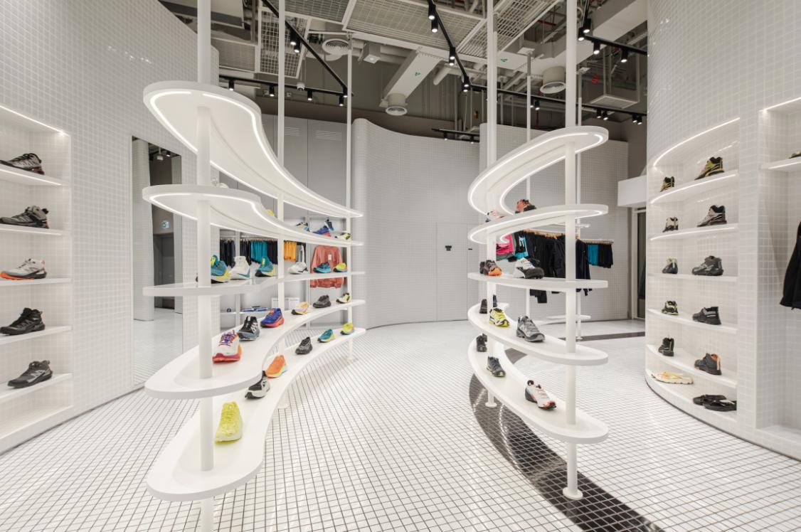
Workplace: performance, focus and flexibility
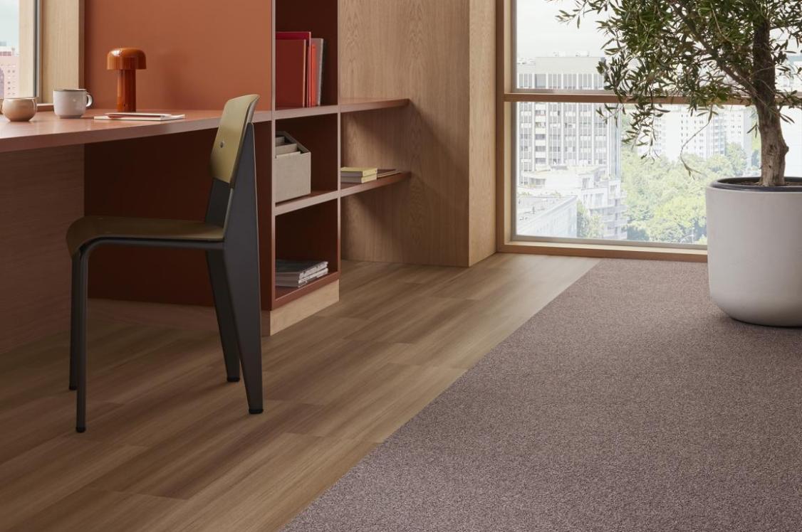
In the workplace, colour psychology is increasingly tied to performance. As offices evolve into hubs for collaboration, social connection and focused work, a single, uniform colour strategy no longer makes sense.
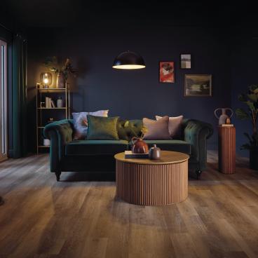
Different tasks require different sensory conditions. Softer, low-contrast palettes can support concentration and reduce visual fatigue in focus areas, while brighter accents and higher contrast can energise collaborative zones and aid orientation. Colour can also reinforce behavioural cues – for example, using calmer tones to signal quiet zones and bolder accents to frame creative or social areas – helping people adjust their pace and expectations as they move through the workplace.
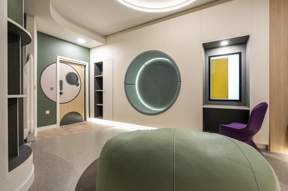
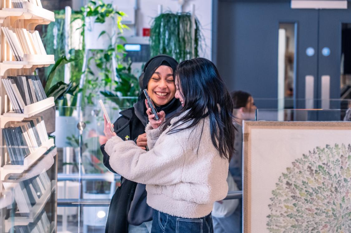
At Crown Paints’ historic headquarters in Darwen, the revitalised Liz Hickson Academy was designed with neurodiversity in mind, using distinct zones and contrasting colour moods to support different ways of working and unwinding. It pairs the high-energy “Hangout” games room with the calmer, nature-inspired “Hideaway”, using contrasting palettes and finishes to encourage social connection while also creating space for wellbeing and quiet retreat.
Crucially, neurodiversity reminds us that control matters. Designing environments with a range of colour experiences – rather than one ‘middle ground’ solution – allows users to choose spaces that best support how they work on any given day. That flexibility is fast becoming a marker of good workplace design.
Healthcare: calm, clarity and reassurance
In healthcare settings, the psychological impact of colour is particularly pronounced. When a space can feel high-pressure or emotionally intense, colour can help steady the experience – easing sensory strain and supporting a calmer, clearer atmosphere.
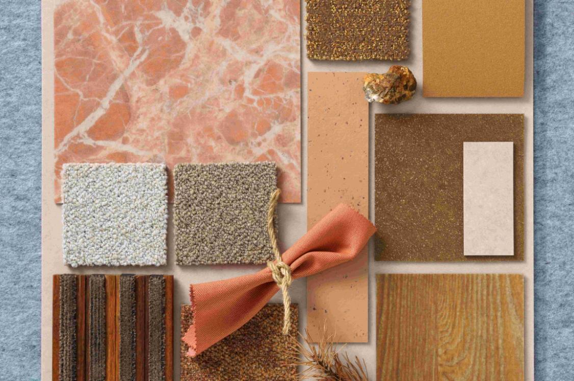
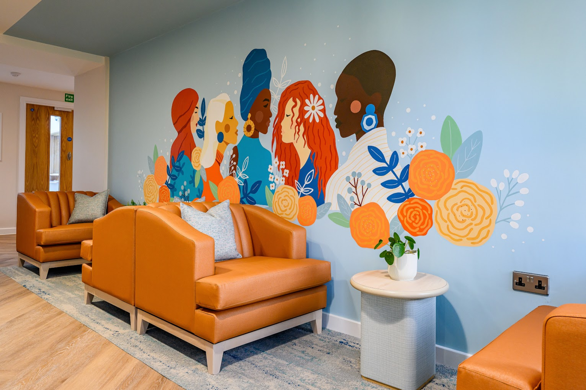
At Cygnet Kenney House in Oldham, a mental health hospital for women, the design brief centred on creating a “home away from home”, using a warmer off-white to soften the clinical feel and help people feel more at ease. This sat within a wider, considered palette shaped around how different rooms are used – from a bright, welcoming reception with subtle accent colours, to calmer social spaces where tones were matched to furnishings for a more harmonious, less institutional experience.
Muted greens, soft lilacs and warm neutrals are often associated with calm and reassurance, helping to create environments that feel less institutional and more human. This matters particularly in settings used frequently by older people, where age-related changes in vision – and, in some cases, cognitive decline – can make busy schemes harder to interpret. In these contexts, contrast remains essential: carefully considered colour differentiation between floors, walls and doors can significantly improve navigation and safety, without the need for excessive signage.
Defining spaces through colour can also help distinguish between clinical, social and restorative spaces, allowing environments to flex between stimulation and sanctuary. These principles don’t only benefit neurodivergent users; they create spaces that feel more intuitive and comfortable for everyone.
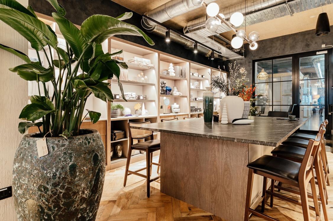
Hospitality: atmosphere without overload
Hospitality environments perhaps face the greatest balancing act. They must create character, mood and memorability – while remaining comfortable and inclusive for a wide range of guests.
Colour plays a vital role in establishing identity and ambience, but overly intense palettes, high-gloss finishes or excessive contrast can contribute to sensory overload. Increasingly, designers are exploring more layered approaches: combining grounding base colours with moments of accent and texture, and using colour zoning to offer guests choice – from lively, social areas to quieter, more subdued settings.
This approach was reflected at Hedsor House Hotel in Buckinghamshire, where ten individually themed bedrooms were refurbished with schemes inspired by different periods in the venue’s history, using layered colour to create memorable rooms while keeping the overall feel comfortable. What’s interesting is that these considerations are no longer niche. As awareness of sensory sensitivity grows, inclusive colour strategies are becoming part of mainstream hospitality design – supporting longer dwell times, repeat visits and broader appeal.
Colour as a creative and technical discipline
What unites all of these environments is a shift in mindset. Colour is no longer just a creative flourish; it's a technical discipline grounded in research and empathy.
Designing with colour psychology in mind means asking different questions. Who is this space for? How will it be used throughout the day? Where do people need clarity, calm or stimulation? And how can colour support those needs without dictating a single experience?
Our Designing for Neurodiversity report reinforced something many designers already sense: inclusive design isn’t about getting it perfect; rather it’s about engaging, listening and responding. When colour is used thoughtfully, it has the power to make spaces more legible, more comfortable and more human.
Ultimately, colour allows us to design environments that don’t just look good but actively support the people who inhabit them – and that, increasingly, is what good commercial design is about.
For more information, download the Crown Paints Designing for Neurodiversity report here.
(*Survey of 250 architects and specifiers conducted in April 2025 by Censuswide for Crown Paints)

In association with
We believe that every pot of paint is brimming with potential. And we want to put that in the hands of everyone. Because with paint, you can change a room, change a mood, even change a life.