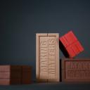
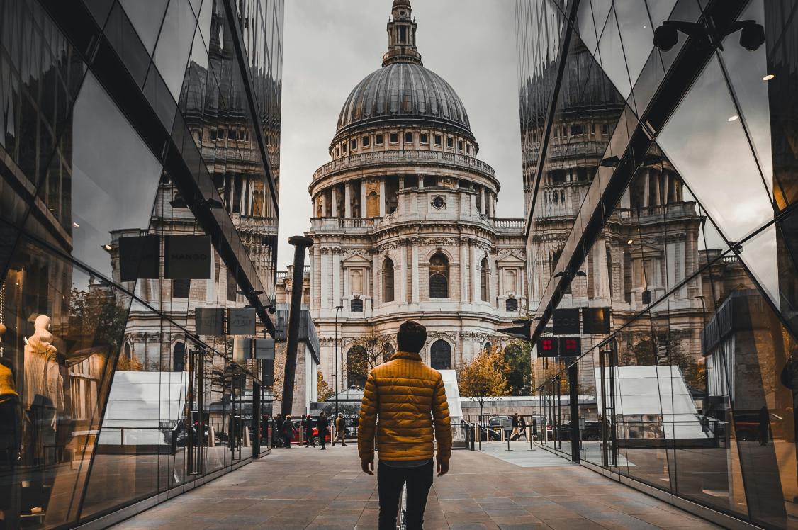
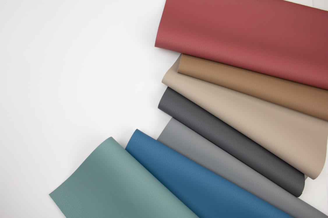
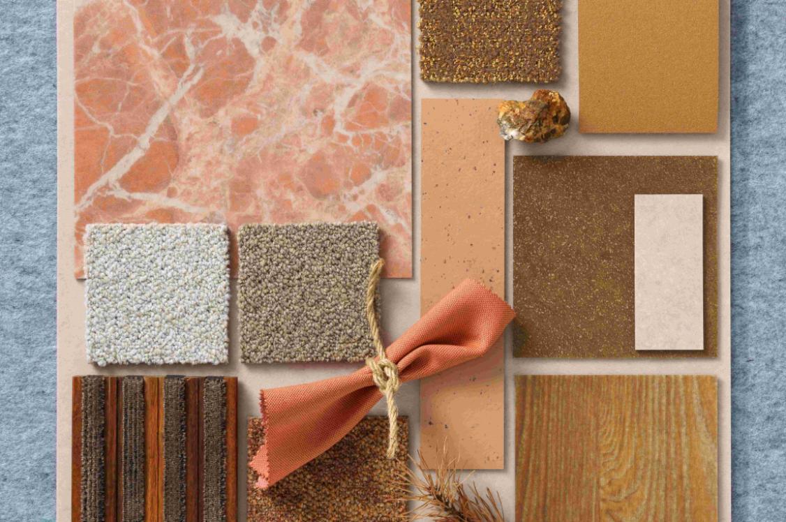
Material Moods, Vitality: A palette crafted from nature's chromatic code for co-existence.
Image credits: Tim Ainsworth & Craig Burrows
What do bees & EDIB have in common?
It’s not a trick question. If you consider the latest addition to the EDI acronym – ‘B’, for ‘Belonging’, and what it takes for a person to feel that they belong, there’s more synergy with nature than we’ve perhaps ever noted before. In fact, when you think about it, feeling that you ‘Belong’ is the most natural feeling of all.
Just as our built environment can foster a sense of belonging through encouraging community, and the coming together of people, the same relationship exists between bees and plants.
For our latest Material Moods, an exploration around this sentiment of inter-species collaboration, led us to the subject of pollinators as our inspiration. And more specifically, to bees. To which, of course, we owe all existence.
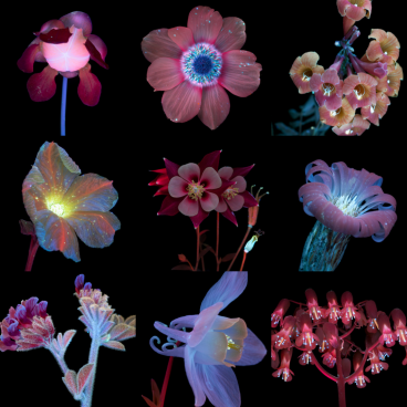
Ultraviolet induced fluorescence: A unique signposting system for vitality
Vitality refers to the continuance of life. Vitality relates to sustainability in the truest sense of the word. Vitality requires community, belonging. As such, in this Material Moods, we explore the direct, intertwined relationship between sustainability and EDIB, through the eyes of the honeybee.
Spurred on to look through a different lens - an essential aspect of any new interior design, or architecture project, and just as EDIB encourages us to put ourselves in another’s shoes - we landed on, “What the Bees See”, a book by photographer, Craig P Burrows, as our starting point.
What the Bees See: A Honeybee's Eye View of the World published by Chronicle Books features a collection of Craig's UVIVF photographs, pairing in-depth research into the honeybee's importance for our environment with photographs of visual artistry.
Nature's chromatic code for co-existence
Offering a honeybee’s view of the world through the utilisation of ultraviolet technology, Craig’s photography shows how nature combines beauty and utility to direct bees to exactly what they need.
Bees see the world through the ultraviolet spectrum – a world unknown to the human eye – and one of nature’s most pure and magical innovations.
Colour acts as an illuminating signposting system in this spectrum. In an intuitive, fine tuned act that allows each party to do their job effectively, to reach what they need to thrive. Well designed spaces apply these very same principles.
By crafting settings that cater for all, you, as designers, are empowering people to thrive. Whether that’s at work, in where they live, or during their down time. Featuring varied shades of violet, luminous lilacs, powder pinks, rich burgundies and electric blues, Craig opens a window to a world that is vivid, glowing, and mesmerising. All while being hugely practical. And this is where our Vitality palette takes its chromatic cue.
Flowers produce nectar to attract pollinators, who in return pass pollen from flower to flower, enabling its reproduction. It’s a symbiotic exchange. A system for life, vitality, immunity, longevity and community. A beautifully useful system which humans benefit from and depend on daily.
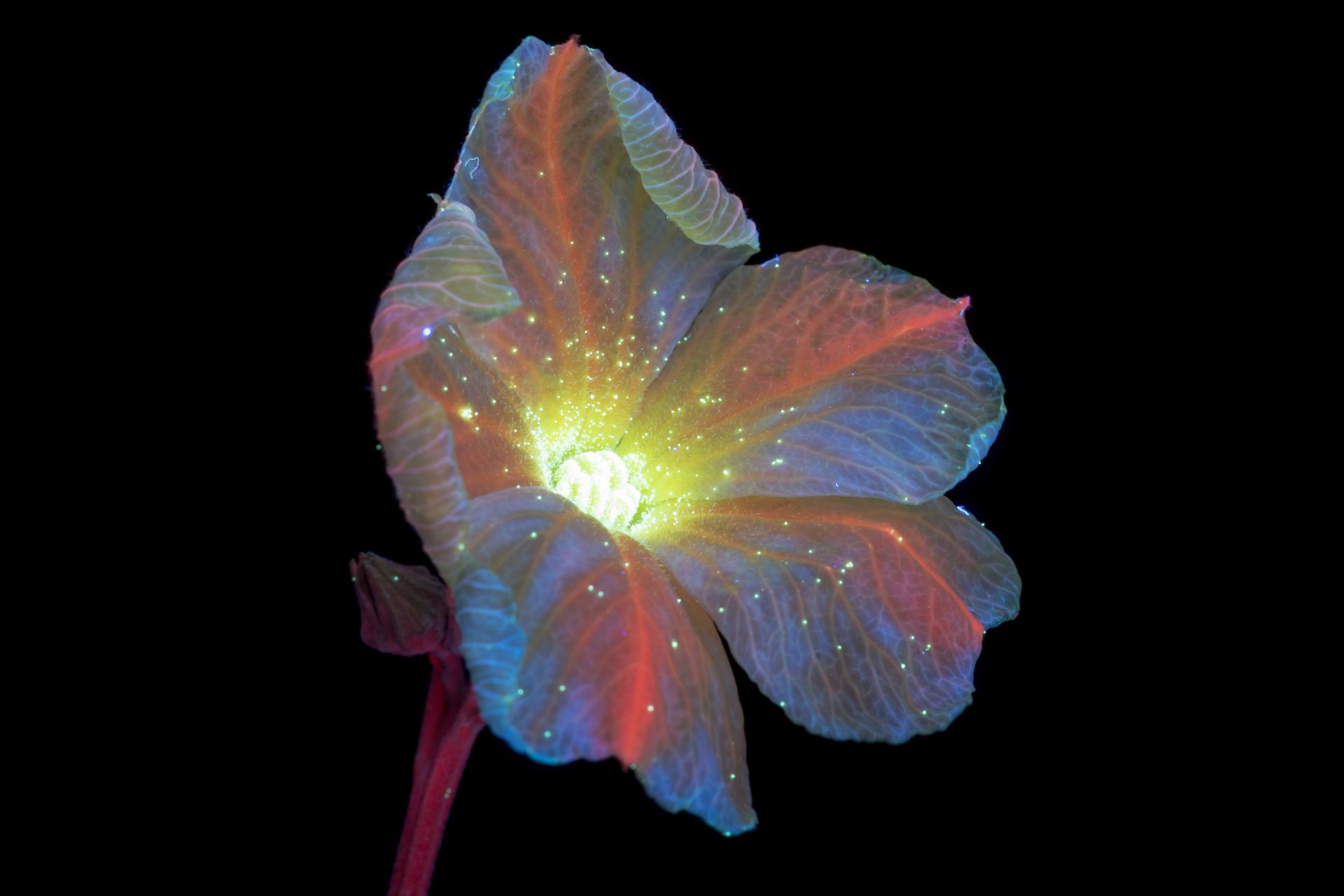
Image credit: Craig P Burrows
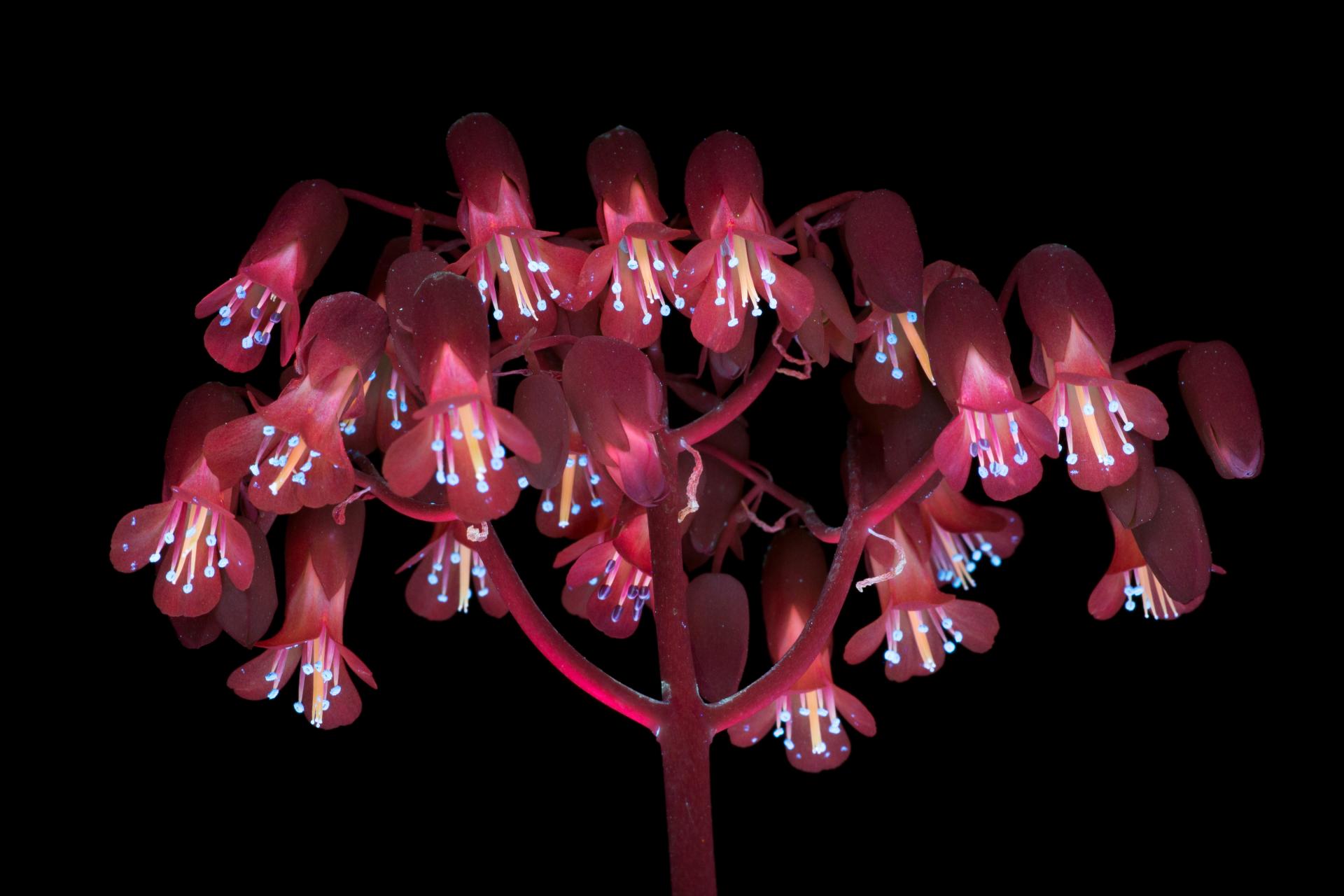
Image credit: Craig P Burrows
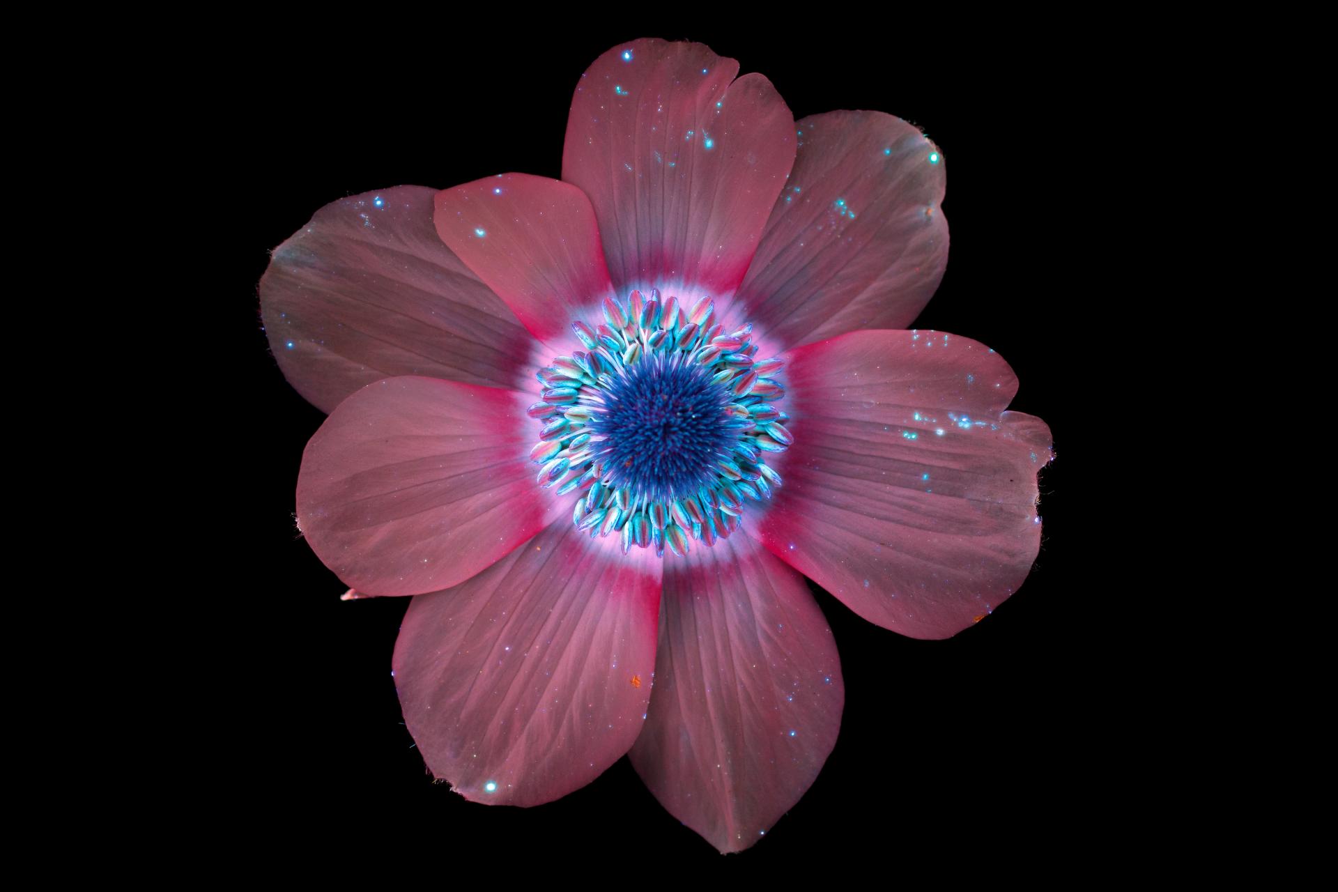
Image credit: Craig P Burrows
New lens perspectives
Through these luminous snapshots of botanicals as we’ve never seen before – What the Bees See advocates the same guiding light to spur meaningful change towards our protection of pollinators such as the honeybee, to ensure they not only survive, but thrive. Their fate is invisibly bound to our own.
Due to the human-induced climate crisis, honeybees face rising temperatures, which cause flowers to emerge early and die quickly. Their dwellings are disappearing as areas previously rich with foliage deplete for deforestation or urban expansion. According to the US Department of Agriculture, three quarters of the world's flowering plants and approximately 35% of the world's food crops rely on animal pollinators to reproduce [ref page 98, What The Bees See].
Pollution is also problematic for pollinators, either directly affecting their health or interfering with scent molecules sent out by plants to signal bees. Pesticides used in industrial farming also affect the air, soil and water around honeybees. If we carry on as we are, we will not survive.
The B(ee) in EDIB
Through a specially curated range of Partner products, Material Moods: Vitality urges us to design from another's perspective, through a different lens to our own. It encourages us to ask questions of our material choices. Not just in the sense of their contents and sustainability credentials, but how a material will foster greater feelings of belonging inside a space – the very life force of community, and ultimately, continuity.
The photography in ‘What the Bees See’ highlights that to design for planetary restoration, empathy and understanding are required. Just in the way we apply these principles to crafting interior spaces that support Diversity, Inclusion and Equity - in turn promoting Belonging, if we could only take the same holistic approach to sustainability, our future would be one enlivened with vitality, for all.
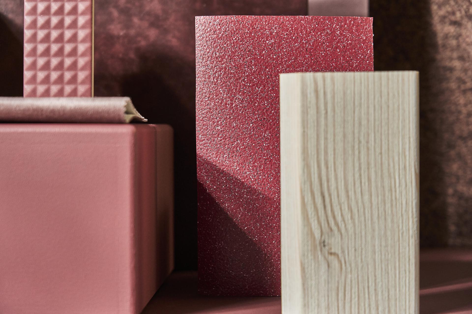
Image credit: Tim Ainsworth
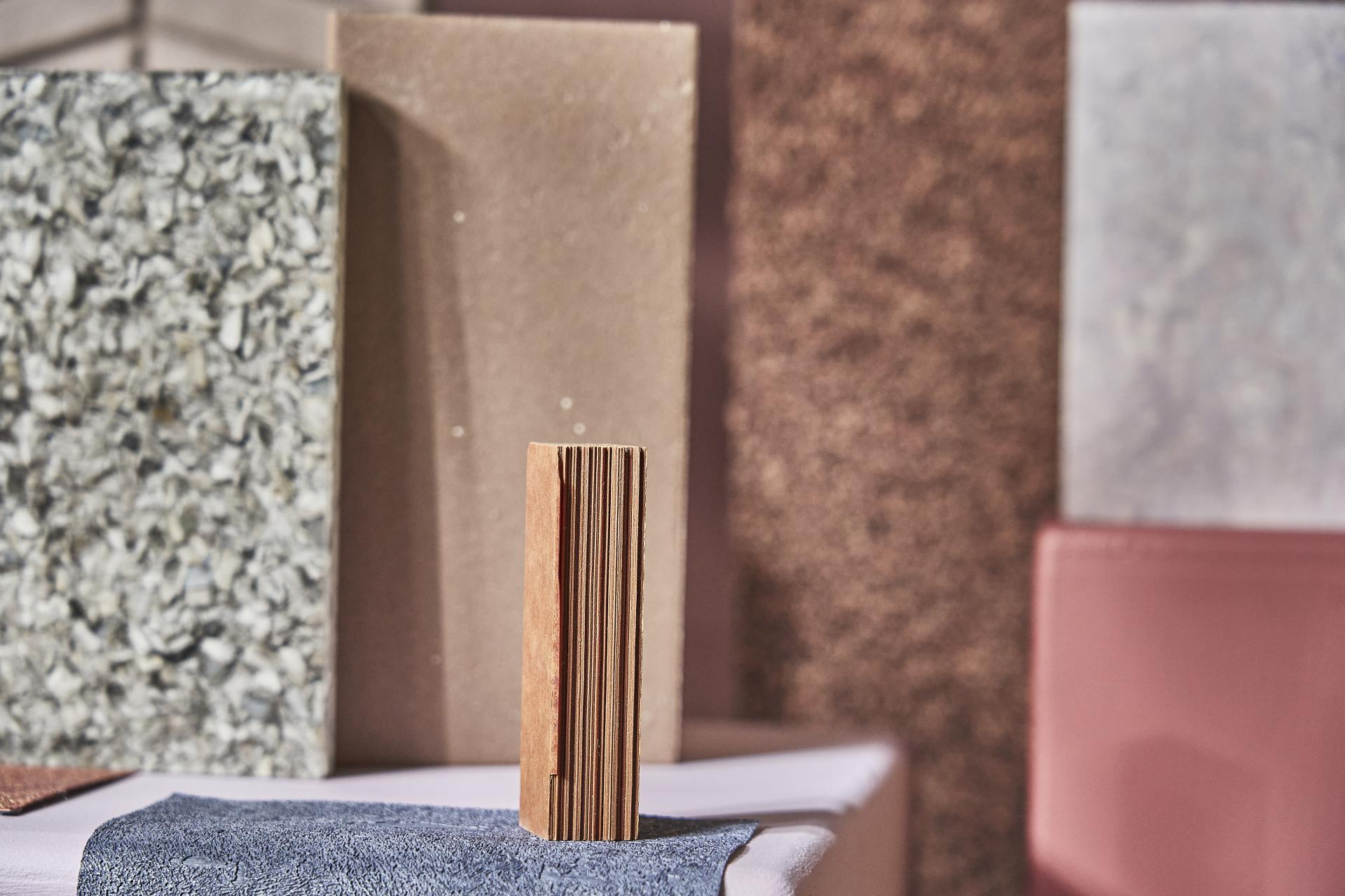
Image credit: Tim Ainsworth
Image credit: Tim Ainsworth
Explore our material and product selections in response to Material Moods: Vitality
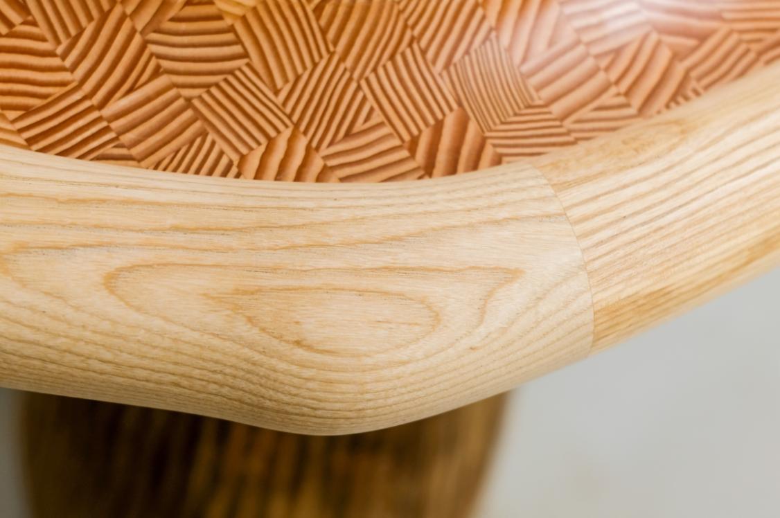
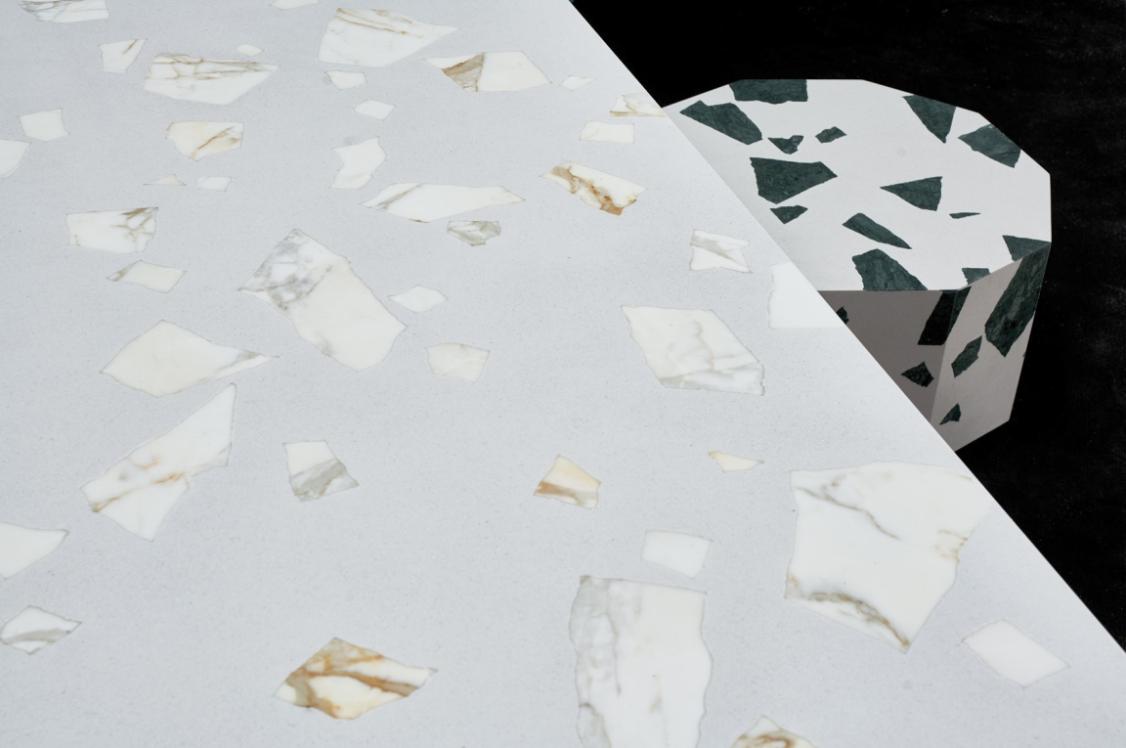
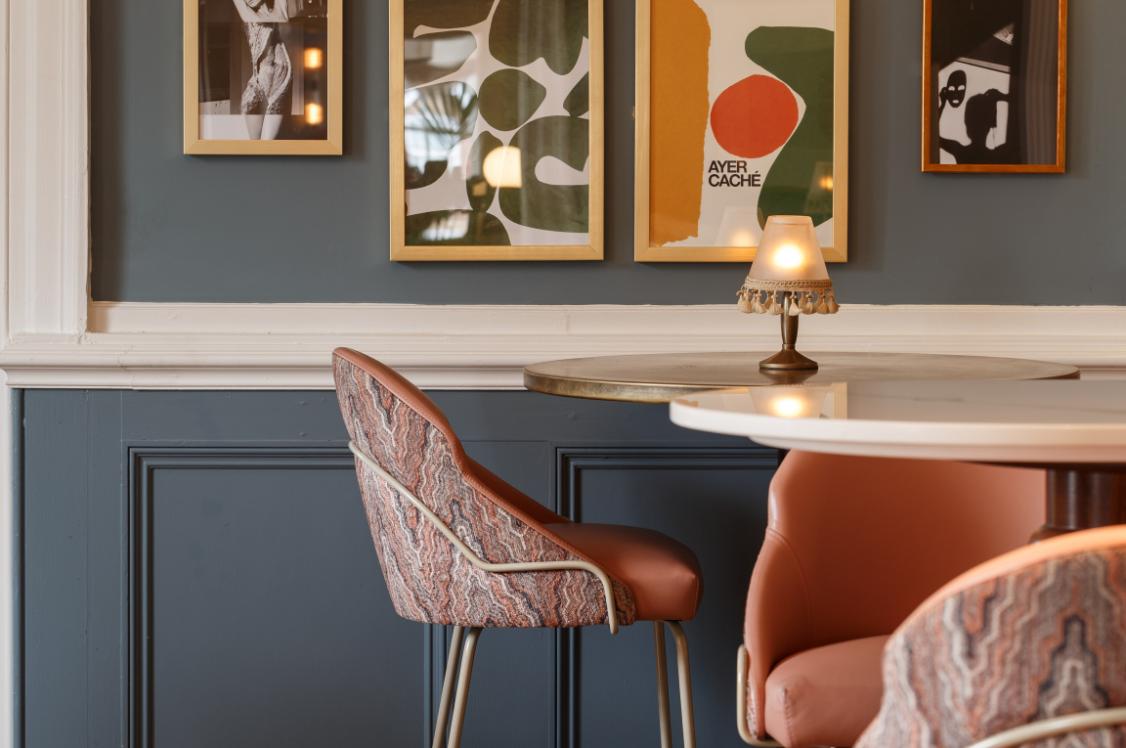
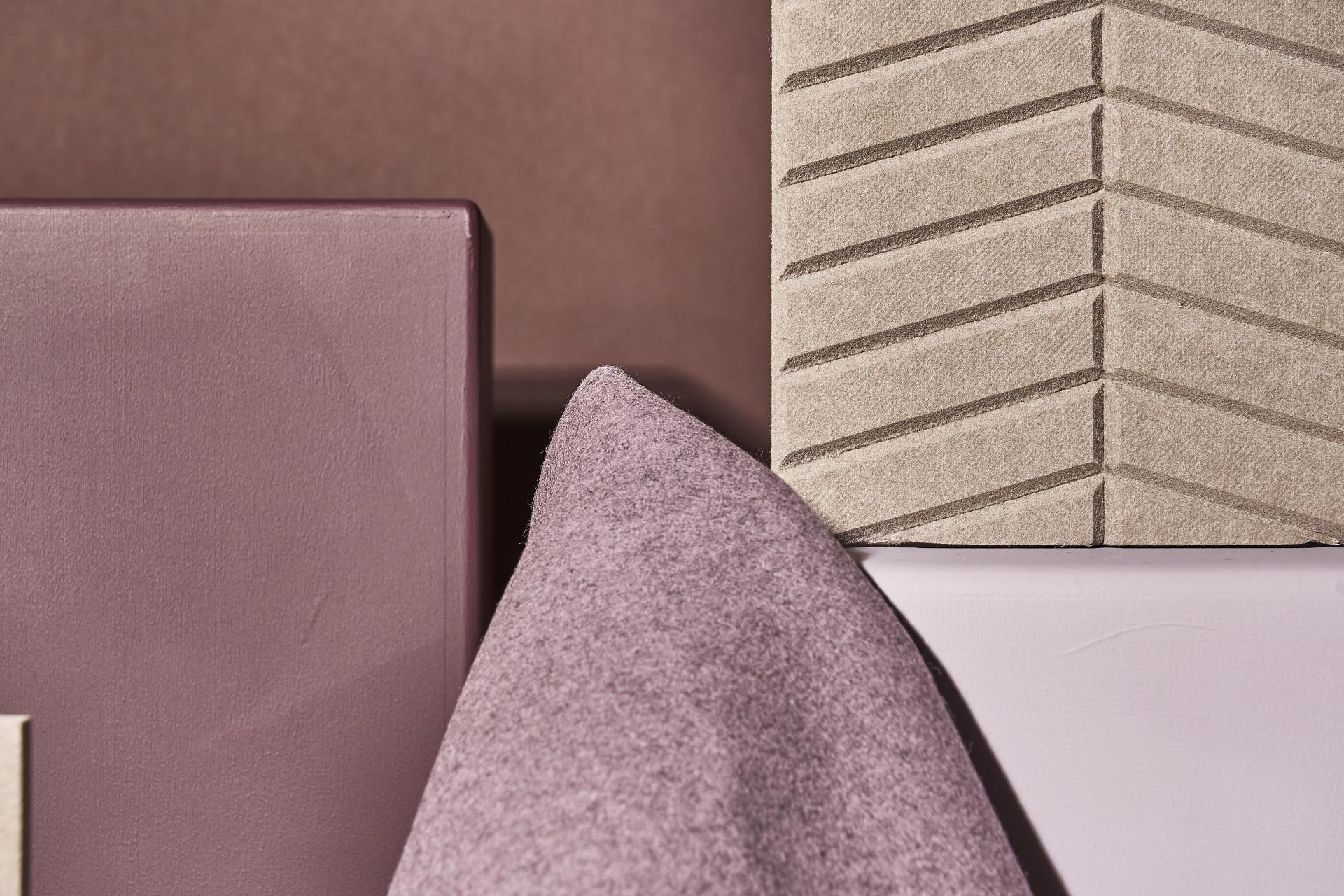
Parkside Architectural Tiles: Mas, Red
Made from up to 98.5% recycled content, Mas is a new floor and wall tile from Parkside Architectural Tiles and Alusid®.
Depending on colour, Mas' pre-consumer recycled contents is minimum 95%, repurposing waste from the tile production industry through a unique low-energy - and therefore low carbon - dry granulation process.
A significantly more sustainable solution to typical Spanish tiles, Mas recorded to have 51% less embodied carbon and 44% less water used in its manufacture in a comparative study of Mas’ third-party verified cradle to gate emissions against the Spanish ceramic tile industry.
Stocked in two size formats for both floor and wall use, and in four colours, its slip resistance of 36+PTV improves safety underfoot for all users, particularly people with mobility impairments, or in wet conditions - enabling equitable access.
Mas also promises durability, with a 35N+ breaking strength and less than 3% water absorption.
Parkside Architectural Tiles: Sedgwick, Bordeaux
The Sedgwick collection comprises six geometric and three-dimensional wall tiles, designed to enable play with light, shadow and tactility. A powerfully rich colourway, Bordeaux sports a matt surface and possesses a sustainably astute +70% recycled content.
Available in six thoughtfully curated colours, Bordeaux, Powder, Bianco, Terra, Salvia and Notte, the Sedgwick selection allows the pairing of different design preferences. Its three dimensional surface qualities adds visual interest which may help wayfinding, orientation, and aesthetically driven delight.
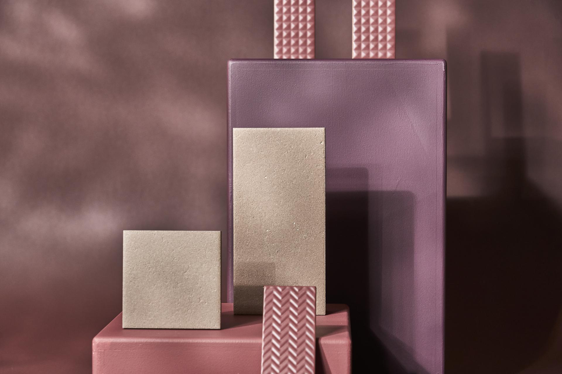
Parkside Architectural Tiles: Mas, Red & Sedgwick, Bordeaux. Image credit: Tim Ainsworth
Altro: XpressLay™ adhesive-free, Cherry
Altro's XpressLay™ is an award-winning, adhesive free safety flooring.
The adhesive-free system means no traditional adhesives are needed, resulting in less chemical use and less harmful volatile emissions during installation.
The product allows for same-day walk-on installation and faster installation over existing floors. For busy, high traffic environments such as healthcare and education, XpressLay™ reduces barriers for projects in occupied buildings, ensuring easier repair, lift and reuse. Installation offcuts and uplifted flooring are recyclable via closed-loop / take-back schemes through Recofloor - encouraging re-use and reductions of waste to landfill in the construction sector.
The deep Cherry shade selected for Material Moods, Vitality is just one of the +30 colours in the range, enabling a wide variety of choice for designs to meet a multitude of diverse needs and preferences. The total product thickness is 2.2 mm, with a 0.8 mm wear layer, ensuring durability and consistent performance over time.
Reducing the risk of slips and falls in wet conditions, XpressLay's slip resistance is pendulum tested (PTV) ≥ 36 (wet). This result improves safety underfoot for all users, especially those with reduced mobility or balance.
Altro: Illustra™ adhesive-free, Rose Petal
Suited to high-traffic classrooms, entrance areas, hospital wards and care homes, Altro's Illustra™ adhesive-free is a design-led, low maintenance adhesive-free safety flooring solution.
Both functional and stylish, the Illustra™ palette supports designers with 18 colours and design options, including stone, textile, and speckled effect surfaces, offering aesthetic flexibility to cater for a diverse range of tastes and contexts.
Like XpressLay™, it has a slip resistance of PTV ≥ 36 (wet), and its adhesive-free installation means for easy fitting, lift and re-use of the product.
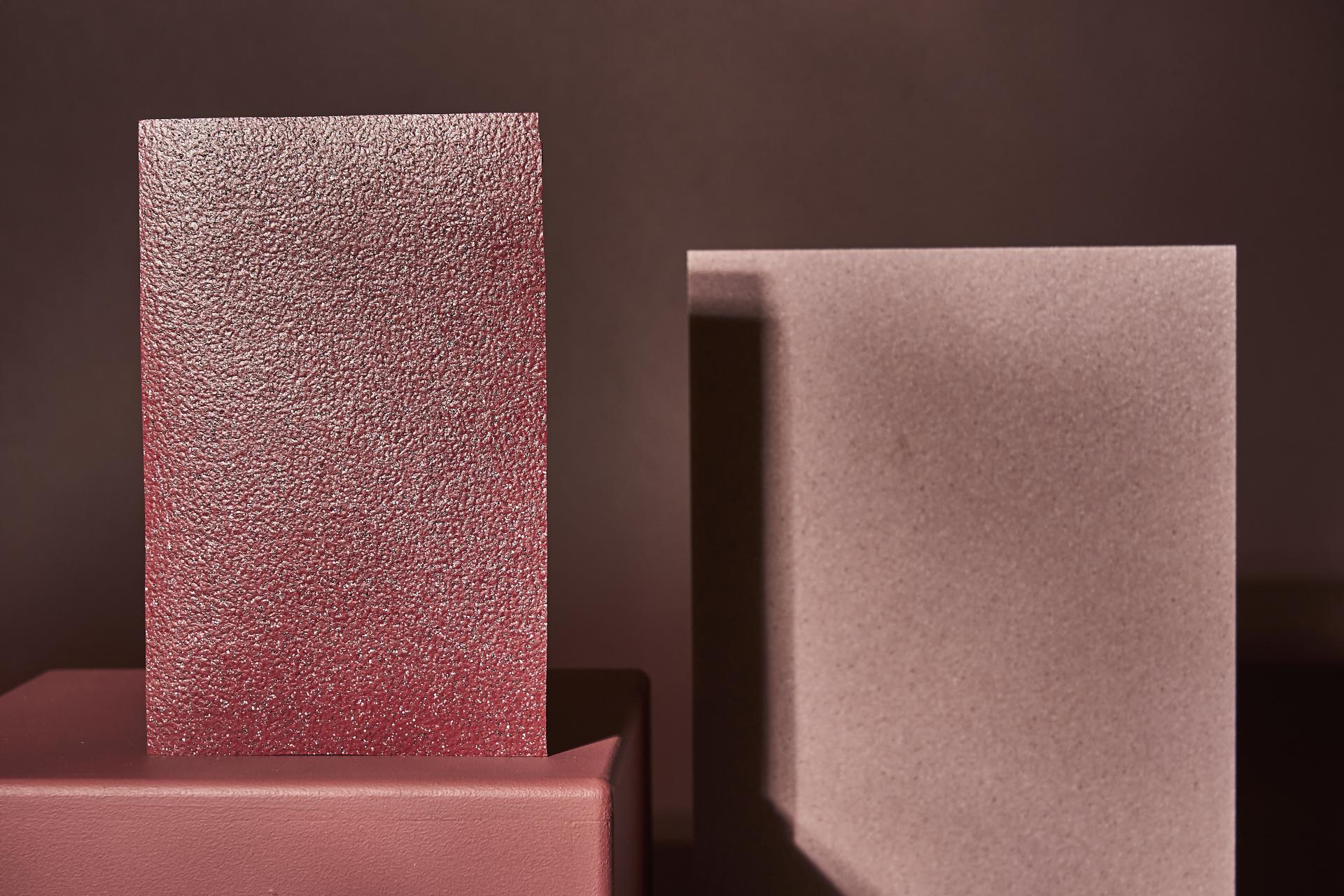
Altro: XpressLay™ adhesive-free, Cherry & Illustra™ adhesive-free, Rose Petal. Image credit: Tim Ainsworth
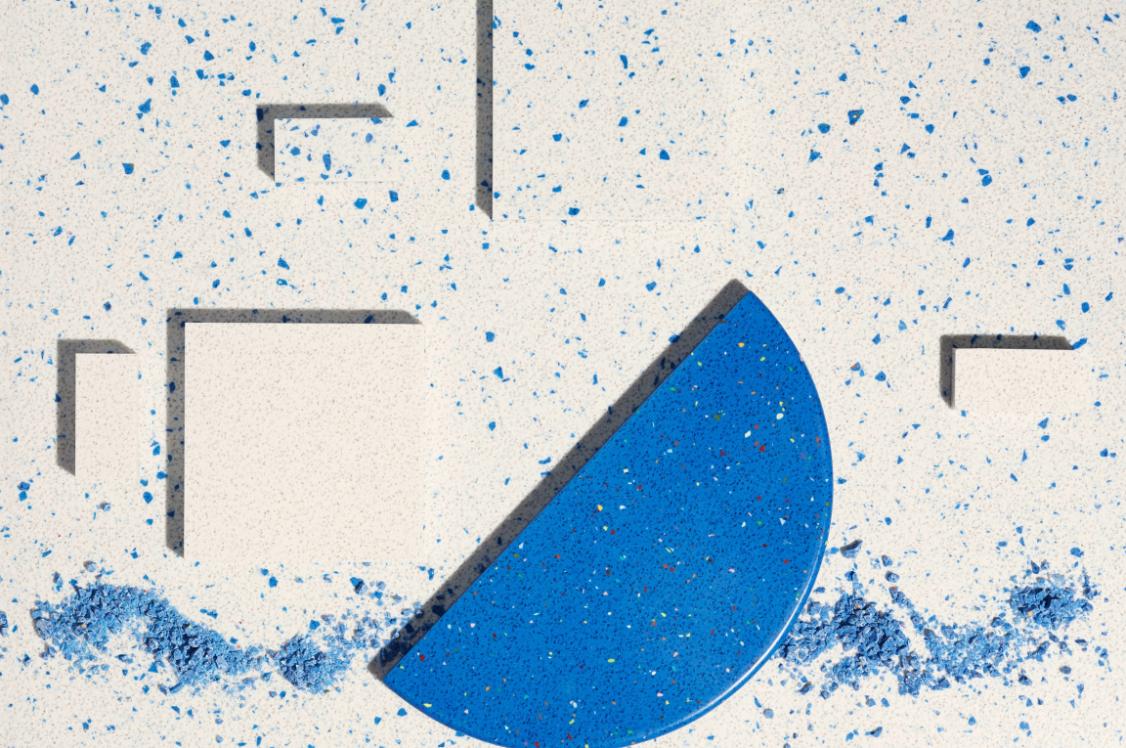
CDUK: Polygood®, Growth Collection, PEBBLE
Diverting post-consumer and post-industrial plastic from landfill, Polygood® is a 100% recycled and 100% recyclable plastic surface for both commercial and residential interior application.
Polygood® surfaces are made from discarded objects such as electronics, refrigerators, packaging and spools, each colourway showcasing the surface design potential and sustainable story of that repurposed waste-stream.
The growth collection, made in collaboration with global design and architectural practice, Gensler serving as product design consultant, is a striking new selection of low-carbon Polygood® patterns.
Cradle to Cradle® Bronze certified and providing a third-party verified EPD, Polygood®'s credentials are supportive of green building certifications such as LEED, and BREEAM.
The durable hard surface is waterproof and weather-proof, and can be utilised in projects from furniture, to interior & exterior cladding and retail displays to name a few.
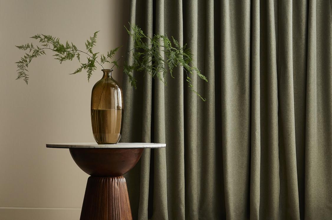
CDUK: Paperstone®, Cabernet
Paperstone® is a recycled paper composite surface made from 100% recycled FSC® paper and a non-petroleum-based resin. It offers both a smooth and subtly variegated texture, like running your finger across a piece of high quality, warm to the touch parchment paper.
Suited to both kitchen and bathroom surfaces, Paperstone® offers 11 rich, tactile colours across its two ranges - the Solid Colour Series and the Designer Series. Resisting temperatures up to 180°C, it's a highly durable and robust surface solution for both commercial and residential interior projects.
Just like Polygood®, Paperstone® possesses a third-party verified EPD, its credentials supportive of green building certifications such as LEED, and BREEAM.
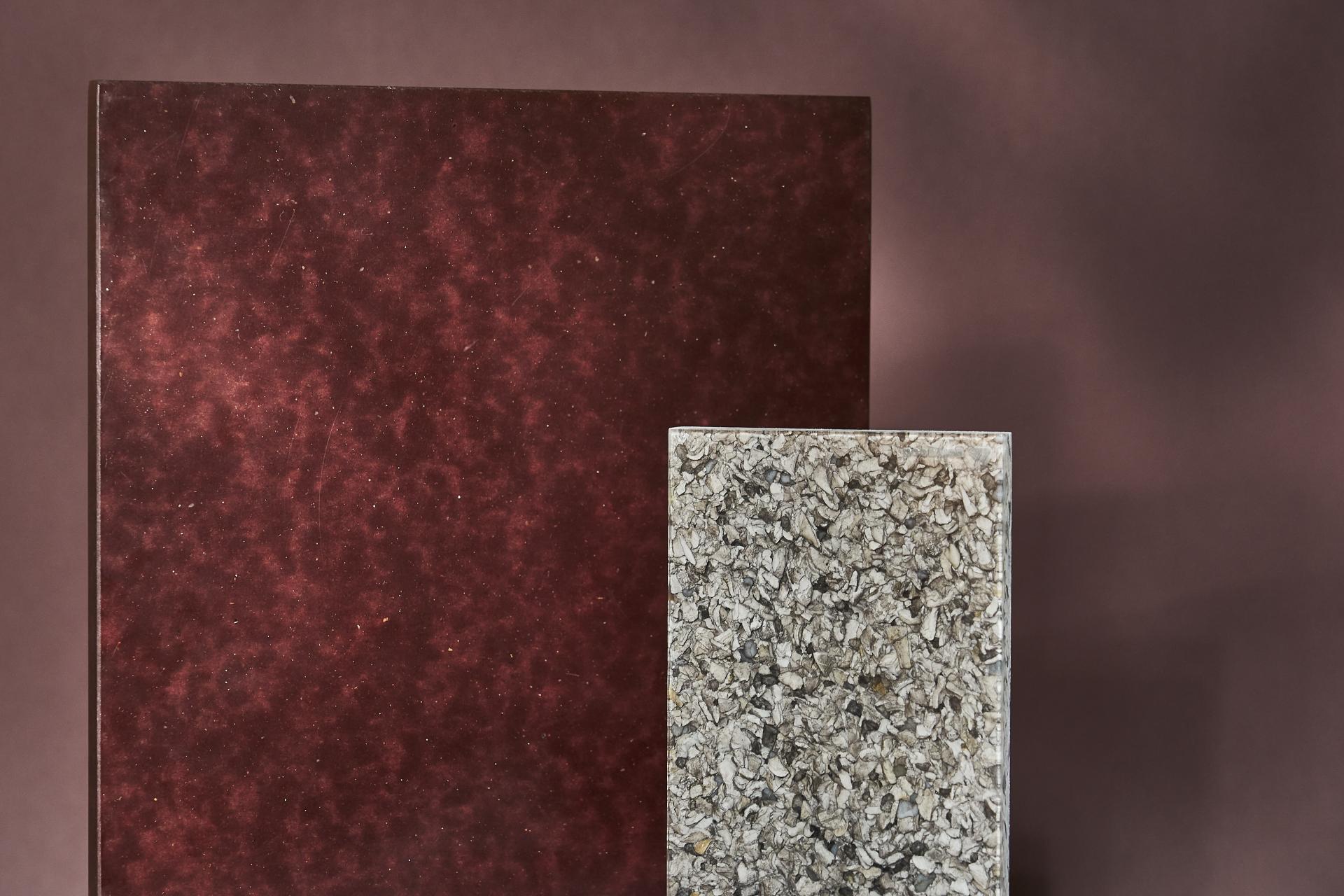
CDUK: Paperstone®, Cabernet & Polygood®, Pebble. Image credit: Tim Ainsworth
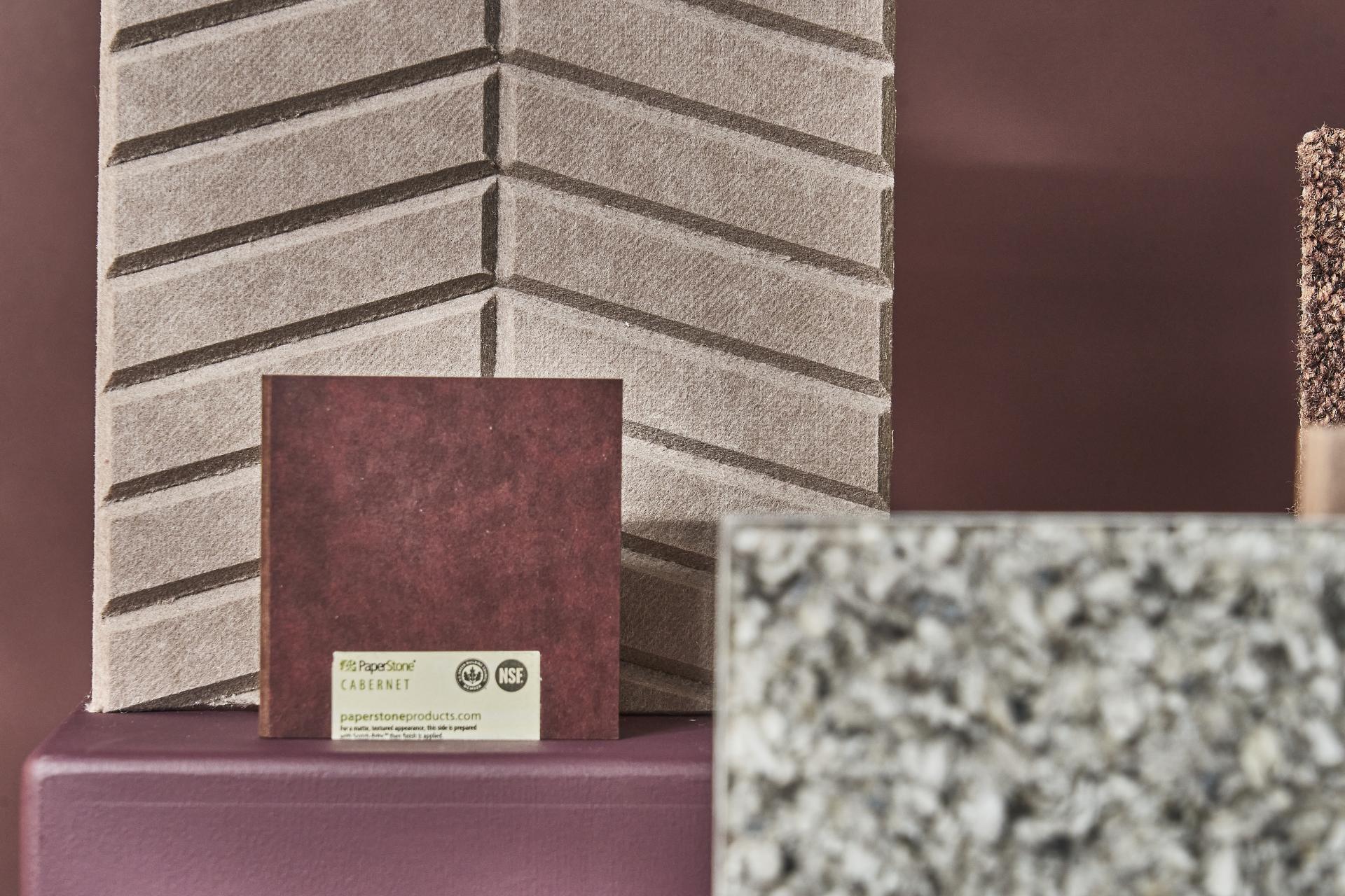
CDUK: Paperstone®, Cabernet & Polygood®, Pebble. Autex Acoustics: Cube™, Terrace. Image credit: Tim Ainsworth
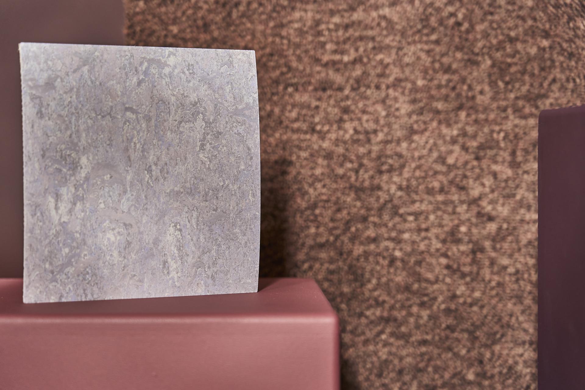
Forbo Flooring Systems: Marmoleum Fresco, Lilac
Marmoleum Fresco in colour Lilac features a subtly blended marbled surface of powder purples, perfect for creating fresh, delicate and balanced aesthetics.
The material’s visual warmth and natural tactility can help unify diverse spaces, creating a cohesive, welcoming atmosphere where everyone feels at home.
Both a certified carbon negative product, with a zero cradle-to-gate carbon footprint, and made from 97% bio-based and rapidly renewable materials, Marmoleum is both sensitive to the needs of people and our planet. In addition, it promotes healthy air quality within our built environment, emitting no PVC or VOCs into the atmosphere.
All Marmoleum Fresco colours can be manufactured in a 3.5mm Marmoleum Decibel construction at a18 dB impact sound reduction, helping to craft spaces that truly soothe. This enhancement reduces noise transmission and improves acoustic comfort - especially for those sensitive to sound (neurodivergent users, people with hearing sensitivities) - aiding equality of experience.
Marmoleum possesses a verified EPD, and contributes to certifications such as BREEAM, LEED, and WELL credits.
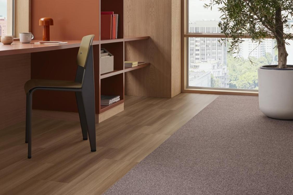
Forbo Flooring Systems: Tessera Chroma, Russet
Tessera Chroma is a textured carpet tile crafted for modern workspaces.
Available in a wide ranging colour palette of +20 curated and trend-led colourways, Chroma allows design flexibility to suit diverse aesthetics and preferences, promoting belonging through choice and visual identity.
Russet's soft textured loop pile offers physical underfoot comfort for those standing for long periods, or moving across spaces, contributing to a more welcoming environment.
All of Forbo's Tessera carpet tiles are designed and manufactured at its facility in Bamber Bridge, championing UK-based manufacturing. Boasting an >80% reduction in embodied carbon and one of the highest percentages of recycled content of any Tessera carpet tile at 77% recycled content by weight, the product is made with 100% ECONYL regenerated polyamide 6 solution dyed yarn.
This reduces demand for virgin materials, lowers environmental impact and supports circularity within the built environment sector. In addition, Tessera, Chroma has a third-party verified EPD.
Furthermore, its partnership with the Dementia Services Development Centre (DSDC) means Forbo has +1000 products accredited across the DSDC’s Class 1a, 1b and 2 rating system. 6 products from the Chroma range meet DSDC Class 1a and 10 products in the collection meet Class 1b.
Forbo Flooring Systems: Marmoleum, Fresco & Tessera, Chroma. Image credit: Tim Ainsworth
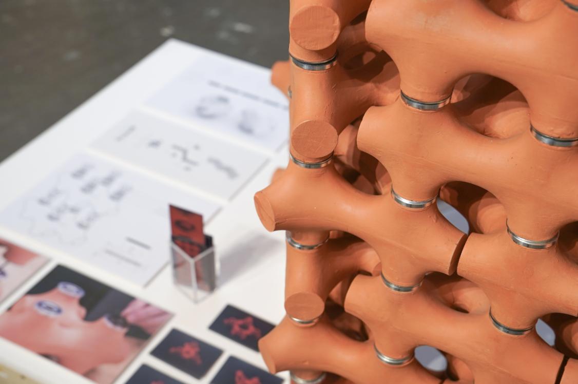
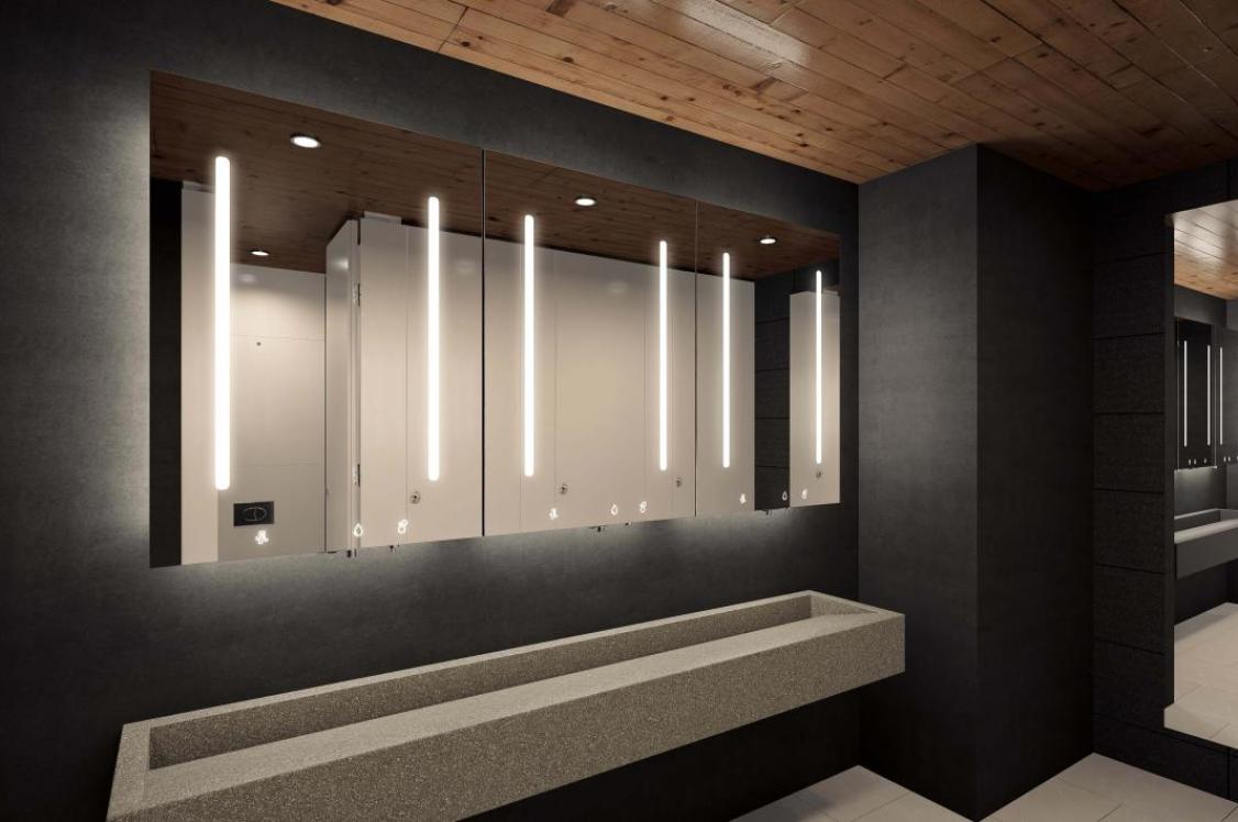
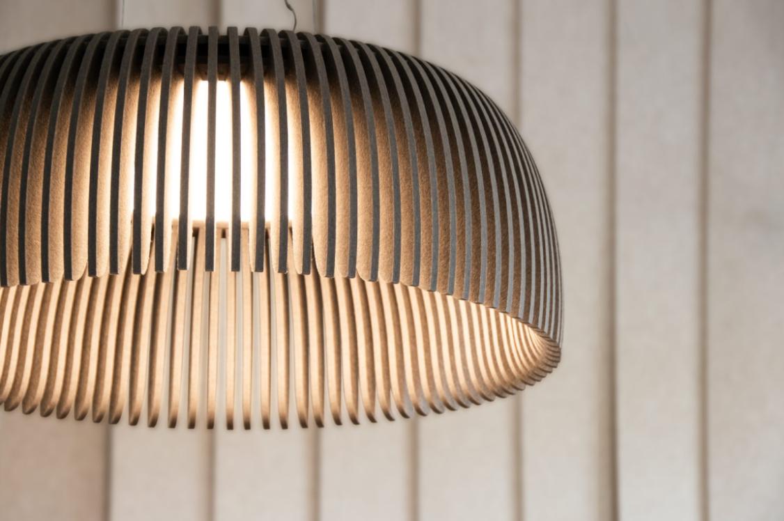
Autex Acoustics: Cube™, Cavalier, Terrace
Reducing noise reverberation and background chatter in commercial shared spaces, Cube™ by Autex Acoustics delivers high performing acoustic solutions for the built environment.
Available in a versatile and customisable medium, its range includes solid colour options, or printed, moulded, cut and grooved panels. Autex's portfolio of acoustic solutions is especially useful for spaces needing to cater to a wide variety of needs and preferences, including people with hearing sensitivities or neurodivergence. The range of colours, patterns and textures on offer enable aesthetic flexibility for any scheme, avoiding monotonous environments.
Contributing to circular material flows, all Autex Acoustics products possess a minimum of 60% post-consumer recycled PET fibre derived from PET bottles etc. Supporting healthy indoor air quality, Cube™ has low VOC emissions and a safe chemical profile, achieving Red-List free certification.
A certified carbon neutral product with a third-party verified EPD, Autex Acoustics has rigorously assessed the carbon footprint of its products, reducing the environmental impact its operations where possible. Ensuring its products contribute positively to formal environmental frameworks, Autex Acoustics' product portfolio support green building certifications such as LEED, WELL, BREEAM and Green Star to name a few.
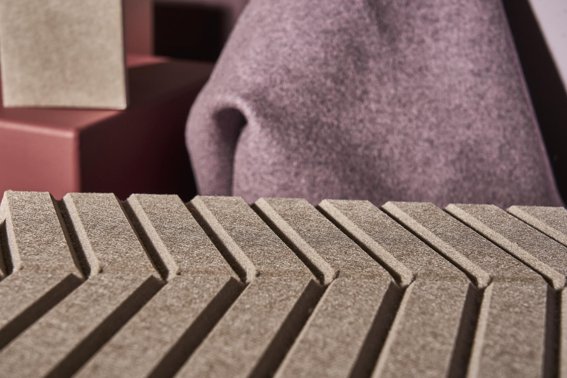
Autex Acoustics: Cube™, Terrace & Iliv: Kelso, Mauve. Image credit: Tim Ainsworth
Crown Paints: Scrubbable Matt, Ruby Chocolate, Winter Cherry, T3340X
Crown Paints is one of the UK’s leading paint manufacturers, supporting interior designers with high-performance products, expert colour insight, and technical specification services.
Crown's fandeck of 1,400 colours is designed to inspire and inform, and its pure paint samples available across all three Material Source Studio locations help designers curate their schemes.
A dedicated Colour Services team provide designers with expert technical advice and colour matching, whilst also curating its annual Colour Insights. In addition, the team conducts specialist research into subjects such as Designing for Neurodiversity, helping shape inclusive and emotionally responsive spaces.
Covering topics such as colour psychology and designing for dementia, Crown Paints offers RIBA and BIID-approved CPDs available in-person or online. These sessions are crafted to provide interior designers with actionable, evidence-based knowledge.
For example, Colour Design for Dementia is an interactive CPD that examines common symptoms and how the built environment can help those with dementia to live well through an understanding of senses, orientation and LRV (Light Reflectance Values). The session offers a greater understanding of how the implications of Dementia can help guide the design within a care setting, offering colour insight through the lens of a Dementia client.
Crown's Psychology and Physiology CPD puts forward insight on how we feel and experience colour - both from studies on the mind and behaviour, to physiological body responses. Committed to providing in-depth research on the effects colour can have on a space's occupants, Crown is passionate about assisting designers to create spaces that are accessible, inclusive and well loved.
Additional complementary tones in the Vitality palette include; X2140S, Y1101Q, W9080Y, Always Orchid X5310X.
Crown Paints, Ruby Chocolate, Winter Cherry, T3340X.Image credit: Tim Ainsworth
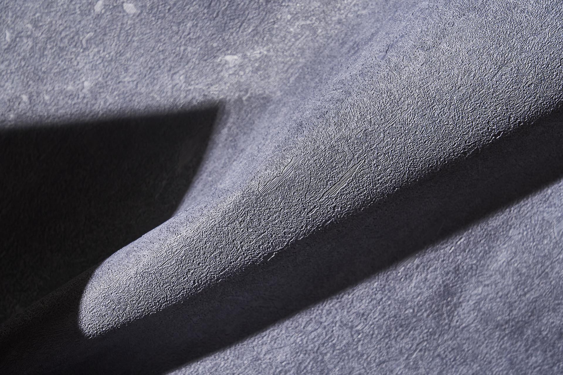
Russwood: Douglas Fir Flooring
A practical and long-lasting solution for interior spaces, Russwood's Douglas Fir makes use of the strong and durable softwood for flooring. Crafted with a three-layer engineered construction, the boards are compatible with underfloor heating and finished with a hardwax oil that enhances its lilac tinted grain and protects the surface.
Douglas Fir trees have a particularly fast growth rate, and also grow to impressive heights and diameters, making it possible to produce boards up to 5 metres long and 350mm wide. The final product is a floor that flows with minimal joins, creating a seamlessly flowing finish.
Implementing natural woods such as Douglas Fir into interior schemes not only enhances a project's green credentials, but helps to achieve truly warm and welcoming biophilic spaces that foster occupant comfort and connection.
Russwood: Architect Select® Larch, SiOO:X Light Grey
Architect Select® Larch is Russwood’s premium grade of vertical grain European Larch. It's FSC® certified, ensuring forestry practices protect surrounding ecosystems and biodiversity.
Due to its naturally durable heartwood and consistent figuring, it makes for excellent external cladding. Enhancing both stability and aesthetics, the boards are quarter sawn for a consistent, vertical or semi-vertical grain appearance.
The SiOO:X Light Grey coating is a Swedish wood surface modification, designed to enhance the natural durability of Larch, providing resistance against insects and decay fungi without the need for toxic chemicals.
The patented surface coating penetrates the wood with protective benefits for the the timber whilst developing a beautiful silver grey colour as it cures.This colour change can happen uniformly around a building, which avoids potential issues of differential weathering rates on north and south facades, and mitigating the potentially patchy effects which overhangs and eaves can leave on uncoated timber.
Russwood: Douglas Fir & Select® Larch, SiOO:X Light Grey. Image credit: Tim Ainsworth
ILIV: Kelso, Mauve
Crafted from 100% British wool and woven in Yorkshire, Kelso is a natural and hypoallergenic contract fabrics offering from ILIV.
Supporting local agriculture and UK-based craft and manufacturing, Kelso's soft texture and warm tones can be utilised to create inviting environments for a variety of sectors, including workplace, hospitality, and retail. With a Martindale rub test rating of 70,000, Kelso offers high durability, leading to longer product lifespans and reduced waste.
Wool naturally boasts fire retardant properties, ensuring that Kelso meets the relevant contract certifications to be used in commercial environments, and offers a colour palette of 51 shades that can be applied to both curtains and upholstery.
ILIV: Hemsby, Mauve
Hemsby is an upholstery fabric made from 100% recycled polyester.
Boasting a Martindale rub test rating of 160,000, Hemsby can be specified within a range of heavy use and high traffic environments such as hospitality and workplace. The lustrous velvet upholstery collection possesses both a flame retardant coating and stain resistant properties, whilst being Crib 5 and IMO 8 certified.
Hemsby is a sustainably sourced high performance velvet available in 24 versatile colourways, providing a superior option for any premium hospitality environment.
Iliv: Kelo, Mauve. Crown Paints: Ruby Chocolate & T3340X. Autex Acoustics: Cube™, Terrace. Image credit: Tim Ainsworth
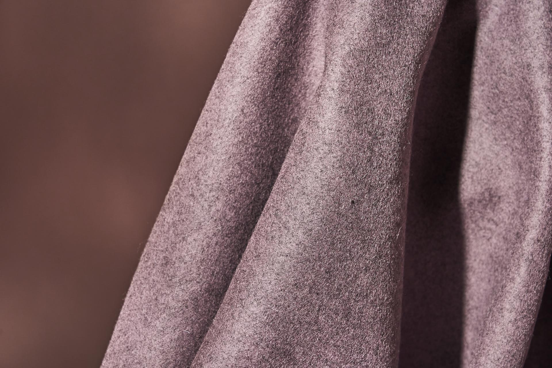
Iliv: Kelso, Mauve. Image credit: Tim Ainsworth
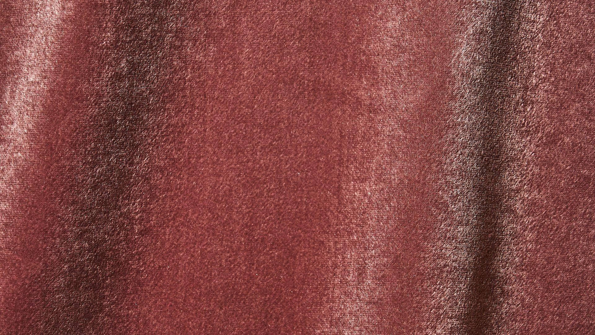
Iliv: Hemsby, Mauve. Image credit: Tim Ainsworth
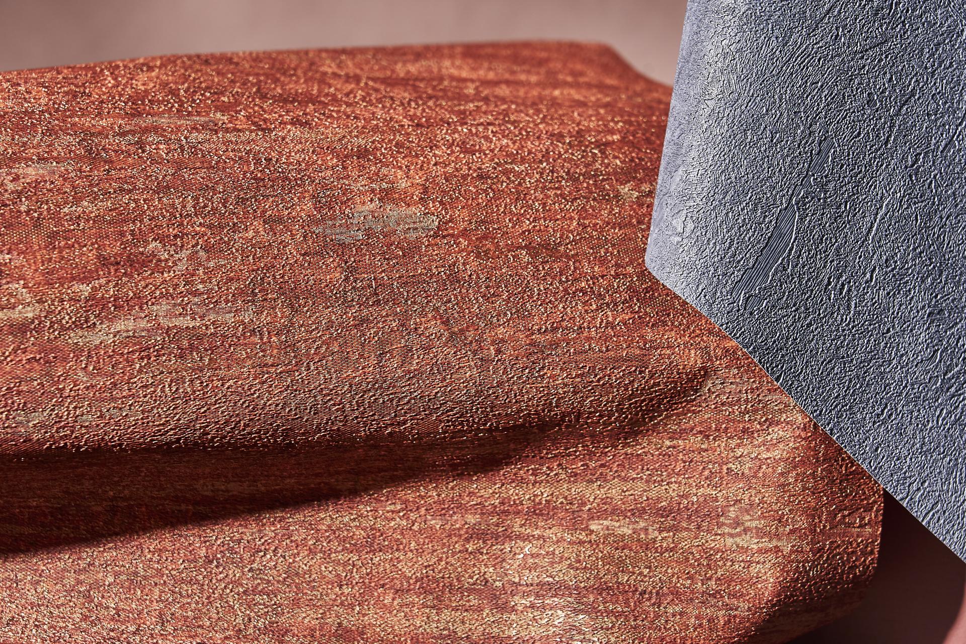
Muraspec: Luxor, Red / Gold 13492
Inspired by fine woven textiles, Luxor is a recently added collection to Muraspec's product portfolio. Blending intricate, tactile detailing with a selection of harmonious colourways, Luxor has the potential to meet a wide body of moods and spaces.
Blending beauty with durability, Luxor has a weight of 460gsm and a fabric-backed vinyl construction, reducing the need for frequent replacements and minimising waste. Luxor has an A+ VOC rating, ensuring minimal volatile organic compound emissions, contributing to healthier indoor air quality. It's also IMO rated, meeting strict fire safety standards.
Muraspec incorporates up to 30% recycled content in all its wallcoverings, contributing to a reduction in carbon emissions by 58% at its UK factory.
Muraspec: Orpheus, Dark Purple
Introducing Orpheus, a textured and timeless wallcovering crafted for commercial interiors. The collection spans a variety of rich, matt colourways, to subtle metallics, ensuring optimum choice for a range of sector schemes.
Its organic surface quality injects elements of tactically into a space, engaging the senses and contributing to user comfort. The wallcovering is IMO rated, meeting stringent fire safety standards, making it suitable for marine and transport environments.
Orpheus has an A+ VOC rating, ensuring minimal volatile organic compound emissions for healthier indoor air quality.
Muraspec, Opheus. Image credit: Tim Ainsworth
Muraspec, Luxor. Image credit: Tim Ainsworth
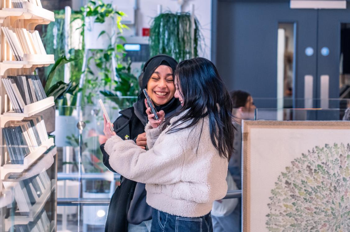
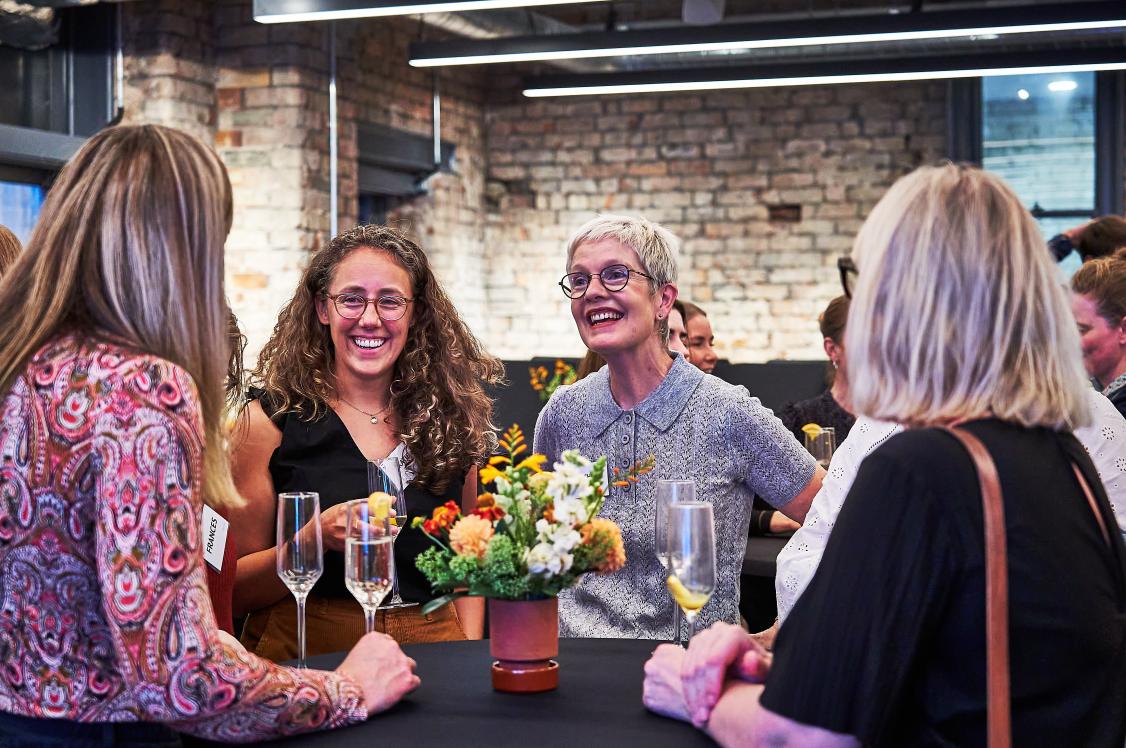
See all Material Moods: Vitality content on Instagram and Tiktok.