
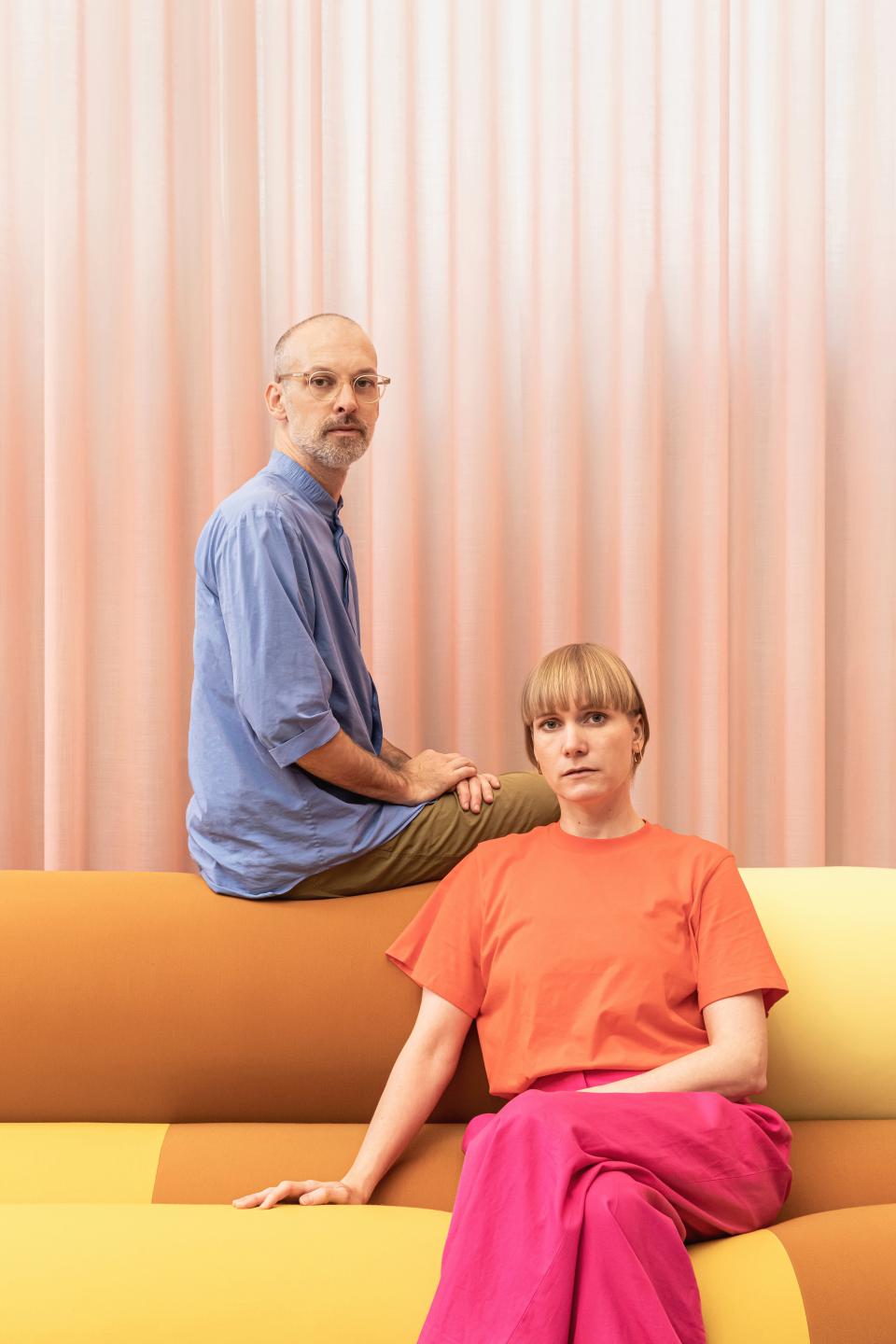
Christoph Brach and Daniera ter Haar reflect on 15 years of Raw Color, bio-based colour palettes, and the future of materials.
“People must have a physical encounter with a material. It maybe sounds contradictory, but the more we are surrounded by digital media, the more our body might need physical encounters” came the response from Christoph Brach of Raw Color when asked about the physical vs digital experience of colour and material we now find ourselves grappling with...
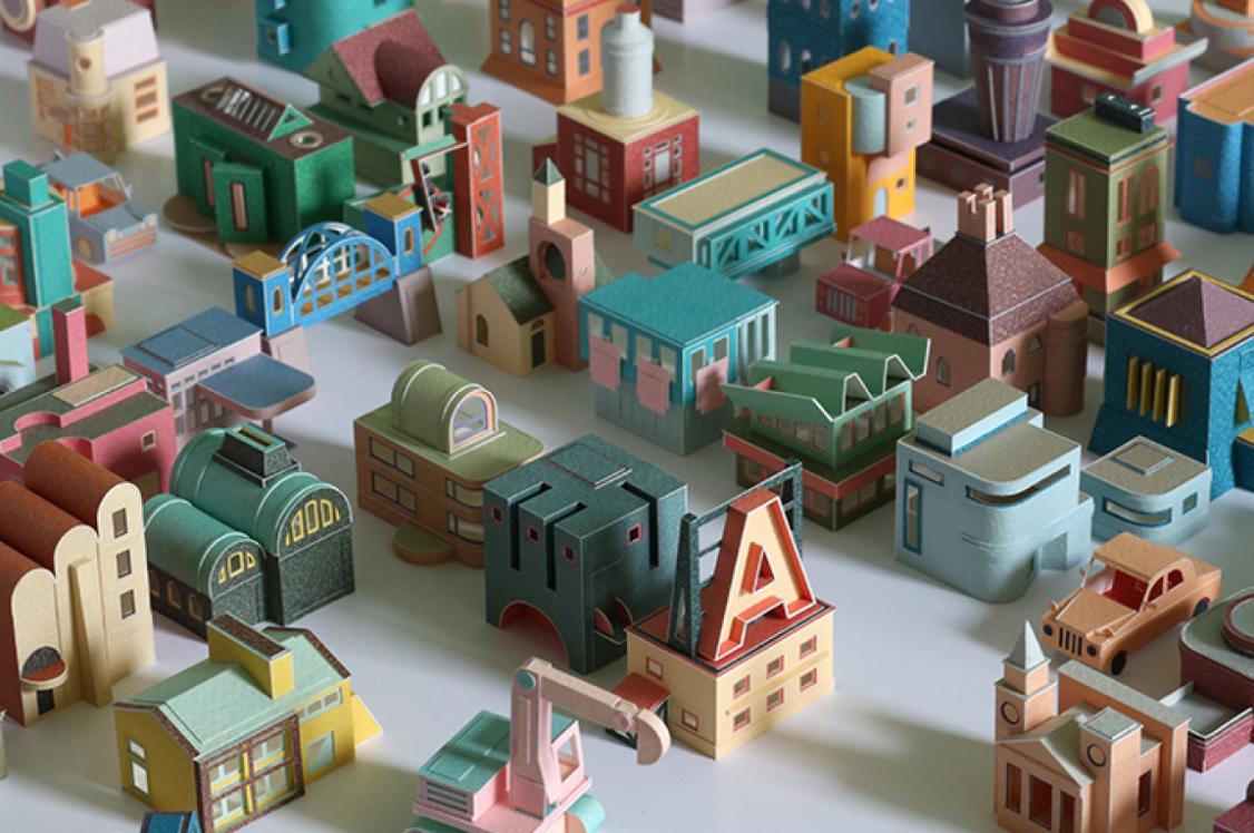
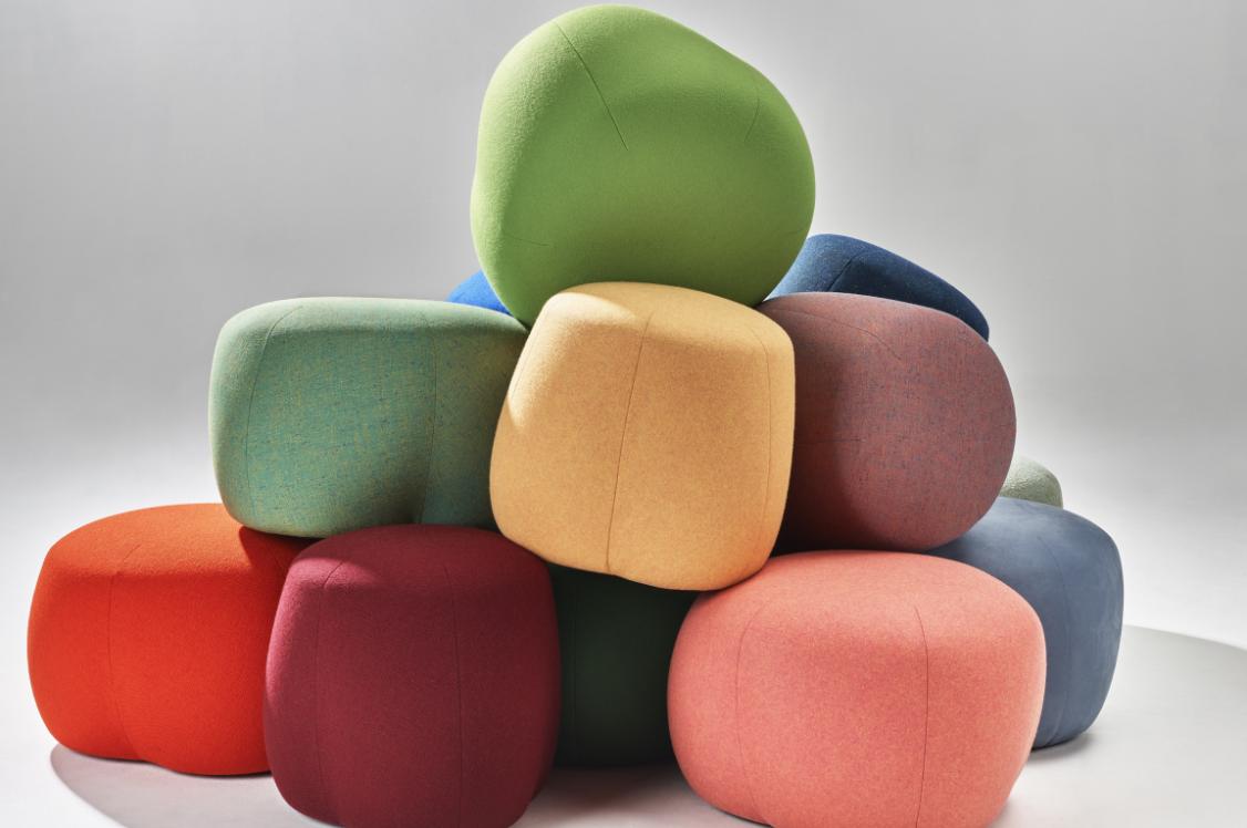
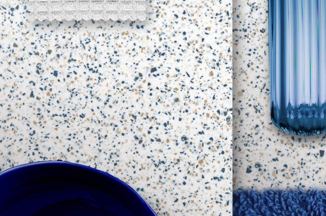
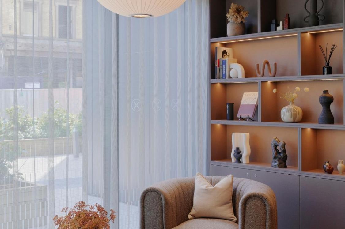
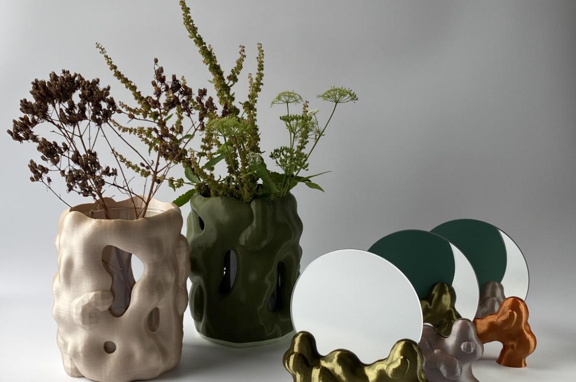
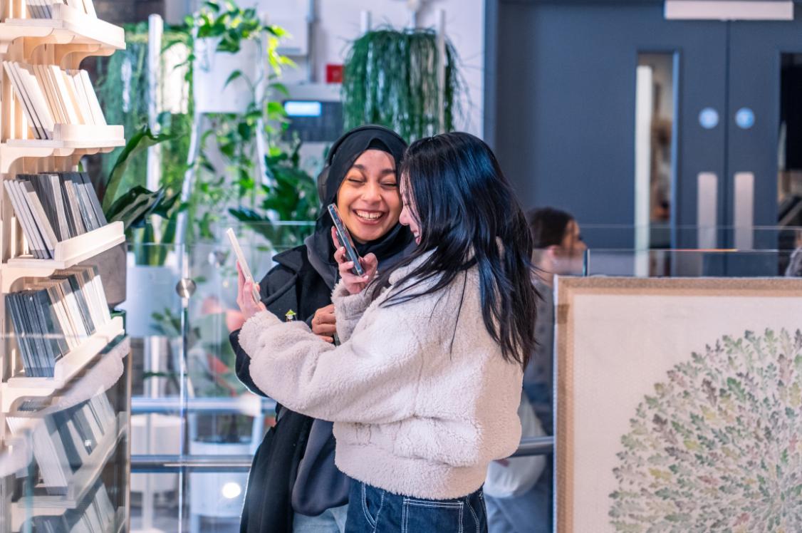
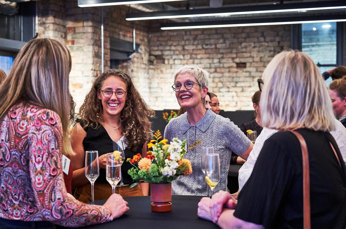
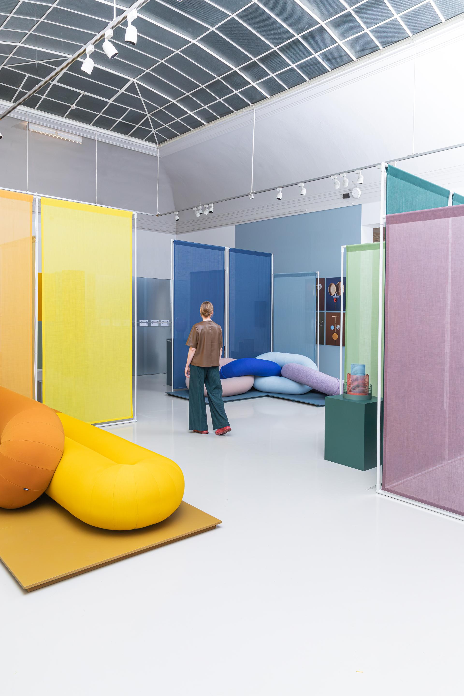
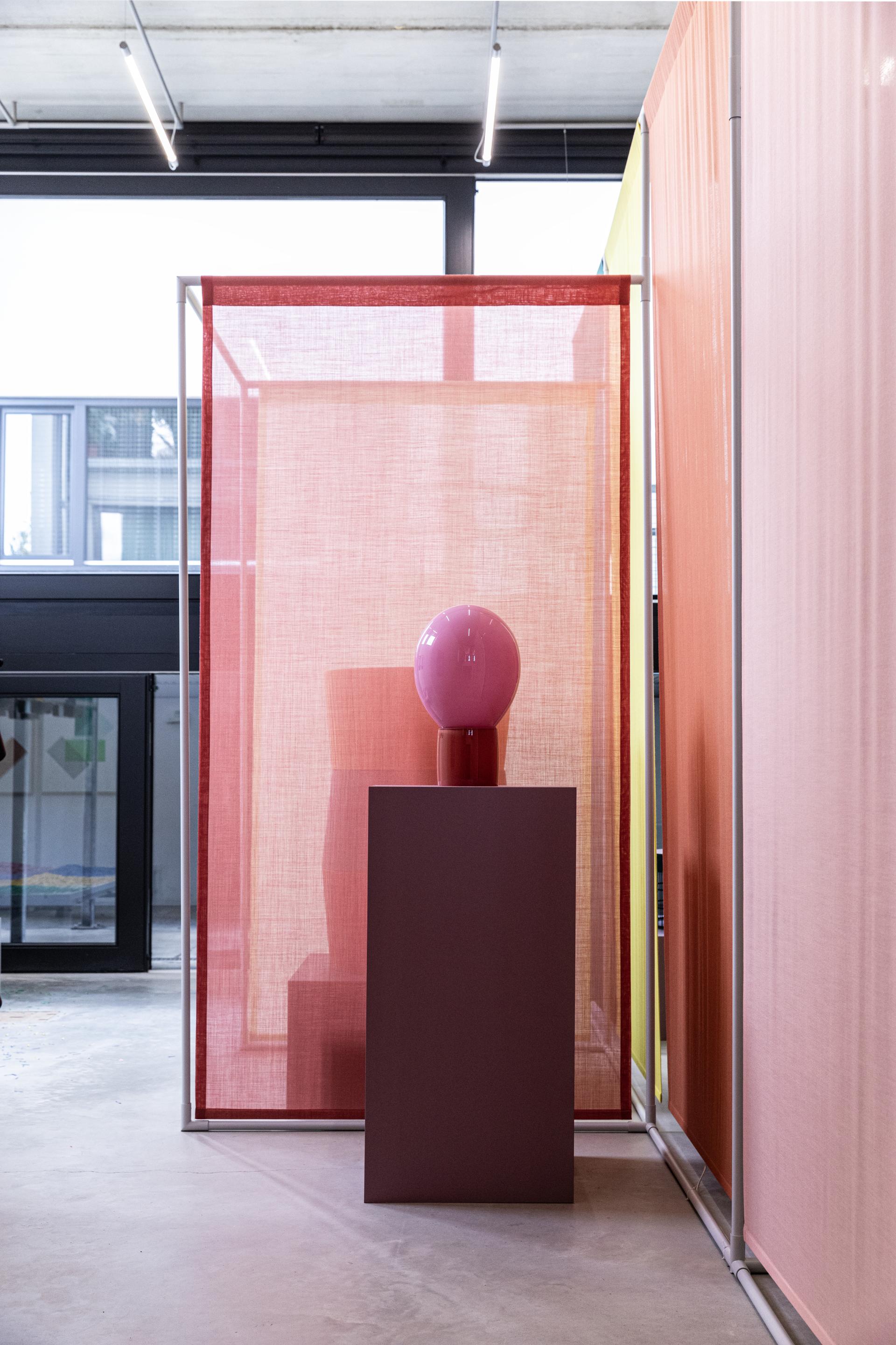
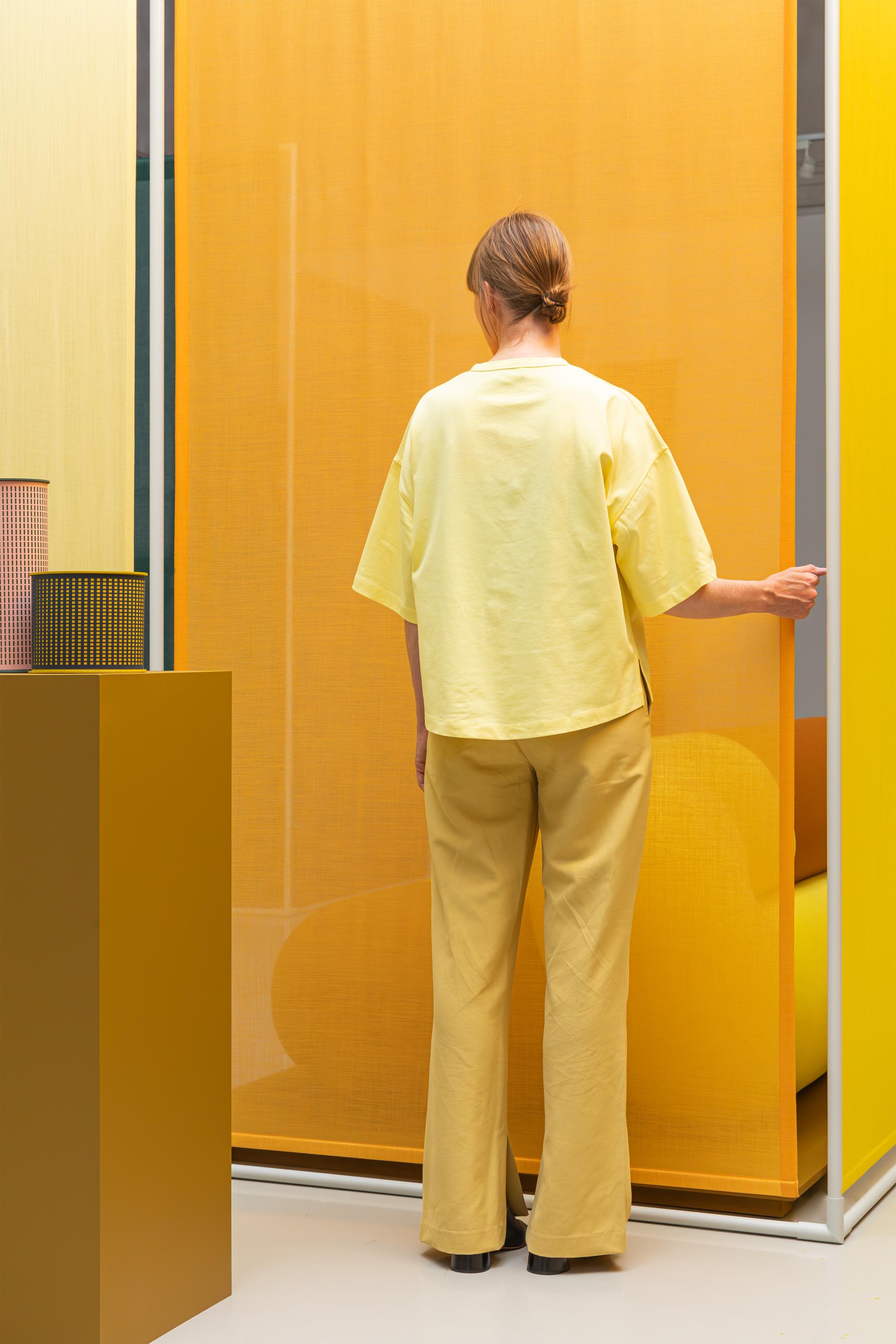
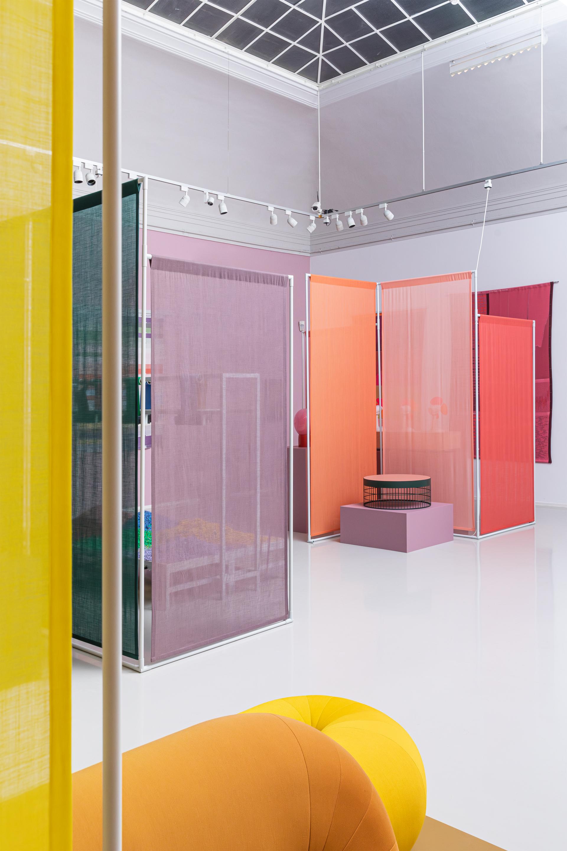
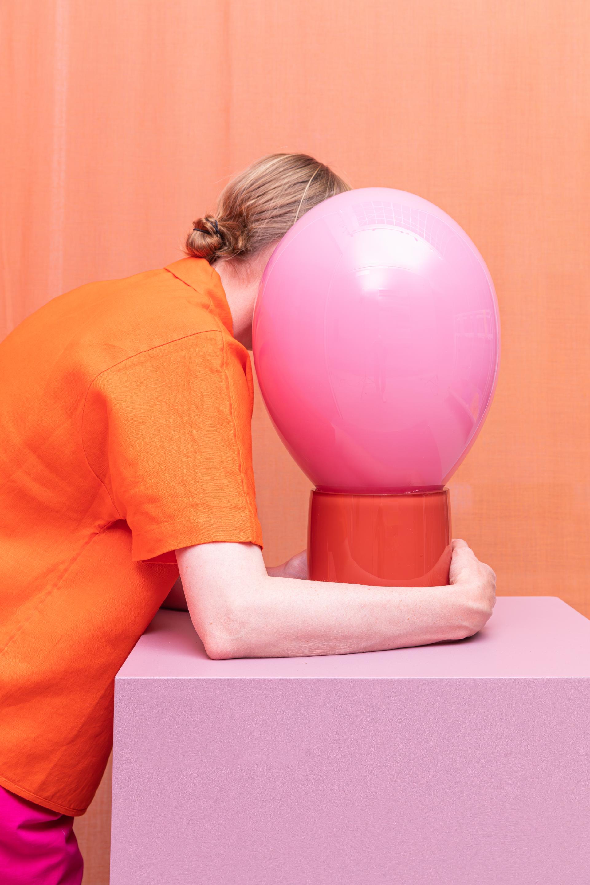
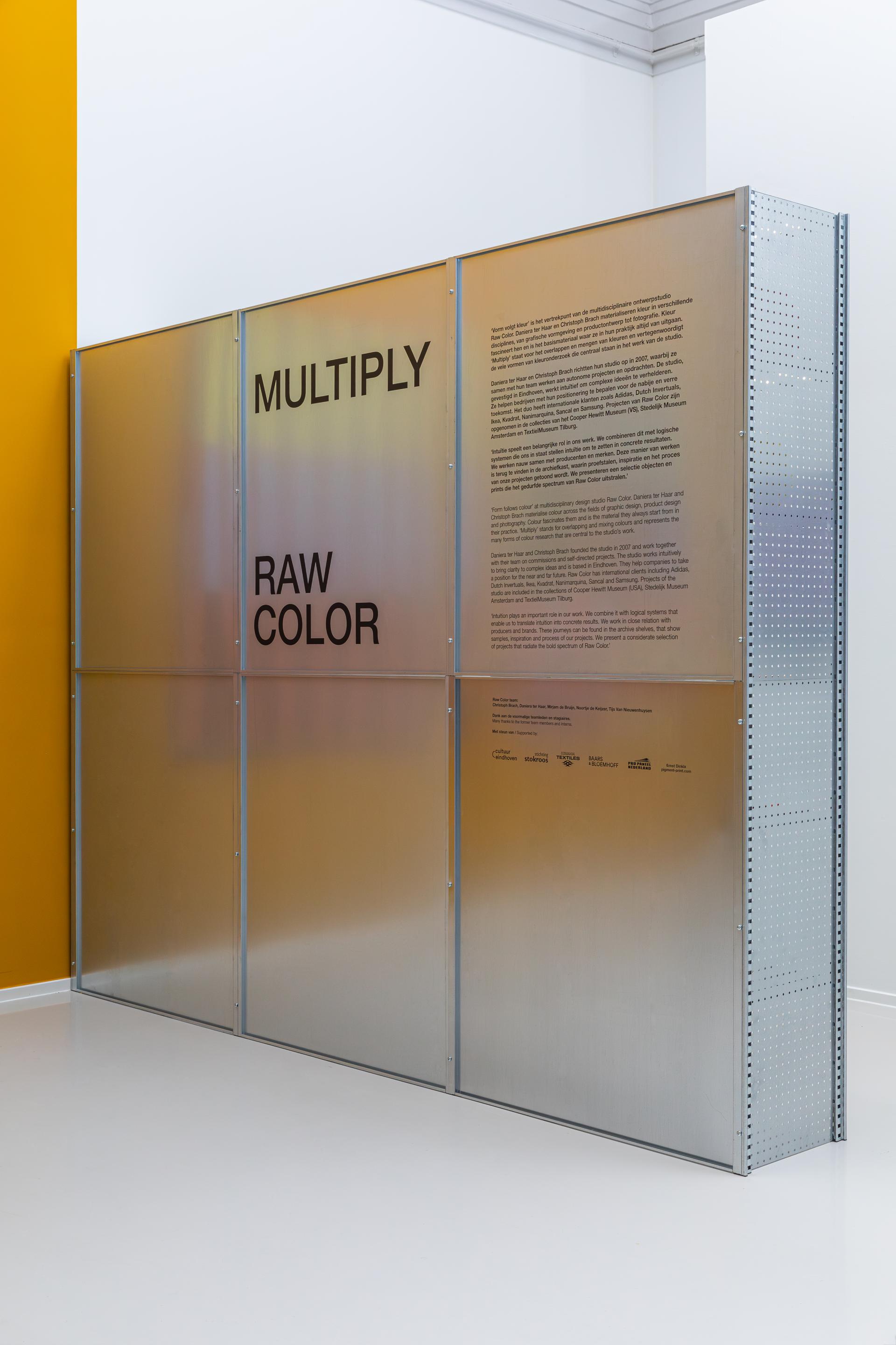
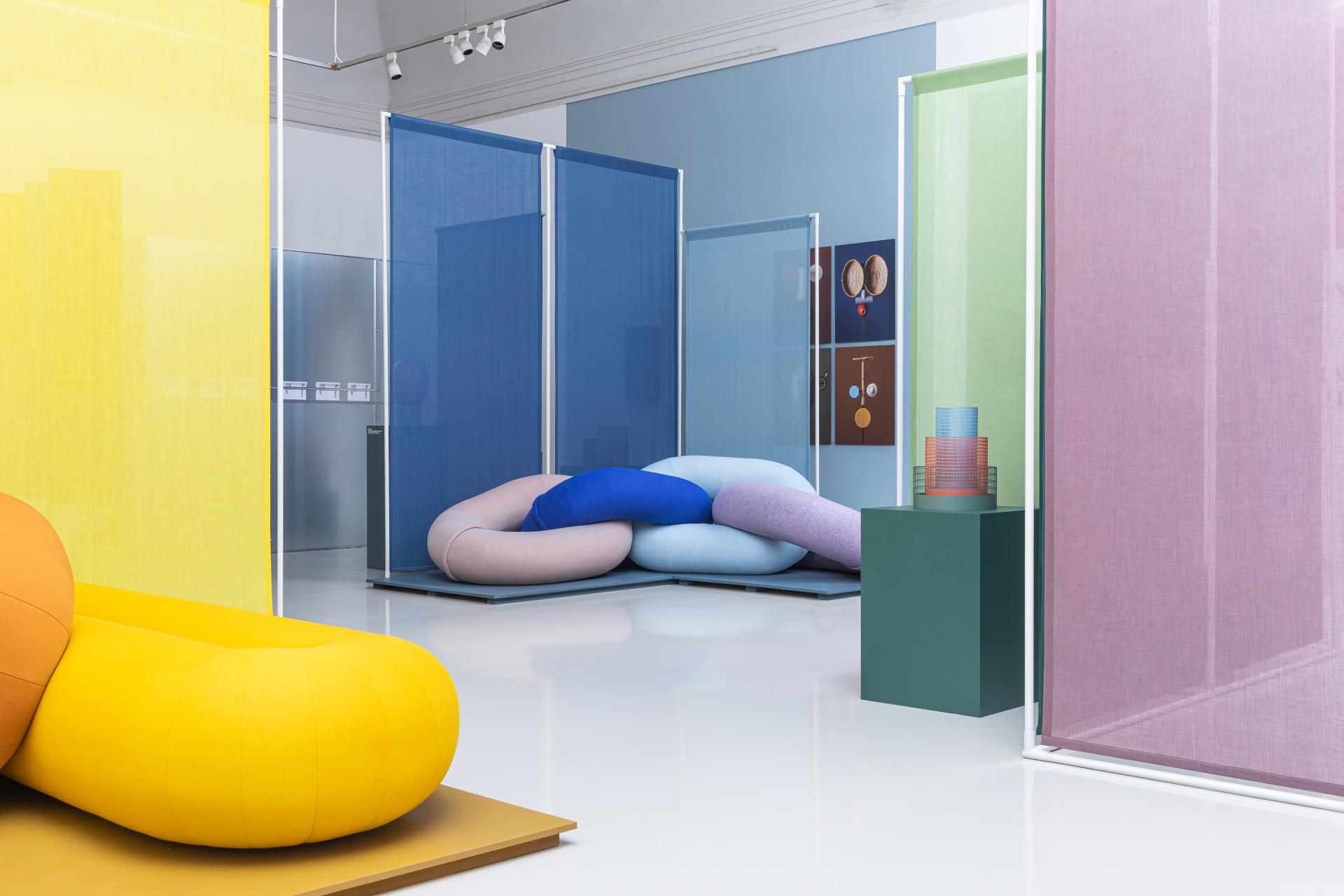
Following on from Dutch Design Week, we’ve been looking back on our top spots, and Raw Color’s exhibit ‘Multiply’ was certainly high on the list. An immersive fusion of physical and digitally derived colour combinations, visitors were enticed to weave through carefully curated gradients of colour, light and materiality.
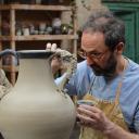
Raw Color is an interdisciplinary practice, initiated by Christoph Brach and Daniera ter Haar. Flowing between disciplines such as graphic design, product design, photography and spatial design, the studio channels its core focus towards the materialisation of colour. Within its small team, the practice embarks on both a mixture of commissioned and self-directed bodies of work that continually break ground on the role of colour and material in design.
After entering Raw Color’s chromatic archive of the last fifteen years in their Eindhoven based studio, we reached out to further continue the conversation on colour, delving into their most notable works, and questioning what the future holds in the ever-changing design world...
Firstly, can you please introduce us to Raw Color?
“Raw Color is an interdisciplinary design studio that operates across several creative areas. Colour is a visual tool, that is recognisable and can be applied in all media, materials and dimensions. It allows us to move between the design disciplines such as graphic design, product design and spatial design, which reflects our educational backgrounds and personal interests. You could say we chose colour, and from there our practice moves between many applications and design fields.
“Daniera and I started the studio together fifteen years ago, and now work within a compact, dedicated team of five including; Noortje, Mirjam and Tijs. We have all been collaborating for more than five years now.”
Could you please tell us how you both get started individually and how Raw Color then came to be?
“We met during our education at Design Academy Eindhoven, and from the very beginning as students we shared and discussed each other's projects. Our careers started by a combination of working part time and completing our first, initial projects together.
“Interestingly, we never actually intended to set up a studio. It happened through an invitation to join an exhibition, and with preparation time not on our side, we decided to do it together. In the first period, we earned money through our jobs and set time aside to do mainly self-initiated projects. We also simply didn’t have any clients. However, first commissioned collaborations quickly followed, and we have grown ever since.
“Still today the combination of both self-initiated and commissioned work is important to the studio. These days we mainly work on commission, which is great to find answers to a client's question. We keep creating self-initiated projects that allow us to formulate our own questions and investigations - both keep the studio and its development in balance.”
How did the name Raw Color come about?
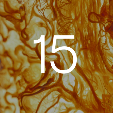
“The name emerged from our first collaboration, which was an investigative project into vegetable derived pigments. We made an installation that transferred beetroot pigments onto a poster. In addition to this, we developed a categorised colour card system, blending different types of vegetables to achieve new colour-ways.
“With our first body of work being with raw ingredients, the name ‘Raw Color’ came to fruition. After branding the project as so, and presenting it at Milan during Salone, our mail was addressed to Raw Color. From that point we decided to use it as a studio name, rather than just that first project.
“Sometimes it can happen that things get chosen for you in life, like this example. We are still very happy with the decision to use it as a studio name. ‘Raw’ represents the quest for essence and purity of a project, which we always try to find. ‘Color’ is obviously representing the visual character of our work. It is recognisable but not limited to a discipline.”
Your practice focusses on harnessing the materialisation of colour. Could you explain to us what you mean by this and how you go about it in your projects?
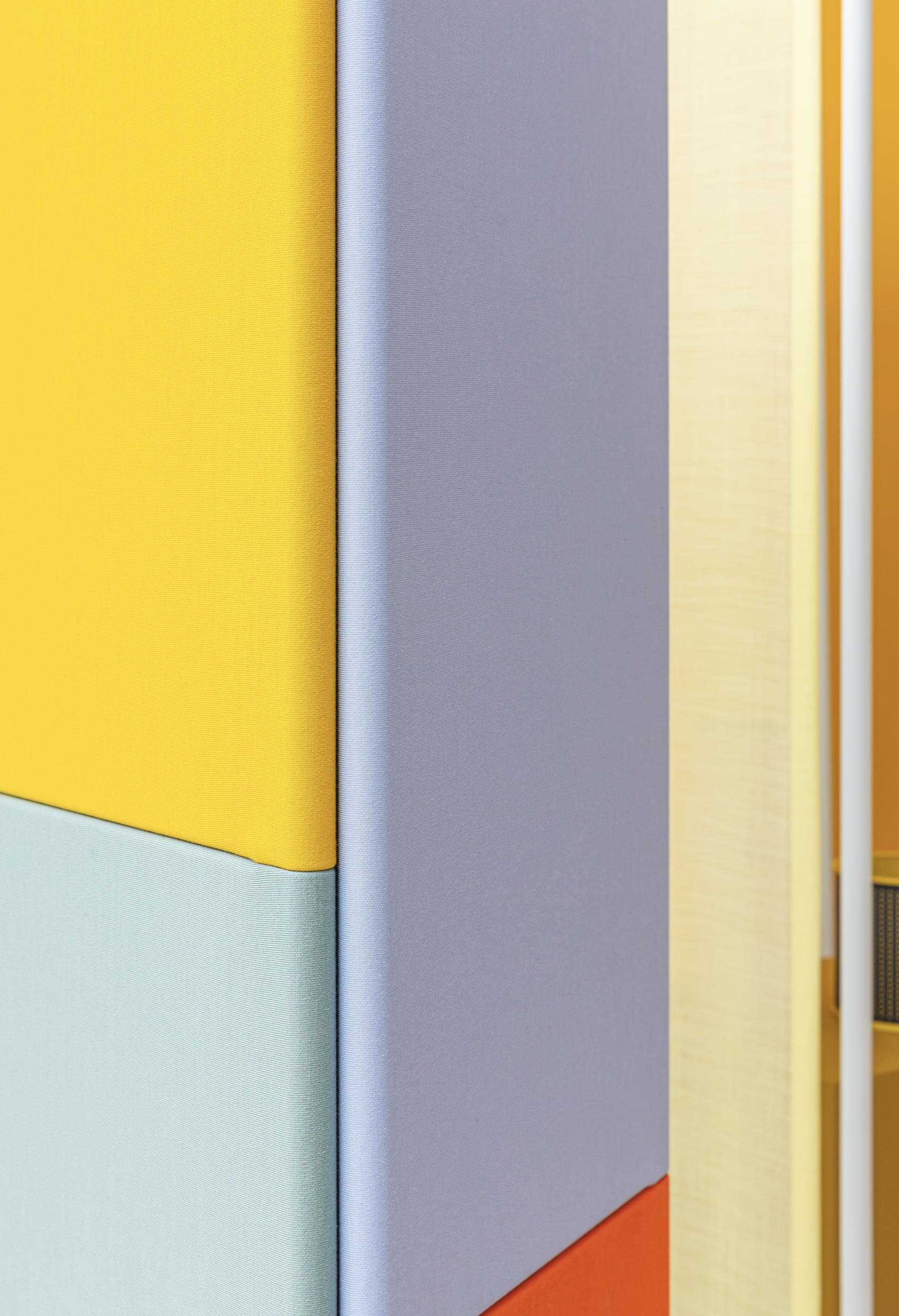
“Colour is something universal, yet it can differ depending on the material that it is applied on. Whether it is static or dynamic, its context plays an important factor on how we read colour. For example, a red velvet textile will express something different to a red steel sign. In our work we like to materialise colour. For us, this means that colour is a profound part of a project - if not the starting point.
“We strive to manifest its presence through installations, products or other type of work and in each project, we try to look at another aspect of it. For example, how can it be physically constructed with pigments? How can grids and pattern of differing tones blend to a sophisticated yet radiant unity? Whenever we work with it, it becomes a medium by itself that allows us to visually and conceptually connect our projects.”
What does a typical day look like in the Raw Color studio?
“We usually start the day with a coffee and tea together with our team in the studio kitchen, having a chat about life and other things than work. We often work on our computer if we’re doing individual work but there are also moments where we are preparing physical things. These are usually simple, made from paper or painted wood.
“We don’t have a workshop, instead utilising basic tools to make a concept tangible. With these simple ingredients, we can test and visualise our concepts in both a spontaneous and swift way. These techniques form a good contrast to our digital work.
“In our typical day there can also be several one-to-one meetings, where we sit together and discuss a project’s progress and its next steps. A fixed ingredient to the studio’s routine is a lunch walk through the woods, reaping the refreshing benefits of being amongst the trees and looking at the leaves, enjoying natural light.
“On top of client meetings, Daniera and I are also tutors at Design Academy Eindhoven on a regular basis. Which means that one of us is there for one day a week, we feel very fortunate to fill our day with such diversity.”
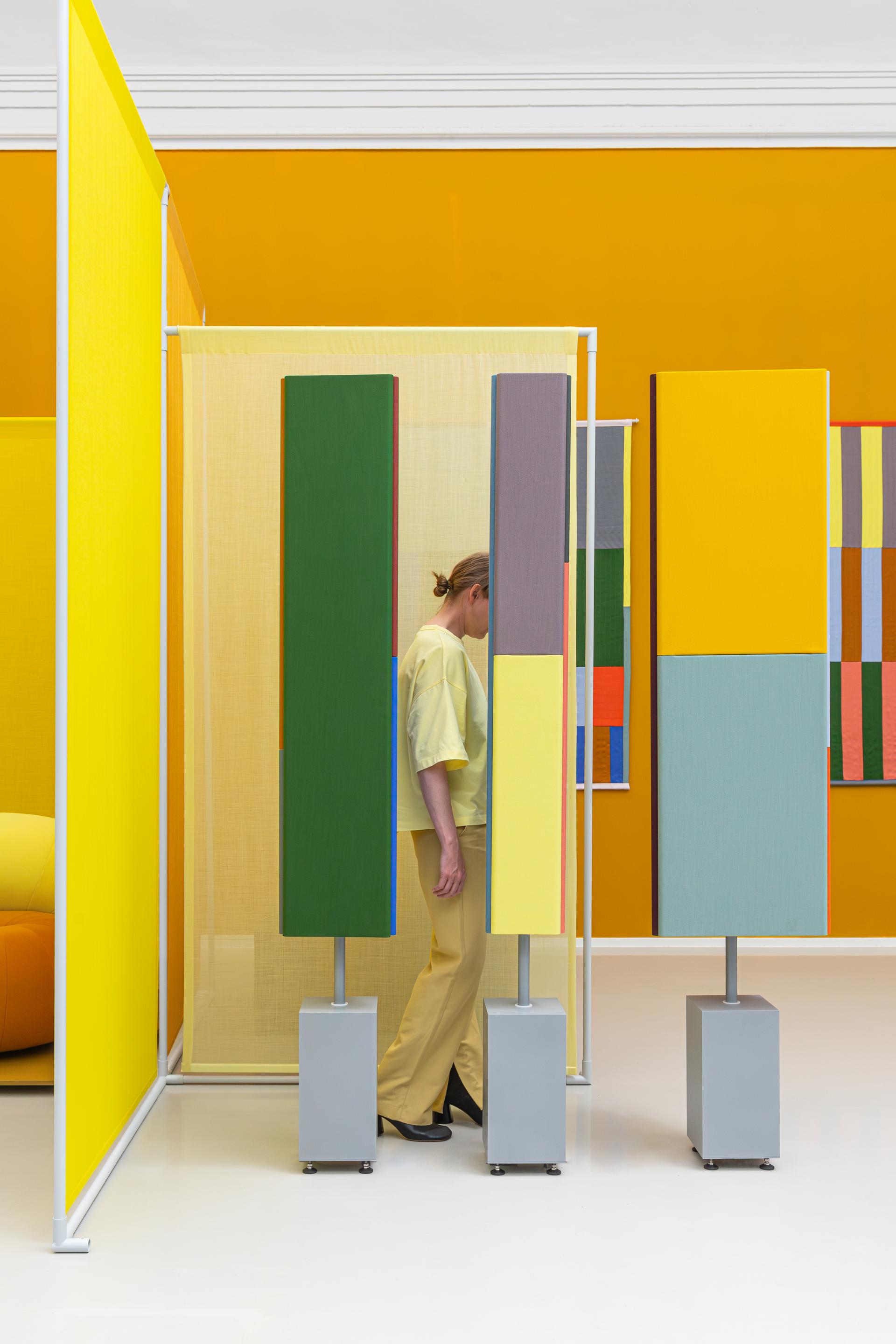
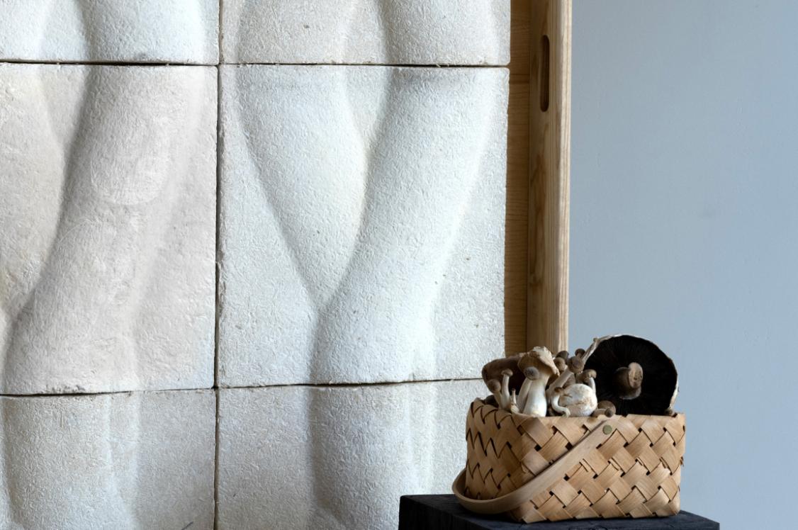
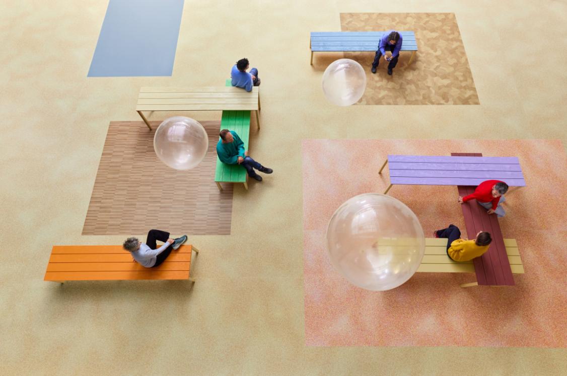
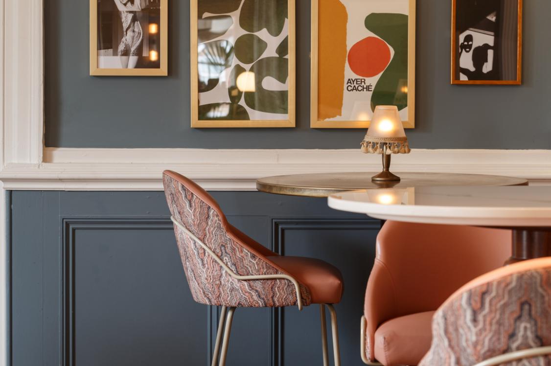
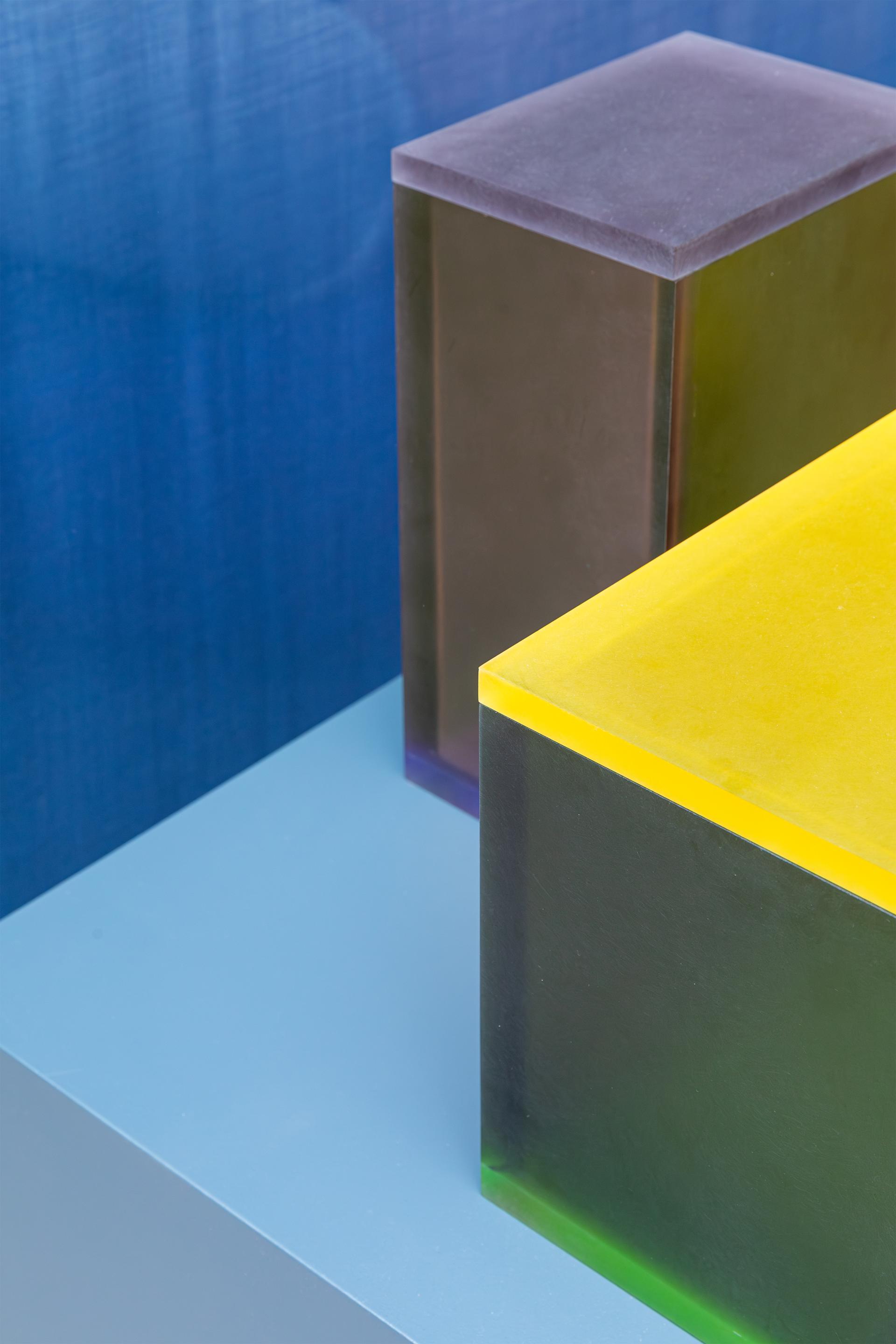
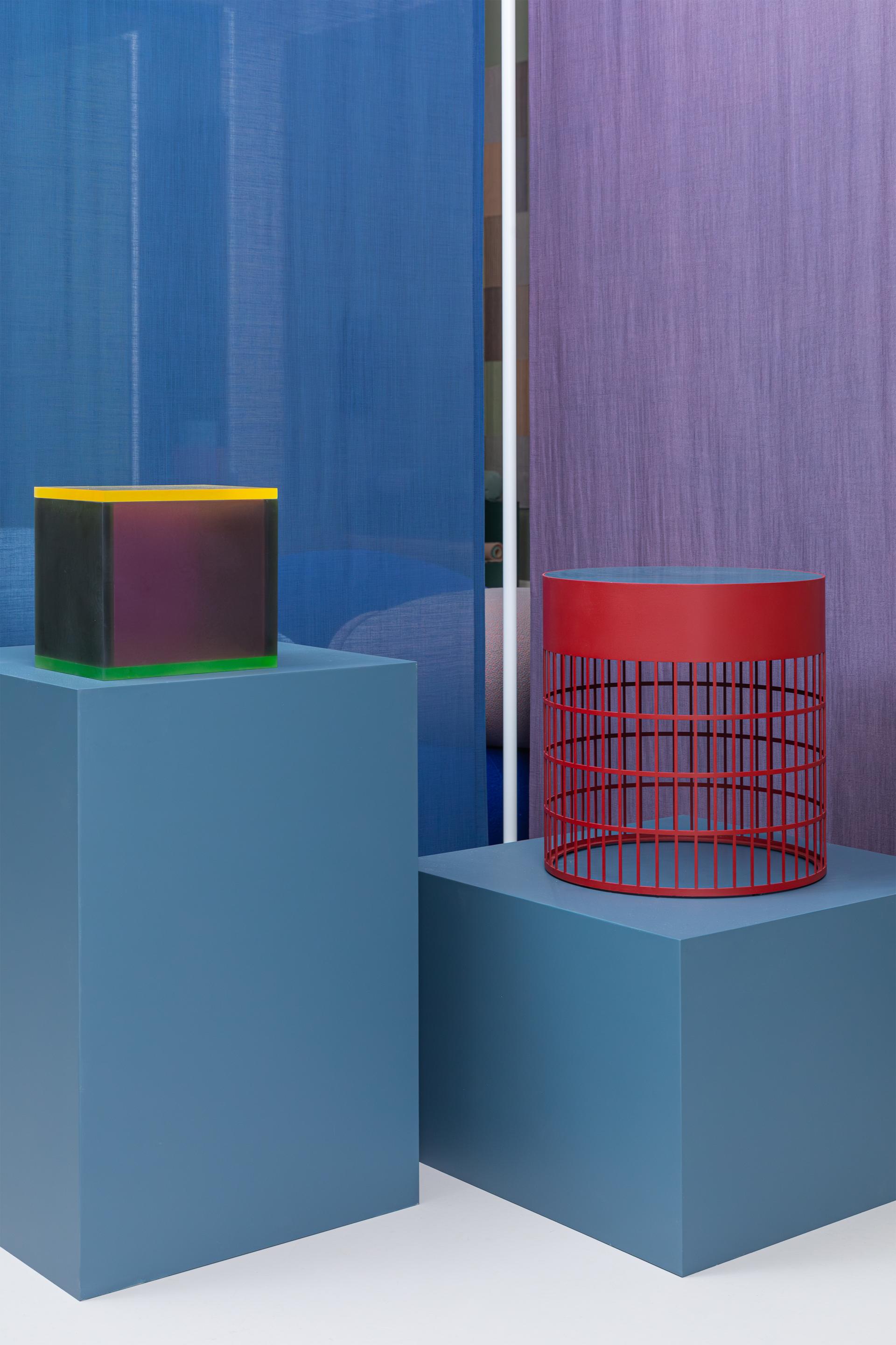
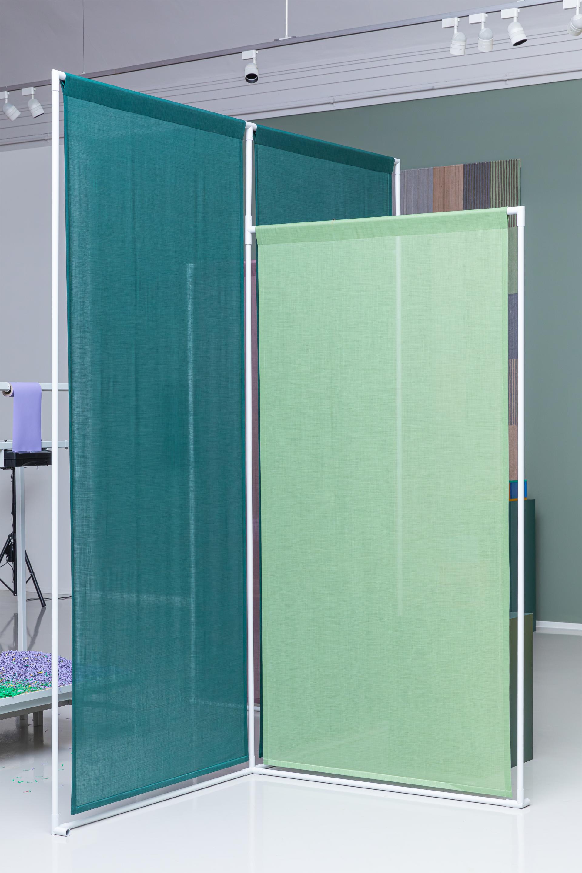
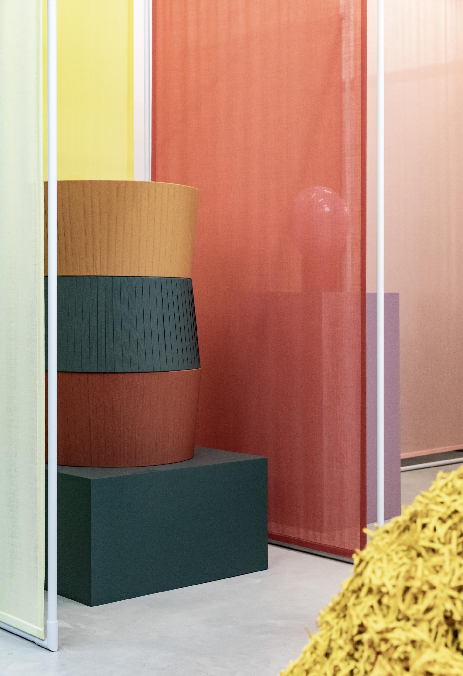
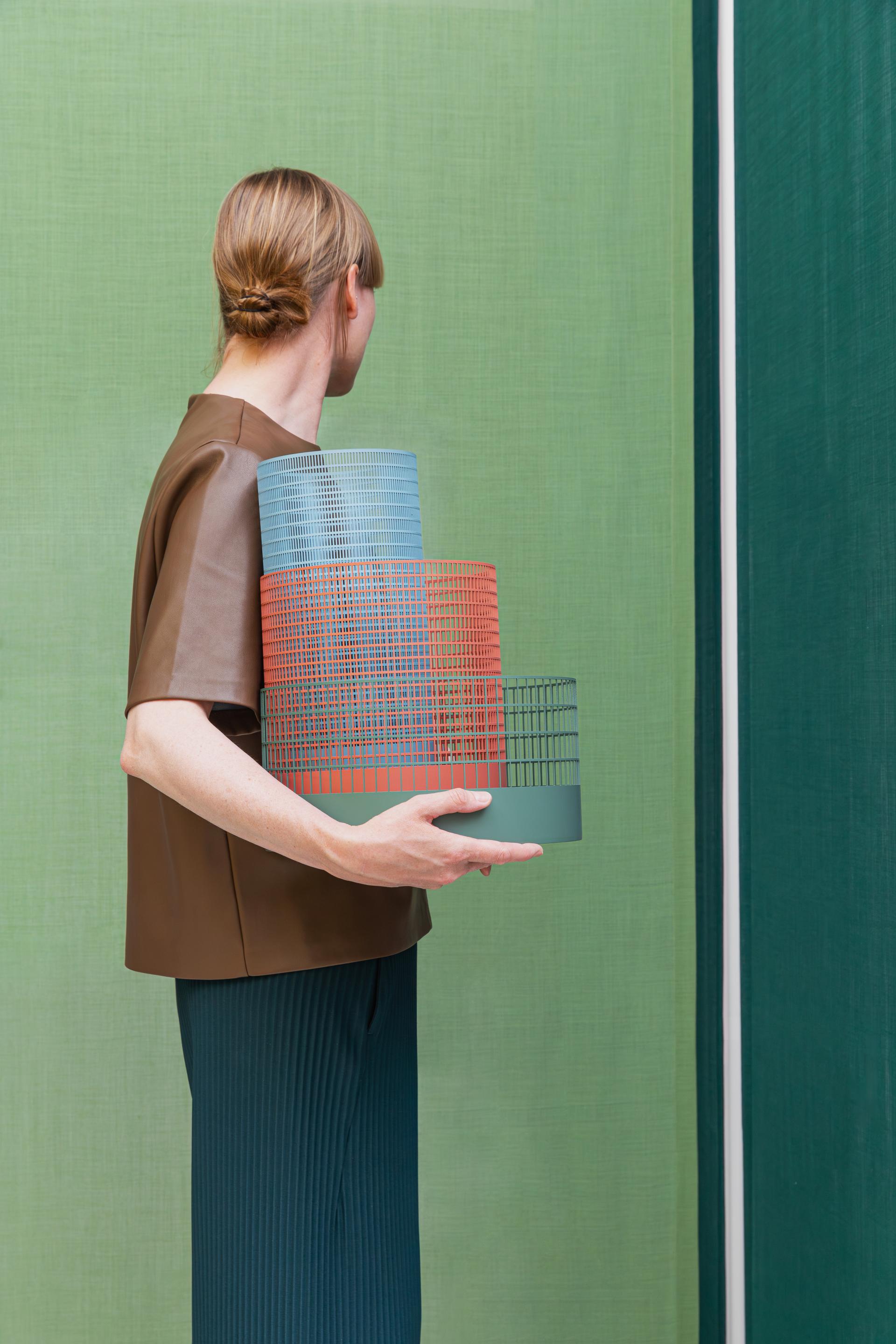
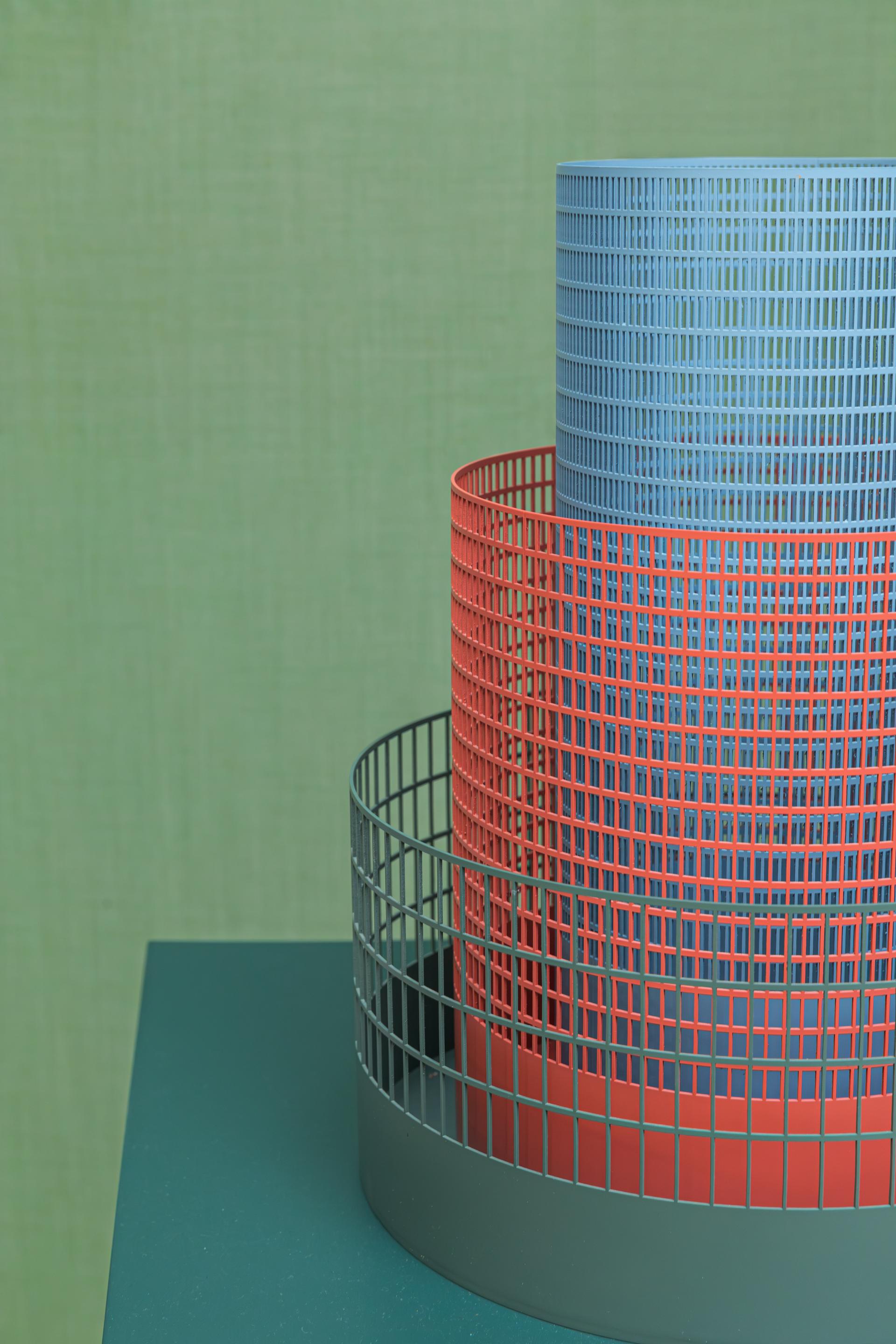
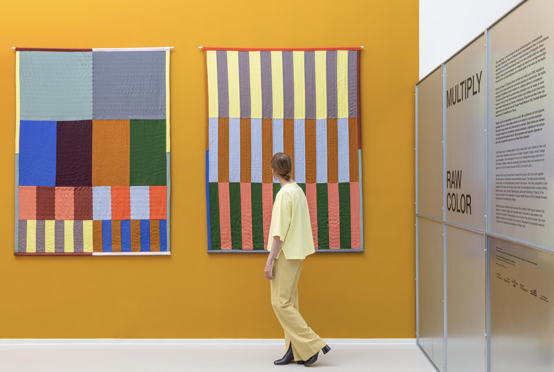
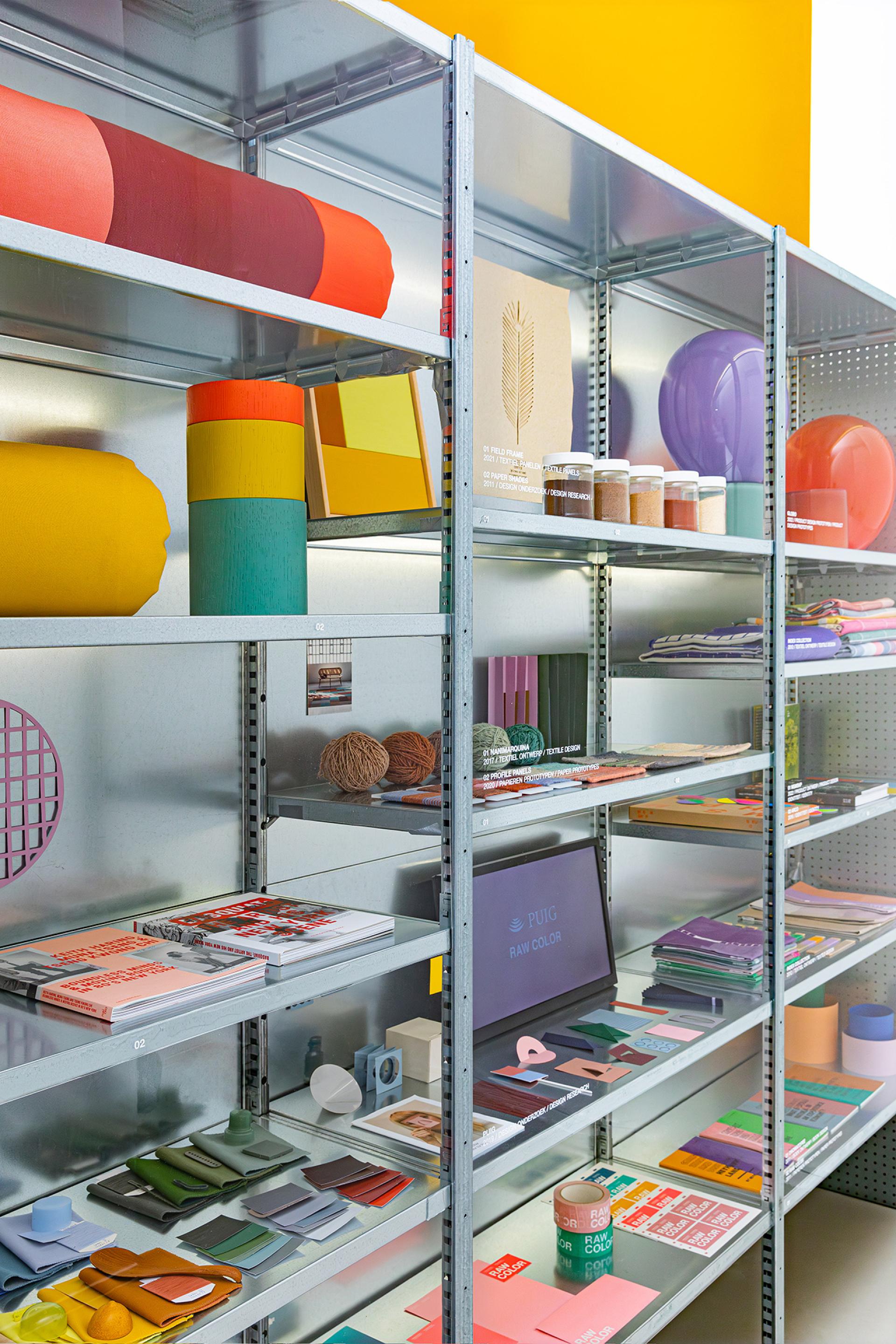
We were glad to catch your exhibit at this year's Dutch Design Week, Multiply - a wonderfully vivid spatial colour experience that deep dived into some of your most memorable works. How did you go about choosing the pieces for this exhibit?
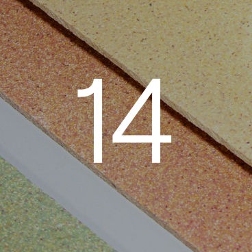
“Thank you for the kind summary of ‘Multiply’! During DDW, we presented a far more compact version of the show within our studio space. The exhibition was created in response to the studio winning Limburg Design Award 2023. In the original setting in Cuypershuis Roermond, we could utilise a space that was four times bigger. In this setting, we clearly defined four hues that served as separated colour groups to structure the presentation and to unite the works within each group.
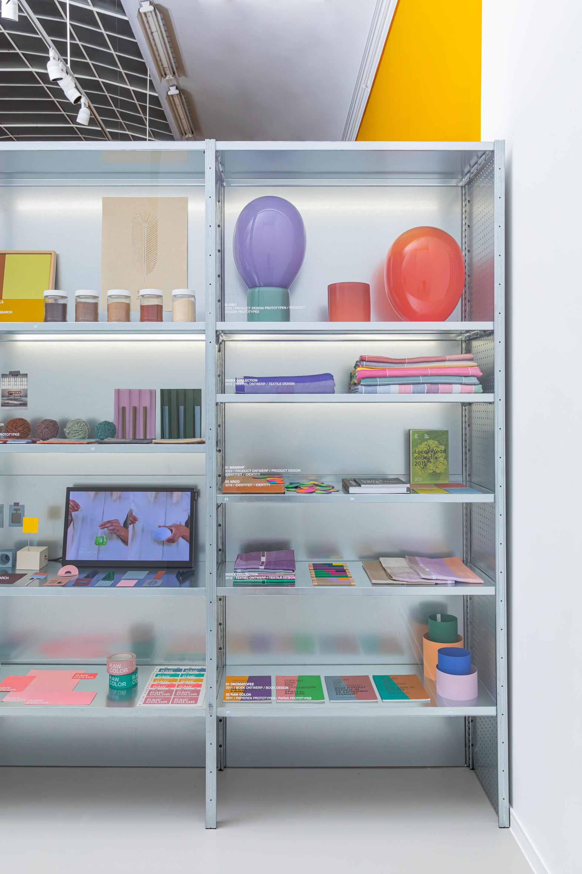
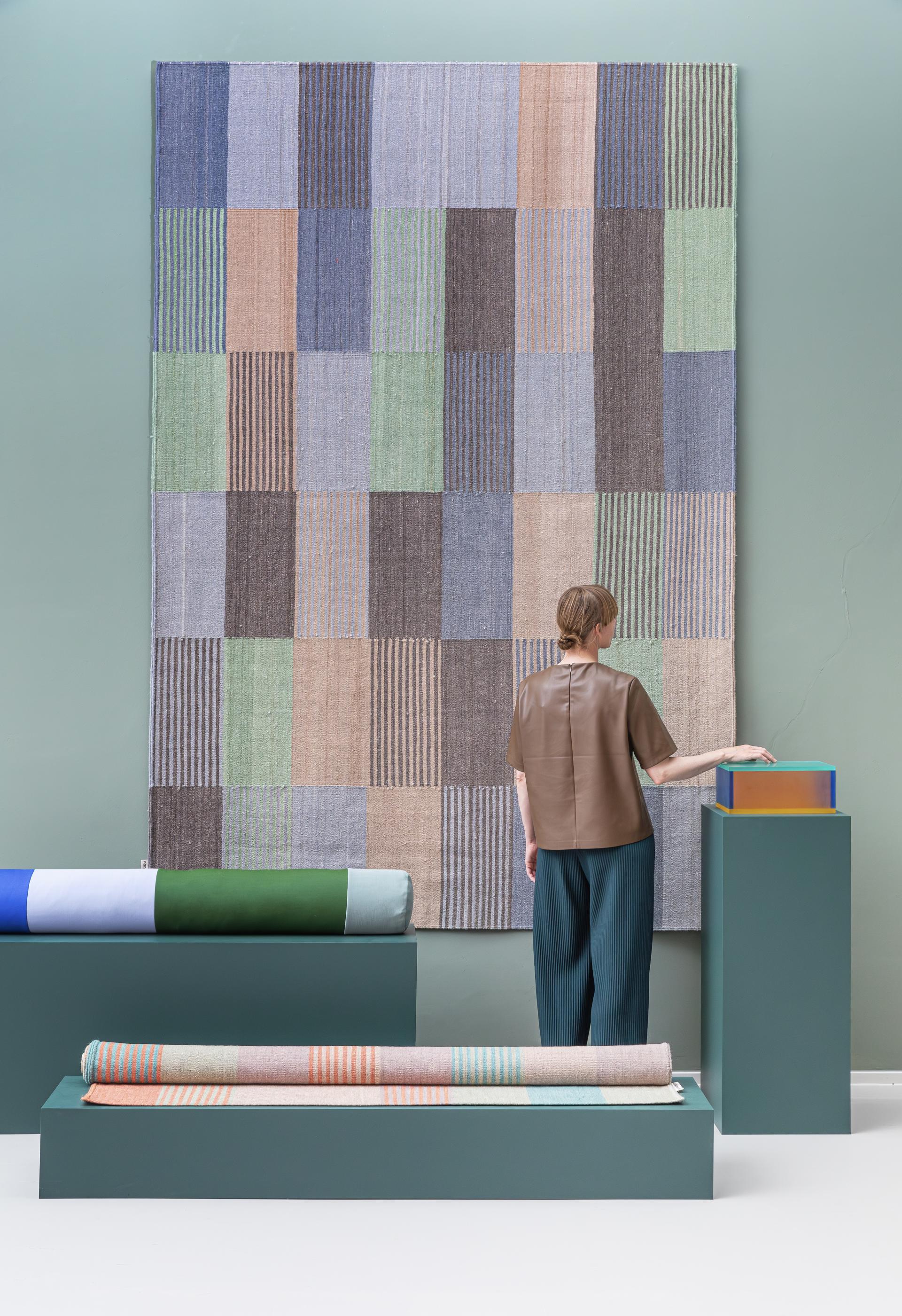
“In order to present in our smaller studio space, we had to make an even sharper selection - striving for a more considered balance between objects, interactive installations and textiles. Next to the larger pieces, we found it important to also share the process behind them, as well as store our graphic work on shelves. These are usually smaller pieces that demands the ability to zoom with and focus. Therefore, the shelves are a good frame for it. The DDW exhibit was a continuous and gradient inspired setting of textile walls, allowing visitors to wander through our world of colour exploration.”
Can you describe the journey visitors embark on when exploring Multiply?
“For us it was important that the visitors immerse themselves in the colours and space, and were able to experience the individual projects. We created the exhibition’s layout to also serve as photographic settings, carrying out several shoots within the setting. The translucency of the textiles partly block visibility of the space, offering soft hints of colour from the projects hidden behind. We found that visitors were fascinated by the diverse manifestations of colour across the projects.”
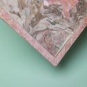
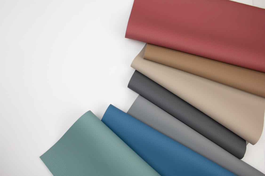
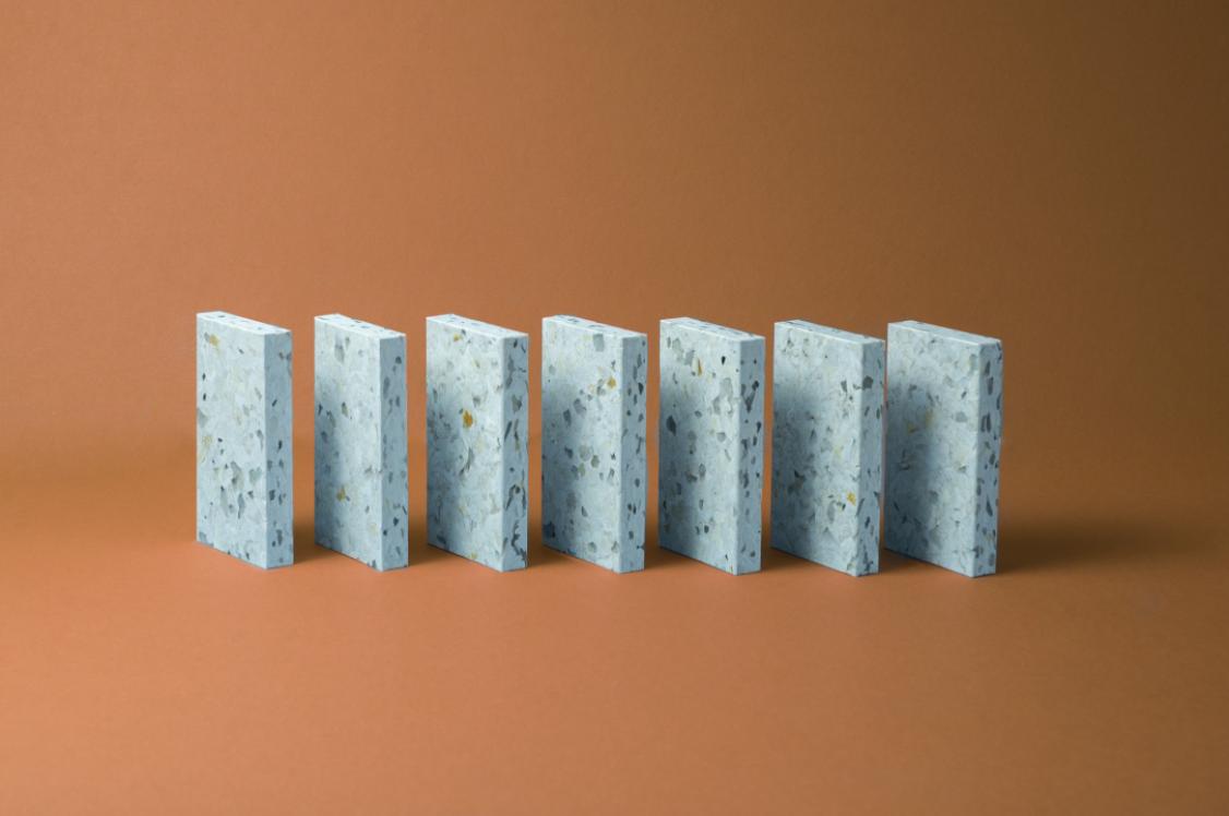
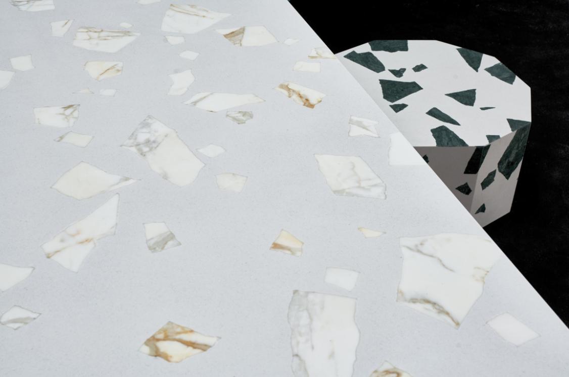
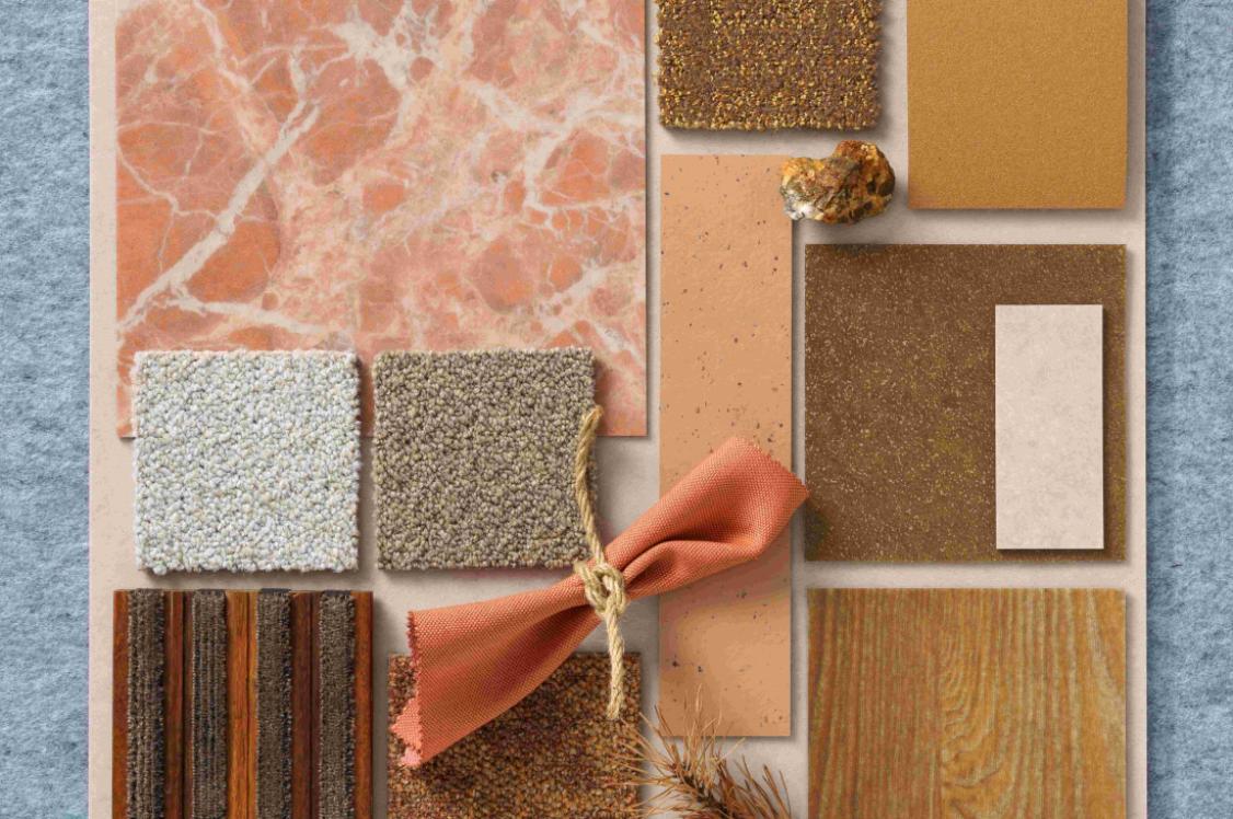
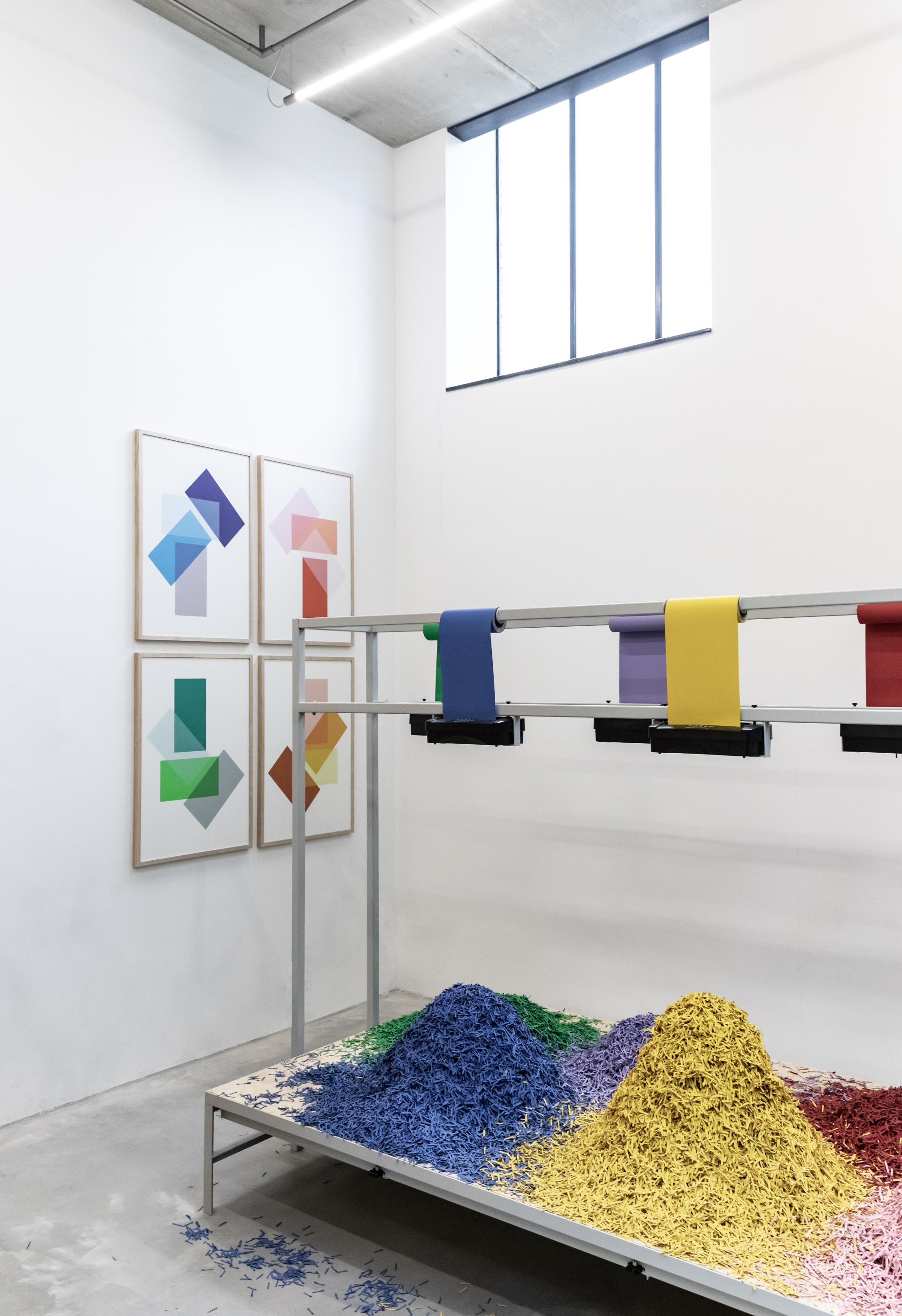
Your project Globo creatively explores the nuances in coloured glass. What other materials are you keen to explore that you haven’t already?
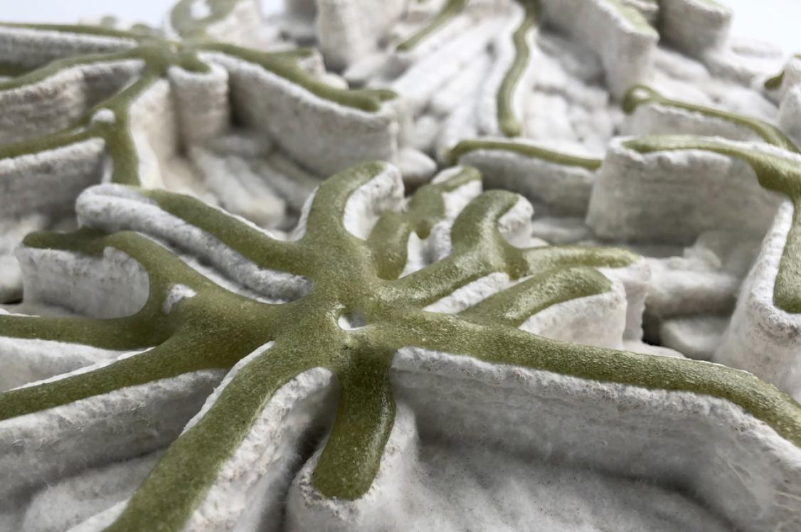
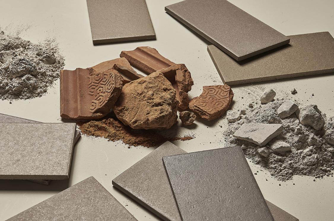
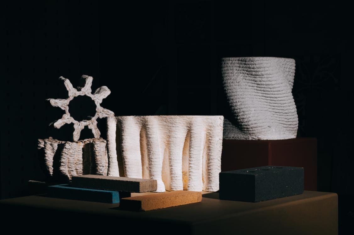
“During Dutch Design Week we had two commissions to develop exhibition designs, and in both cases the aim was to apply materials that would be bio based or circular.
The world is in need of new solutions, and we would like to explore solutions like these more in the future. From our point of view, we like to challenge that a bio-based colour palette doesn’t necessarily need to be brown or grey.
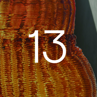
“In one of the designs, we have managed to find a compostable board that is pressed from flax harvest remains. It has a chipboard light brown hue. For the exhibition we applied three yellow shades of ‘Linolie’, a lineseed oil that is pigmented. As a result, the boards are fully compostable and have a vibrant yellow appearance - with a beautifully natural texture of the shredded stems. In future we are curious to look deeper into the combinations of materials and colours that are both beautiful and less harmful.”

Raw Color has worked with a number of notable clients, Adidas, Kvadrat and Material Source Studio Partners' Forbo Flooring Systems and Samsung to name a few. How do you approach encouraging brands to think differently about colour and its materiality in these projects?
“We are in the fortunate position that brands approach us in many cases. In order to make it happen they need to be aware of our existence and abilities. In our career we have approached possible clients only several times. But, there is a thing in common - no matter if they approach us or if we approach them, it is our self-initiated work.
“This is something that is important for us to share, whether it happens in a direct or indirect way. The work is never created with the motivation to get new projects. This is rather a possible consequence than a goal on itself. Our goal is that we follow our curiosity. And this is what we do. It can happen on a smaller scale that is self-financed, or on a larger scale with the help of funding. We really enjoy developing these self-commissions. It allows us to formulate our own questions. I truly believe that a viewer will feel the joy and passion we have put in our projects, and therefore in the studio.”

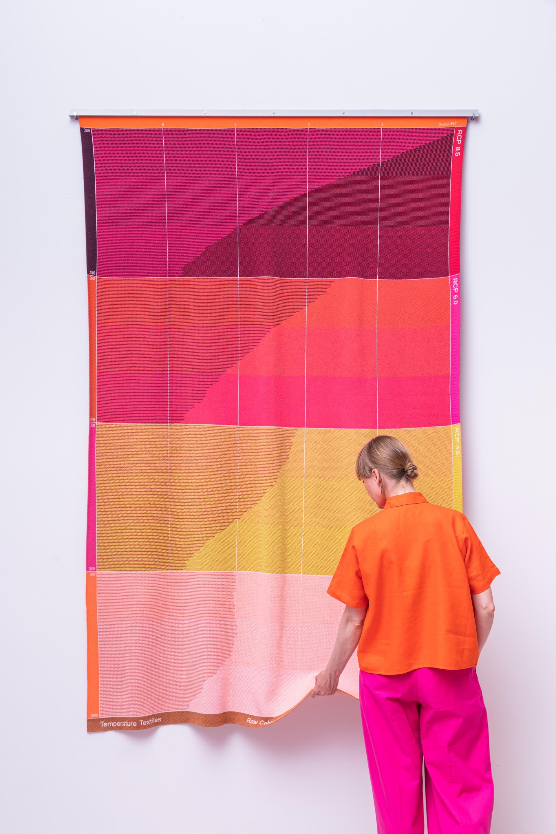
Can you talk us through the project Temperature Textiles?
“Temperature Textiles has been a step towards applying our skills to a greater cause. We all know that climate change is happening, and we experience its consequences. We wondered: What could we contribute to this as a design studio?
“We decided to design a graphic identity that helps to communicate the issue and its causes. It felt a bit as if climate was our client. It was still the aim to design something beautiful to look at, but to also serve as a piece of communication to bring this pressing matter to attention.
“Although climate change is part of much public debate, we noticed that we were not familiar with many details. Through diving into the research and data visualisations, we came across many layers that were new to us. These included the infographic and pattern that show that temperature rise is not everywhere the same. It depends on region and is therefore influenced by the local and global weather system.
“Within Temperature Textiles, we have touched upon three themes within the project. These are; emission, temperature change and sea level rise. The data within each theme is a combination of past, present and future modulation. All data is derived from scientific resources such as the IPCC (Intergovernmental Panel of Climate Change) that is part of the United Nations.
“For every sold item we share 10% of the income with Trees For All, a non-governmental organisation that plants trees. Within the years since the release, we have managed to plant more than 300 trees to actively help binding CO2.”

What were the reasons behind selecting textiles as the medium to communicate climate change data?
“Textiles for us are something that are close to the human body. A blanket or socks have useful qualities, namely generating warmth. It would help the user to be reminded of the subject matter, and actively save energy by turning the heating a bit down. By using it you become part of it.
“Presenting climate change data on textiles feels less temporary than seeing the information on a screen or piece of paper. Size plays a role in the design decisions too. A suspended blanket of more than two metres in height displaying the data is larger than human life, and so is the issue.
“Finally, we have a passion for textiles and there have inputted a lot love and attention into developing pieces that are well executed.”
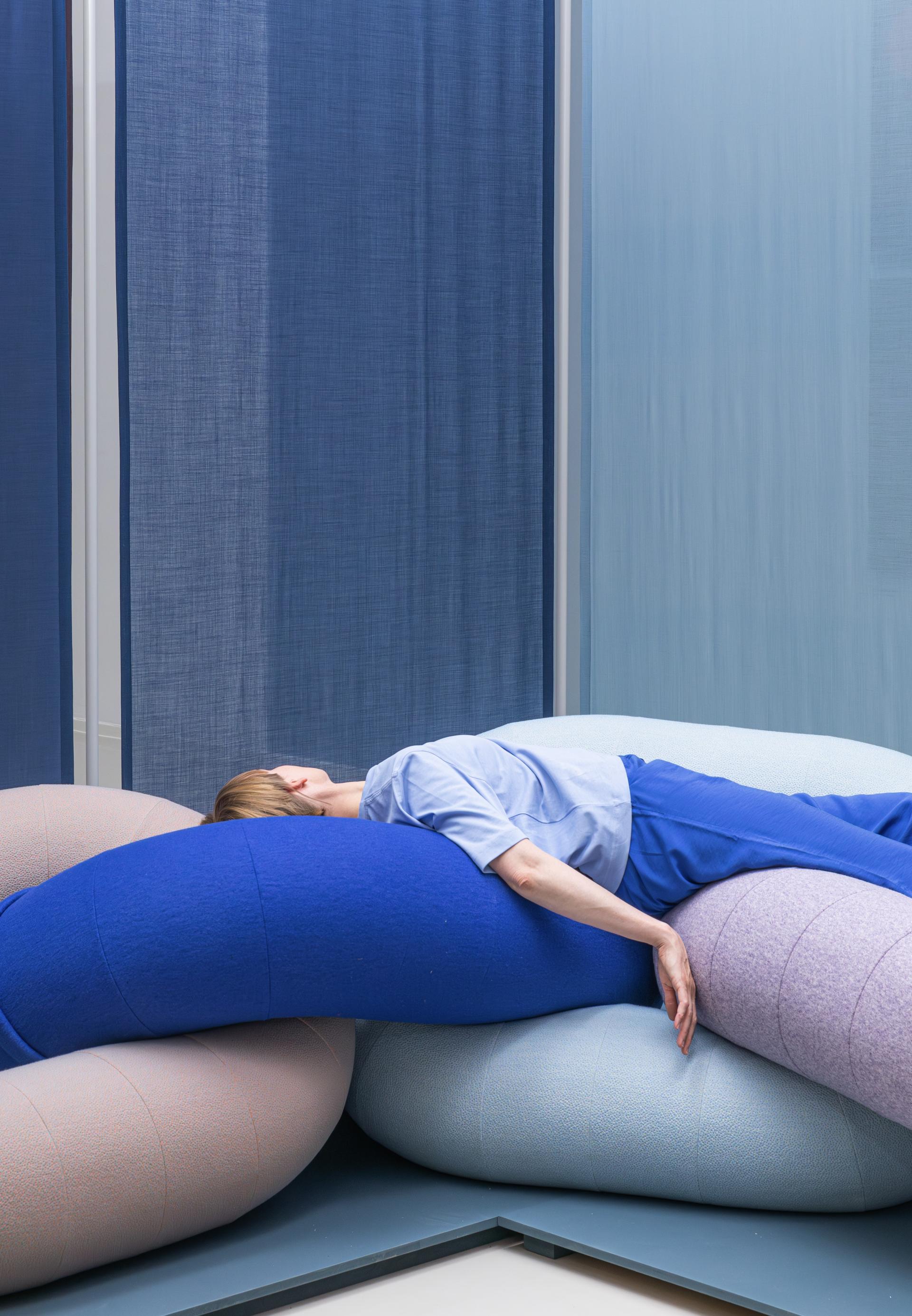
Raw Color works across a multitude of disciplines, such as textiles, graphic and spatial design - applying both a physical and digital blend to experiencing colour. How do you balance a need for a tactility / physicality of materials within an increasingly digitalised world?
“Many of our working fields are actually generating physical outcomes through product, textile and spatial design. Therefore, tactility is widely present in our work. Questioning how a surface feels and looks is very important to us. Is it rough and therefore matte? Or is it smooth and therefore shiny?
“Alongside this work, we also work within the digital domain. In recent years we have been experimenting with 3D modelling. Within these softwares, materials, textures and light can be accurately simulated and manipulated. And although it is technically challenging to work with this technology, this way of working holds similarities to our studio photography work - reproducing materials and compositions.
“However, we do believe that people must have a physical encounter with a material. We are curious about the future that will be more and more digital. It maybe sounds contradictory, but the more we are surrounded by digital media, the more our body might need physical encounters. In many science fiction movies, the future is envisioned in black and white spaces with glossy surfaces and traces of steel finishes. We like to imagine the future more like in the movie ‘Her’, by Spike Jonze. The main character is a human that falls in love with his artificial intelligent operating system on his phone. The movie’s set design is dominated by warm, reddish tones and includes natural materials such as wool and wood.”
Can you tell us a bit about your approach to teaching about colour and materiality at the Design Academie Eindhoven? What are the most important lessons to master when understanding and implementing colour in any project?
“We have been tutoring now for more than twelve years at Design Academie Eindhoven (DAE). Our shared position at the Academie means that one week the students will have Daniera and the next Christoph. In our sessions, we give project advice which you can consider coaching or creative direction to the students. We try to be objective and observe from more of a distance on what the students have done.
“Small groups of five are also brought together to discuss their progress. This is where we actively encourage the students to contribute through input to a peer project. We appreciate the students have their own interests and may prefer to work with more neutral palettes and materials, which are less prominent in our own work. Engaging with the students in this way keeps our perspective fresh, we don’t try to educate people to work like we do. Instead, we help the students to find their own voice and way of working.”
What's next for Raw Color?
“We are now looking back on fifteen years of Raw Color in the exhibition, Multiply. In the next fifteen years, the overview of our body of work will differ. As a population, we have many challenges to face on a global level and so we hope to include these quests for solutions and new considerations within our practice.
“We will continue to be courageous and explore new materials and working fields. In the near future, there are some interesting collaborations coming. Unfortunately, we can’t say much more than that but more will be released next year.”
A huge thank you to Christoph and Daniera. You can discover more about Raw Color here.