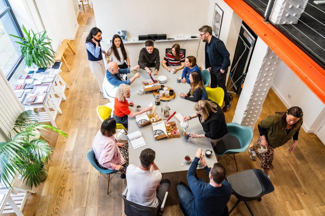
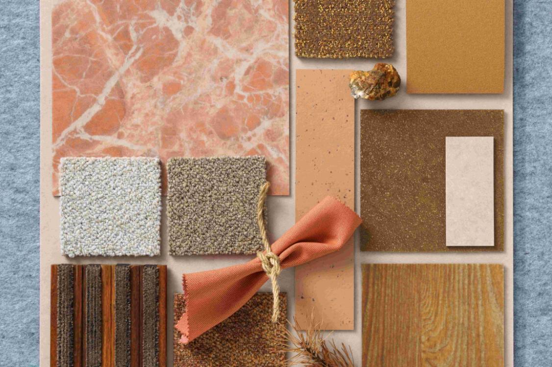
Circular, solar and celebratory opposites: Our top colour insights from DDW for 2023.
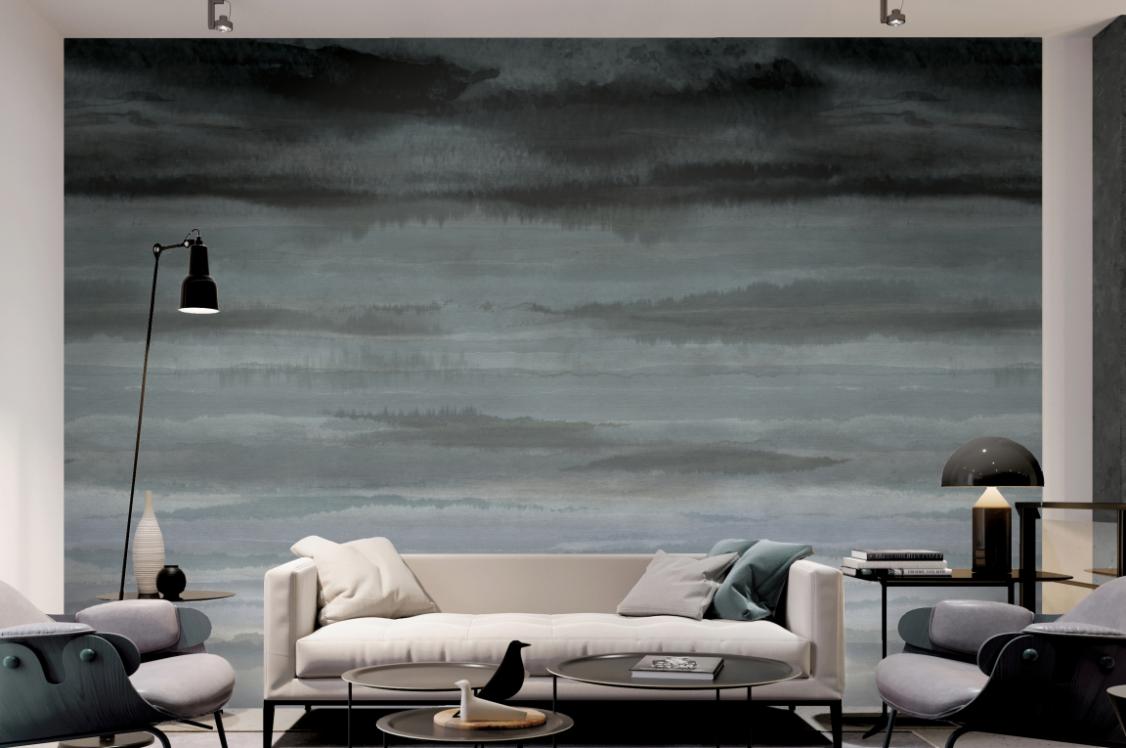
Raw Color
Marking its 20th anniversary, Northern Europe’s largest design event championed a visionary spectrum of waste derived and natural hues - as well as a joyful collection of complementary opposites - playful in their positioning.
This year’s colour insights travelled far beyond just aesthetics; a colour’s origin, planetary impact and emotional value were also heavy on the agenda for 2023. Presenting a chromatic celebration of subtleties in saturation, the circular economy, as well as organically derived colours’ natural weathering, were at the forefront of design thinking.
Here we share some of our firm favourites spotted at Dutch Design Week, sparking new insight into our palettes for the year ahead.
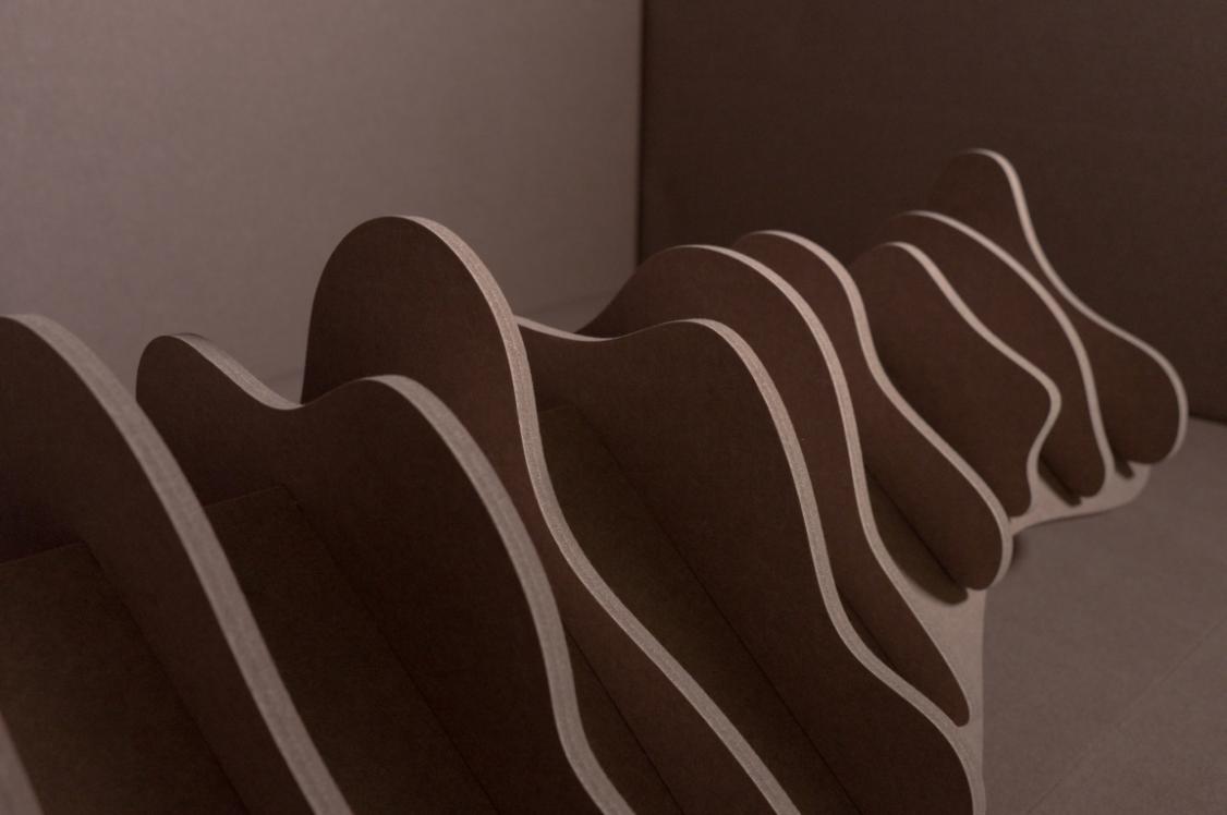
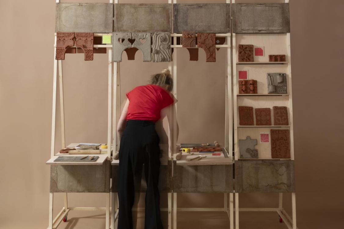
Studio Rens: Building the Greater Sum of Colourful Parts
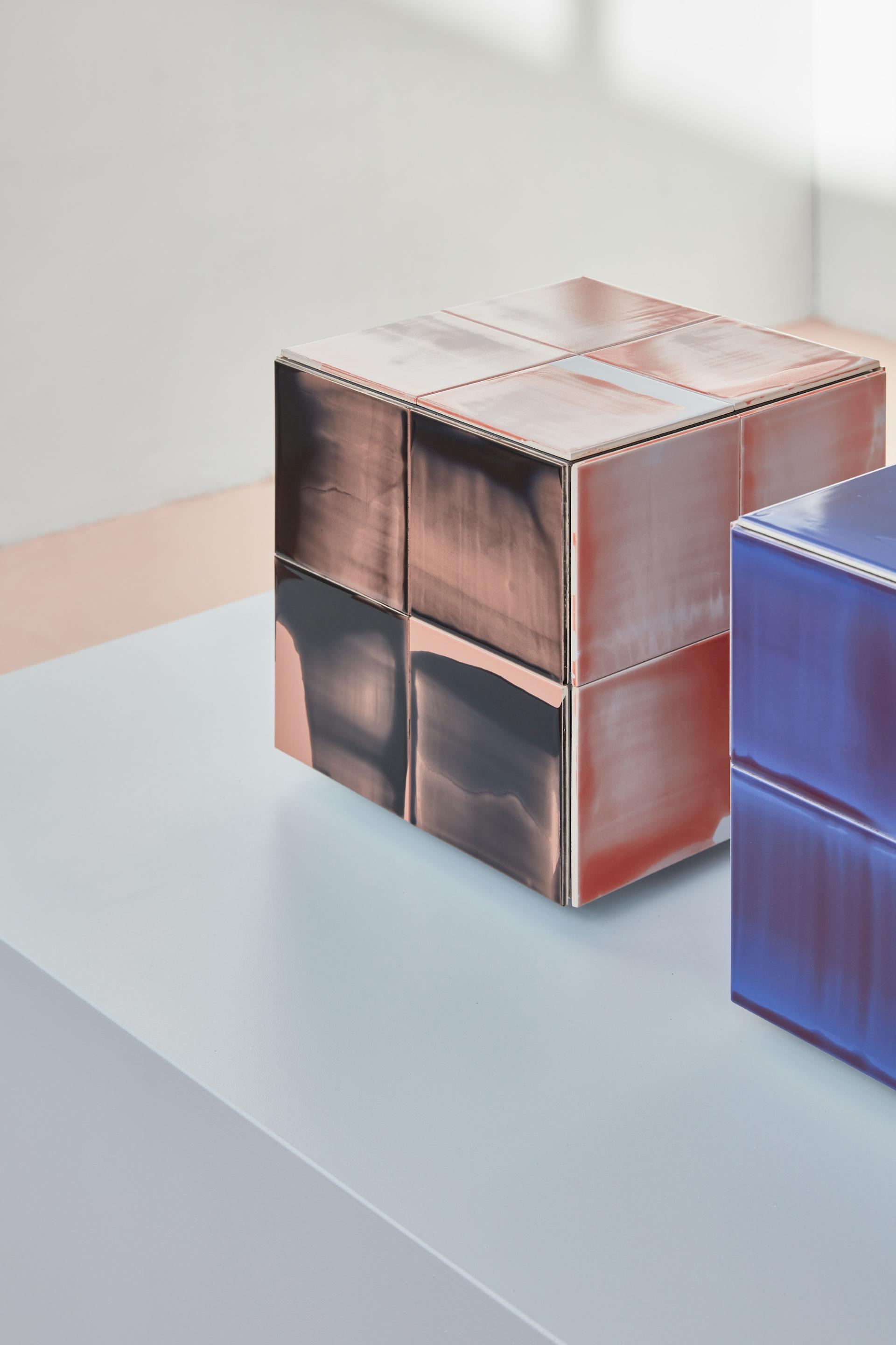
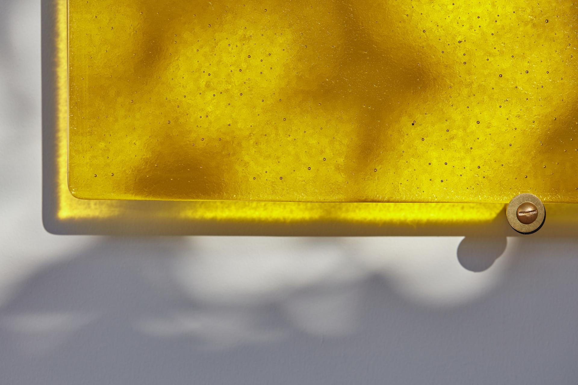
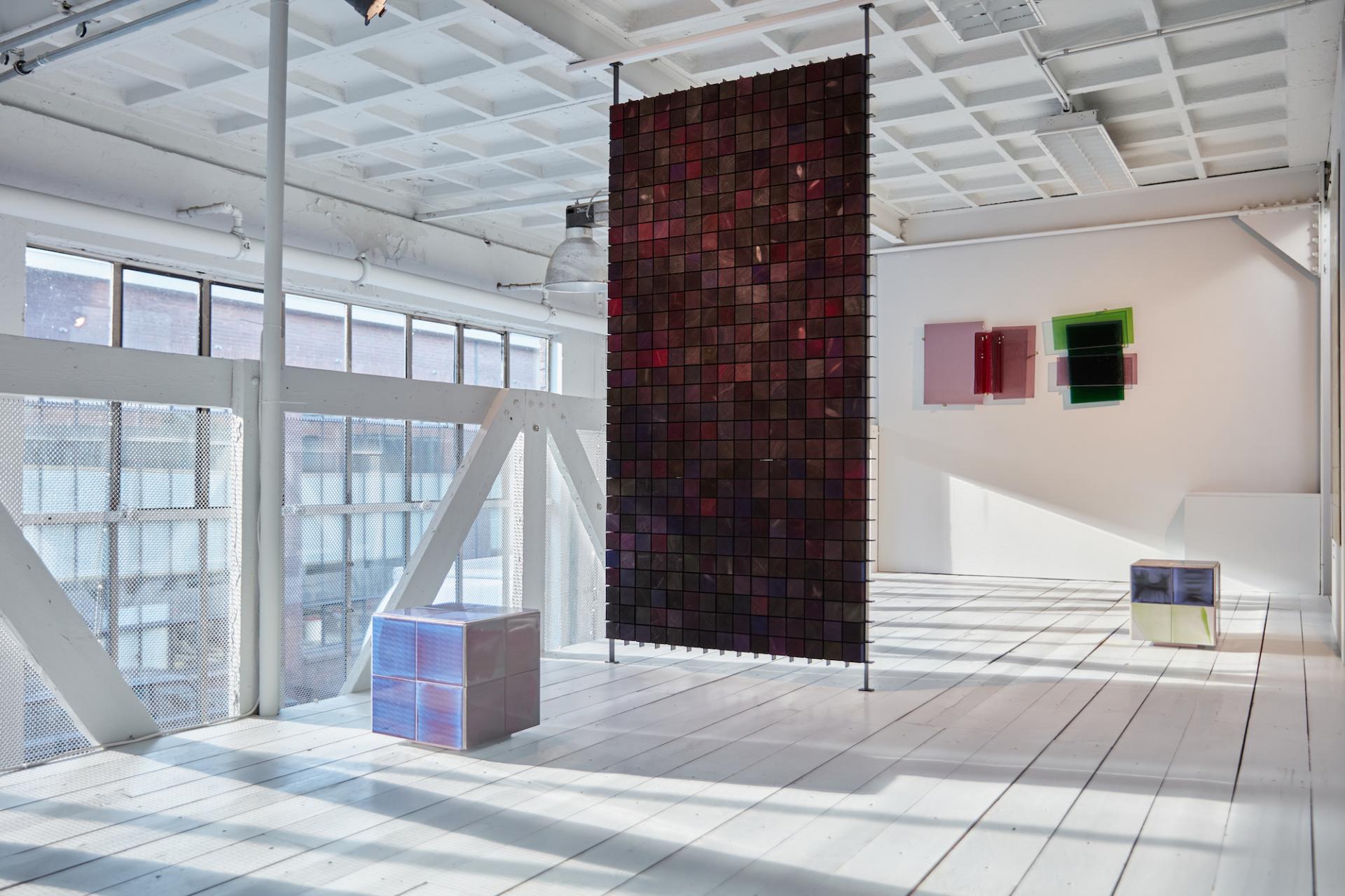
Studio Rens enticed us into their uplifting exhibit, Building the Greater Sum of Colourful Parts with their latest technicolour selection of experimental concepts and collections.
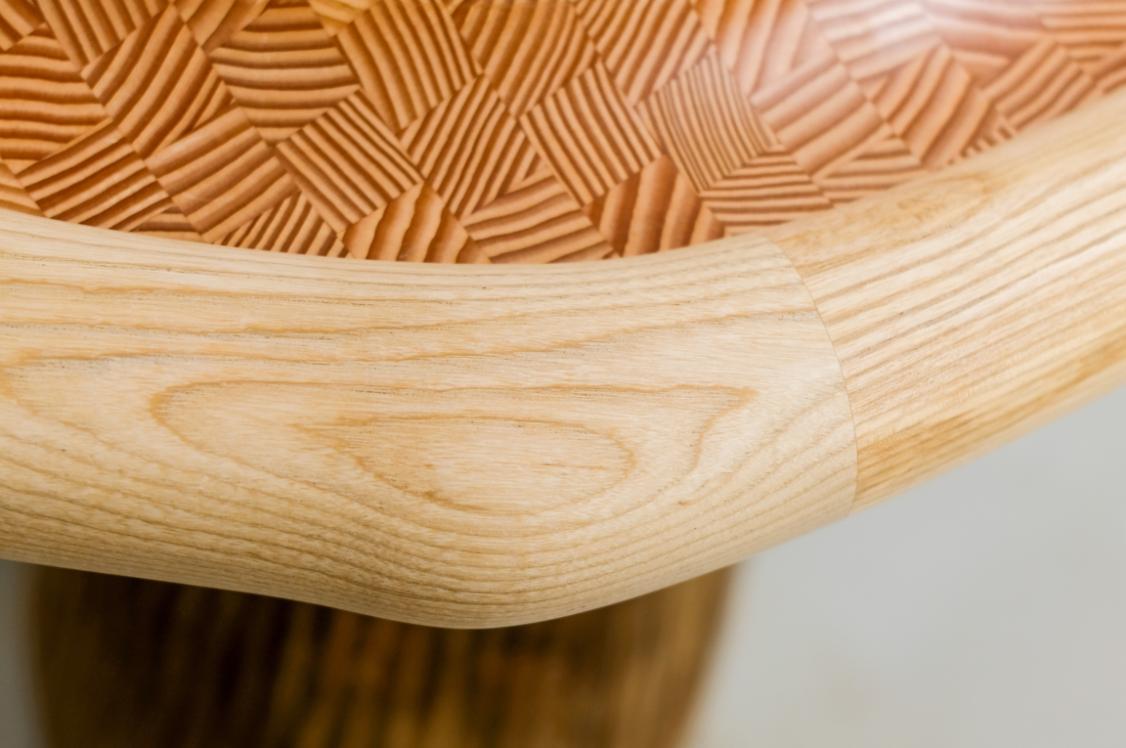
Showcasing a modular and expanding investigation into colour, the Eindhoven-based design and research studio interrogates the spectrum using a variety of different mediums; ranging from wood to glass and ceramic tiles.
Its Glass Ensembles project puts forward a collage-like sequence of glass segments. The overlap of block colours in the translucent material allow shades and hues to playfully shift in the sunlight, offering viewers glimmering nuances in saturation, depending on their viewpoint.
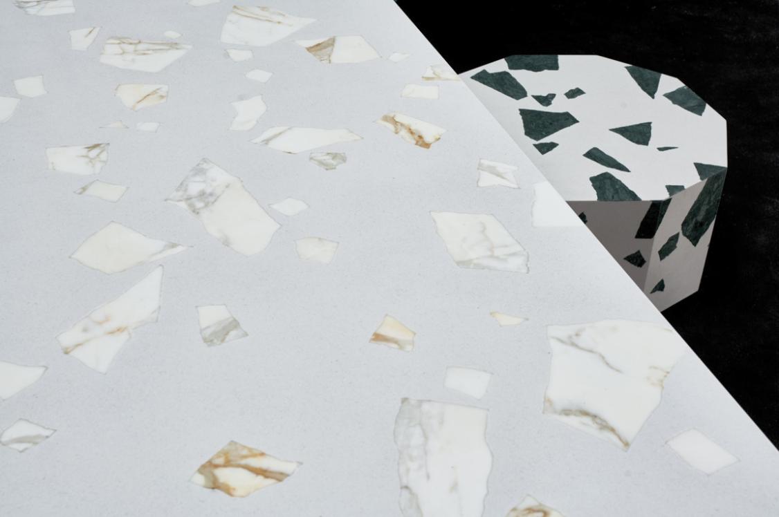
Re-Glow showcases watercolour-like washes across surplus ceramic tiles through a process similar to textile screen printing. Pigment is pulled across the surface of the tiles using a squeegee, creating a distinct and dynamic design each time. Available in three-dimensional, free-standing cubes and wall cladding, Re-Glow allows viewers to enjoy the nuances of two opposing colours in collusion.
Colour Blocks explore the tactile beauty observed in wood grains. A pixel-like celebration of pigment, this modular arrangement of wooden blocks uses liquid colourants that soak into the surface of the wood to create a sensorially rich surface panel. This series of saturation investigations are brought to functionality as room dividers.
To find out more about The Greater Sum of Colourful Parts, click here
Raw Color
Raw Color

Raw Color
Raw Color
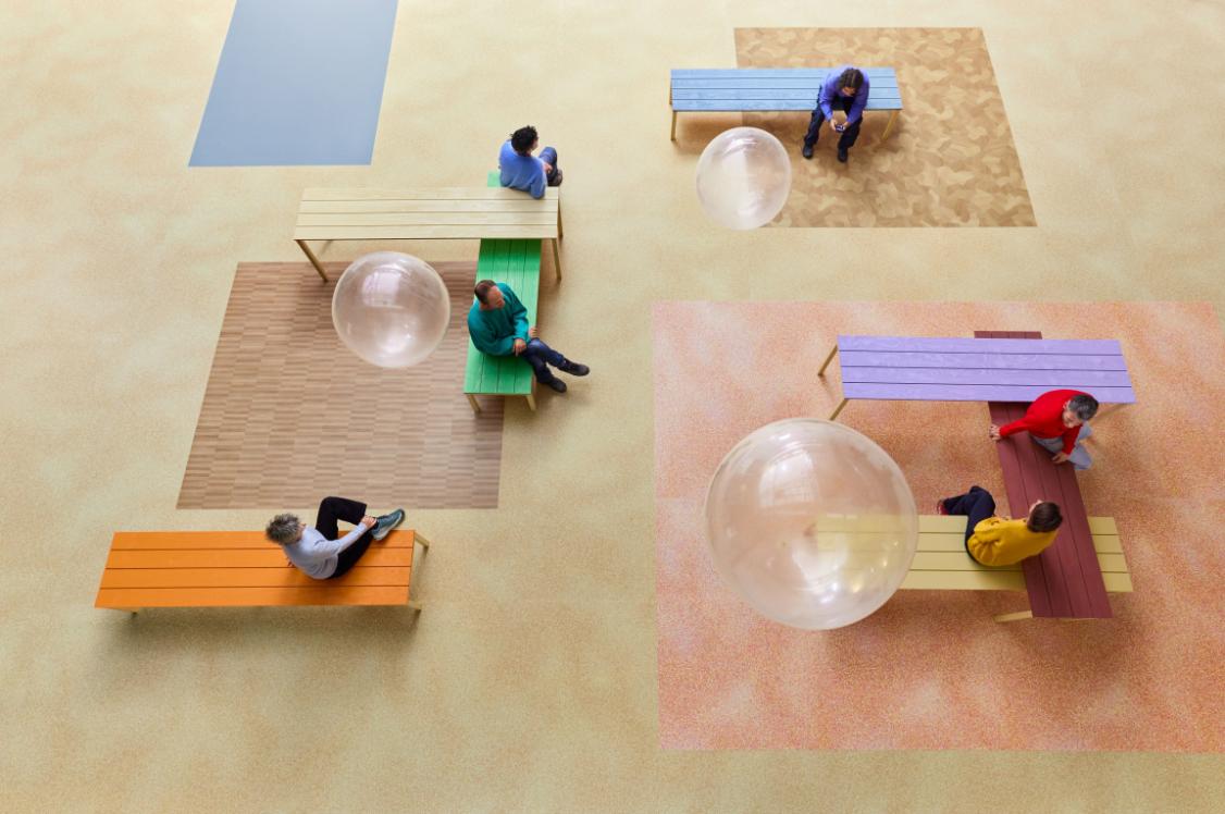
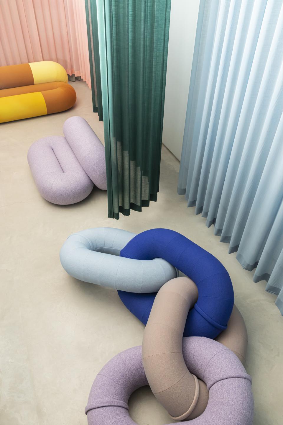
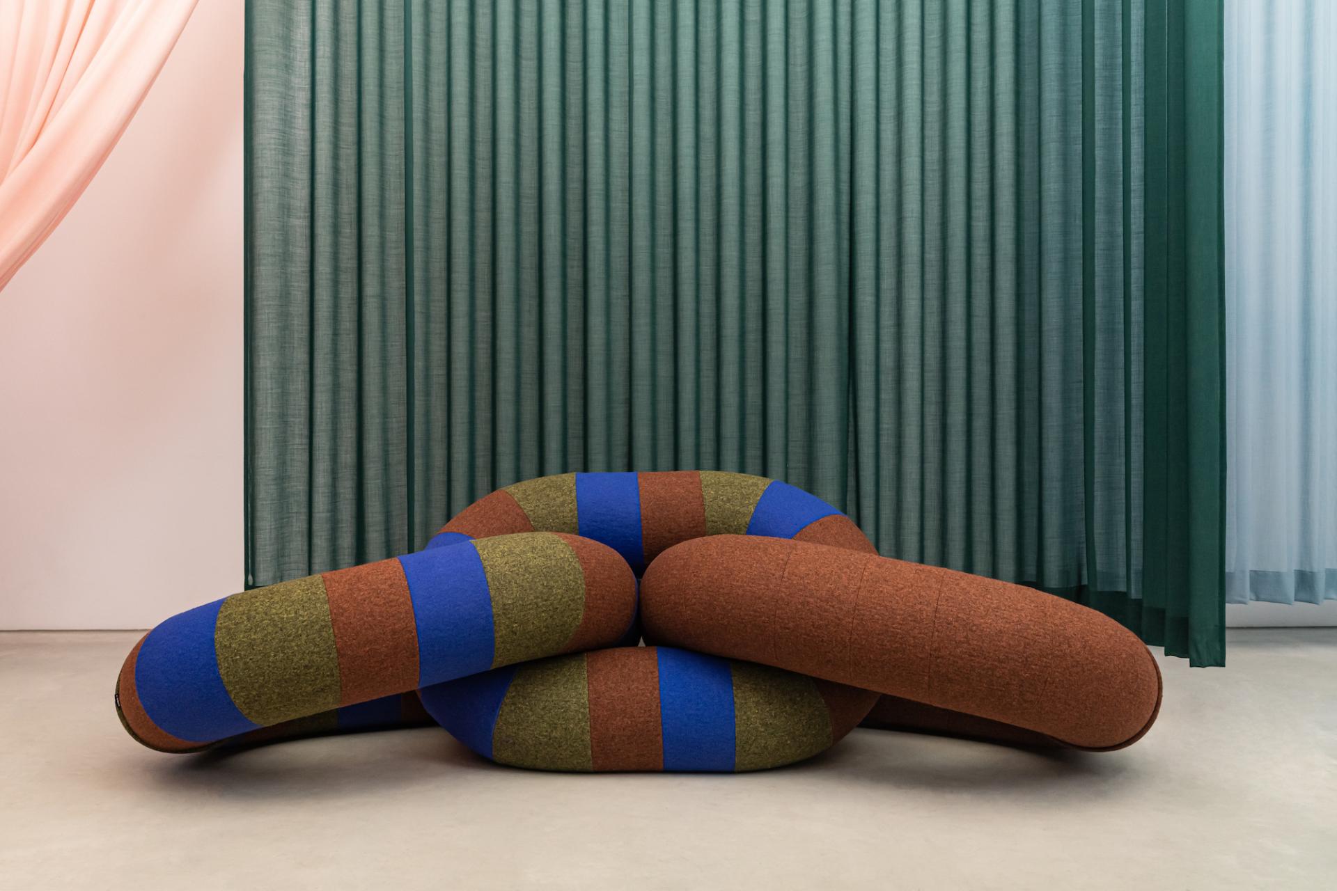
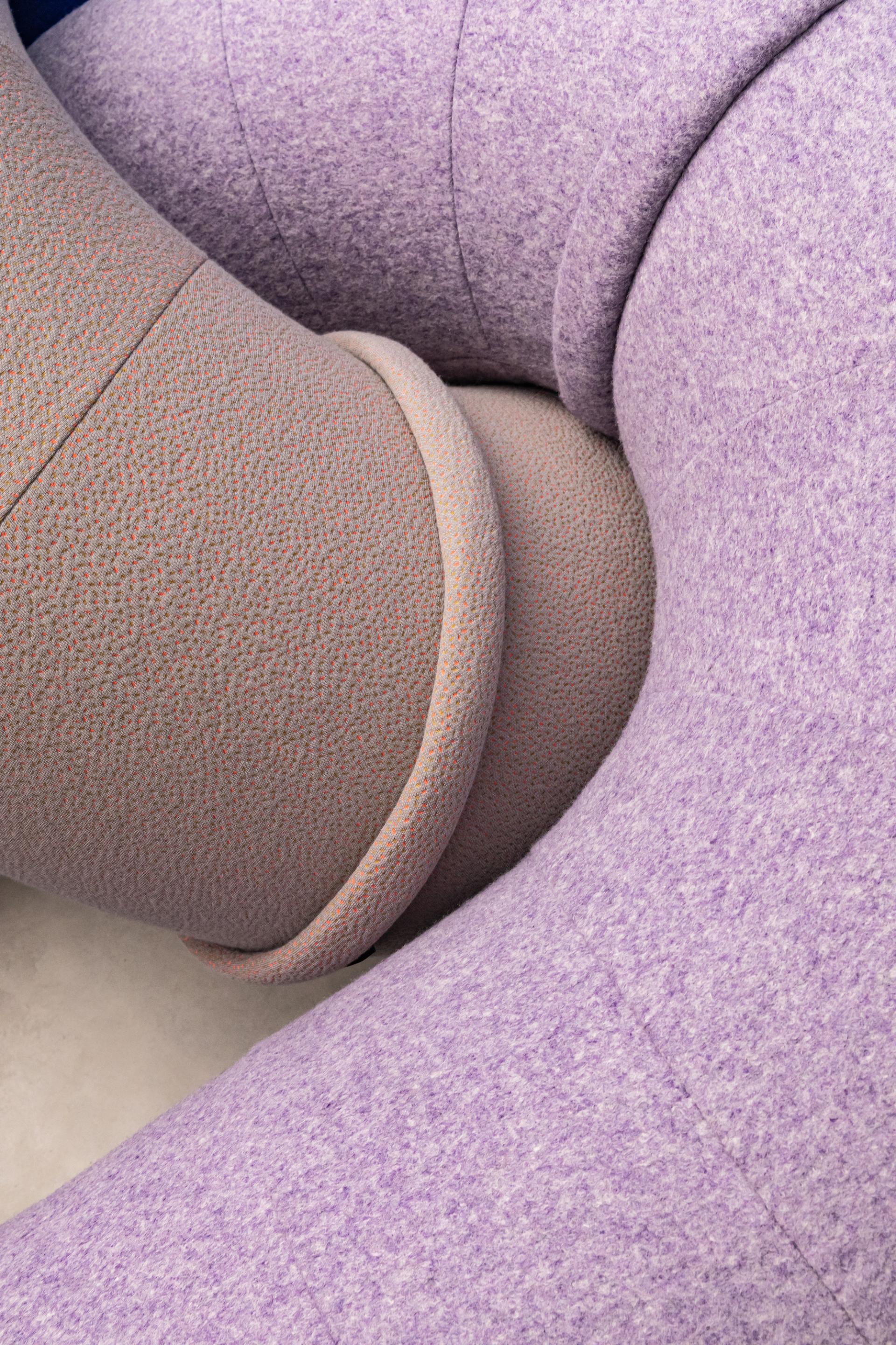
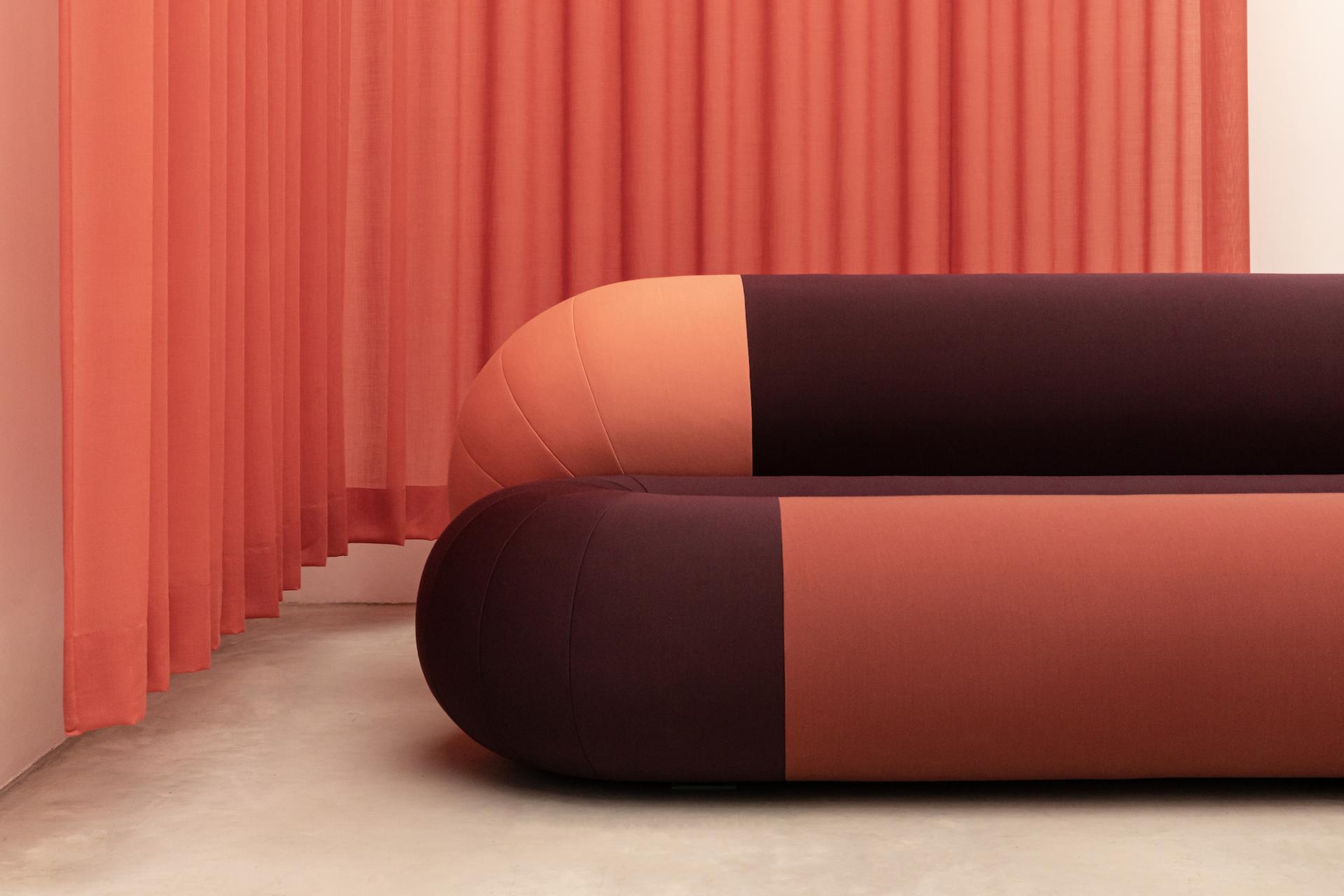
Raw Color x Sancal: Link & Loop
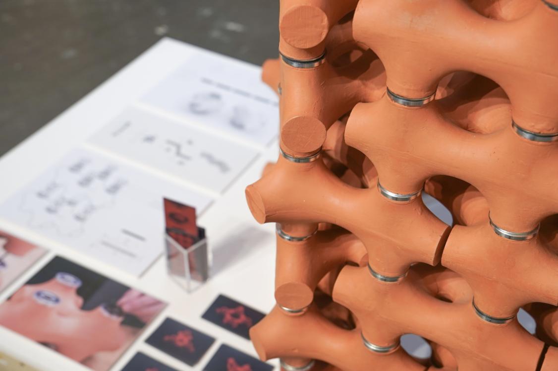
Tucked away towards the top of the Dutch Design Week map, we popped into see the hotly anticipated Link and Loop projects by Eindhoven-based, multidisciplinary design studio, Raw Color and Spanish furniture manufacturer, Sancal.
Within the attentively curated space, Raw Color and Sancal exhibited varied adaptations of Link - a bulbous geometry of interlinking chains, and Loop - a more tubular rendition of the Link silhouette. The two projects bring an inflated form to the everyday, household unifying object that is the sofa. Void of any hard edges, the generous shape of these pieces compromises on neither form nor function.
The cylindrical seating draws your attention to the vibrant and astute colour pairings that interlock cohesively and playfully. Link and Loop reveals the undeniable impact that colour can positively project on the senses.
Soft in appearance and irresistibly inviting, Raw Color and Sancal bring a joyfulness to the everyday act of sitting.
To find out more about Link & Loop, click here
Studio Rens
Studio Rens
Studio Rens
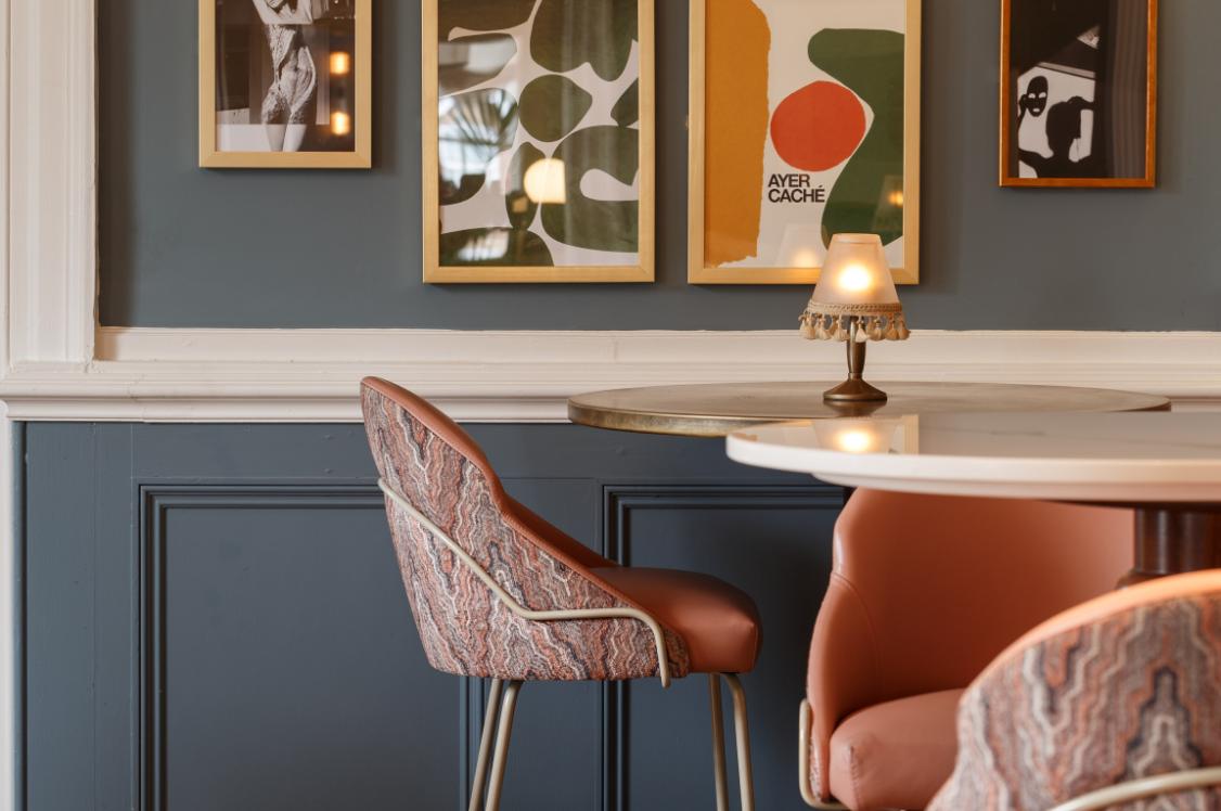
Scheublin & Lindeman
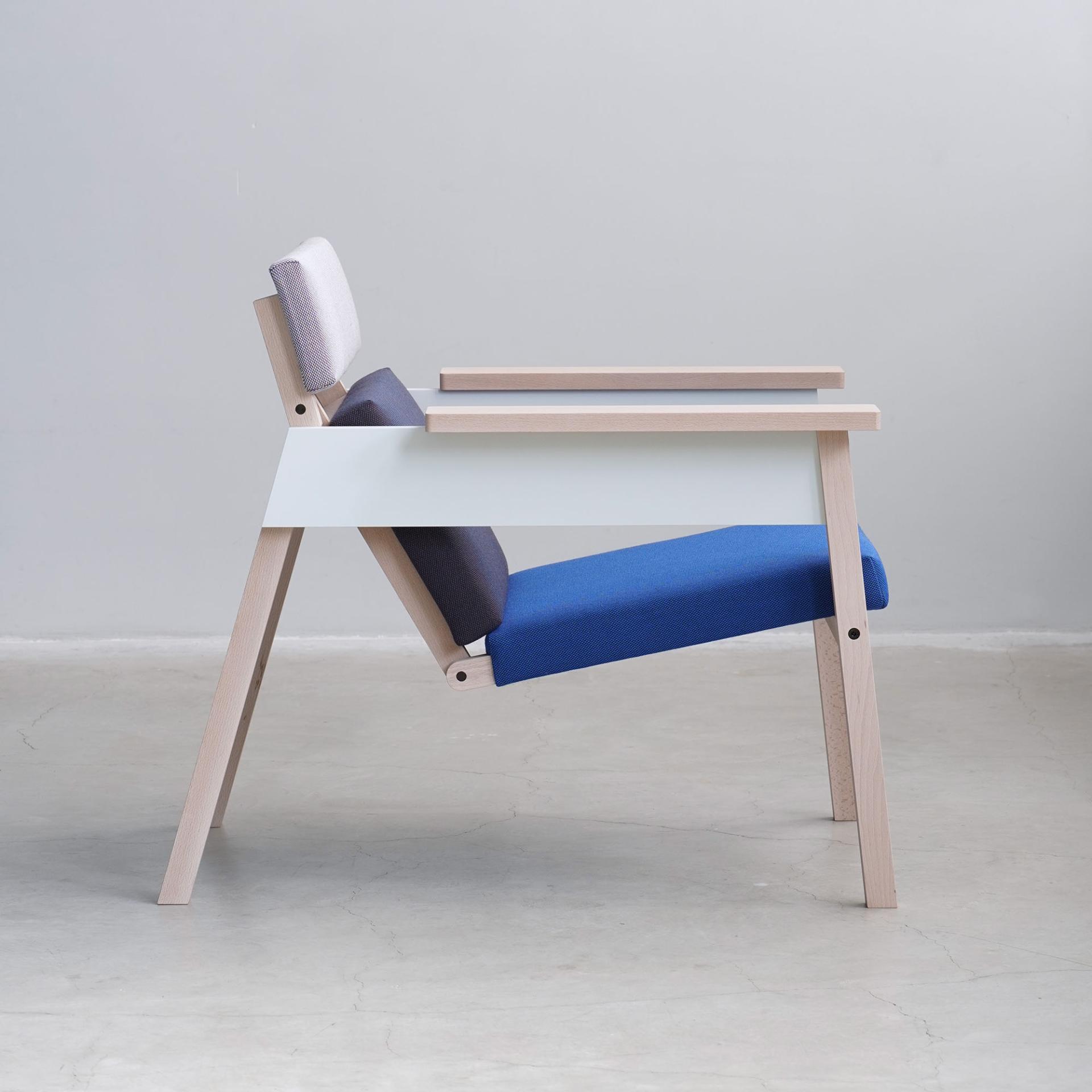
Product design duo Wouter Scheublin and Lotty Lindeman delighted us with a unique and utilitarian use of colour - pragmatic yet playful in its positioning.
Their minimalistic aesthetic puts practicality first but illustrates a refined eye for detail and craftsmanship. Joining forces to form their Eindhoven-based design studio, Haave, they collectively craft surprising details and construct polished compositions of colour and materials that are well balanced and simultaneously soothing to the eye and to the touch.
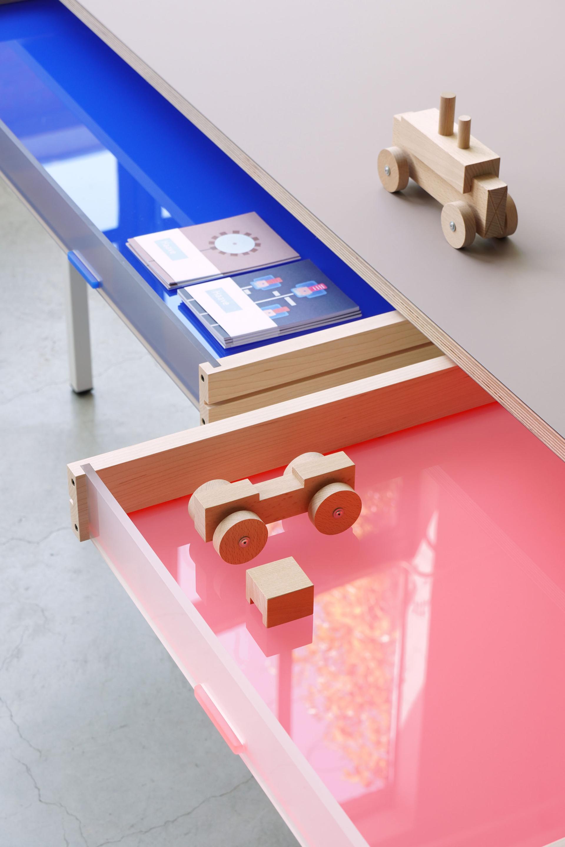
Exhibiting a varied body of work consisting of chairs, children’s toys, quilts, lighting, and other household objects, Haave showcased their apparent extensive backgrounds in the industrial production of wood, metal, textiles, and plastic.
To find out more about Scheublin and Lindeman, click here
Scheublin & Lindeman
Scheublin & Lindeman
Scheublin & Lindeman
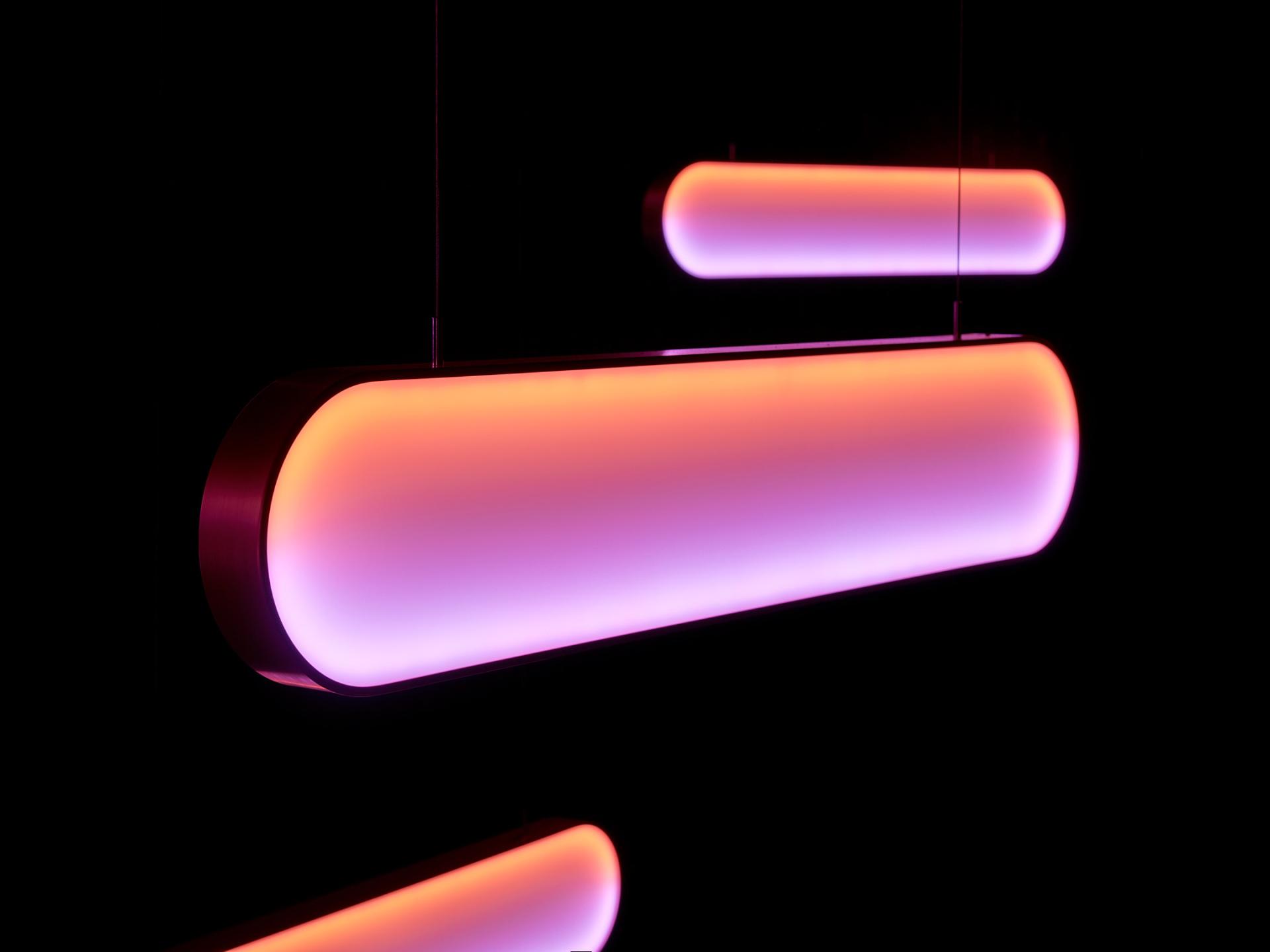
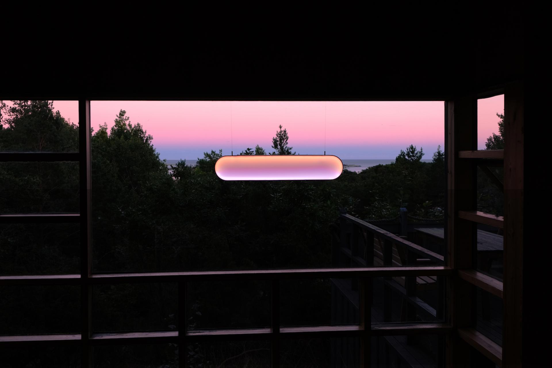
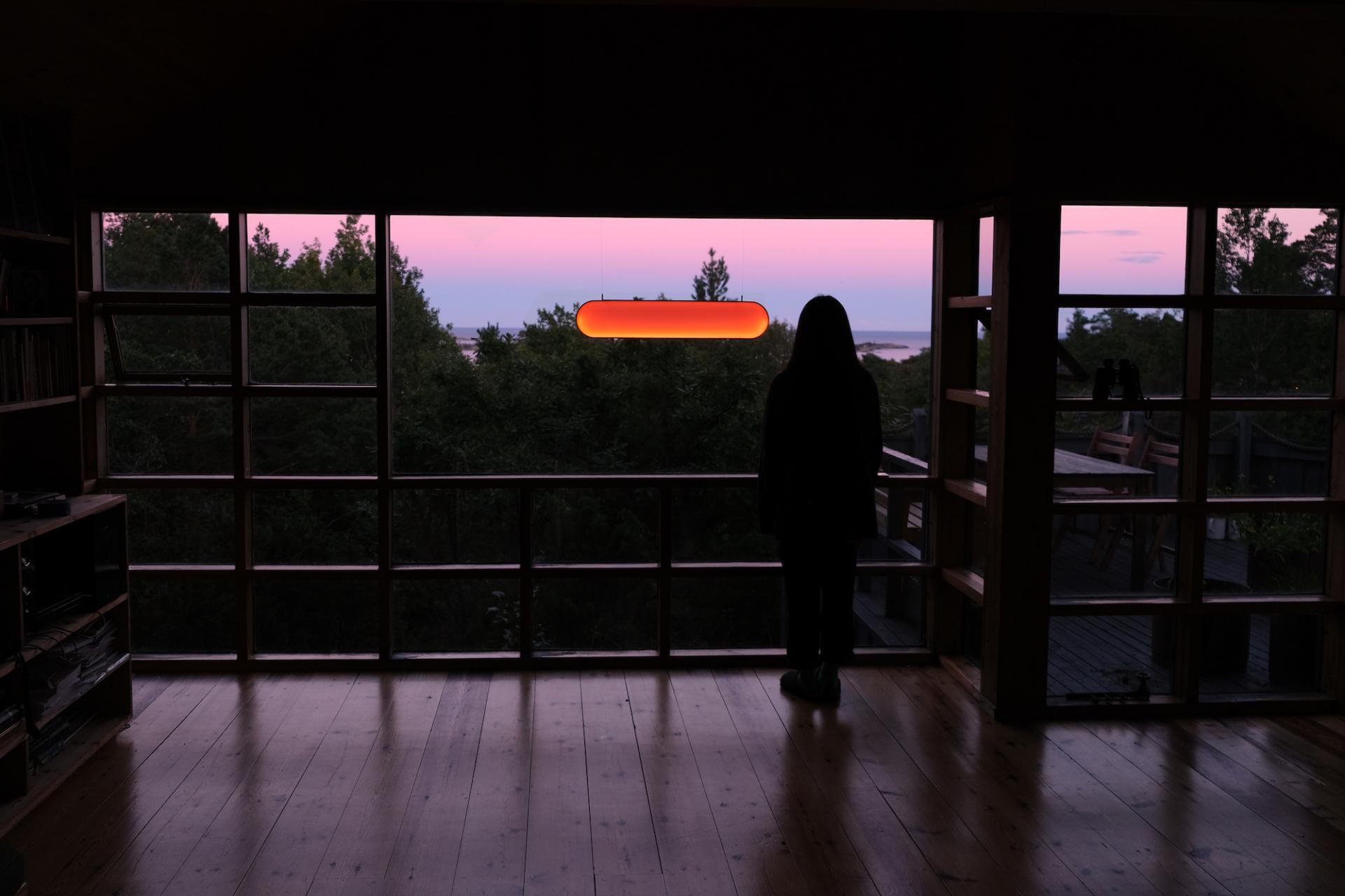
Marjan van Aubel: Sunne
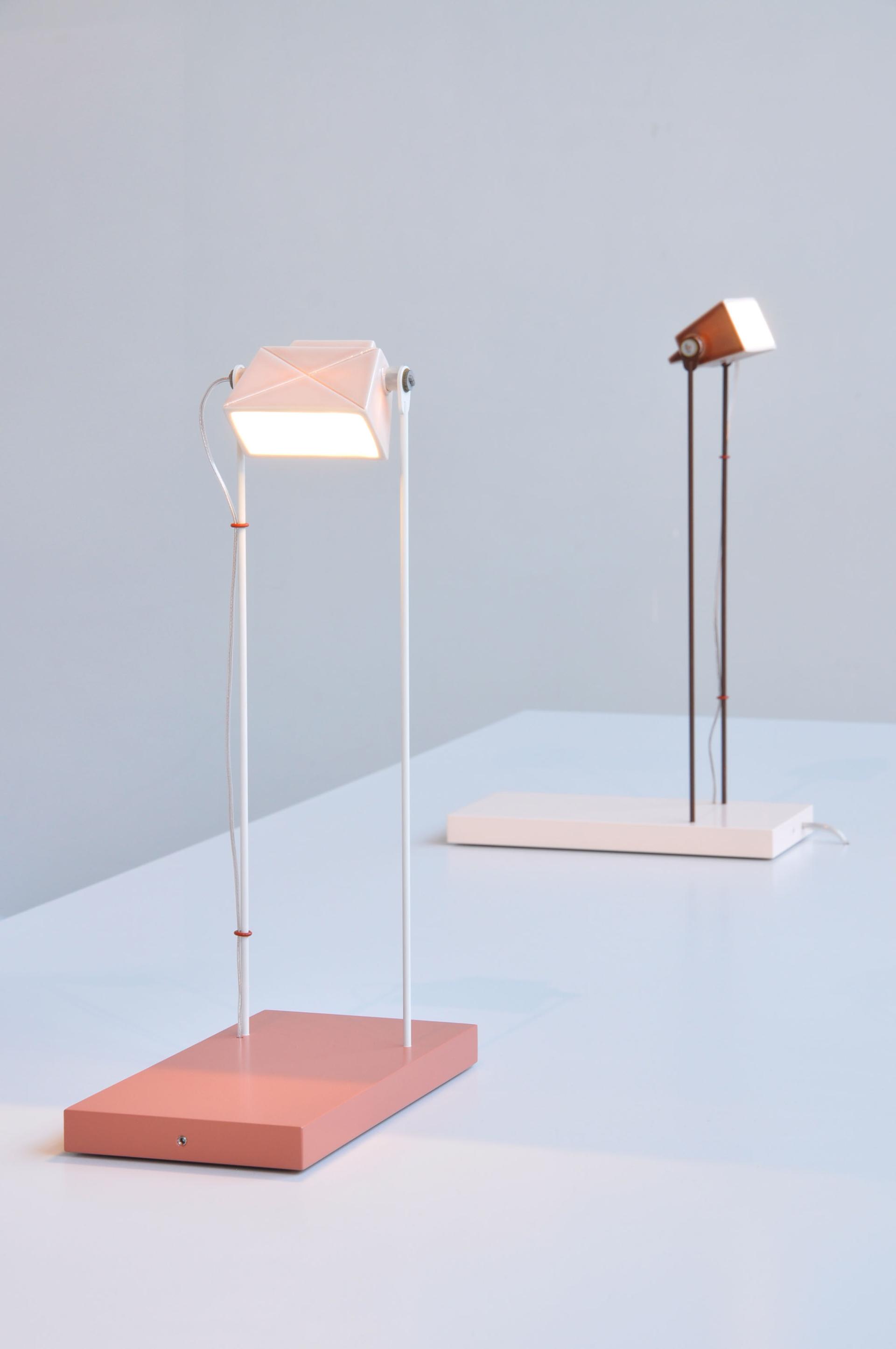
One of this year’s Dutch Design Week ambassadors was the illustrious solar designer, Marjan van Aubel. Her dazzling lighting development, Sunne, harnessed solar energy whilst hanging in front of a window, suspended from two stainless steel wires. Sunne radiates an array of colours that emulate the changing palette of the skyline.
Switching itself on automatically at dusk, the designed three settings - sunrise, sunlight and sunset are activated by a simple tap on the aluminium frame. In-tuned with our circadian rhythm, its elongated shape takes visual queues from the horizon.
We love how Sunne brings the primitive palette of the outdoors to the built environment, integrating solar energy more accessibly to the typical household. It empowers users to feel more harmonious with the duration of their day and integrates healthier sleep cycles into their routine through subtle interchanging colour sequences, as well as using light more economically.
To find out more about Sunne, click here
Marjan van Aubel / Credit: Ronald Smits
Marjan van Aubel / Credit: MvA Studio
Marjan van Aubel / Credit: MvA Studio
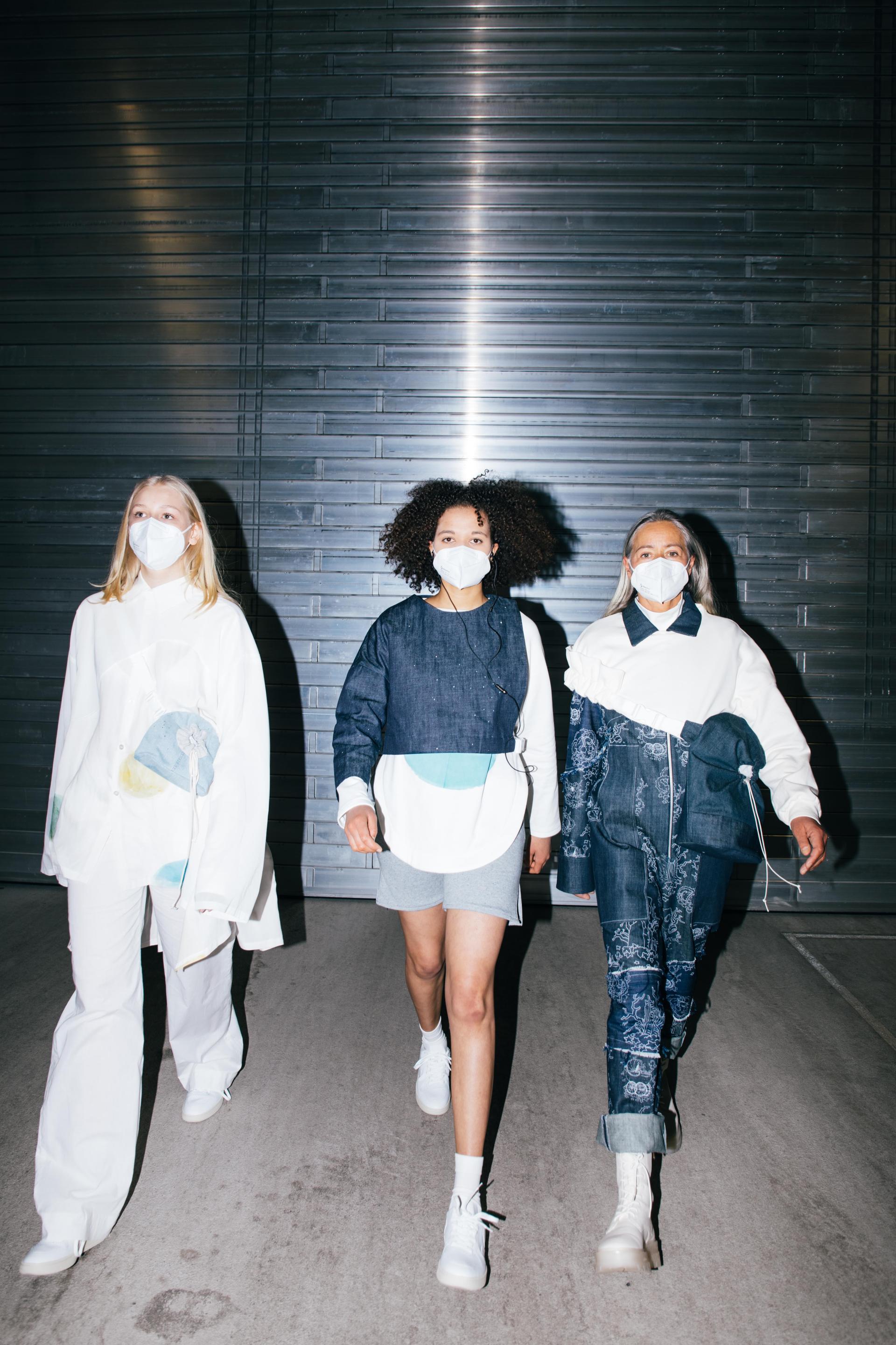
Anne-Marie Sust: Why Colours Matter
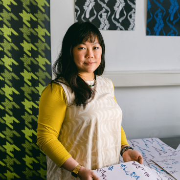
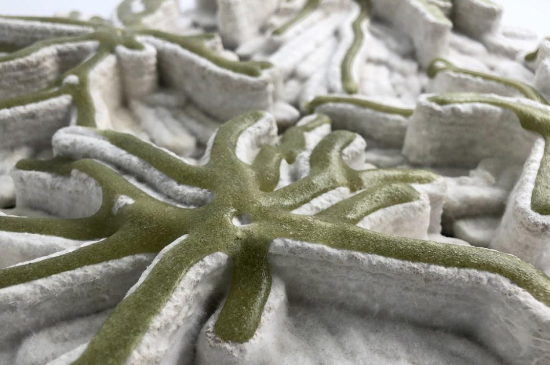
Positioned at the tip top of the Dutch Design Week Map, in the historic, converted military building that is now known as BioArt Laboratories, we found the micro-algae ink innovations of Anne-Marie Sust. Her experiments with micro algae inks have produced printed textiles for fashion that gradually fade upon contact with light, introducing an alternating palette to our wardrobe that is dictated by the natural elements.
Realised as a dynamic fashion collection, Anne-Marie reminds us that colour shouldn’t be considered a calculable constant if we are to colour our clothes sustainably. Instead, we should welcome and appreciate the unpredictability inherent in natural colourants, treating it as an interchanging entity and celebrating its nuances as it succumbs to the weathering of the sun’s rays.
Delivering alternative perceptions and expectations of what colour means to us, Why Colours Matter also sensitises its audience to the temporary and sustainable nature of clothing.
To find out more about Why Colours Matter, click here
Anne-Marie Sust
Anne-Marie Sust
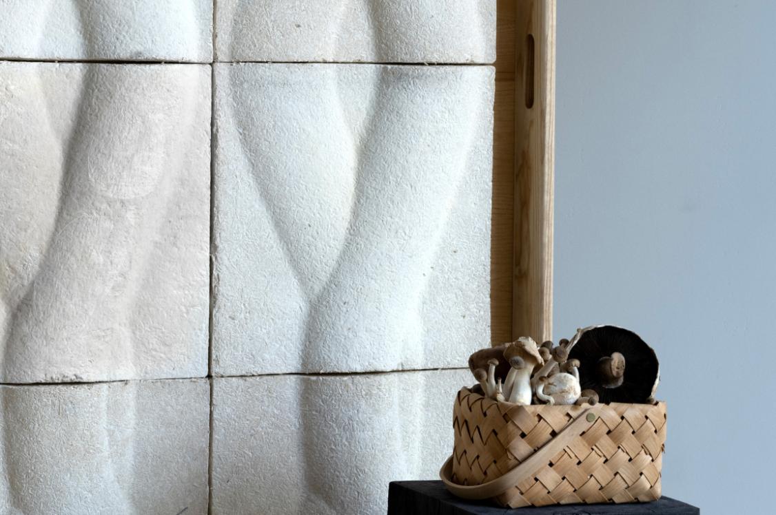
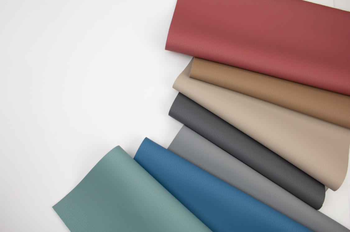
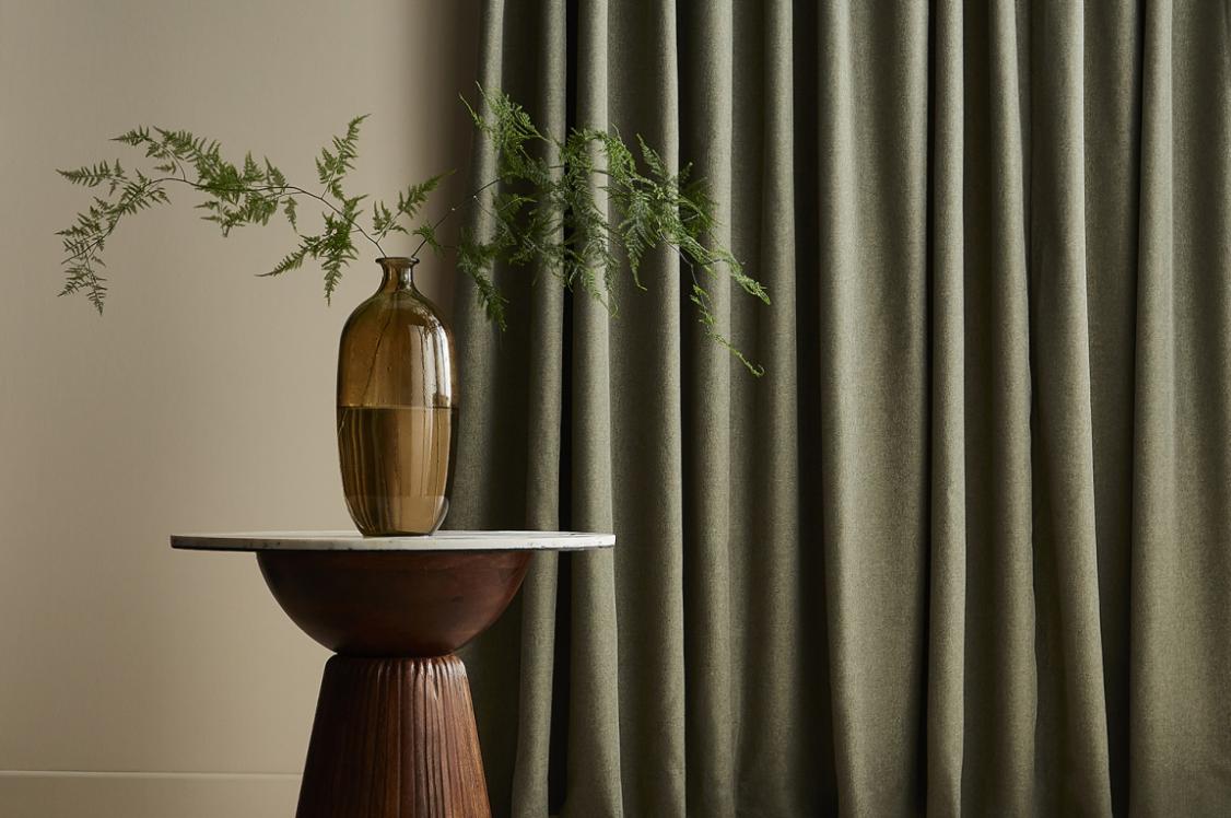
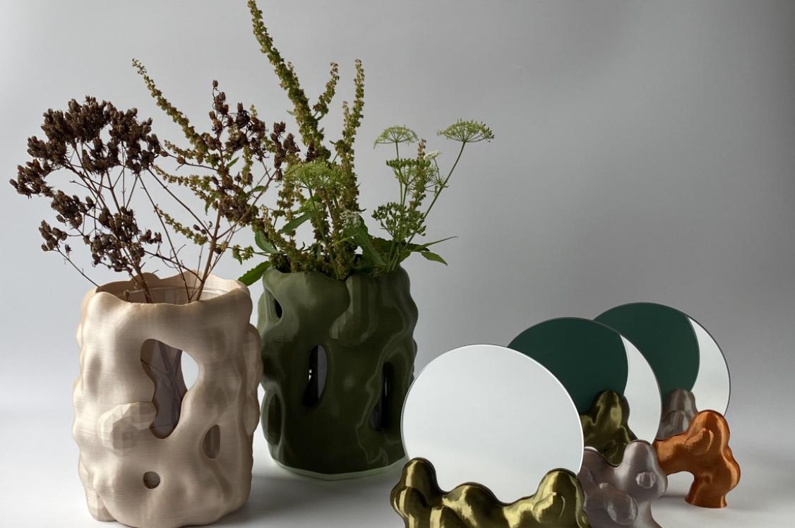
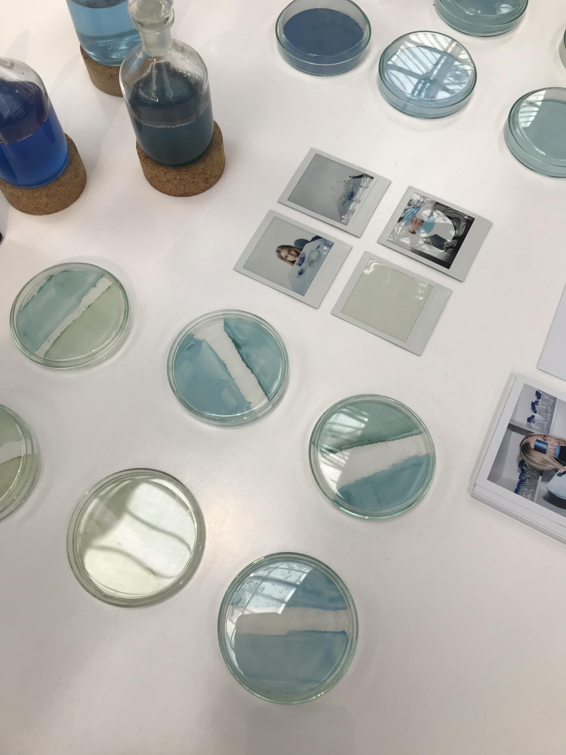
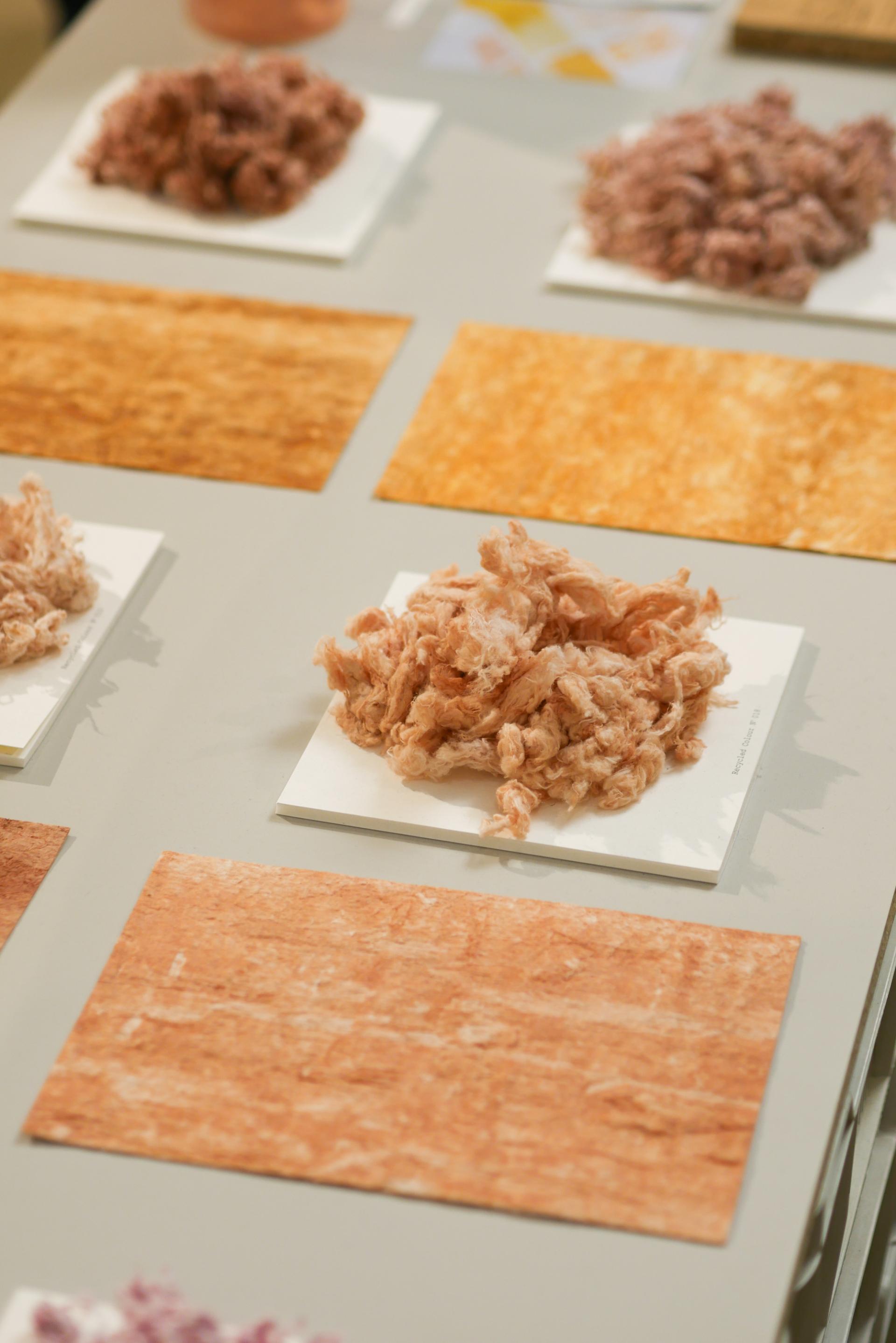
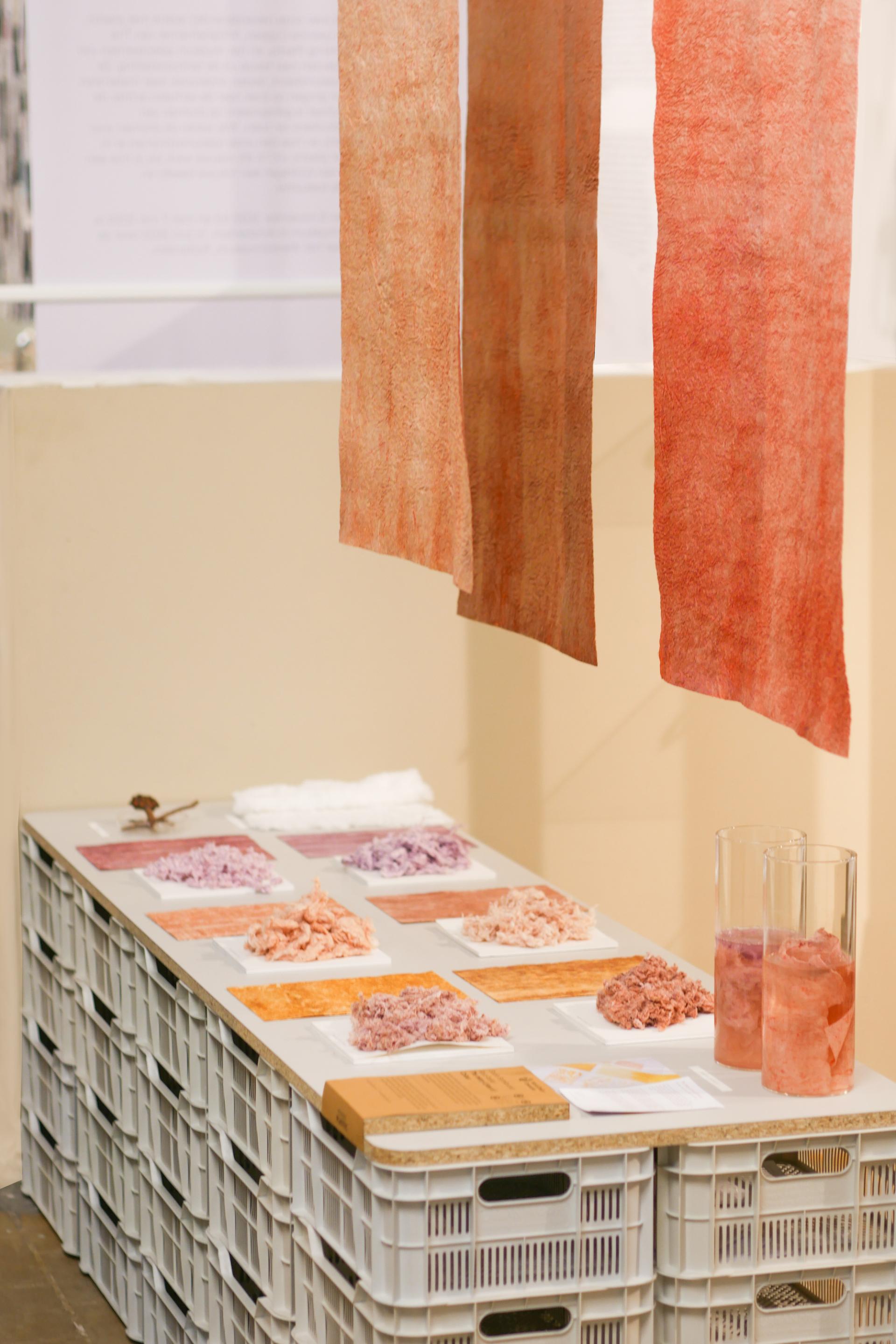
Sarmite Polakova: The Many Lives of Colour
As the domain of bio and circular materials expands, so does the spectrum of new hues and shades available to us - either determined by nature or within a broad spectrum of recycled content.
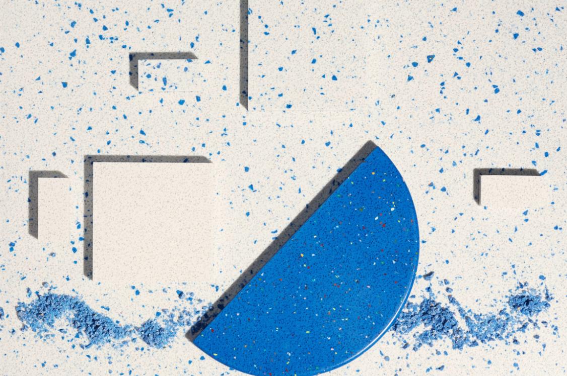
With this in mind, Sarmite Polakova - a firm favourite in the biomaterials realm – has created The Many Lives of Colour. We were charmed by its dawn meets dusk chromatic collection of warm, mottled blends, created from inferior textile fibres and natural dyes.
Studio Sarmite in collaboration with Roua Atelier questioned what new production methods in the textile industry could emerge when recycling not only the fibres, but the colour itself. Devising a pioneering dyeing process for mixed blend, unrecyclable fibres otherwise headed for landfill, The Many Lives of Colour revolutionises how we can implement the circular economy into colour, continually circulating pigment within a closed loop system.
The material composite is realised as Pre-Loved - a leather-like bio-textile made from discarded textile fibres that when submerged in water, dissolve. The left-over fibres can later be repurposed for new production cycles.
The Many Lives of Colour urges us to consider the origins of colours within our products and encourages us to mix new hues with pre-existing palettes whilst redefining textile waste.
To find out more about The Many Lives of Colour, click here
Sarmite Polakova
Sarmite Polakova