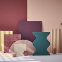

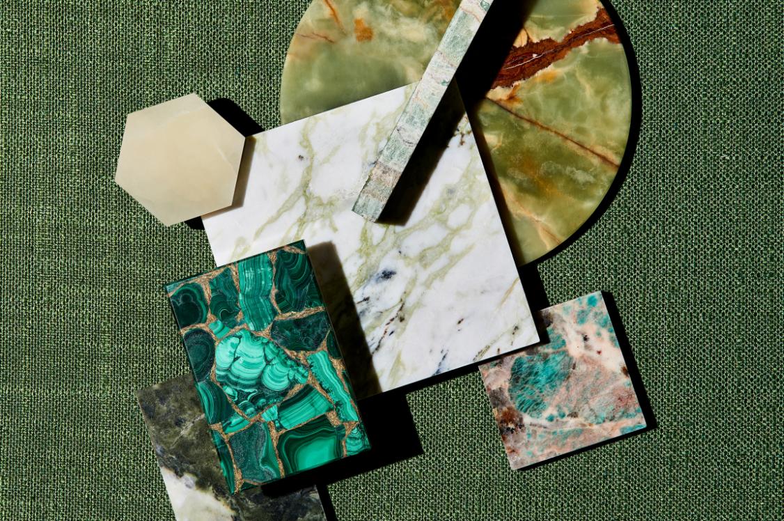


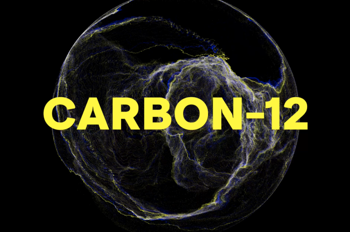
Material Moods: Balance.
A moodboard signifies the beautiful possibilities of a project.
It’s a means of communicating the material language of a space, to forge a directional path.
Not only a tool to reflect an aesthetic vision, moodboards are also a medium for storytelling.
It's this dual notion that's spurred us to launch Material Moods - a creative initiative that acts as a visual sanctuary of tactile inspiration to fuel your next project, featuring the products and materials of our Studio Partners.
Each instalment is themed on a topic that, you've told us, matters most to you. The first being, Balance.
Material Moods: Balance
Amid a cacophony of noise, from notification pings to ever-flowing traffic, underpinned by the continuous whir of social media, we are experiencing an era of collective burnout and algorithm fatigue.
The Burnout Report 2025 by Mental Health UK found that 91% of UK adults reported experiences of high or extreme levels of stress and pressure in the last year. As a result of the increasing pace and digitalisation of our everyday lives, we are craving moments of meaningful pause and digital detox. We’re looking to rebalance.
We’re seeing people retreat to the outdoors en masse, escaping to secluded off-grid destinations, or embarking on outdoor adventures. There is an undeniable desire to recalibrate in nature. Where can we find this deliberate change of pace? It can be found in the trees.
The practice of ‘forest bathing’ is immersing oneself in a forest environment to improve physical and mental wellbeing. It encourages us to slow down, re-engage with our senses, and connect with nature. It’s thought to deliver a host of physical and psychological benefits to human health. Trees release particularly high levels of phytoncides. These microscopic compounds are atomised and released by plants in an aerosol form as a natural defense. However, they’re also thought to play a part in human health and wellbeing, through the lowering of cortisol levels and enhancing overall immune functions.
Not only does being in nature slow us down but - more often than not - it brings on a sense of awe. Experiencing awe matters. It repairs. Awe allows us to appreciate the intricate details of the world, and it is deeply helpful to any creative process. Shifting our experience from the mundane to the extraordinary. Creativity and awe go hand in hand.
Experiencing awe matters. It repairs. Creativity and awe go hand in hand.
Microsoft founder, Bill Gates is known to take “Think Weeks”, where, secluded in a boarded cabin in the Pacific Northwestern wilderness, Gates spends a week reading printed materials fully disconnected from his daily routine. It’s a strategy he employs to foster deep creative thinking and problem solving in solitude.
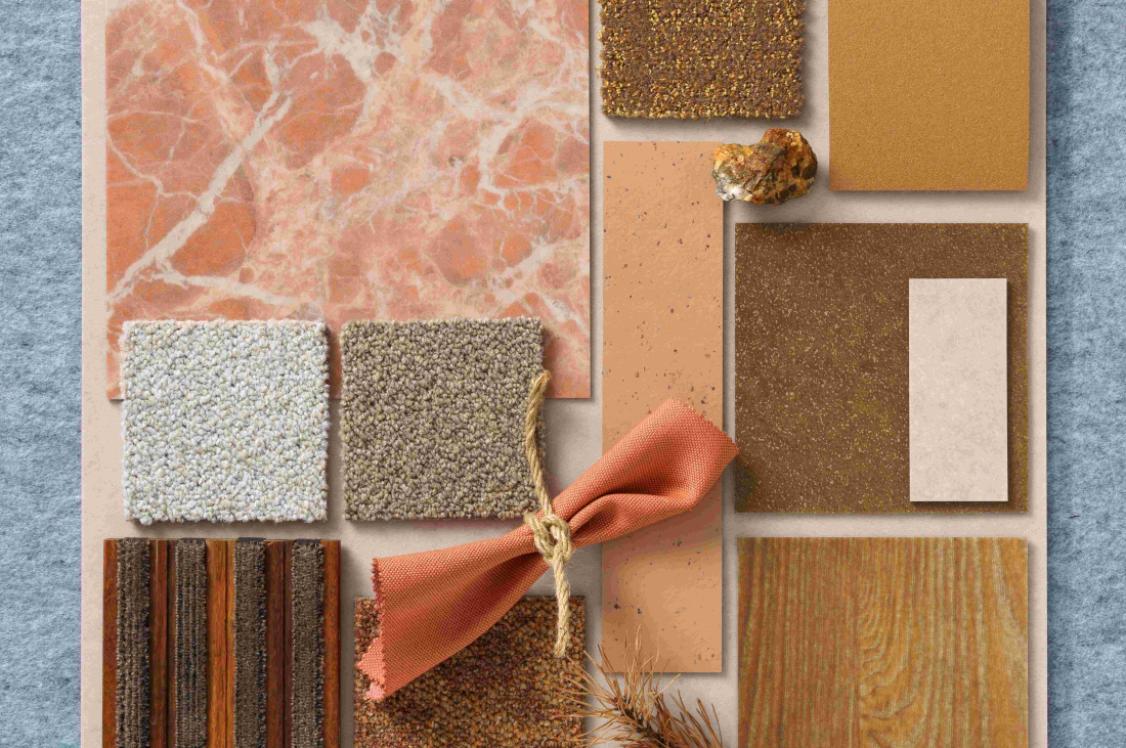
And so, with all of the benefits of spending time in the trees in mind, our first Material Moods palette is inspired by the Japanese term ‘Komorebi’. Komorebi describes the everyday spectacle of sunlight leaking through the trees. It’s a phrase used to express nature’s dance with light and shadow. It’s the simple natural wonder of dappled sunlight light that warms our skin through the cracks in the forest canopy.
Through a curated range of Partner products, in deeply saturated shades of soothing green, to shards of white light that appear to seep right through to the forest floor, Balance evokes a sense of tranquility and stillness.
A palette grounded in nature, green is evolutionarily familiar. We have evolved to see more variations of the colour green than any other colour. Identifying edible plants or detecting predators in lush environments, deciphering subtle differences in shades of green was essential to our survival.
We have evolved to see more variations of the colour green than any other colour. Green was essential to our survival.
Green and its vastly varied spectrum of shades signifies a back-to-nature, and a back-to-basics approach. This palette invites you to take a much-needed moment of pause. It acts as a gentle reminder to seek out experiences, however big or small, that bring about the feeling of awe. To replenish yourself, and to enhance your creative process.
The products selected tell a story of outdoor escapism with a nod to the surfaces and shades we experience at that exact moment where the sunlight spills through the trees.
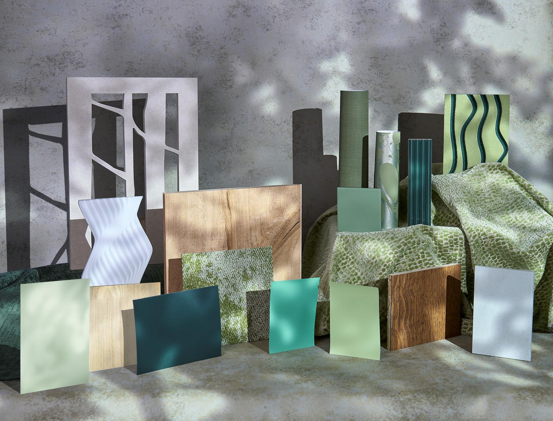
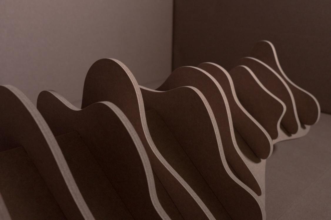
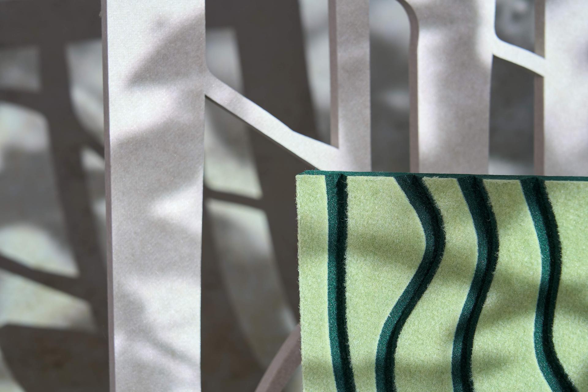
Image credit: Tim Ainsworth
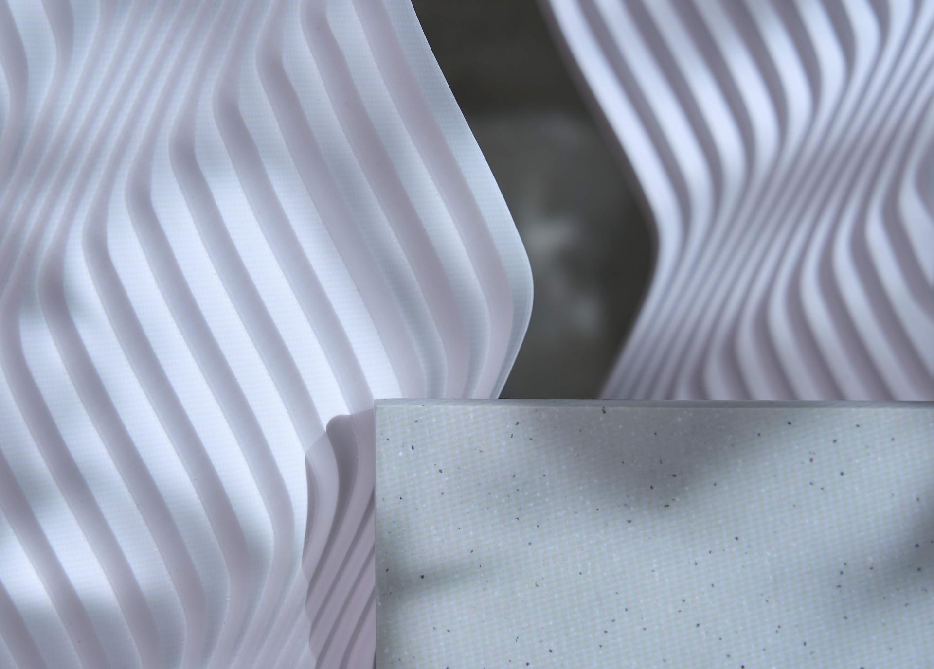
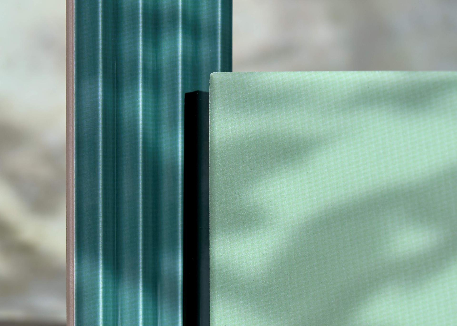
CDUK: M|R Walls, Reeds
The creeping, undulating surface qualities of Reeds – selected for Material Moods: Balance – are reminiscent of bark and twisting tree trunks.
Chosen because of this multidimensional nature, CDUK’s M|R Walls transform architectural features into visually stunning, tactile landscapes. With 12 different motifs – all inspired by surfaces found in the natural world - M|R Walls is the crafted result of carving into Corian® Solid Surface material.
Available in five colours, these surfaces also lend themselves to being backlit, emitting a soft, blissful glow through the CNC carved patterns.
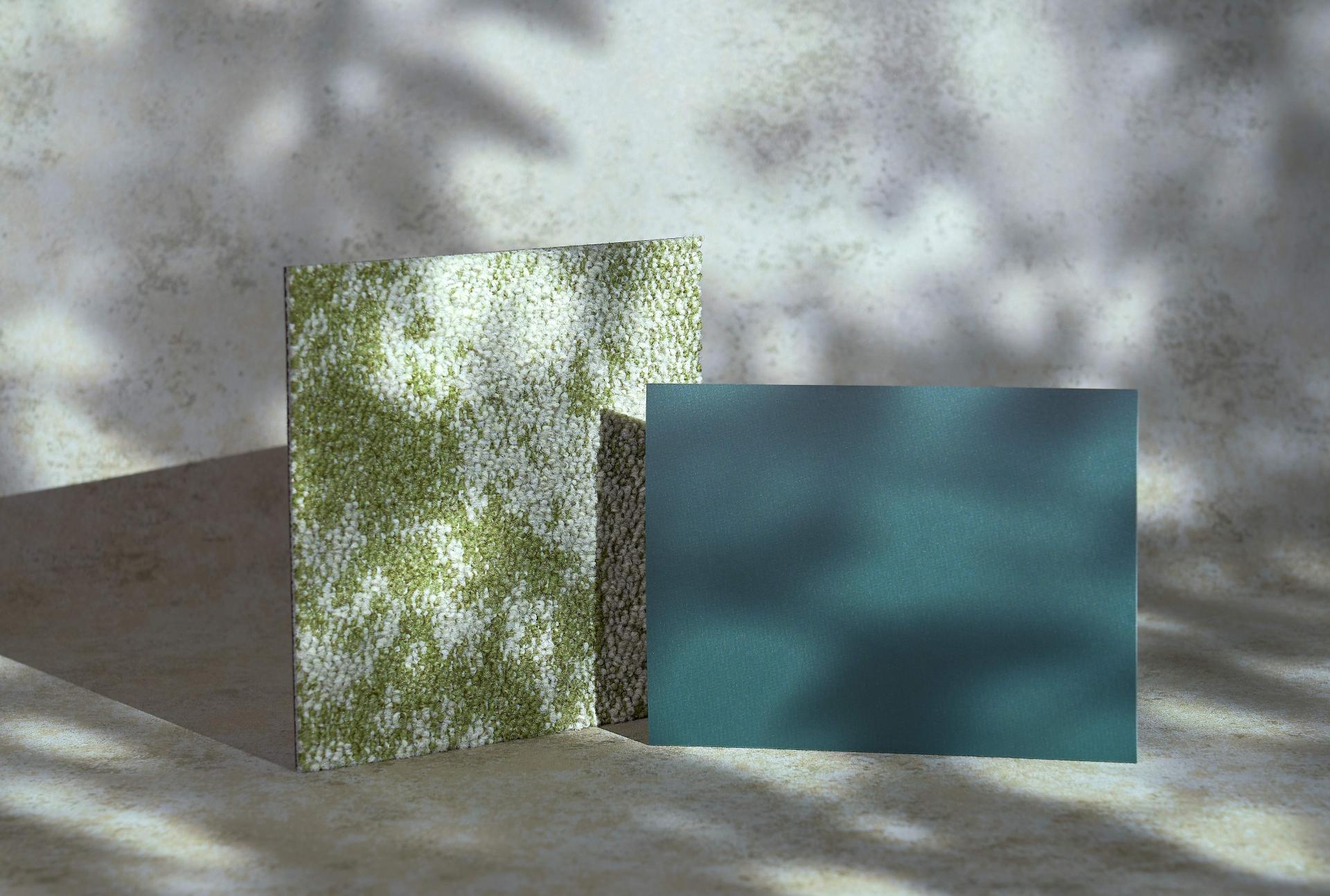
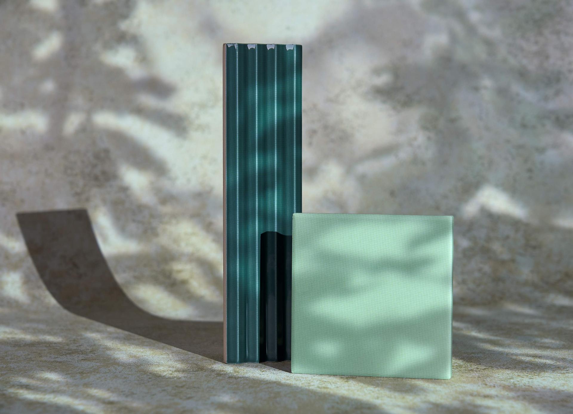
CDUK: Corian®, Nature’s Canvas, Artista Sage
Capturing the more understated tones of the forest flora, Artista Sage is one of Corian®’s recently released Nature’s Canvas colourways.
Inspired by the subtle influence of neutral colours from nature, with fluid and intricate vein patterns, Artista Sage adds a pale lichen-like hue into our Balance palette.
The latest colours in Corian® Solid Surface’s Nature’s Canvas collection mirror details found in a range of landscapes, from calming woodlands and coastlines, to clifftops and clear skies. In both shade and shape, Corian® can be used to imitate the organic surfaces found in our natural environment through thermoforming, engraving, seamless joins or backlighting - offering designers the scope to experiment with luminosity and form.
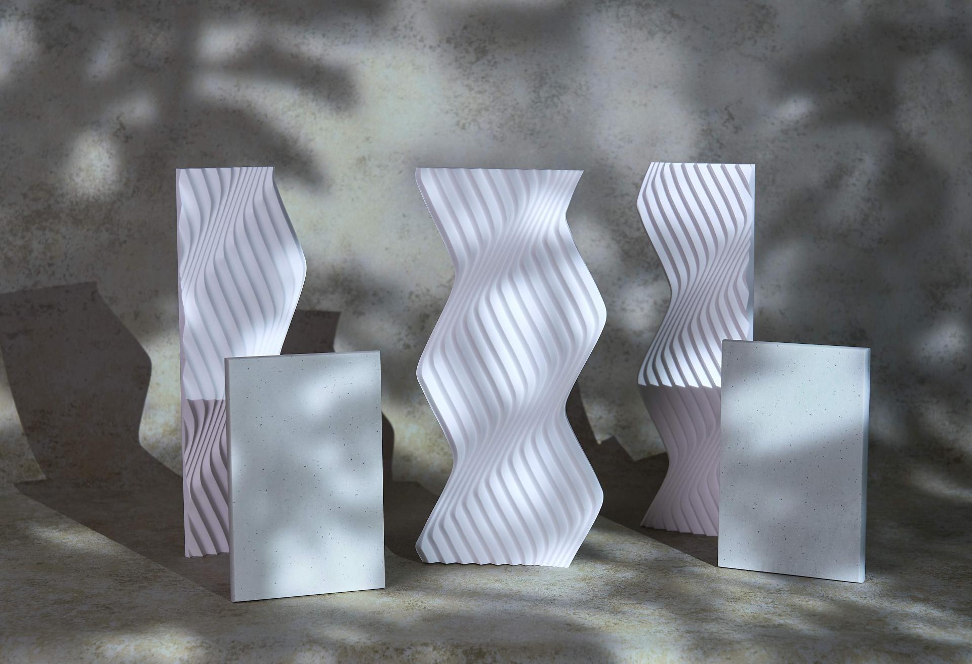
CDUK M|R Walls, Reeds & Corian®, Nature’s Canvas, Artista Sage. Image credit: Tim Ainsworth
CDUK M|R Walls, Reeds & Corian®, Nature’s Canvas, Artista Sage. Image credit: Tim Ainsworth
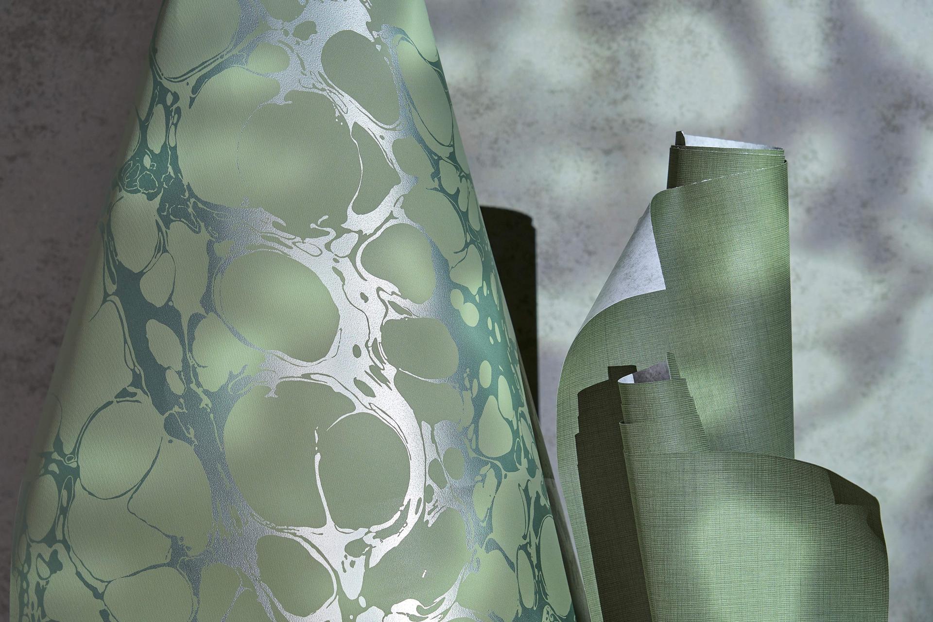
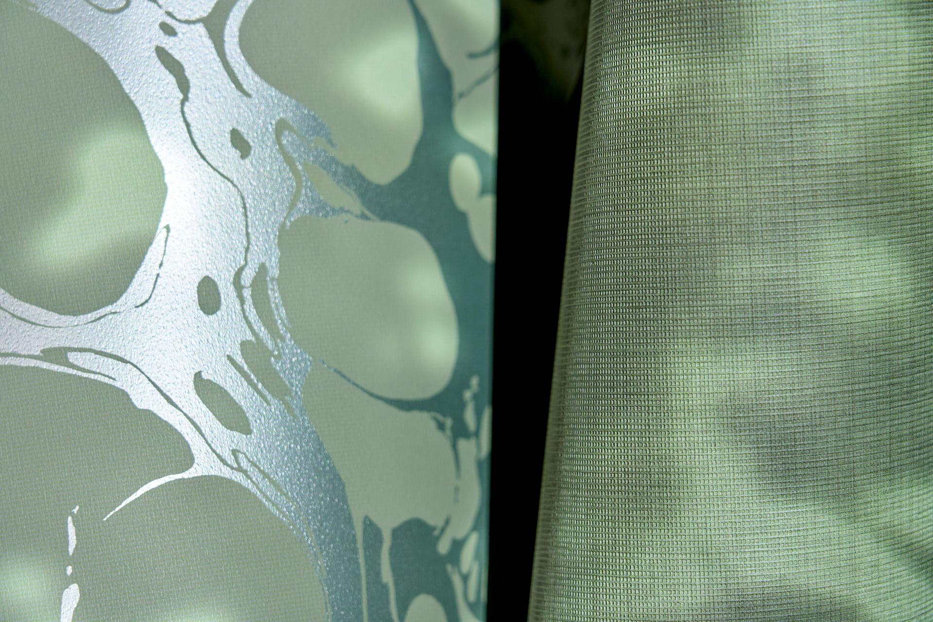
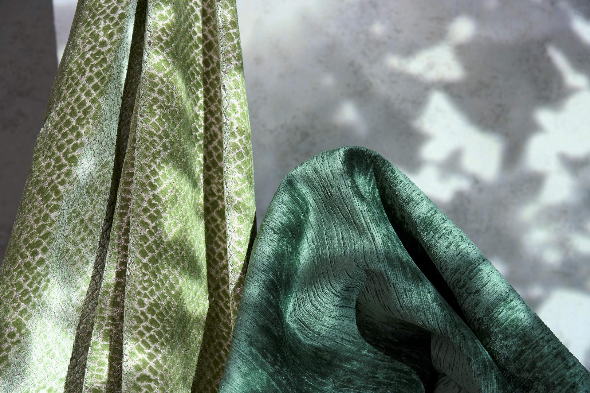
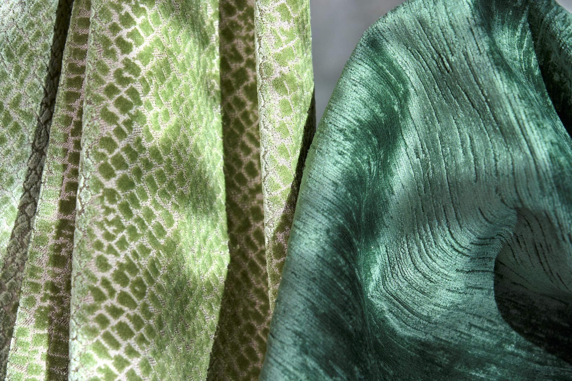
Muraspec: Muslin, Dark Green
Muraspec’s Muslin in Dark Green drenches our palette in a rich and reassuring verde.
With a tactile texture that invites haptic engagement, Muslin interprets the subtle warp and weft of muslin cloth. A new collection in Muraspec’s wallcovering portfolio, Muslin is a soothing surface for commercial and residential schemes alike.
Muraspec: Lava, Olive / Silver
Casting shimmering light through subtle reflective foils, Lava in Olive / Silver takes cues from the lighter tones of green to bright white in our Balance palette, featuring an intricate interplay between light and shadow.
Drawing inspiration from the mesmerising fluidity of oil and water, Lava’s large-scale printed foil design glimmers, with both depth and dimension.
Muraspec: Muslin, Dark Green & Lava, Olive / Silver. Image credit: Tim Ainsworth
Muraspec: Muslin, Dark Green & Lava, Olive / Silver. Image credit: Tim Ainsworth
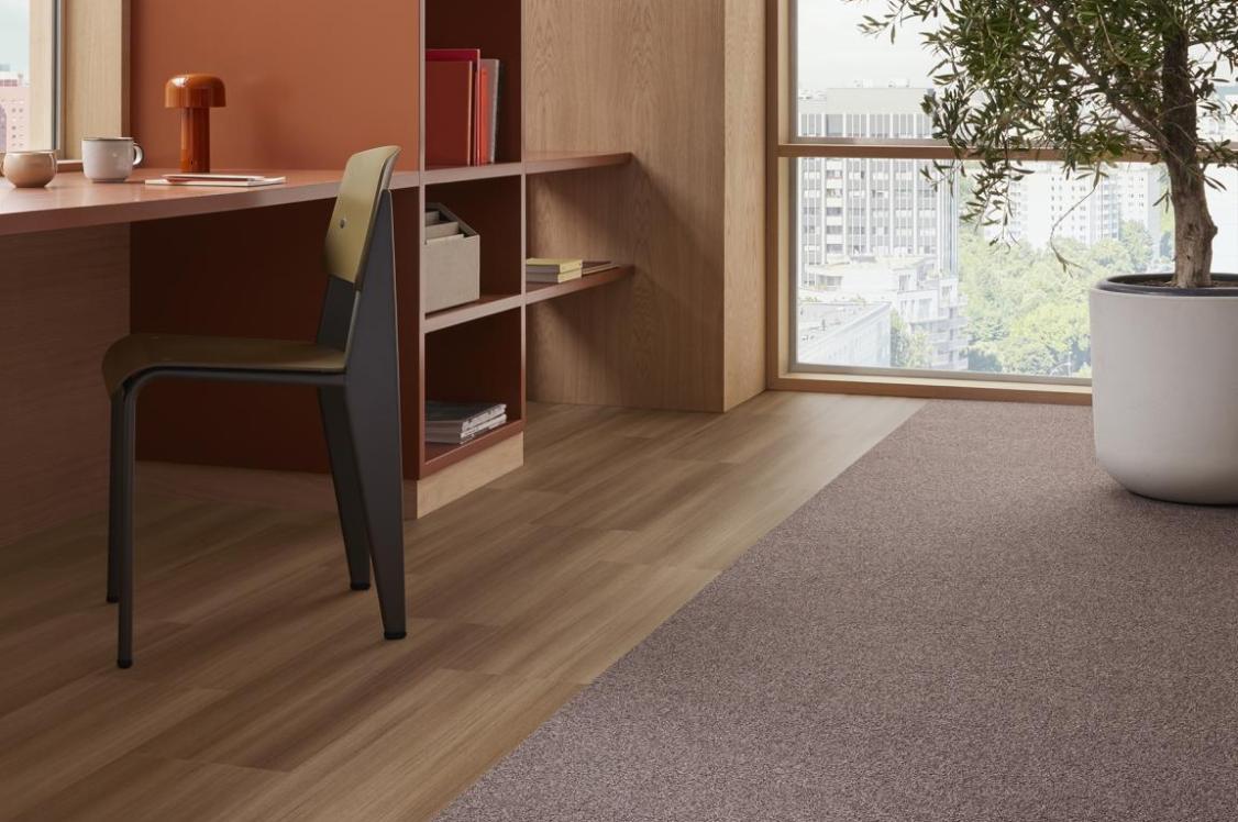
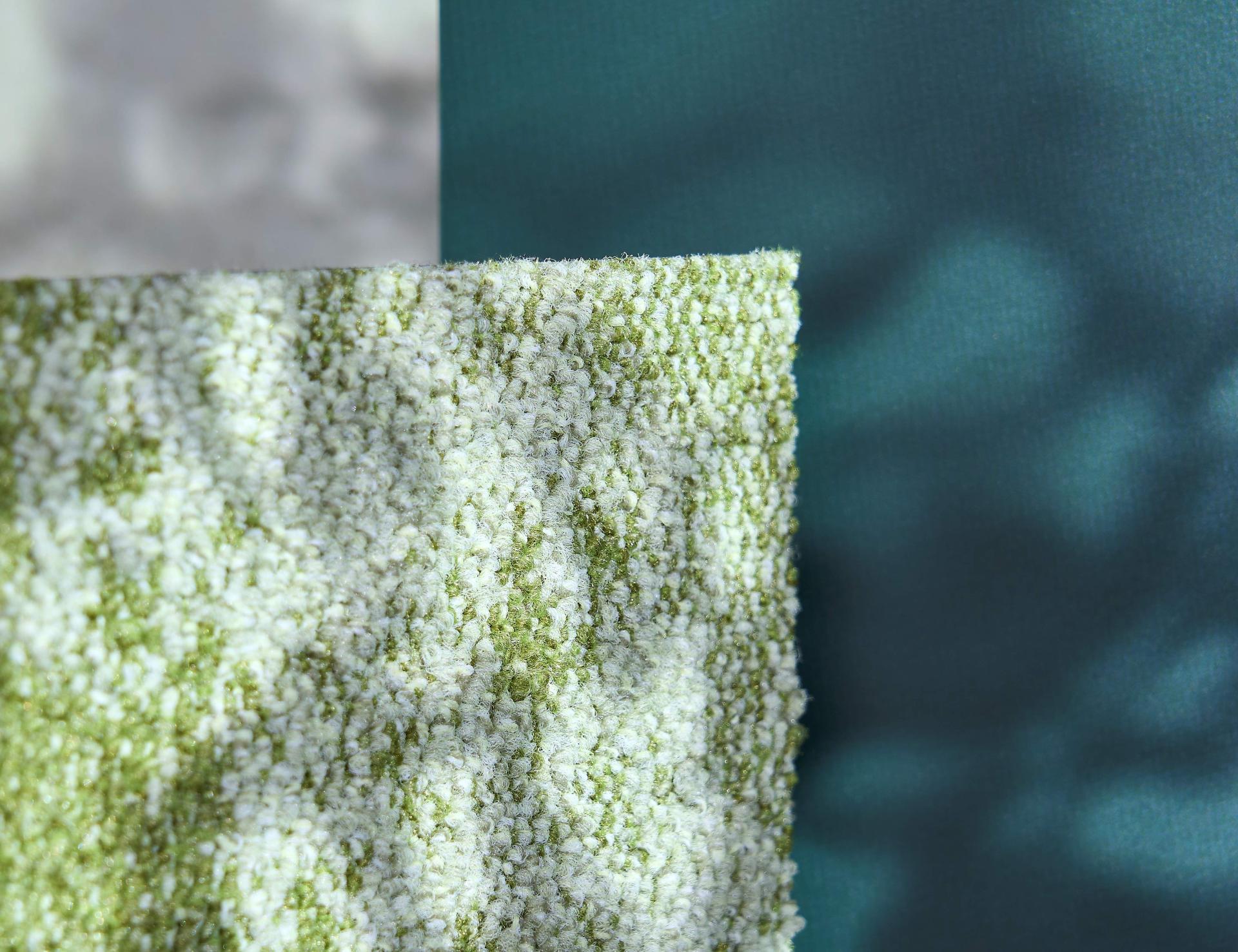
Forbo Flooring Systems: Tessera, Cloudscape, Monsoon Cloud
Forbo Flooring Systems’ Cloudscape in Monsoon Cloud interprets the rich greens of the forest canopy, offering tonal progression from dark to light across each carpet tile.
Featuring a varied spectrum of the evolutionarily familiar shade of green, Monsoon Cloud equips designers with a naturally appearing mottled flooring design that echoes surfaces often observed in nature.
Created to reconnect us with the outdoors, with today’s crowded urban environments in mind, Cloudscape takes creative cues from the sky above us. The constantly changing vista of cloud formations and the rich spectrum of light and colour provide a bridge to the outside, helping us to reconnect and rebalance.
Forbo Flooring Systems: Furniture Linoleum, Conifer
Inspired by the deeply saturated alpine greens of the forest, Conifer is one of Forbo Flooring Systems’ newly released shades in its refreshed Furniture Linoleum range.
Made from 94% natural raw materials including linseed oil, wood flour and pine rosin, Furniture Linoleum is Forbo Flooring Systems’ much-loved, climate positive (carbon negative), natural surface material. Providing designers with a soft and elegant matte finish, Furniture Linoleum can be incorporated into a wide range of interior applications – including kitchens, desks, cabinetry, and doors.
The updated collection has been curated with a balanced palette of neutral and contemporary colourways, integrating a number of calming tones such as warm wood and cool stones.
Forbo Flooring Systems: Tessera, Cloudscape, Monsoon Cloud & Furniture Linoleum, Conifer. Image credit: Tim Ainsworth
Forbo Flooring Systems: Tessera, Cloudscape, Monsoon Cloud & Furniture Linoleum, Conifer. Image credit: Tim Ainsworth
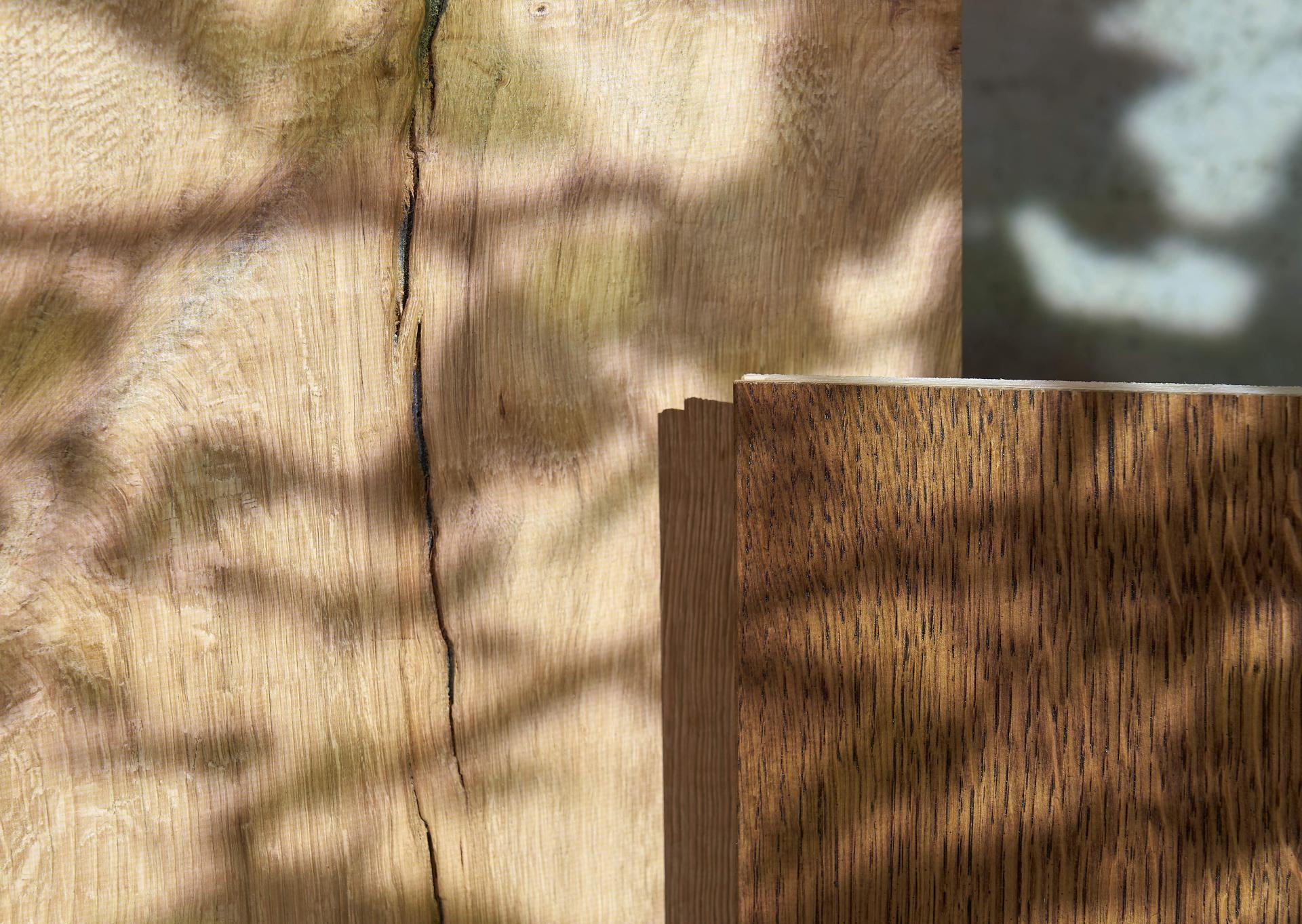
Russwood: The Signature Collection, ’90
A material reminder of our wonderful woodlands, Russwood’s Signature Collection retains the raw and authentic features of an oak board. Offering an undulating surface of natural splits and knots, its Signature Collection embodies the craftmanship and attention to detail at the heart of Russwood since its inception.
With each of the five carefully curated Oak floors named after Russwood’s early years, its colourway ’90 is the warm and timeless tone selected for Balance.
It’s available in a plank, chevron and herringbone layering styles. And this product is FSC certified.
Russwood, Core Collection, Cask
Symbolising tree trunks cast in shadow, Cask is a deep and rich shade full of character. A part of Russwood’s Core Collection of premium European Oak and Larch floors, Cask features sunken, hand filled knots that transport the sensory surface qualities of the outdoors in.
Cask is finished with an Osmo Hardwax Oil, highlighting the natural nuances of the woodgrain. Russwood’s range of durable, timber flooring solutions can be used for both commercial and residential projects.
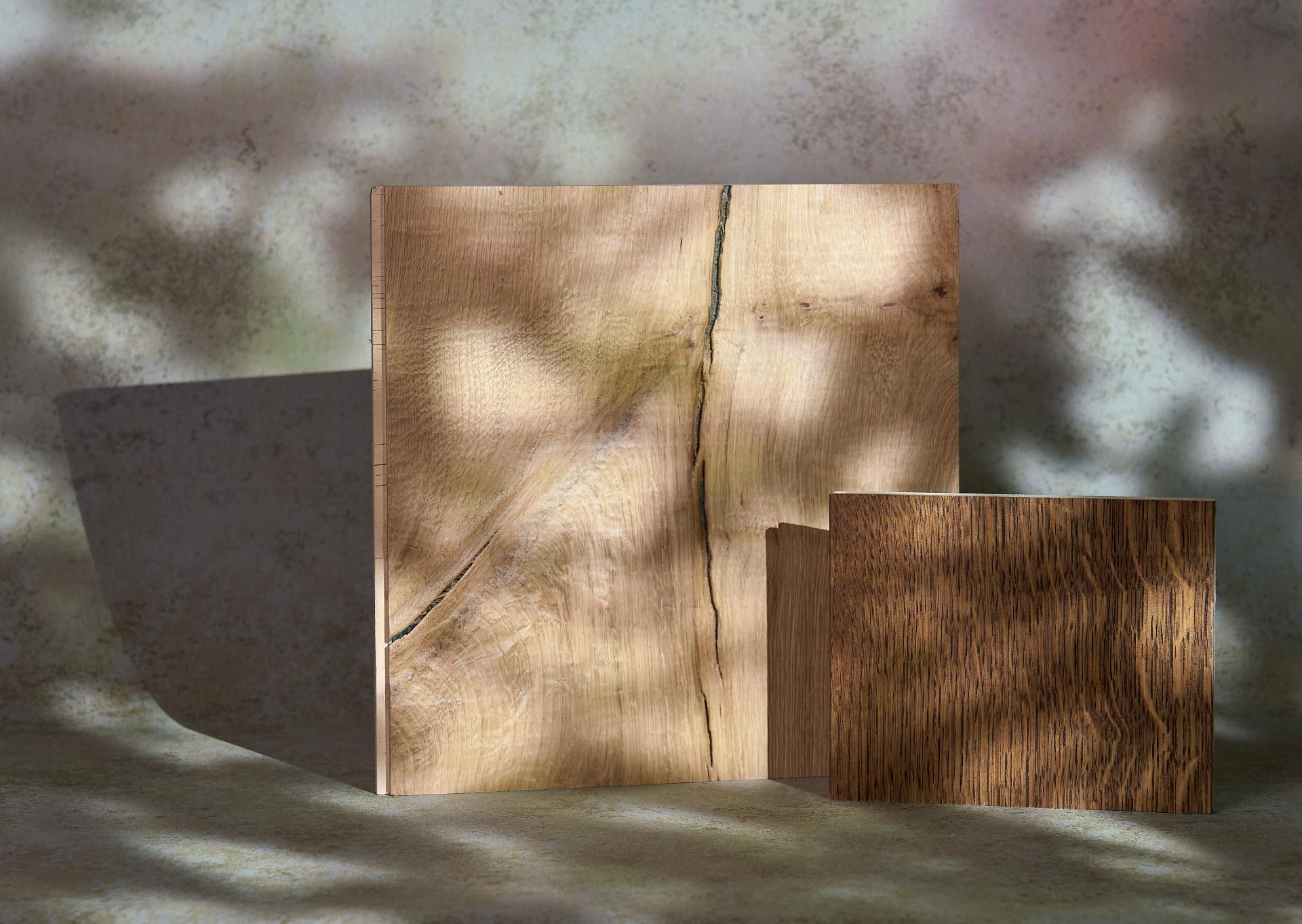
Russwood: The Signature Collection, ’90 & Core Collection, Cask. Image credit: Tim Ainsworth
Russwood: The Signature Collection, ’90 & Core Collection, Cask. Image credit: Tim Ainsworth
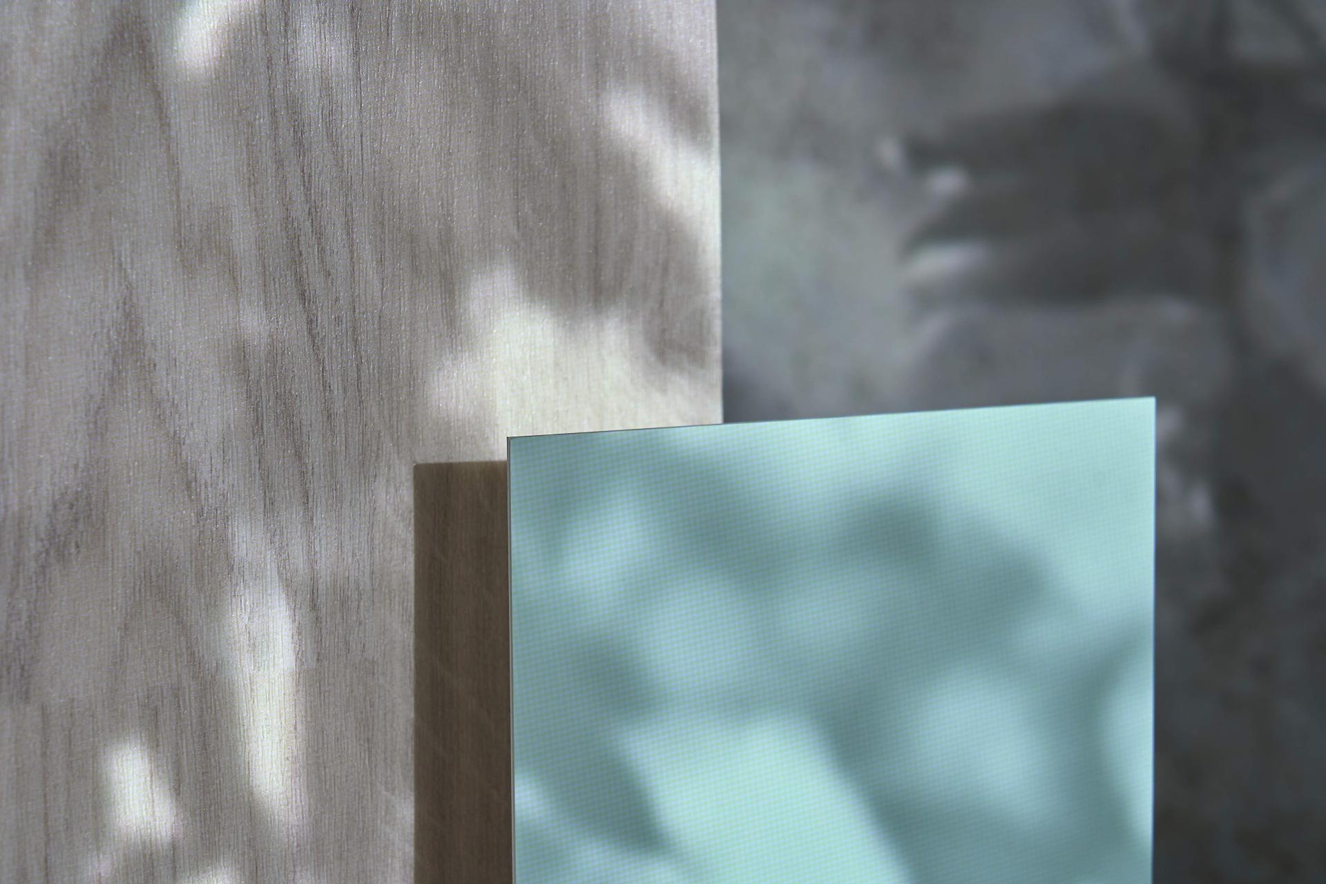
Altro: Whiterock Satins™, Serenity
On the lighter side of our spectrum of a sunlight bathed woodland, Serenity is a soothing shade that’s part of Altro’s Whiterock Satins™ range - a satin finish wall sheet crafted for wet environments, wards and kitchens.
Available in a variety of 27 off-white, tonal, solid, and decorative shades, Whiterock Satins™ wall cladding can be used to create spaces from calming and restorative, to vibrant and dynamic.
Altro: Wood™ adhesive–free, Frosted Oak
A luminous woodgrain inspired shade, Frosted Oak perfectly pairs with the light and bright Serenity Whiterock Satins™. Part of the Altro Wood™ adhesive-free range, Frosted Oak takes cues from light coloured wood species such as Ash, Birch and White Oak to create both durable and decorative flooring solutions for high traffic areas.
Having recently launched six new colours, Altro Wood™ adhesive-free offers 18 shades as well as a 14dB sound reduction – facilitating the creation of soothing environments that reduce stress and restore calm.
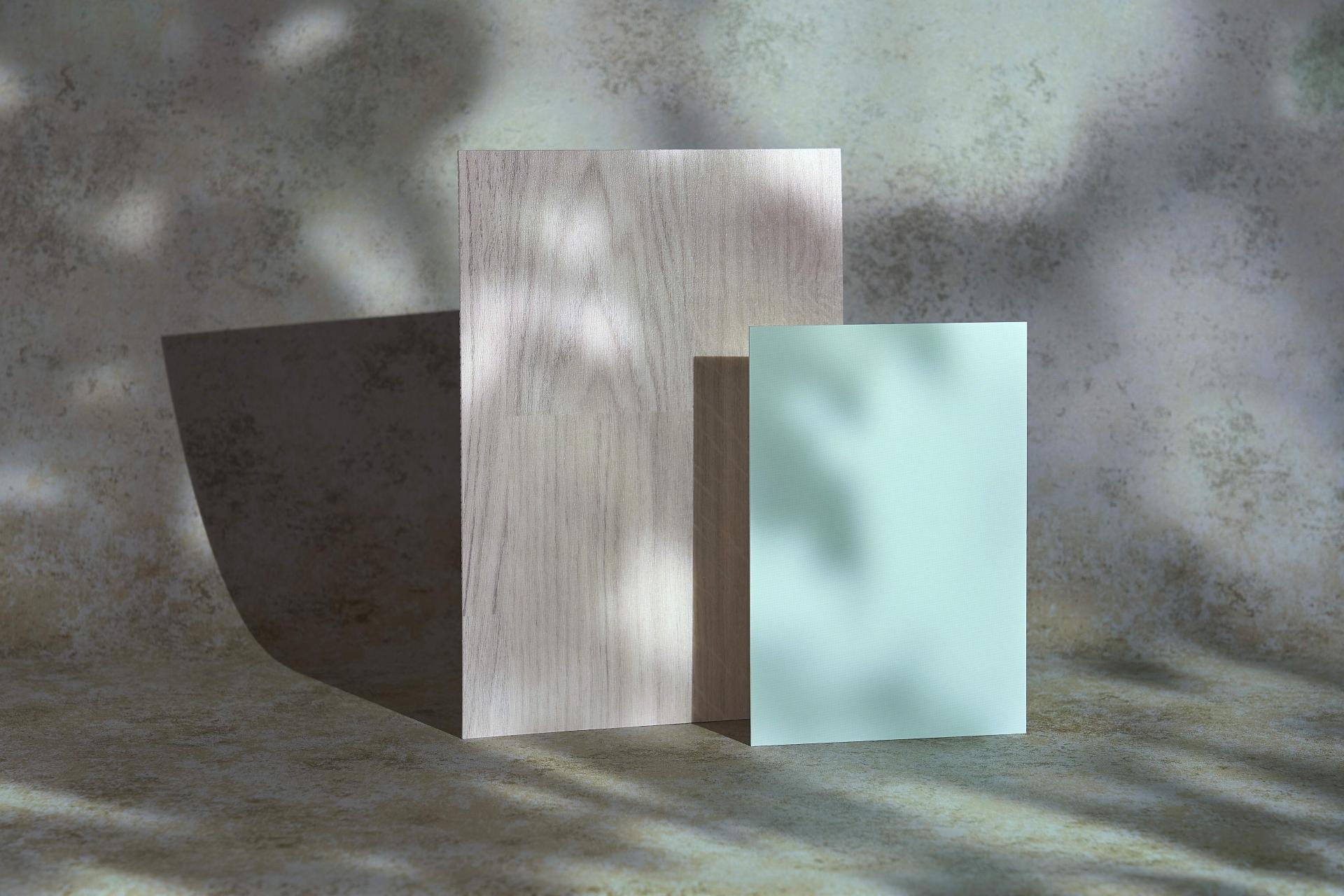
Altro: Whiterock Satins™, Serenity & Wood™ adhesive–free, Frosted Oak. Image credit: Tim Ainsworth
Altro: Whiterock Satins™, Serenity & Wood™ adhesive–free, Frosted Oak. Image credit: Tim Ainsworth
Autex: Cascade™, Bespoke, Opera
Designing for acoustic comfort has never been more important amidst the constant whir of our urban environments, whether that be from traffic, chatter, or continuous notification pings. Aiding our ability to recalibrate and focus, Autex Cascade™ is a subtle acoustic solution used to separate spaces whilst maintaining an open feel.
Imitating nature’s dance with light and shade, this bespoke made Cascade ™ screen in shade Opera casts shadows of the treetops through its waterjet cut forest inspired design. Cascade™ screens are suspended from the ceiling to create subtle acoustic features.
Featuring shards of forest inspired shapes, in which light can spill through, the Cascade family consists of three styles—static, folding, and expanding, with a host of additional waterjet cut designs to fit any interior scheme, beautifully.
Autex: Groove Duet, Acros, Tree House
Further evoking the feeling of outdoor escapism, Autex’s Groove Duet adds to our Balance palette the Acros colourway, with organic undulating trails of the shade Tree House.
With an ingrained understanding that every space is unique, Autex offers bespoke design solutions to enable designers to tailor environments to meet client needs. From subtle patterns to complex 3D sculptures made from a variety of hinges and joins, both aesthetics and acoustic comfort are equally considered here.
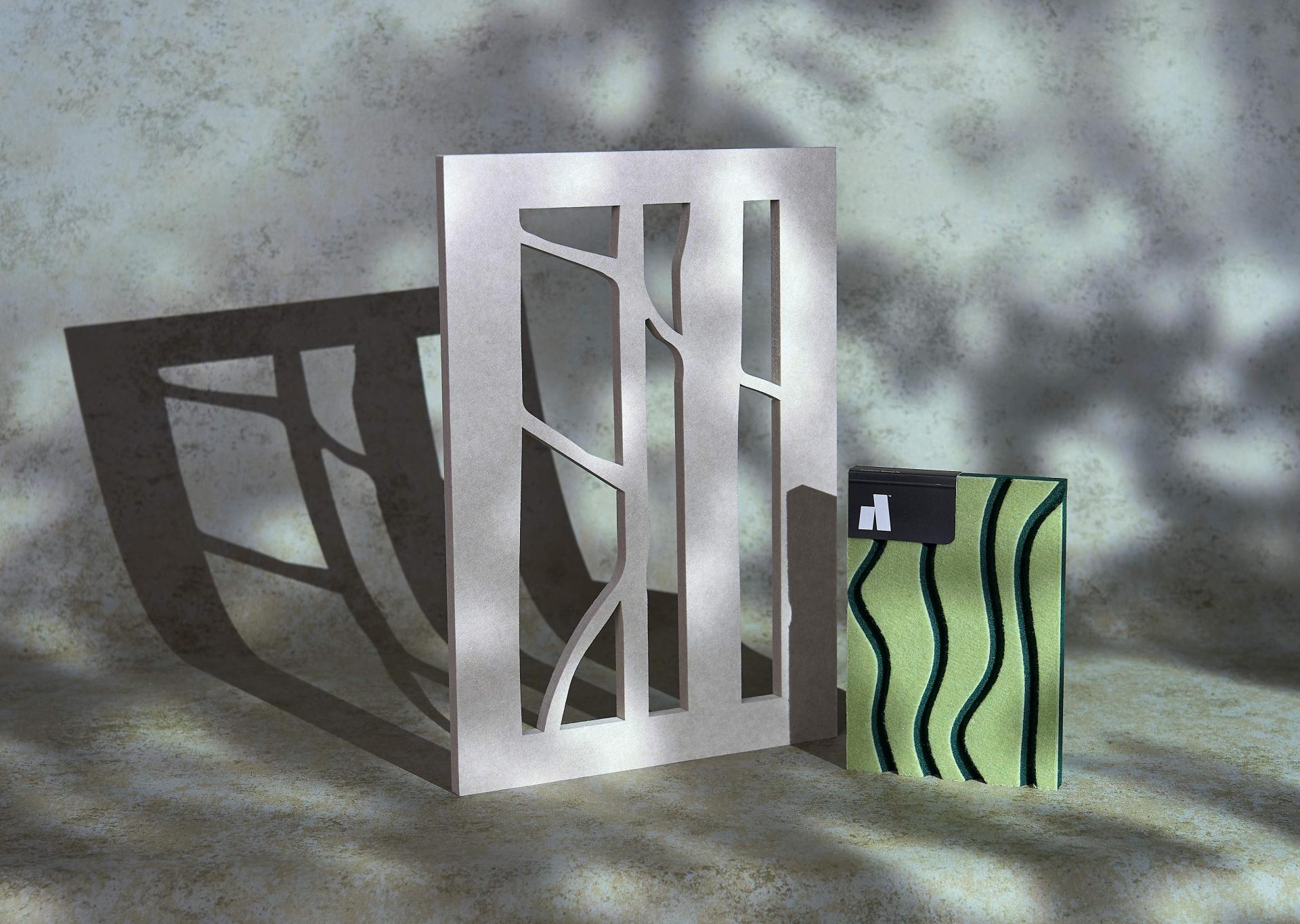
Autex: Cascade™, Bespoke, Opera & Groove Duet, Acros, Tree House. Image credit: Tim Ainsworth
Autex: Cascade™, Bespoke, Opera & Groove Duet, Acros, Tree House. Image credit: Tim Ainsworth
ILIV: Tahoe, Cedar
Paying homage to the deep, rich, and sophisticated shades of the evergreen Conifer tree, Tahoe in Cedar is a highly textured chenille with a slub effect. A high performance, fire retardant fabric range by ILIV, it is especially suited to upholstery for commercial interiors.
With a halogen free Crib 5 coating and a Martindale rating of 42,000, this fabric can be flexibly applied across workspaces, hospitality, residential and healthcare schemes.
Lending a sense of freshness and quiet luxury to every space, Tahoe in Cedar is perfect for interiors seeking a connection to nature.
ILIV: Infinity Velvets, Mandal, Seafoam
Emulating the dappled light glimmering through the forest canopy, Mandal is part of ILIV’s luxurious Infinity Velvets collection. The colour Seafoam resembles the mossy underbelly of the forest floor, with a soft-to-the-touch, speckled velvet finish.
Part of its Residential Fabrics range, Mandal can be used for both drapery and upholstery. It is a visually engaging and tactile textile that brings the restorative qualities of the outdoors in.
ILIV: Tahoe, Cedar & Infinity Velvets, Mandal, Seafoam. Image credit: Tim Ainsworth
ILIV: Tahoe, Cedar & Infinity Velvets, Mandal, Seafoam. Image credit: Tim Ainsworth
Parkside Tiles: Cabrera, Laurel Green, Praia - Gloss
Parkside Tiles’ Cabrera in a Laurel Green colourway simulates the shades of climbing ivy smothered tree trunks and shaded ferns. Smooth to the touch and rich in tone, its rippling ridges in a Praia format add three dimensionality to interior material palettes.
Its glazed gloss surface mirrors the natural polish of rain-washed foliage, reflecting its surroundings in the forest’s deepest shades of green.
The Cabrera range is a wall tile that celebrates colour and texture, available in 15 colours, matt and gloss finish, and various 3D structures.
Parkside Tiles, Chorus, 28
A tranquil, lightly textured porcelain tile with an unglazed earthy honesty - Chorus in colourway 28 is a shade of gentle woodland green.
Its natural texture breathes authenticity, giving the impression of forest floors underfoot - quiet, organic, and grounding.
The Chorus range is made from resilient porcelain, with a slip-resistant PTV 36+ rating. This makes it well suited to high-traffic areas and moisture-prone spaces like spas, pool sides, or open-plan commercial interiors - spaces that will benefit from a sense of calm without compromising on performance.
Chorus offers a large selection of unglazed porcelain tiles in various sizes, shapes, and textures, including finishing pieces all in a matt finish, and rated +36 slip resistant.
Parkside Tiles: Cabrera, Laurel Green, Praia - Gloss & Chorus, 28. Image credit: Tim Ainsworth
Parkside Tiles: Cabrera, Laurel Green, Praia - Gloss & Chorus, 28. Image credit: Tim Ainsworth
Crown Paints: Scrubbable Matt, Co, Bowling Green G4291X
Crown Paints’ buoyant Bowling Green delivers deeply saturated tones of the trees to our Balance scheme whilst maintaining a sense of maturity. Selected from Crown’s Co palette, a part of its 2025/2026 Colour Insights, Bowling Green is a shade that aids both productivity and relaxation in a space by having a natural, non-overwhelming brightness.
Co as a palette is all about the creation of harmonious spaces. A mix of calming green and grey tones serve as a foundation for Co, while vibrant pops of yellow and red inject energy and a sense of joy. The Co palette is intentionally saturated, focused on delivering a calming aesthetic that supports community and connection.
Crown Paints: Scrubbable Matt, Lea Green D0531M
A shade brimming with chlorophyll-rich saturation, Lea Green is a fresh and energising shade that encourages rebalance and recalibration. Part of Crown Paints’ Design Collection, Lea Green is both light and airy, harnessing the same quiet power as nature’s process of photosynthesis.
Crown Paints: Scrubbable Matt, Forest Vista C2111N
Forest Vista evokes the timeless serenity of a woodland in shade. A deep, olive-tinged green, Forest Vista – a part of Crown Paints’ Design Collection - transports us to the forest floor’s mossy undergrowth.
Crown Paints: Scrubbable Matt, Co, Bowling Green, Lea Green, Forest Vista, Glass Green. Image credit: Tim Ainsworth
Crown Paints: Scrubbable Matt, Co, Bowling Green, Lea Green, Forest Vista, Glass Green. Image credit: Tim Ainsworth
Crown Paints: Scrubbable Matt, Glass Green, F1132B
A highly pigmented, pine-like shade, Crown Paints’ emerald Glass Green is a colour symbolic of the gentle interplay between light and leaf. With a light reflectance value of LVR13, this shade feels serene, yet teeming with life.
If you’d like any more information on the products and materials featured in Material Moods: Balance, please get in touch with our Studio teams, who will be happy to chat further about your specific scheme requirements.
Head to our Instagram to explore the palette in more detail.
Brought to you in association with our Partner brands: Crown Paints, Parkside Architectural Tiles, ILIV, Autex Acoustics, Altro, Russwood, Forbo Flooring, Muraspec, CDUK