


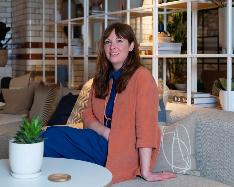
CMF designer & author Laura Perryman on colour theory, the metaverse & celebrating nature's imperfections.
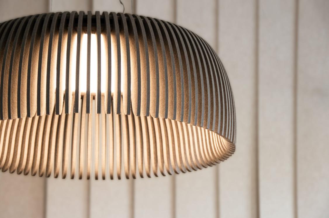
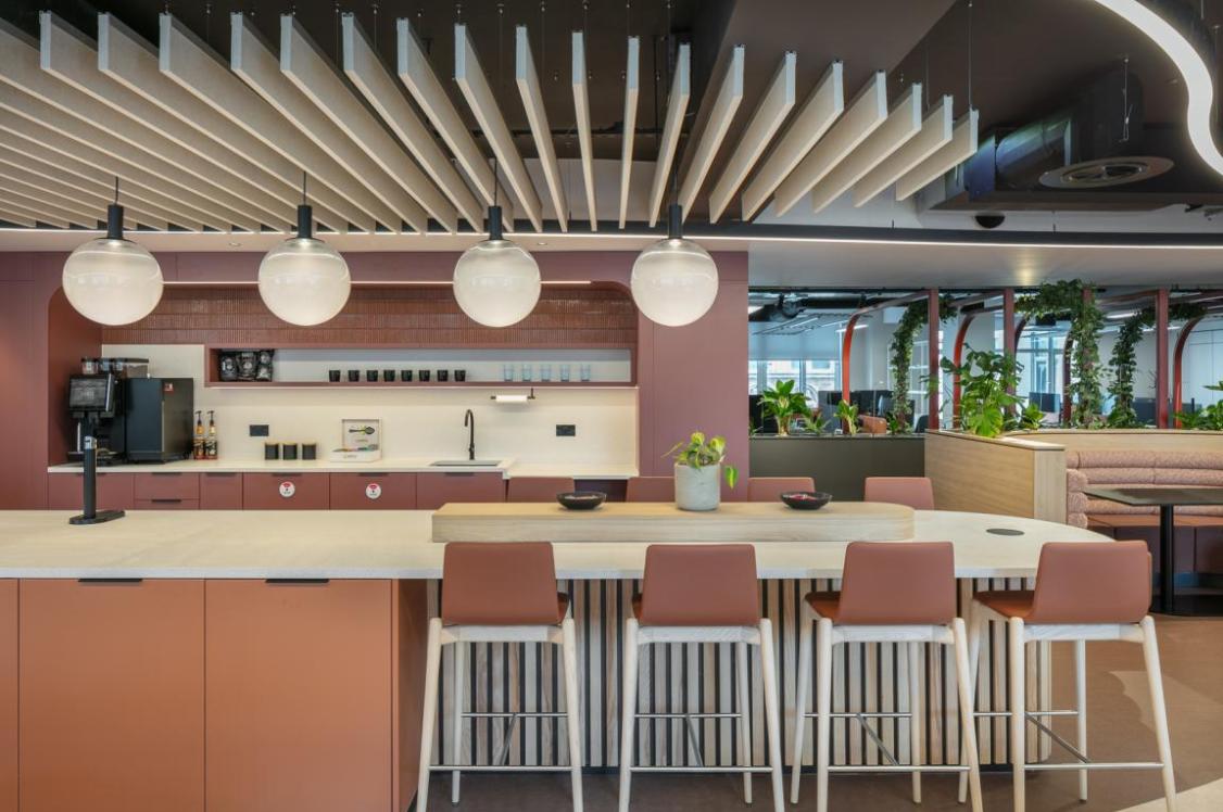
Credit: David Lake
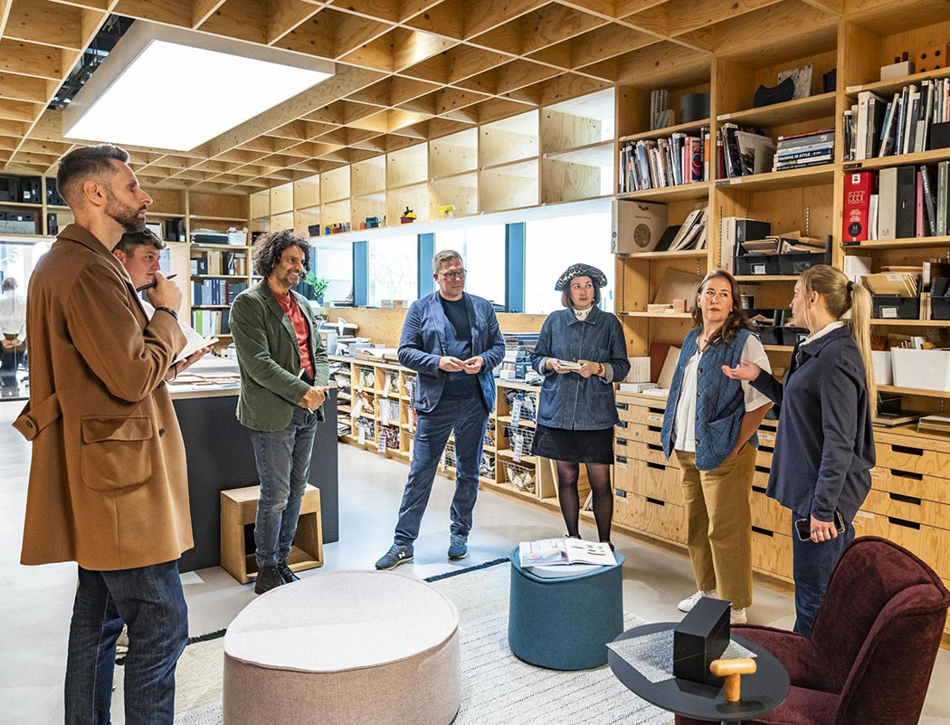
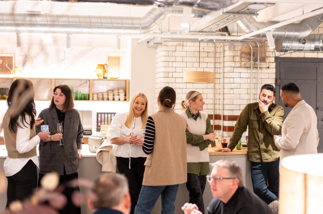
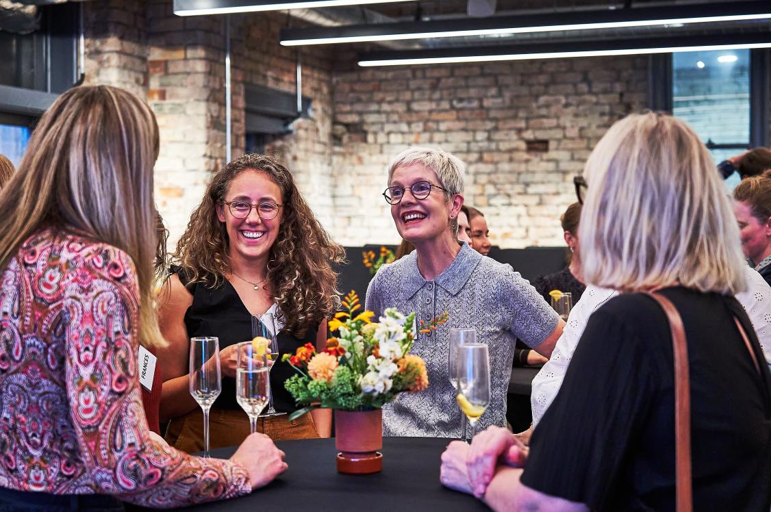
This week, we hosted Manchester Metropolitan University's School of Art for a talk and workshop with Laura Perryman - CMF designer, editor, author, and all round colour expert.
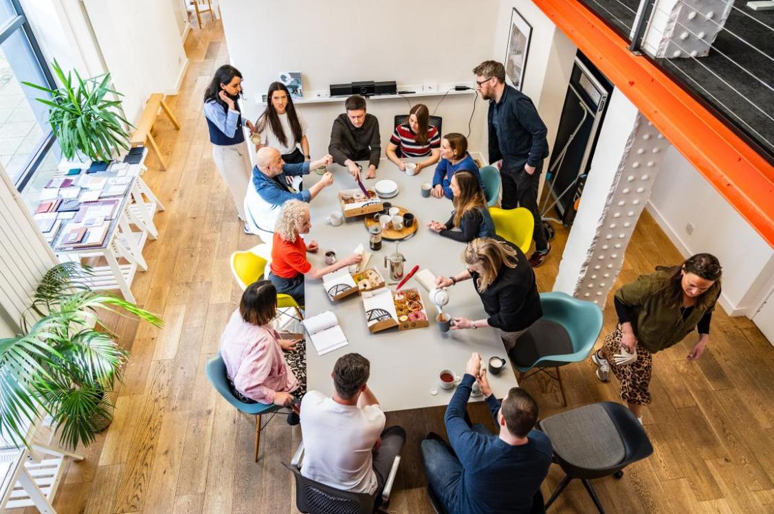
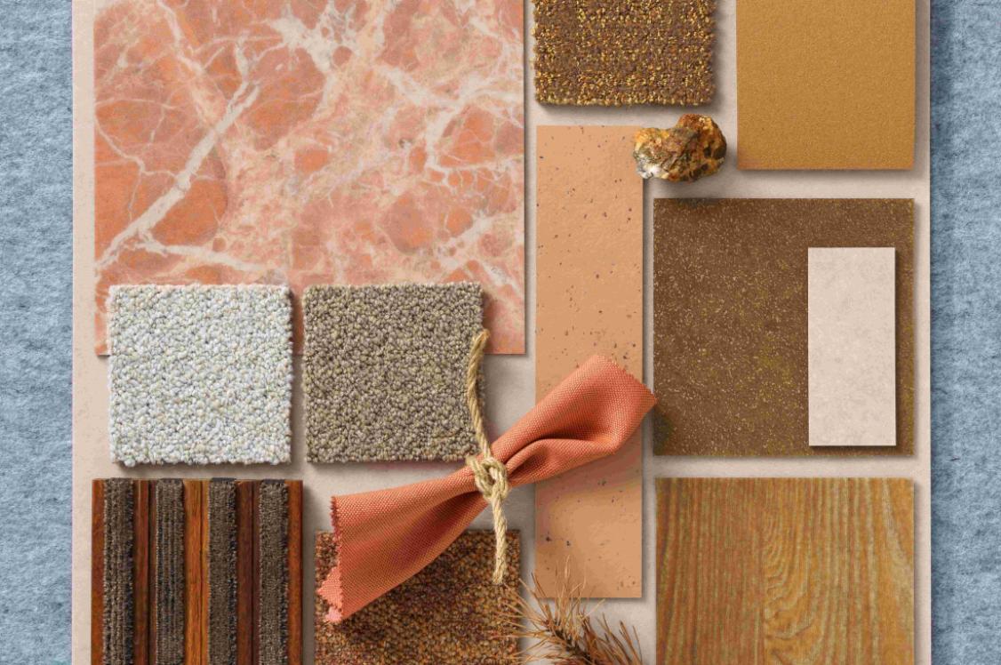
The event was part of the school's Unit X, which brings together students from various disciplines to collaborate and skill share, just as they would in the working world. For this particular session, students from the Interior Design and Textile courses were invited to learn more about the role of a CMF designer (colour, materials, finishes).
And who better to learn from, than trailblazing designer, Laura Perryman? Who has not only worked practically within the industry for more than 10-years, but has also authored a book on the subject of colour theory: The Colour Bible (a staple publication in the Material Source Studio library).
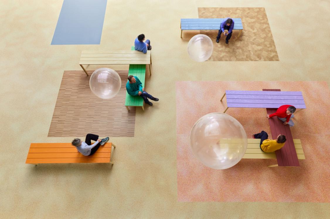
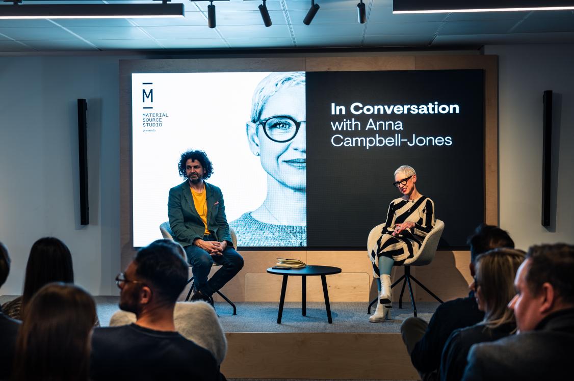
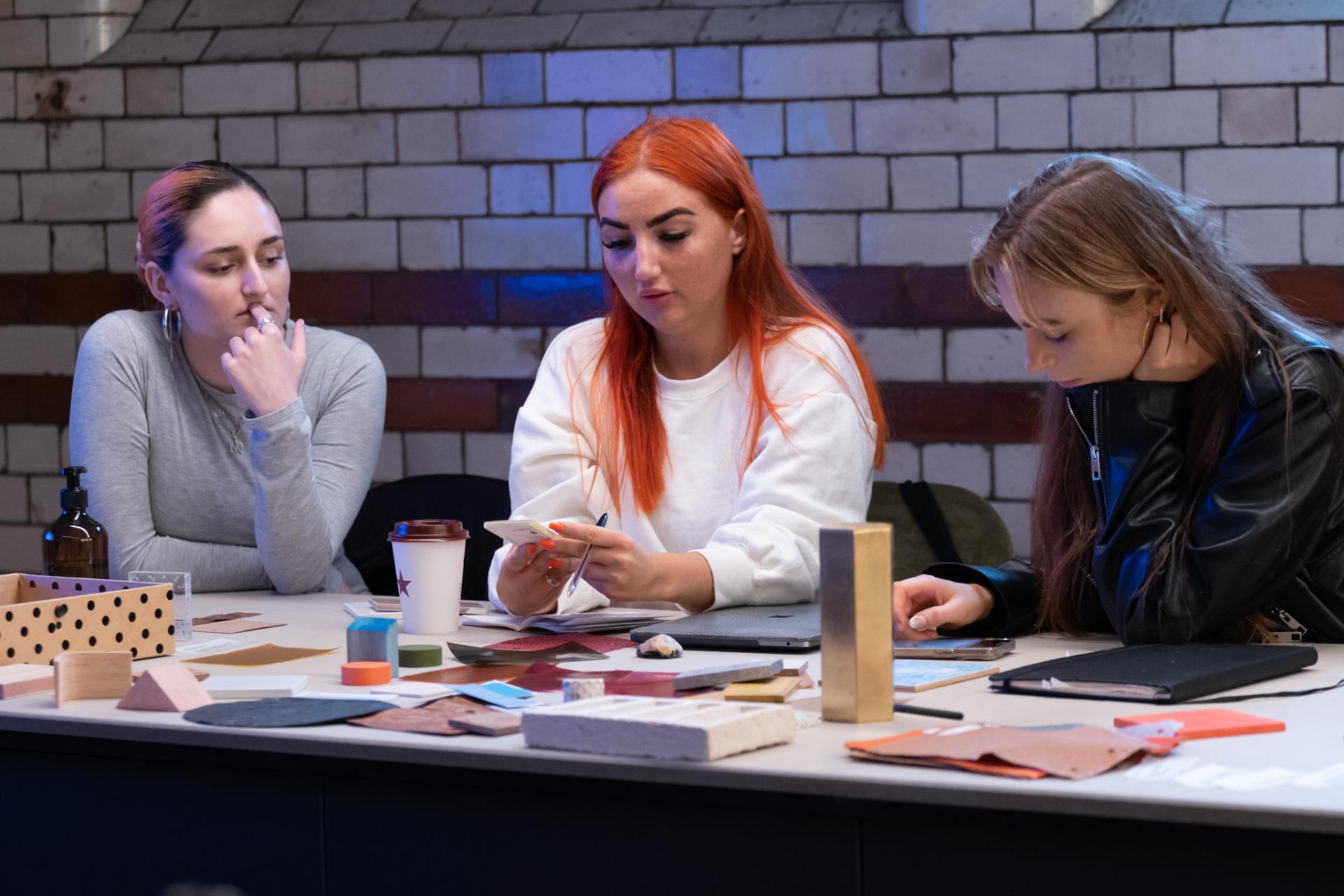
As well as sitting in on the talk, and workshop, which tasked students with gathering inspiration from the partners in our Studio (with guidance from our expert materialists Emily and Hannah) to create scheme concepts for a healthy, hybrid live/workspace, we grabbed a quick chat with Laura on some of our burning questions around colour, wellbeing and the role of CMF in the future of design.
Firstly, what is the role of a CMF designer?
"A CMF designer takes care of the colour, material and finish. This could relate to product or industrial design, and it focuses on the finite details of how these three elements work together. There are many factors that can impact how a CMF designer makes their selections, but more than anything else, we are concerned with making choices that are mindful and purposeful. And while trends play a role, they are tied into cultural, economic and political change."
Is colour an art or a science?
"I think people can be naturally good at colour. And I think people naturally can put colour combinations together and choose colour really instinctually. You see this in art and creative areas, because some artists will instinctually have a colour palette, which they use with ease but they won't necessarily have learnt colour theory. I think it's only when colour theory is taught and you've learnt it that you really understand the science that can be accessed behind it.
"Some of the reasons that I wrote The Colour Bible in the first place is because colour is a massive subject and it isn't always taught as much in further education or at a university level. And so it's about making it really accessible. There are lots of great tools in colour theory, which can be learnt really simply and easily. It explains why a colour will interplay with its direct composite, why colours that are close to each other create a softer harmony.
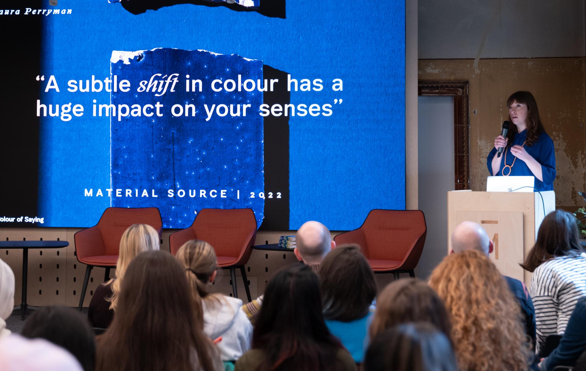
A subtle shift in colour has a huge impact on your senses
"As well as having a natural ability to understand colour, I think, over the years, the amount of time that you put into doing something, you actually do naturally get better. I found myself in industry, learning some colour theory as a textile designer and studying textiles and mixing dyes, and understanding how I can tweak colours with other hues when making physical colour. And then I found myself in industry, maybe not doing that as much, but putting colour combinations together for products or clients and realising that I did naturally have an ability to do it.
"The book is to be used alongside the colour wheel for experimenting and going off in your own medium. It allows access to this really important information quickly and whether you're a digital VR designer, or a product designer, you can confidently put a colour combination together."
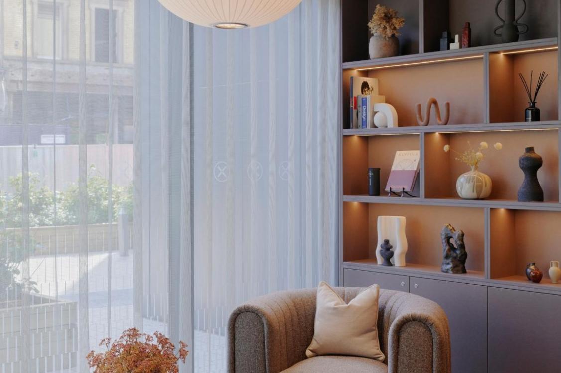
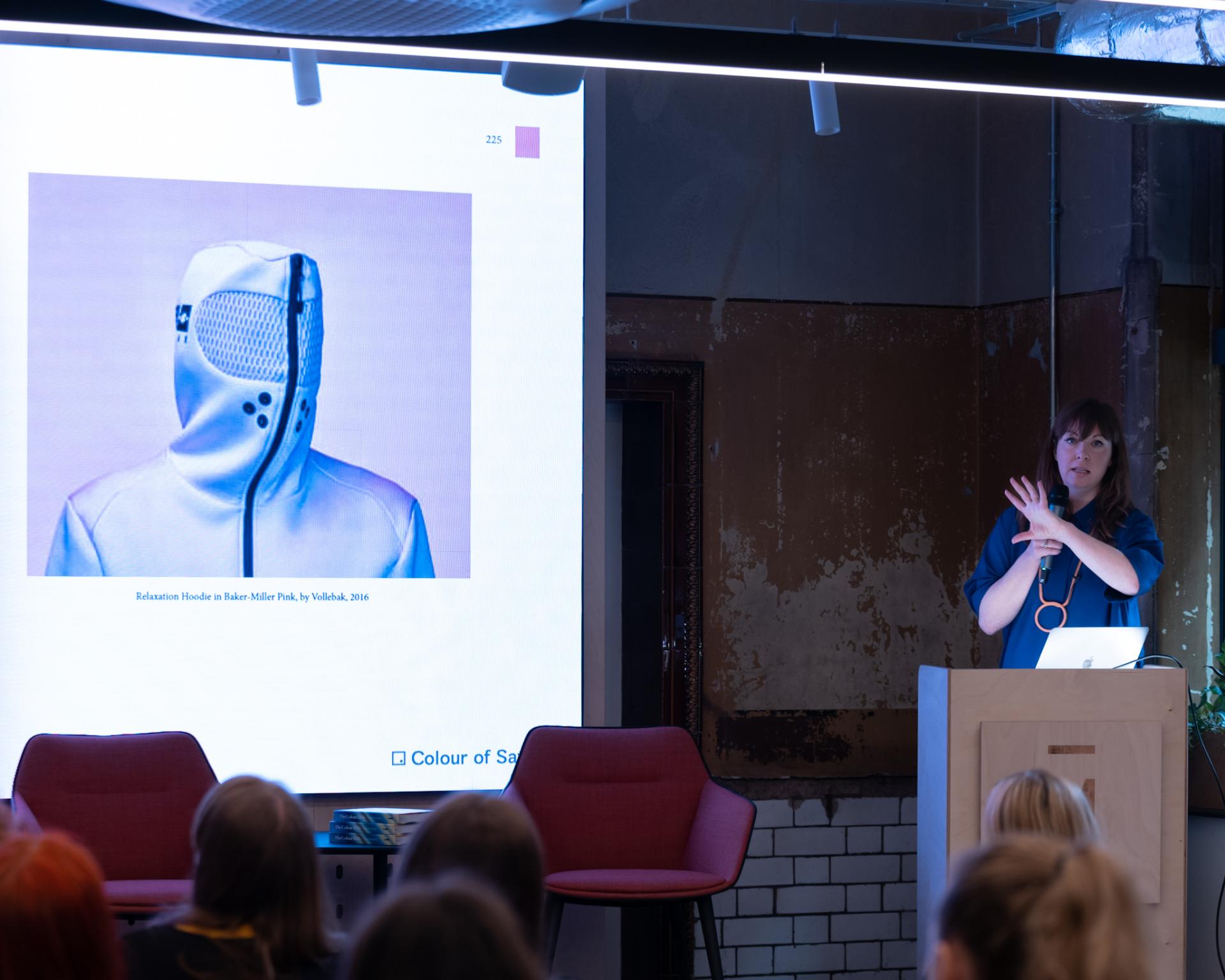
Credit: David Lake
Credit: David Lake
Credit: David Lake
That leads us on nicely onto my next question. How can CMF designers impact the evolution of the metaverse?
"I think lots of people are starting to lean towards digital CMF. In some industries such as interiors and mobility, VR and augmented reality is already being used to judge design environments, with textiles and colour being digitalised. They can be applied and they can be experienced. But I think it's been done so far at a surface level. And I think we're going to start seeing entire environments and immersive spaces being completely digital soon, and colour is going to be massive in that area.
"I read recently about how the colour red has got so many connotations with alarm and emergency, and it catches our eye because of that. But actually when it's applied in the metaverse, a red could easily bleed into an orange, and, as a result, it can become softer and then it loses this aggressive edge that we've always perceived as attention-grabbing. And I think that is where we've not quite found the ultimate metaverse palette yet. No one's really gone that far.
"There are some industries, such as gaming, that have touched on this area. The way that immersive gaming has evolved, they have detailed to the highest level - even down to fabric and clothing. It is amazing what's been achieved so far. But then also there's an emerging area to do with digital therapy as well. With the healthcare system being revolutionised through digital technology. I was researching recently future wellness spaces being online. So you would go in and have meditation sessions in a virtual space, and therefore, obviously the colours, materials, experiences, the intricacies of those will need to be curated as well."
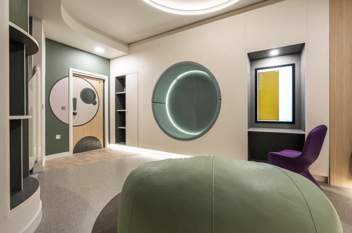
Credit: David Lake
Credit: David Lake
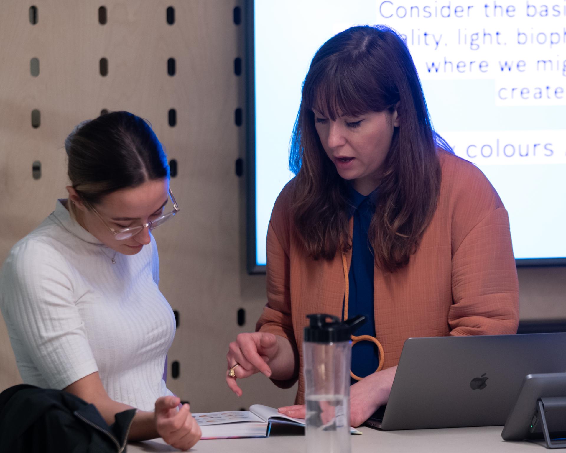
Credit: David Lake
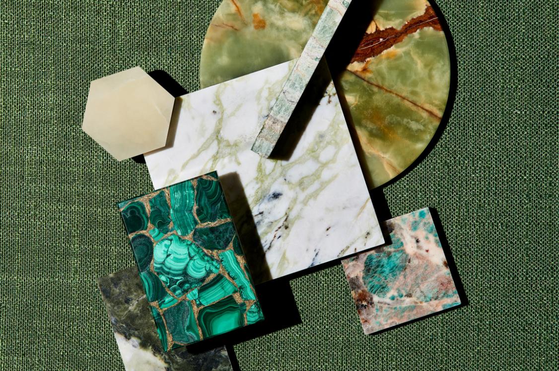
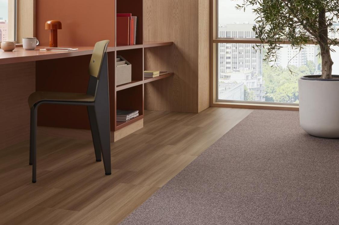
Related to wellness, biophilia is a big interiors trend currently. But how can designers interpret it creatively outside of simply green?
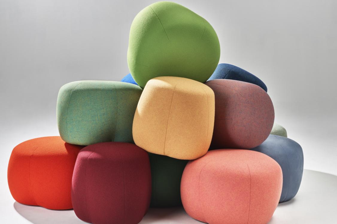
"It can be oranges and red and other natural yellows that are coming from natural plants and materials too. We've seen a massive uptake in natural colour over the past couple of years, where designers are making plant based dyes, growing plants for colour and using waste colour from food sources. And that's giving us a much wider, actually quite a warm palette, I would say. So it's actually almost the opposite of green.
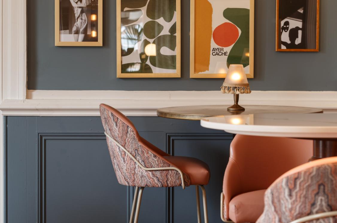
"Green can be quite cold sometimes. We've seen blue come back quite strongly, but being tinged with green. And some of these other colours that we're seeing now are like the kickback. So this is why we get blue and red mixes, these violet colours such as the Pantone Colour of the Year. It's the categorical opposite of green. What was once considered unusual is now starting to become more mainstream. Now lilac not green, if you like, will start to infiltrate.
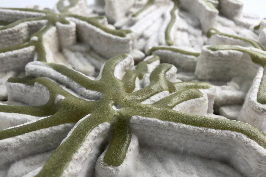
"We're also seeing from a biophilic point of view, there are new colours coming through from other sources like fungi based dyes and bio based colours. And some of those are unlocking quite vibrant shades. Biophilia used to be a one stop shop of greenery, but now I think it is much broader. If you look at the work of Hannah Elizabeth Jones, for example, she's using all of these very locally sourced colours that are not green. They're coming from a vivid plant source. And the reds, oranges and pink are quite strong. It still feels natural. But there's a natural blending happening too."
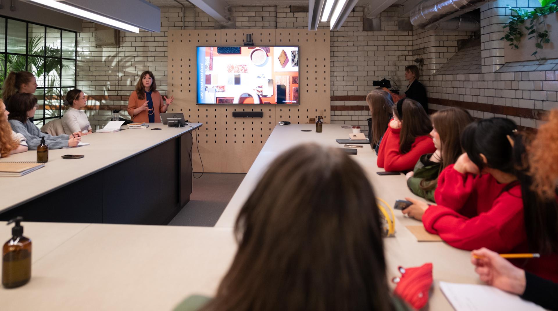
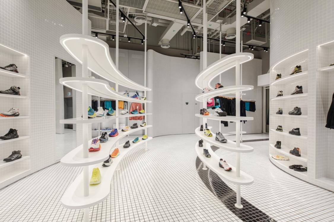
Credit: David Lake
Credit: David Lake
Would you say that our minds are more at ease with a natural blend because we recognise that it's from nature?
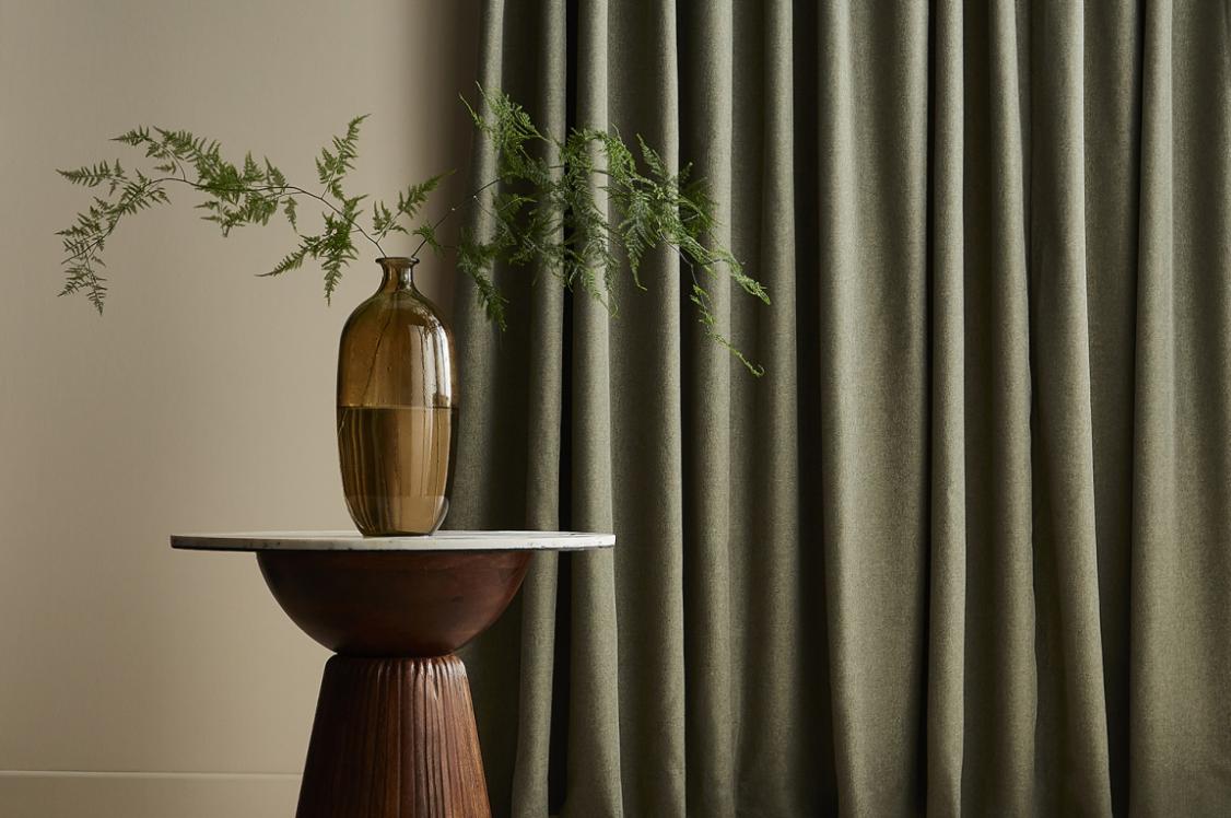
"Yes, we recognise it and connect with it too. Natural colours have also been interpreted in certain industries for some years now, such as in interiors or paint collections. Shades have been slightly pared back or are a bit softer or have greyness to them. Everyone's got a colour inspired by nature in their palette it seems. However, what we're seeing now is a grassroots makers' movement, which is, like, actually, all colour sources coming from natural plants and other grown matter. And therefore, as we move forward, we're going to have to embrace the aesthetics that are associated with nature, and nurture them, and embrace them, rather than trying to fake them.
"We will get inconsistency of colour. We will get natural raw imperfections. We will get intertones, which are colours that are in between - perhaps even on a second or third life cycle and there will be more of these coming through in trends. So, less primary, more secondary, and even tertiary, which is the third mix, tones like lilac are also in this region. It's also been driven from incorporating waste or second-life materials in design as well. All of this is creating these nuanced mixes, which before we might have thought a bit odd or a bit dirty, but now they're just becoming commonplace."
Finally, and I'm sure you've never been asked this before, do you have a favourite colour?
"It's really hard, I would have said blue a long time ago, and it's still a colour I really connect with, but I have become really interested in orange, especially when I wrote the book, because it's really interesting, the history of orange. It has got a very healing, natural energy to it. It's quite a difficult colour to work with because it is hard to pin down a perfect orange. I feel it's quite an undervalued colour."