


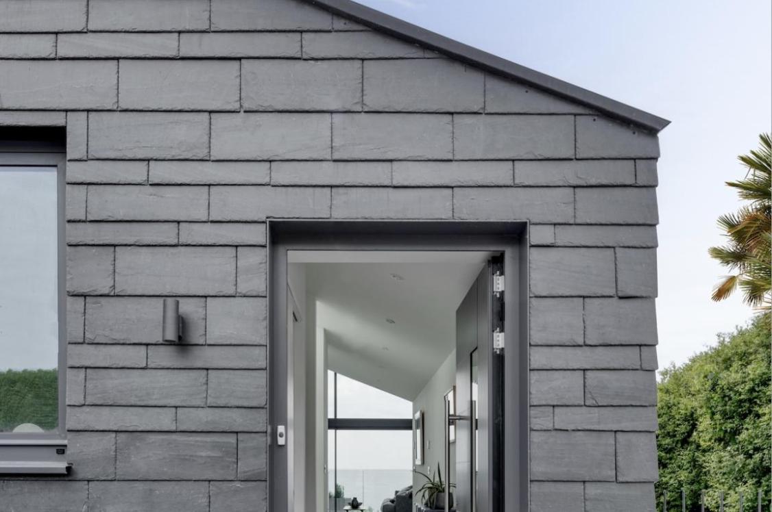


Crown Paints highlights the importance of colour in the workplace. Wherever that workplace may be.
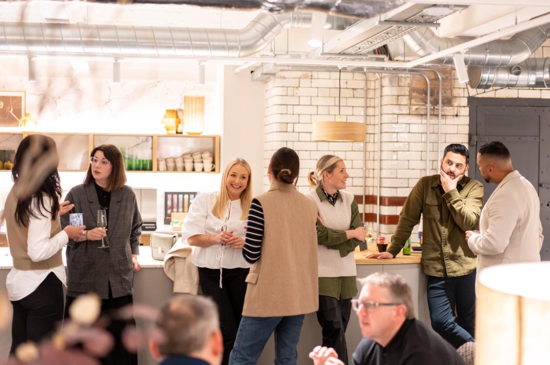
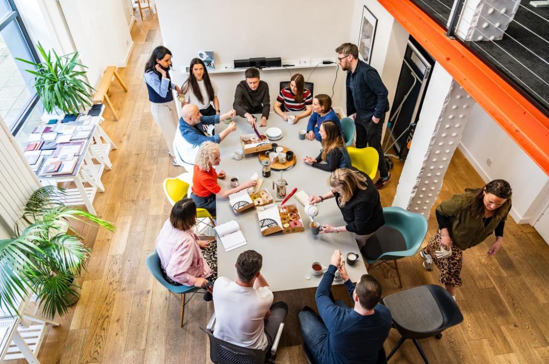
The concept of the office has changed beyond recognition over the past 18-months. As well as including a dedicated workplace, it now extends to kitchen tables, conservatories, bedrooms and everywhere in between.
With this in mind, and as our internal environment has never been more important to our physical and emotional wellbeing, Kathryn Lloyd, colour specialist from Crown Paints, takes a closer look at how the use of colour can have a profound effect on how we view and use the spaces in which we work.
As we slowly adjust to a ‘new normal’, one of the lasting effects of the pandemic is that it has forced many people to re-evaluate how they work. Depending on the job at hand, where possible, more people than ever have been forced to work from home. And this has led to a louder call for flexibility going forward.
So, what does this mean for the future of commercial office spaces? How will they look and what design features will need to be incorporated to inspire a generation of unsettled workers and to keep everyone safe in these challenging times? The answer is by no means black or white – but Crown believes the use of colour is a good place to start.
Setting the tone
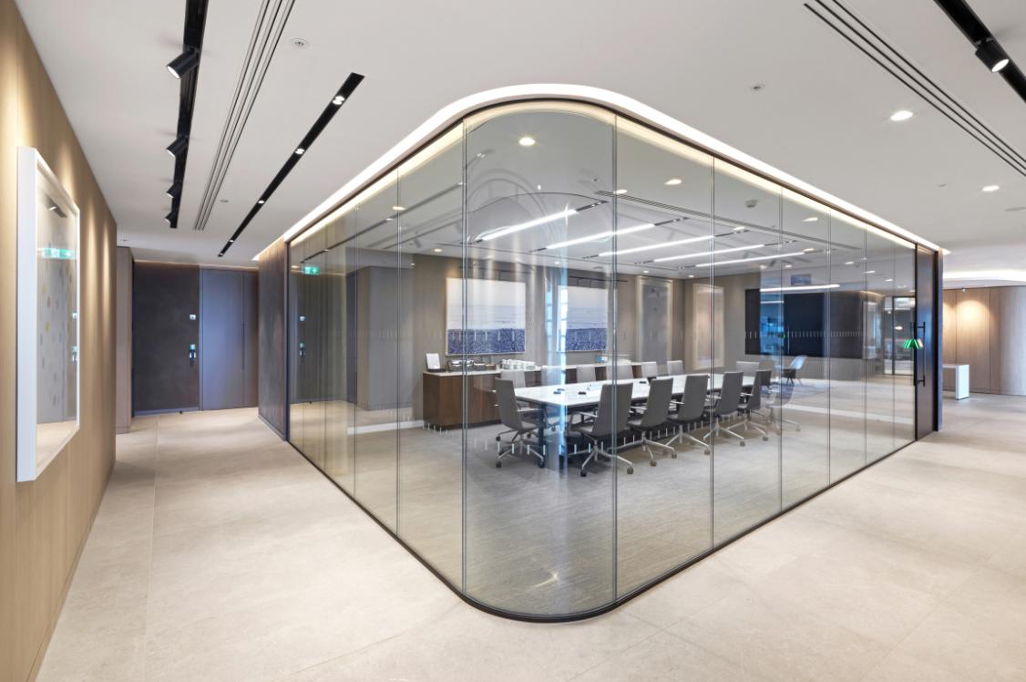
When it comes to creating an office space, to some extent design flexibility will inevitably be affected by the need to make premises COVID-secure. The layout of rooms will have to be modified to be able to adhere to social distancing requirements and so the positioning of desks, for example, will be guided more by safety measures than aesthetic appeal. Many areas will also need to incorporate additional signage and this will obviously impact on the overall design scheme. However, designers don’t have to be limited when it comes to colour schemes.
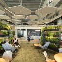
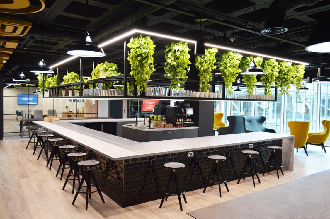
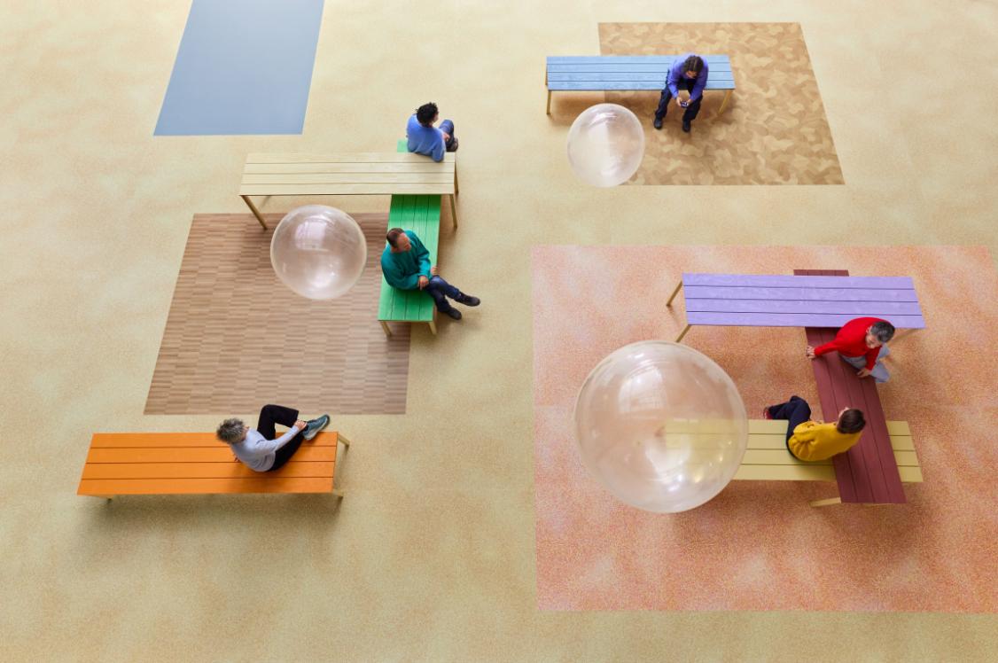
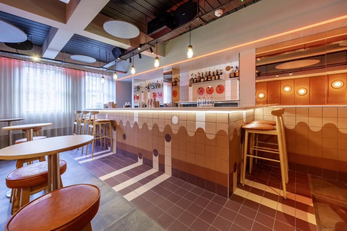
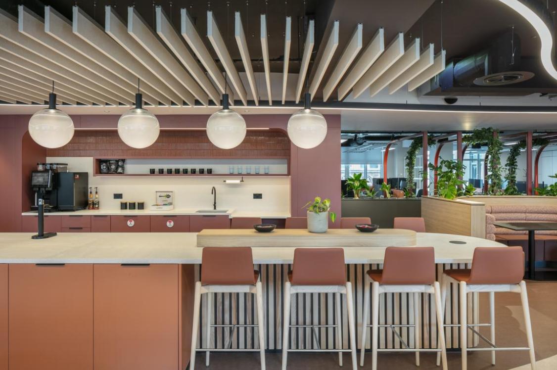
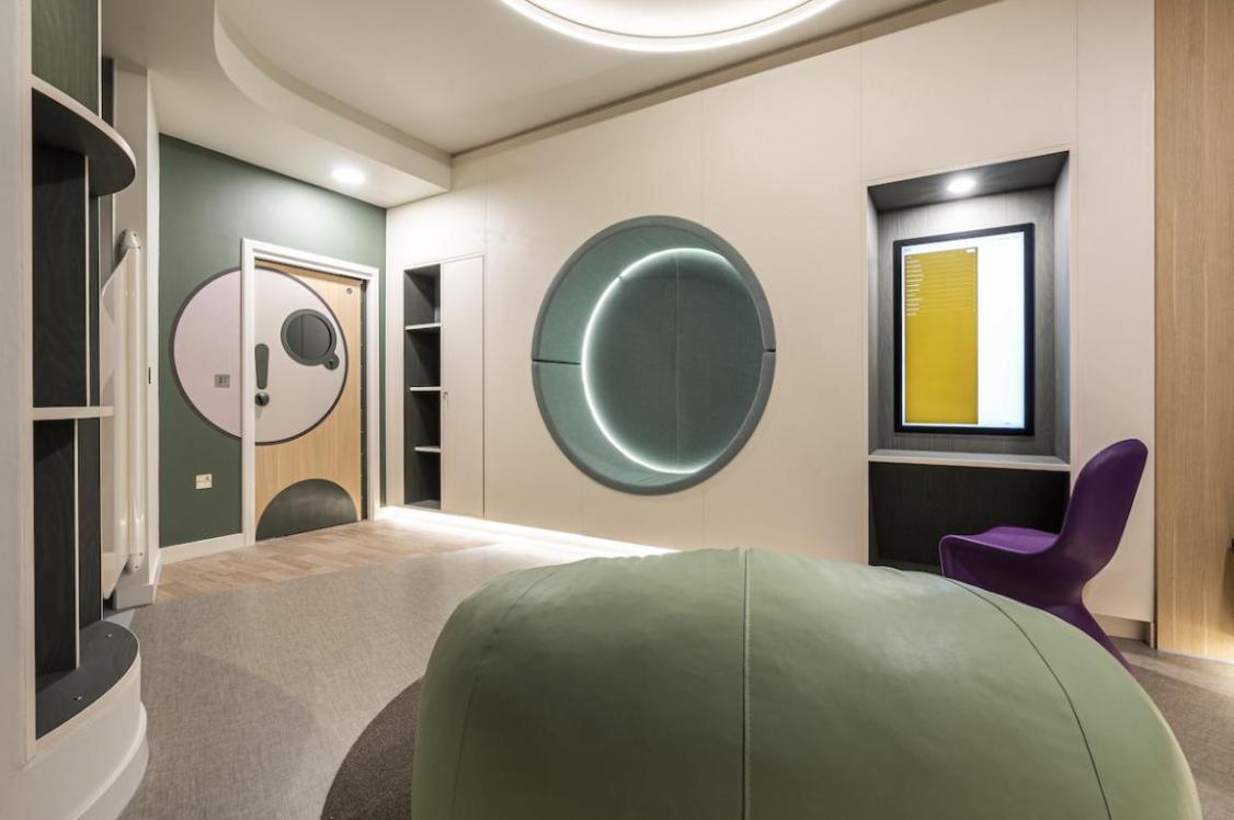
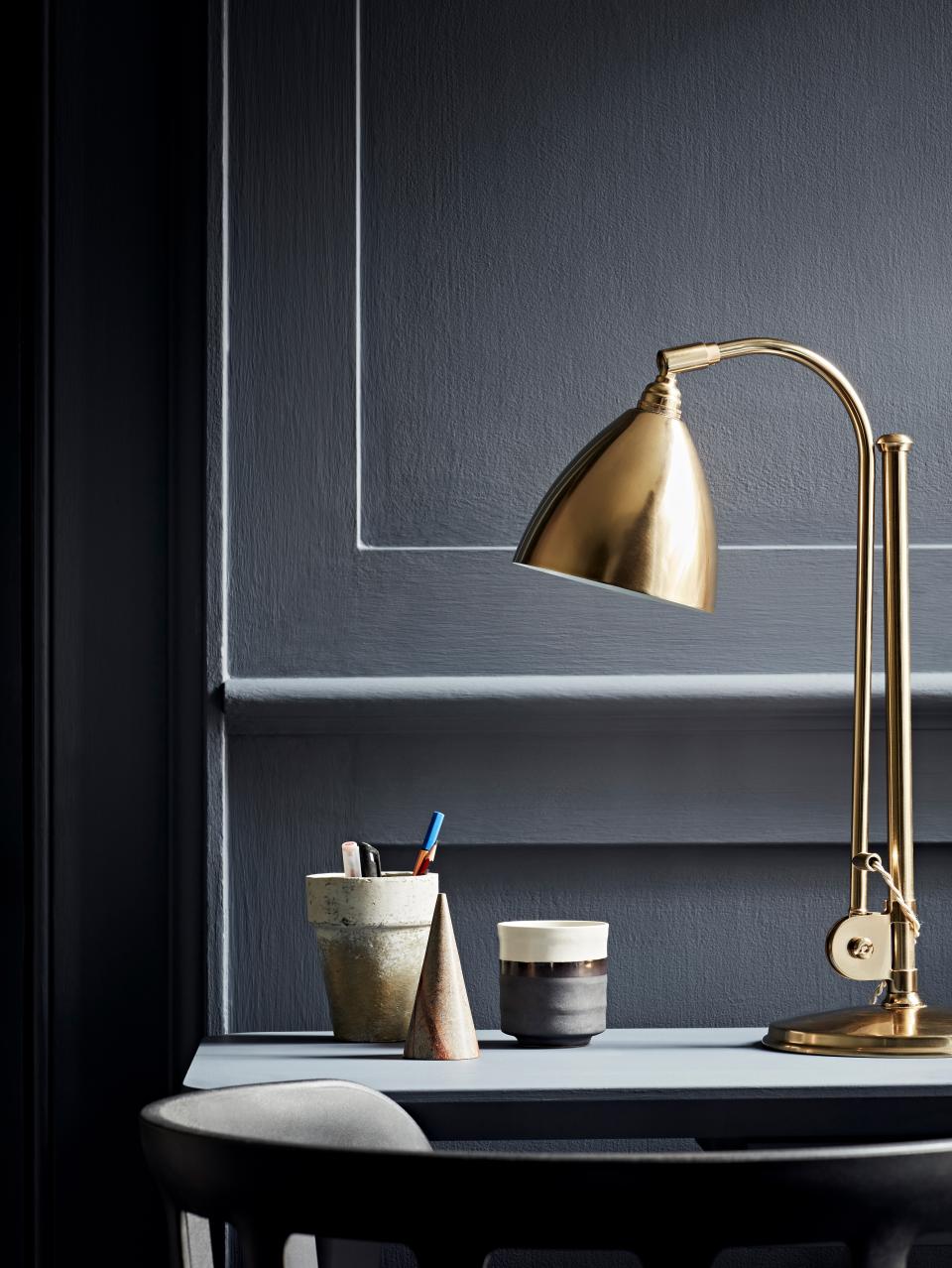
Colour is an effective way to create clearly defined areas but as well as having a practical benefit, colour can also play an important role in boosting the productivity and wellbeing of employees.
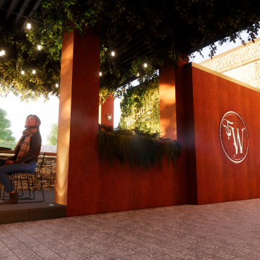
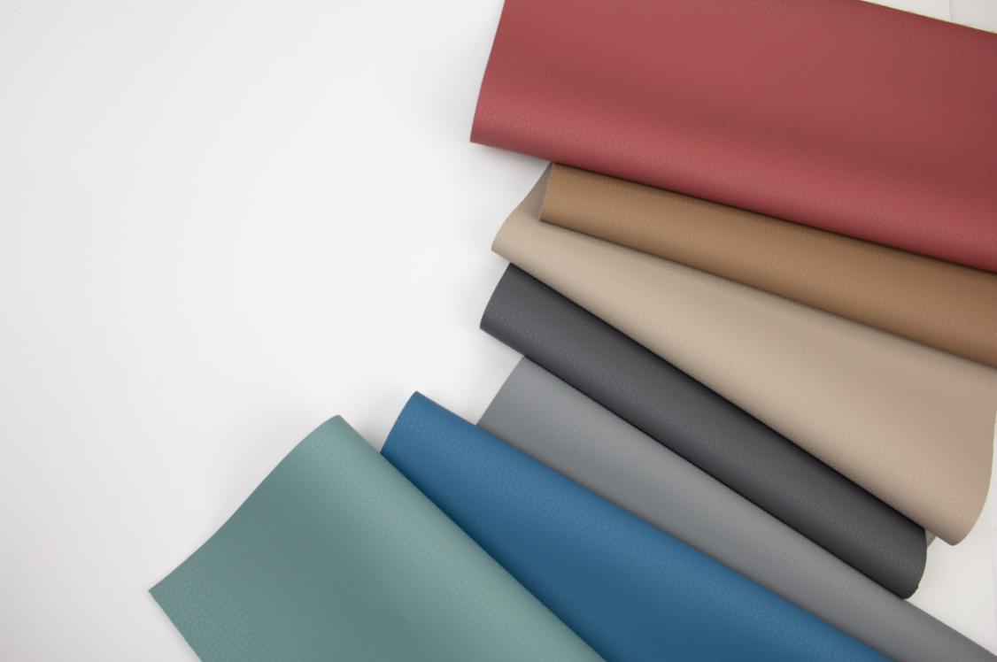
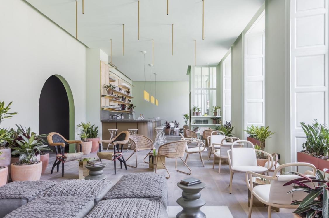
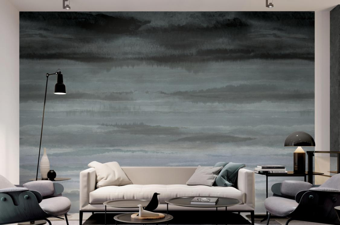
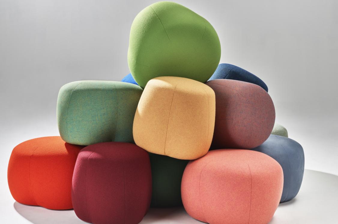
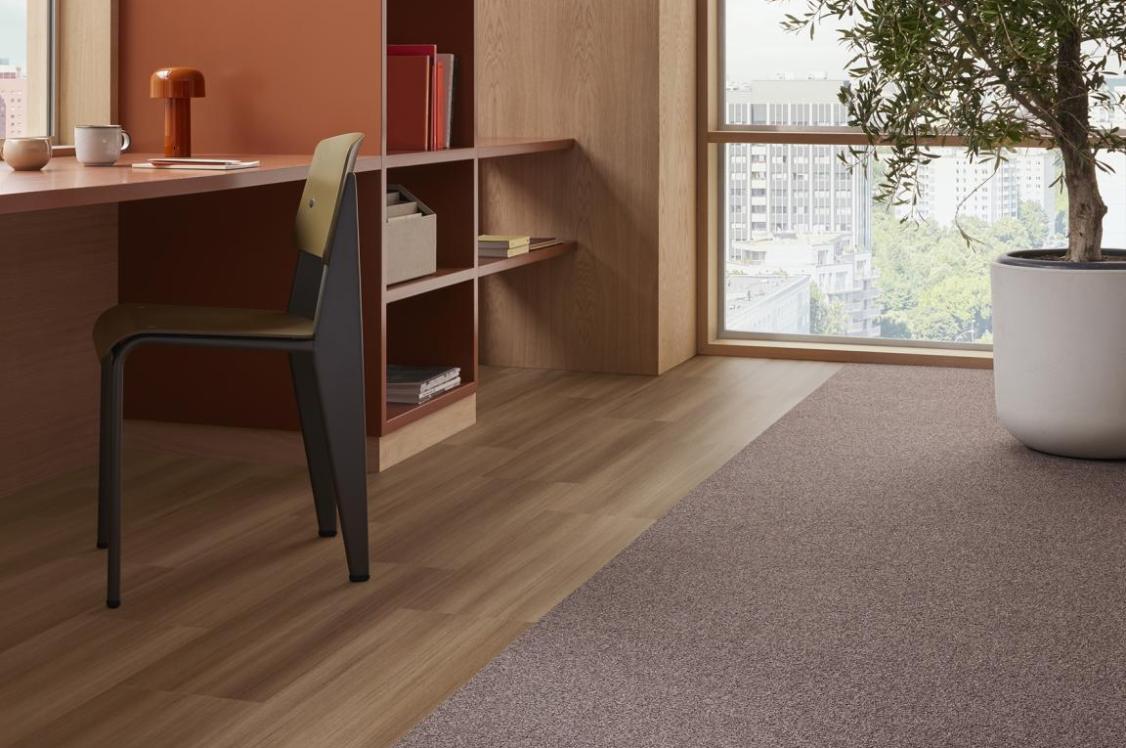
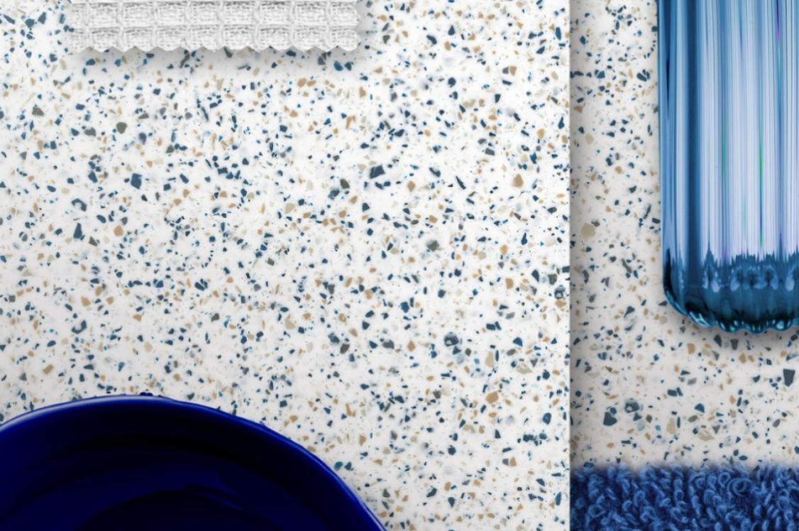
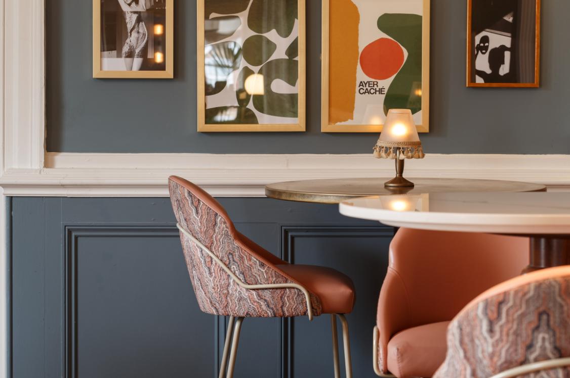
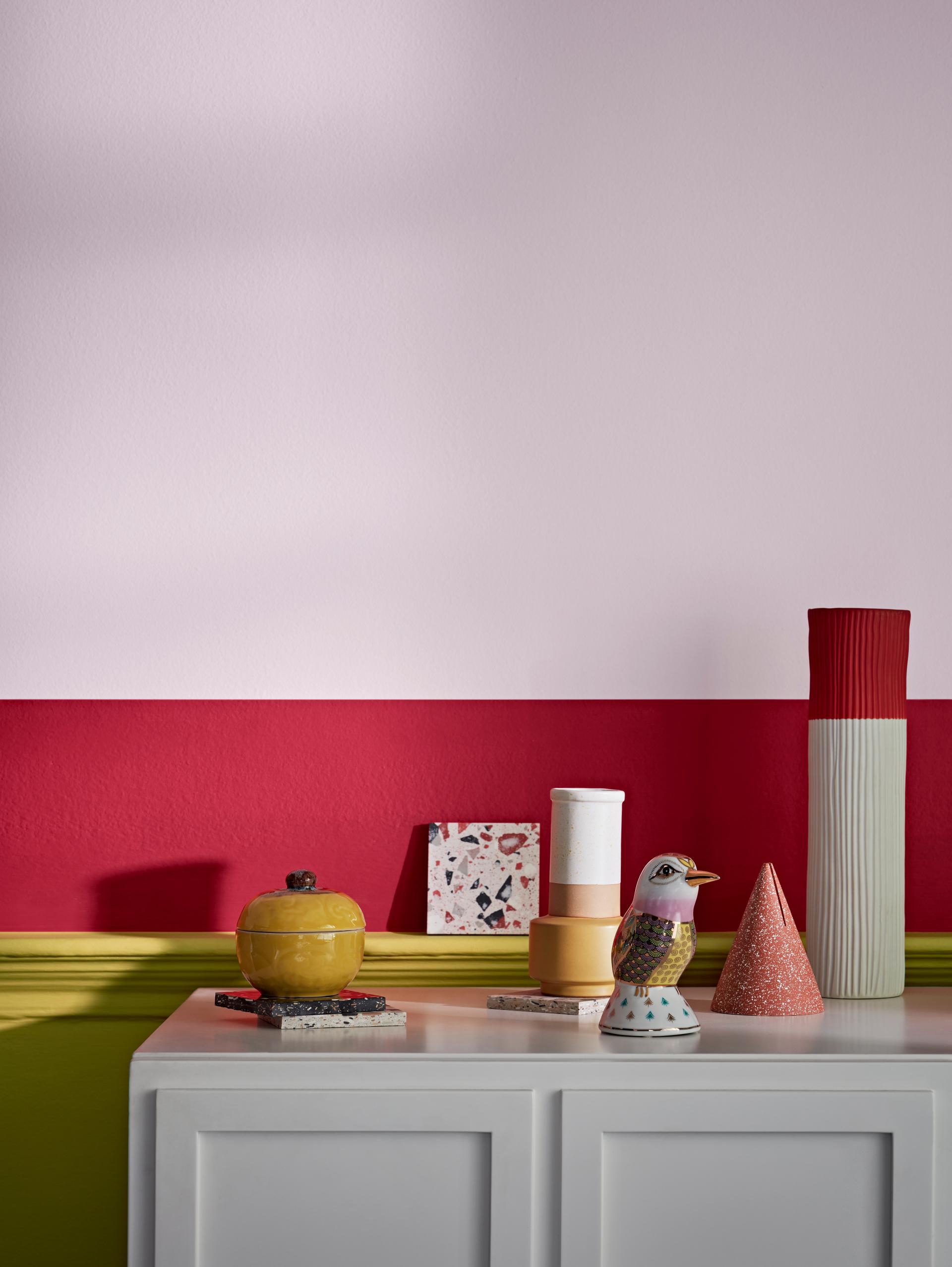
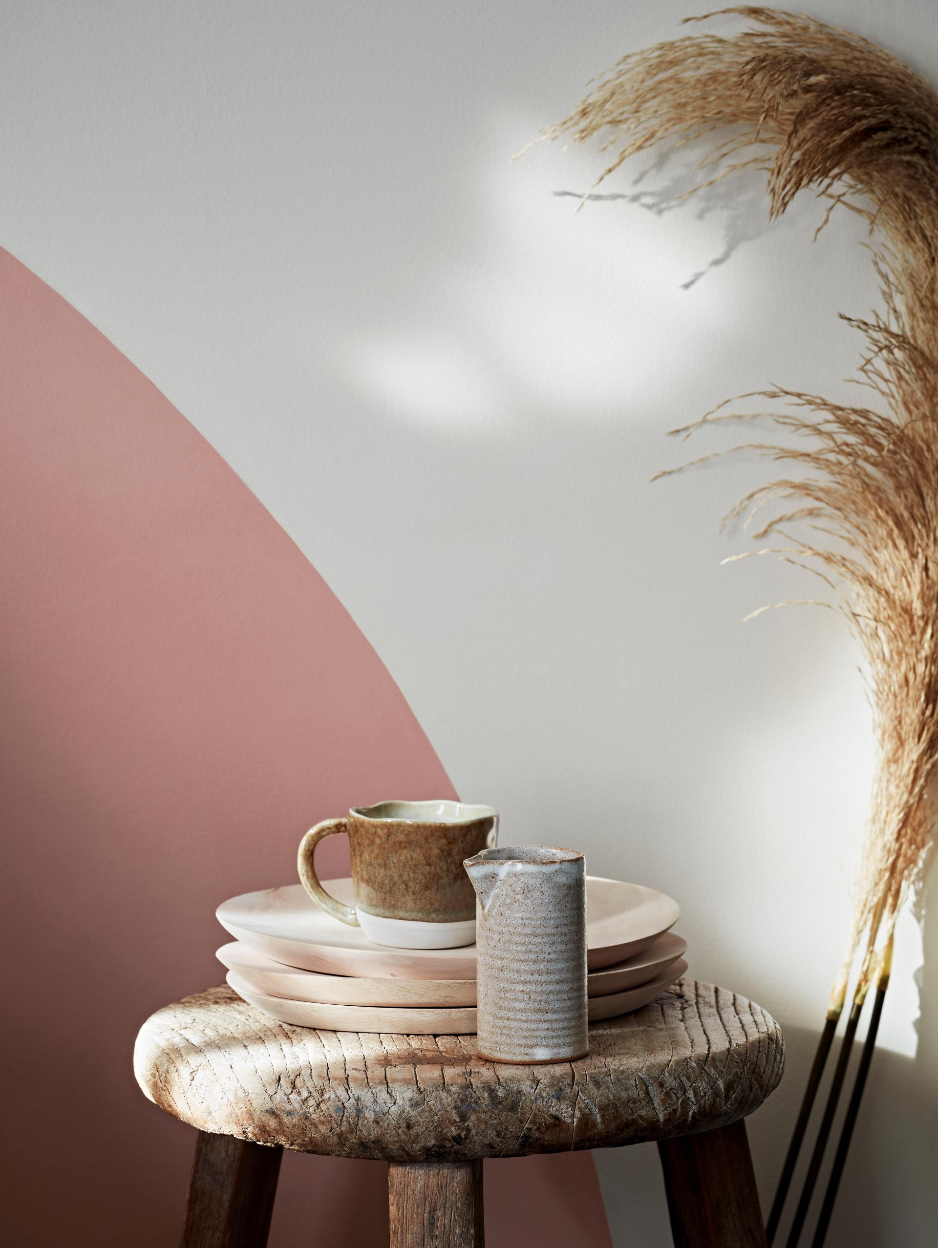
Green and blue tones are popular choices for workplaces as cooler colours can help create a calm ambience which is ideal for concentration and focus. Warmer shades such as red, orange and yellows, which can evoke a much stronger emotional response, are often used in more social breakout areas. Lighter colours can open up a space and lend themselves perfectly to communal work areas, whereas darker shades can make an area feel more enclosed and private and so are ideally suited to meeting rooms.
With the growth of video conferencing technology replacing face to face meetings, there is also scope to use bolder colours or patterns to create a striking feature wall and an eye-catching backdrop for those online calls and presentations.
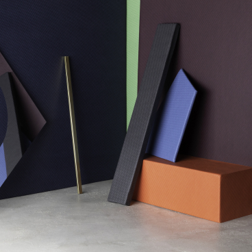
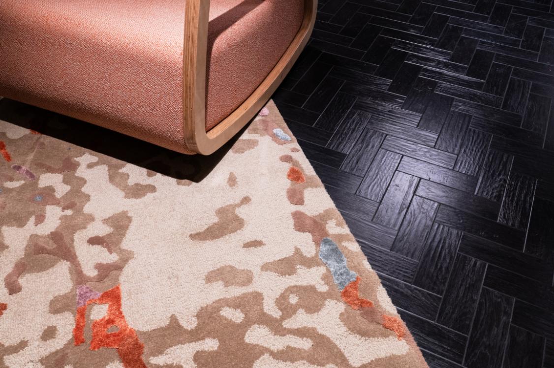
Although the psychology of colour is a fascinating subject, it would be limiting to dismiss the full spectrum of colours without careful consideration – it is often less about the specific colour choice itself than how and where it is used, the tones that can be created and how these can work with other colours.
This is why Crown Paints works with its clients to create colour schemes that comprise both contrasting and complementary colour choices. Quite often, businesses will want to incorporate their own brand colours into their scheme and this is much more effective if you consider all the different shades and tones available to create a palette.
Colour your thinking
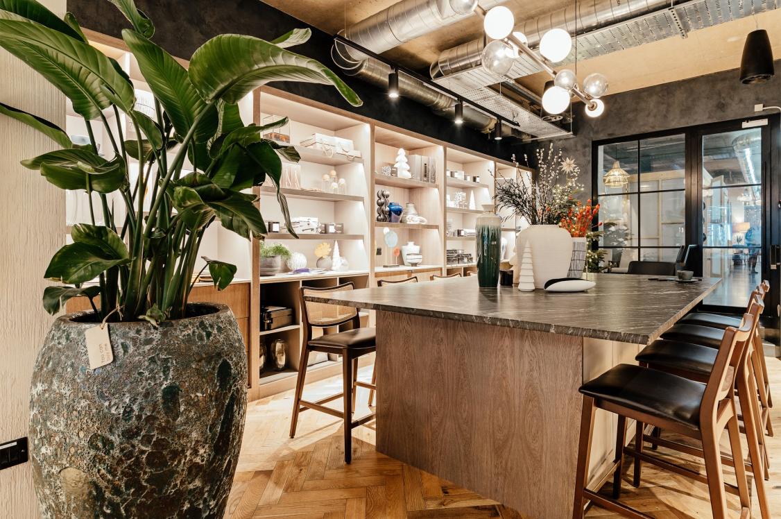
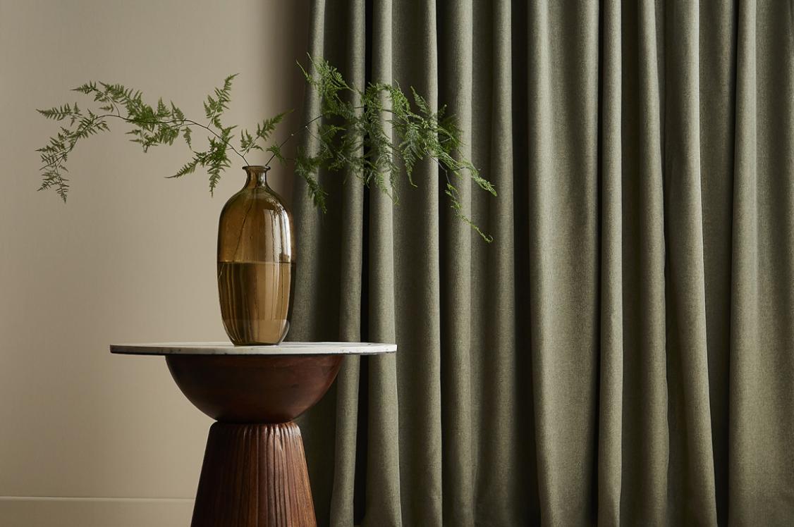
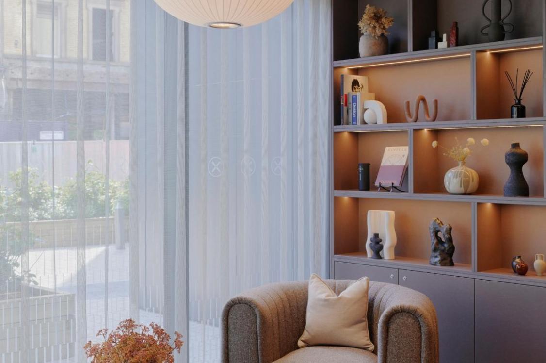
Once a colour scheme has been chosen, it’s important to take into account the specific requirements of office workers who, for the most part, spend the majority of time at their desks. One of the most important factors to consider is the use of natural lighting and how this can influence everything from your internal body clock to the perception of colour itself.
Daylighting is not only more sustainable than the use of artificial lighting but naturally-lit rooms can also boost mood and productivity. In small rooms, the use of pale colours can create a sense of space but in harsh sunlight, can appear either too clinical or in the case of brilliant white, too brilliant.
Softer mid-tones often work well when used on walls and ceilings and can provide a suitable focal point for resting eyes after staring at a computer screen. Colours can look very different in different light so it’s important to consider what shadows, glare and contrasts will be created throughout the course of a day. As well as considering the specific layout and orientation of a room and its light sources, Crown Paints is also able to advise its clients about how specific colours will appear in different lights using the colour rendering index.
Practical paintwork
Although many people will be continuing to work from home for the foreseeable future, more and more business are welcoming back their employees and a key part of this process is ensuring that a robust cleaning programme is in place. With maintenance requirements, and therefore costs, set to increase, it’s important to consider the longevity of the interior decoration.
Choosing a washable and hardwearing paint product that can be repeatedly cleaned without any detriment to the opacity and quality of the paint finish can make important long-term savings. Crown Trade’s Clean Extreme range also includes an anti-bacterial paint solution which can further help to maintain cleaner and more hygienic interiors.
Just as the rainbow has becomes the unofficial symbol of lockdown, colour will undoubtably play an important part in redesigning the world in which we live and work, particularly as the boundaries between the two have been blurred for so long for so many. Embracing colour at a time of social distancing can give offices the boost they need to stay positive and productive, and create a stronger link between wellbeing and work.

In association with
We believe that every pot of paint is brimming with potential. And we want to put that in the hands of everyone. Because with paint, you can change a room, change a mood, even change a life.