

Intervallo by Hannah Drakeford Design celebrates the art of the aperitivo.
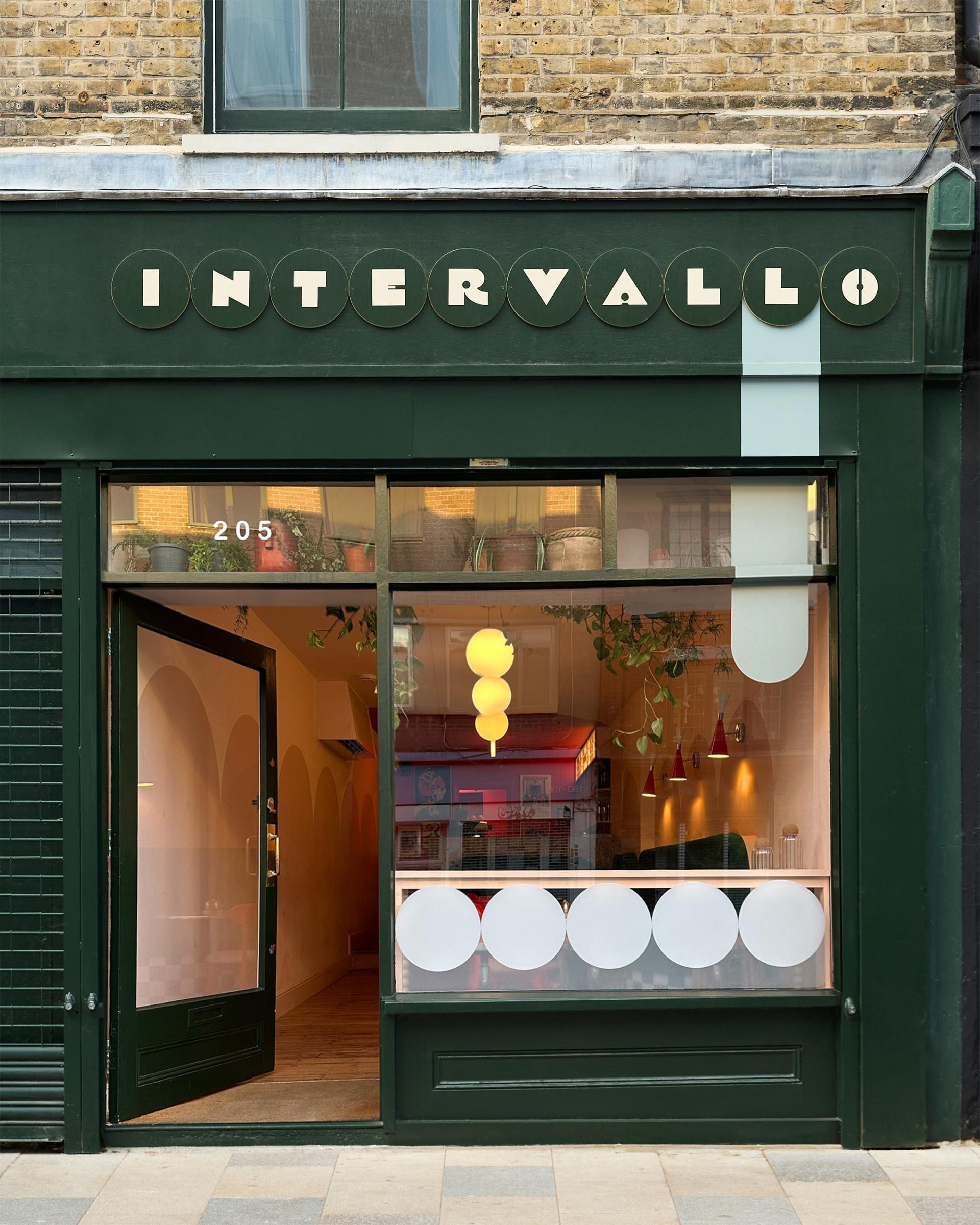
Intervallo is an aperitivo bar on Deptford High Street that celebrates the pause - the moment in between. Its name translates literally from Italian as “the interval,” referencing the cherished aperitivo ritual: that unhurried window between lunch and dinner when friends gather to share small plates, sip something refreshing, and slow down together.
For founder Alessandra, Intervallo is the culmination of a decade-long dream. Having moved to the UK from Italy ten years ago, she quickly realised how much she missed the social rhythm of aperitivo culture - informal, joyful, and deeply rooted in everyday life. The bar is her way of bringing a slice of that culture to London, reinterpreted for a contemporary Deptford audience.
Designed by local studio Hannah Drakeford Design, based just ten minutes from the site, the project carries a strong sense of place and personal connection. Alessandra initially contacted the studio without realising how close by they were, a coincidence that makes the project especially meaningful: a collaboration rooted in the same neighbourhood, on the designer’s own local high street.
“Intervallo is designed not for rushing through, but for staying awhile, a spatial expression of aperitivo itself. In the heart of Deptford, it offers a place to pause, connect, and enjoy the interval,” - Hannah Drakeford
From the outset, the brief called for a space that would stand out against its surroundings while remaining intimate and approachable. The interior needed to feel unmistakably Italian without leaning on cliché - bold in colour and atmosphere, yet warm, informal, and human in scale.
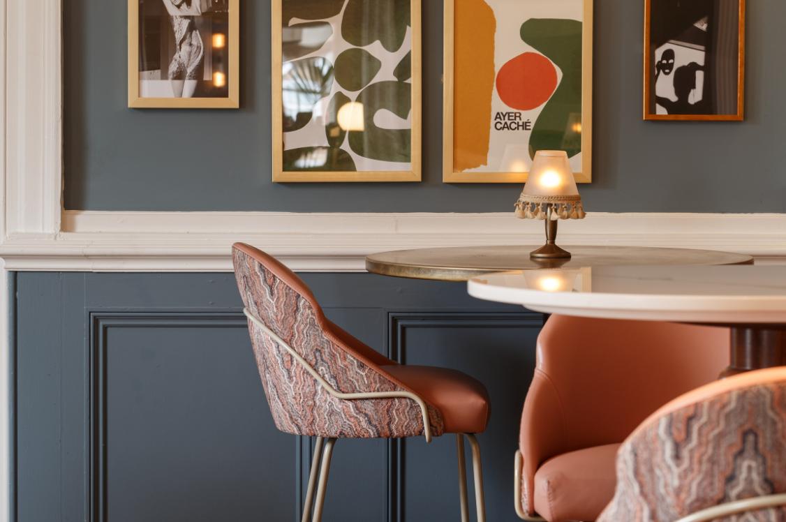
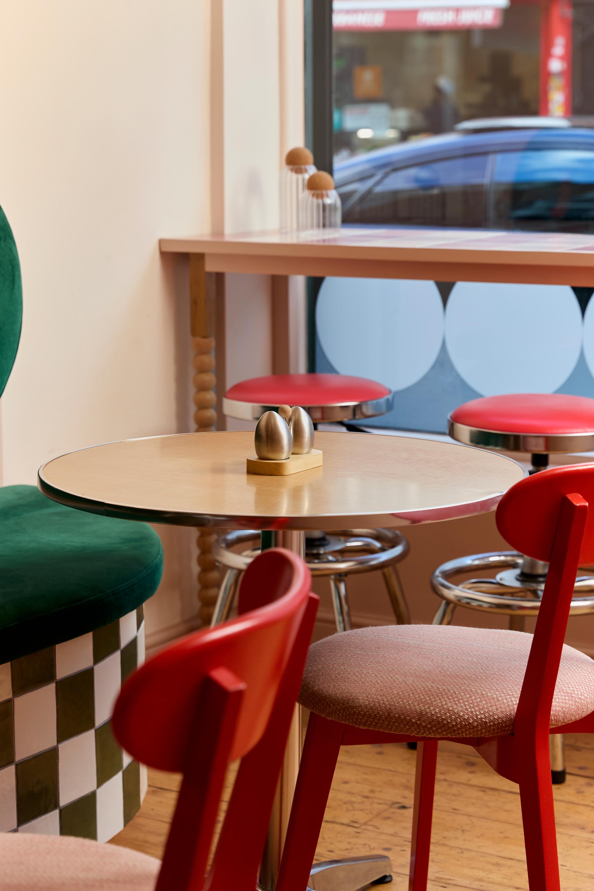
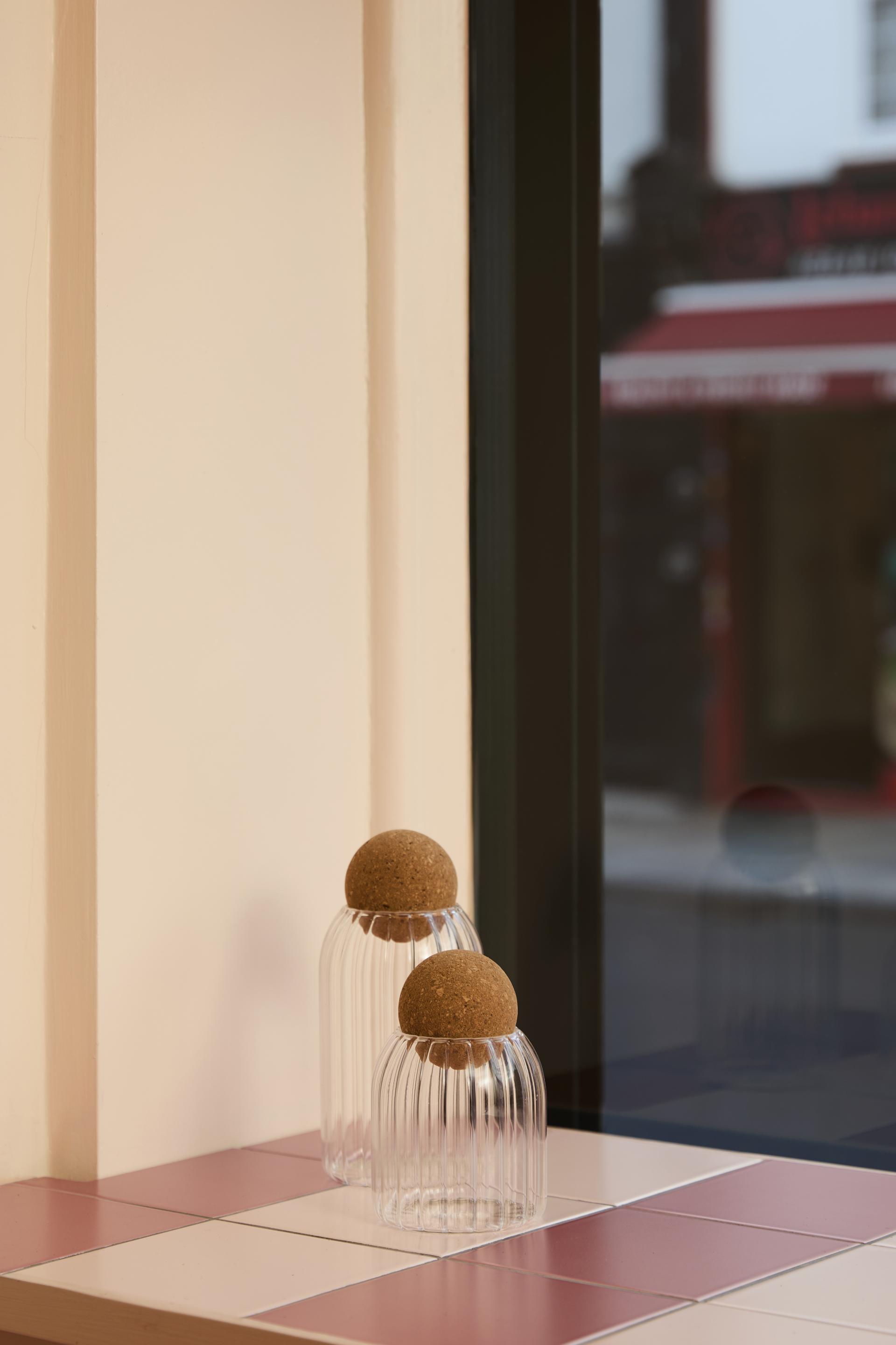
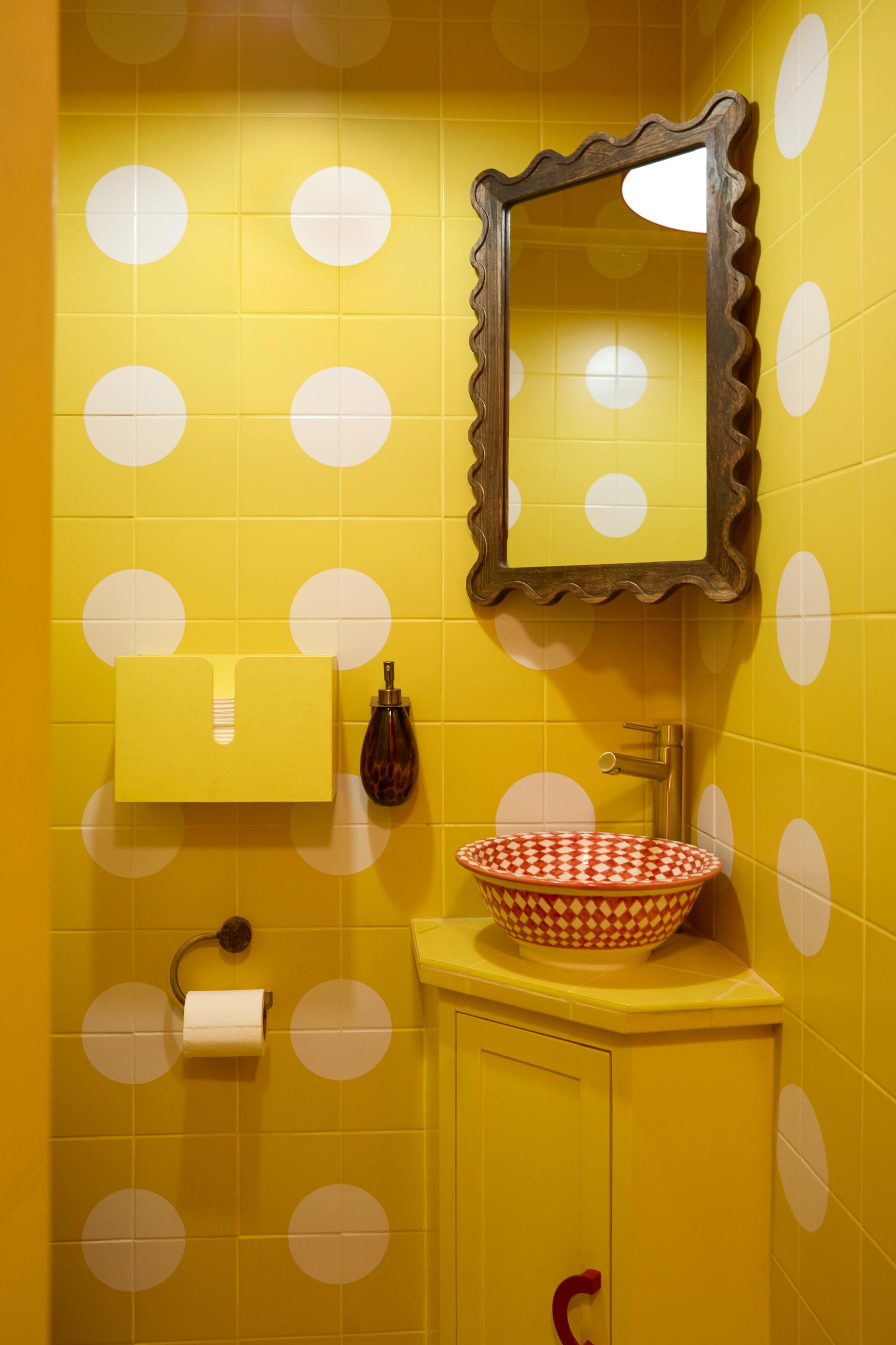
The design is anchored by a soft nude-pink base that runs throughout the space, bringing warmth and cohesion while allowing richer tones to take centre stage. Midcentury Italian–inspired accent colours are layered in to add depth and character, referencing classic cafés and bars without direct imitation.
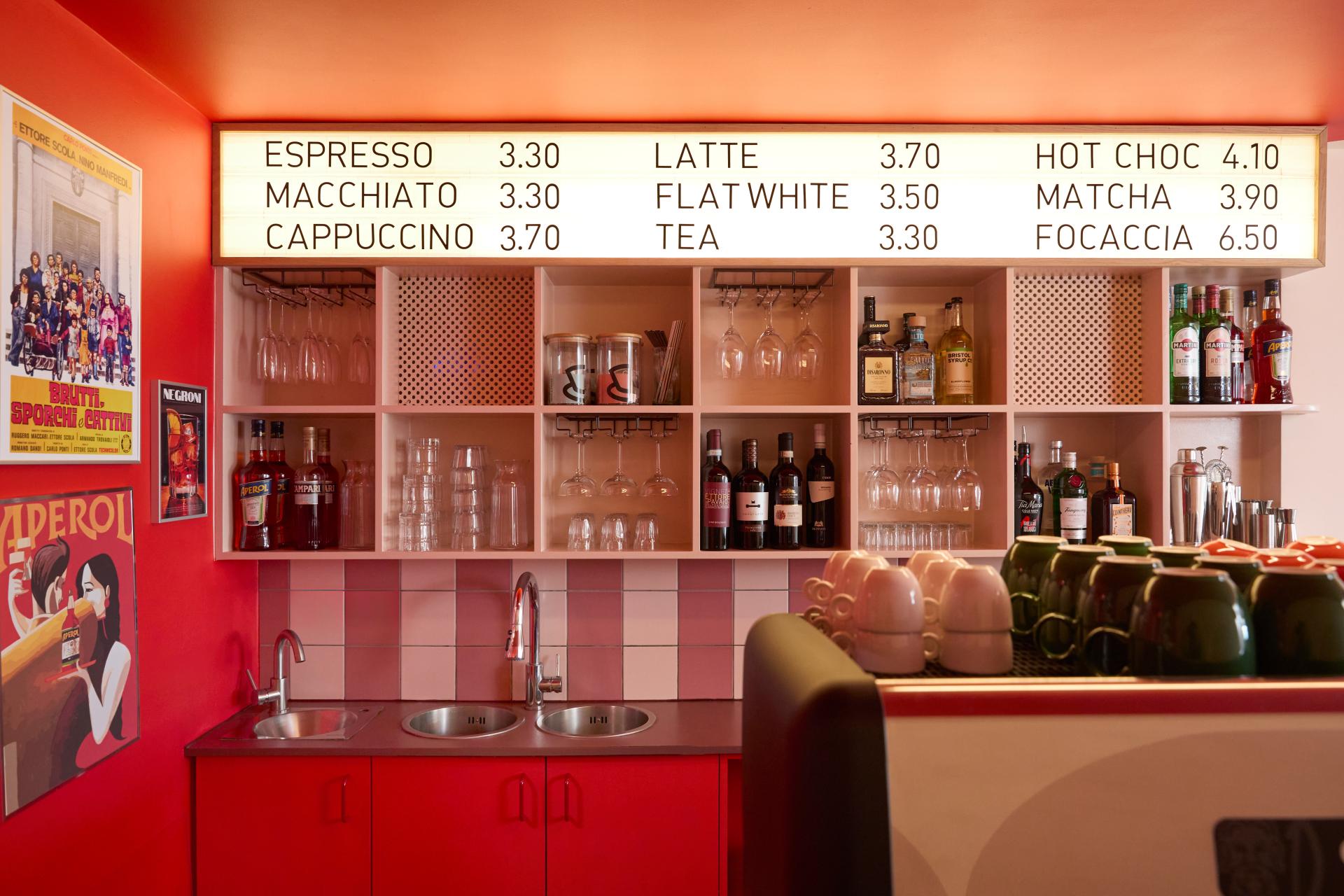
At the back of the bar, the area furthest from the street and natural light, the palette deepens dramatically. Rather than attempting to brighten the space with pale finishes, the area is enveloped in a rich blood red. This deliberate shift creates a sense of cocooning and intimacy, drawing guests through the space and encouraging them to linger and maybe strike up conversation with the staff.
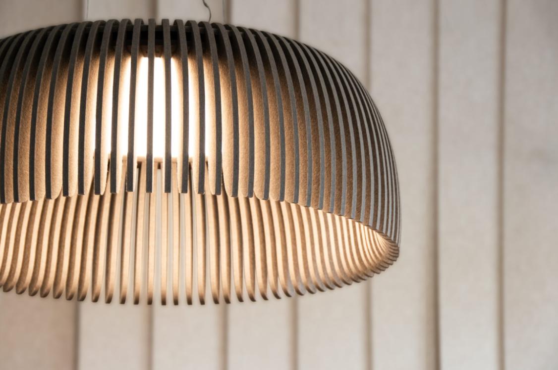
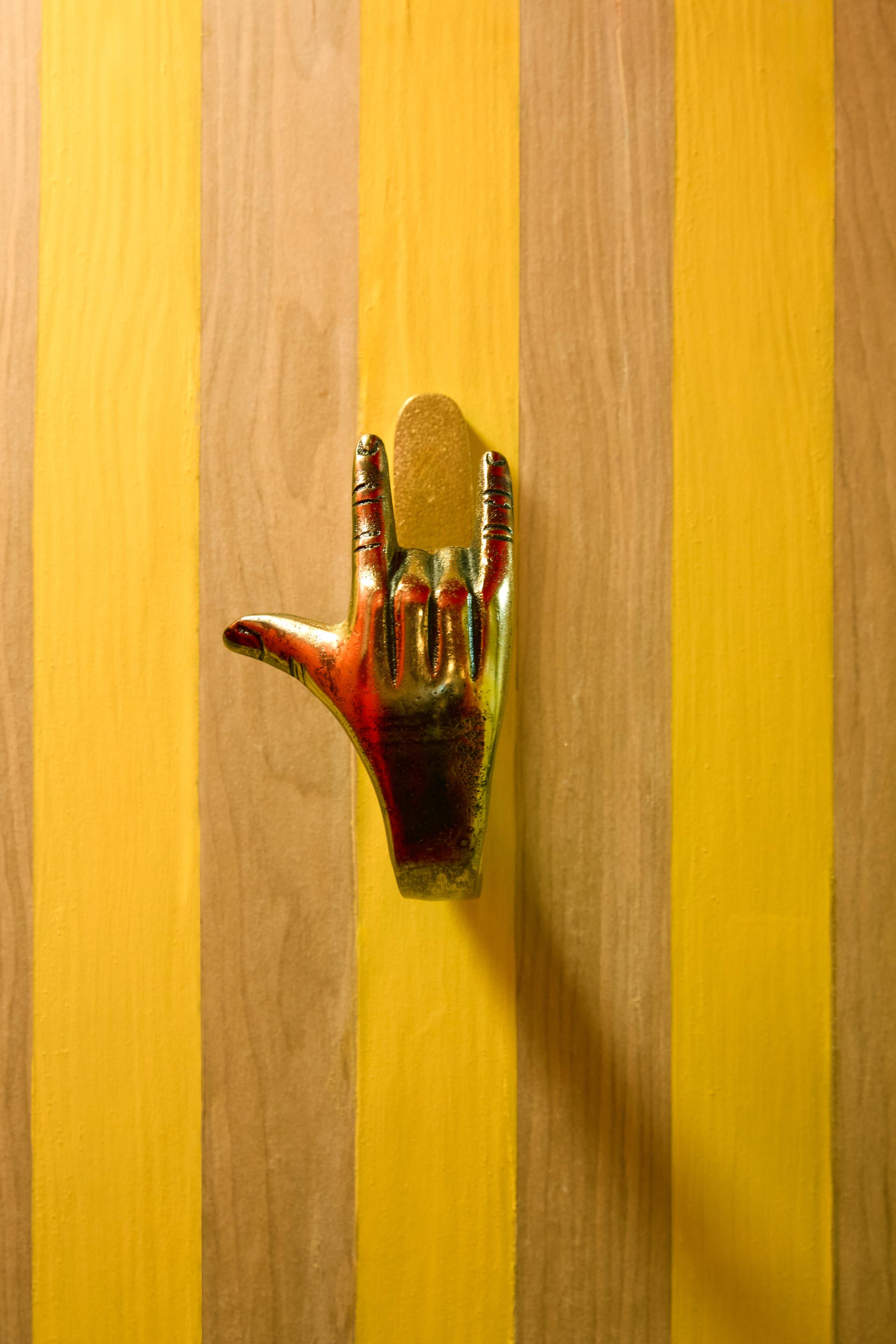
Against this saturated backdrop, the illuminated menu board glows a rich warm hue, becoming a focal point that punctuates the depth of the interior. The bar itself forms the visual and social heart of the space, wrapped in a Sottsass-inspired veneer that introduces pattern and playfulness. Retro references are woven throughout: a Forbo Marmoleum marbled red floor, vintage bistro-style tables, and graphic lighting elements that nod to Italian café culture while remaining firmly contemporary.
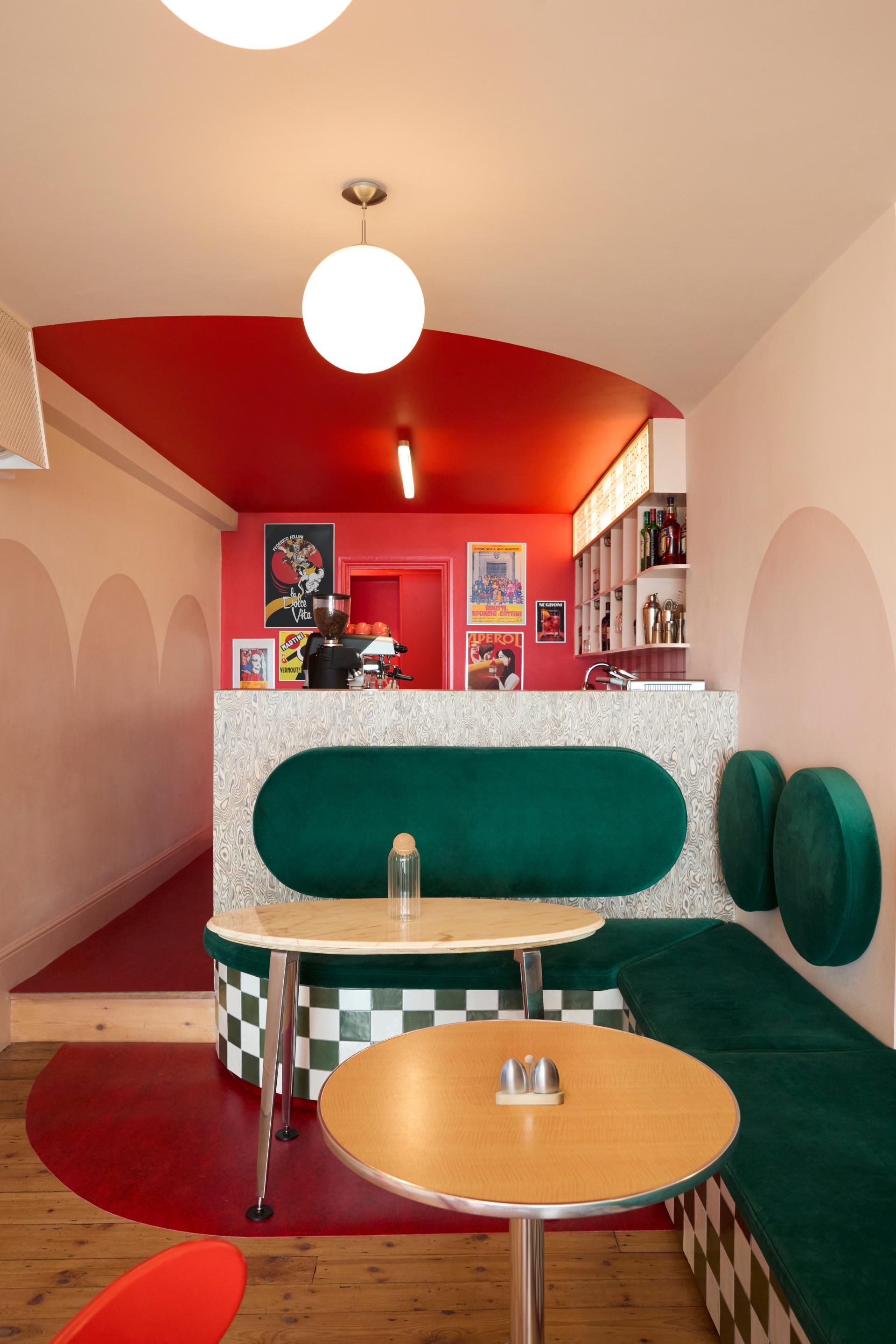
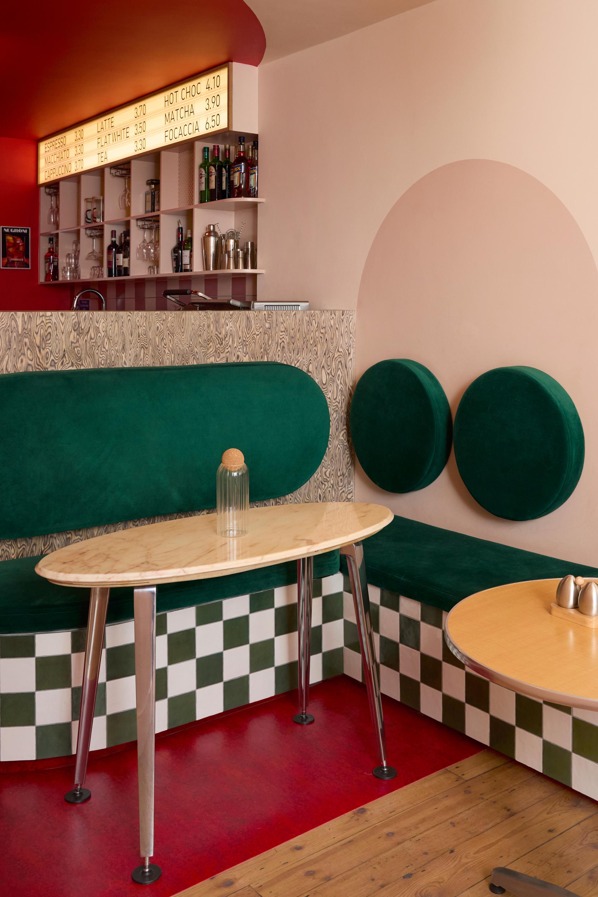
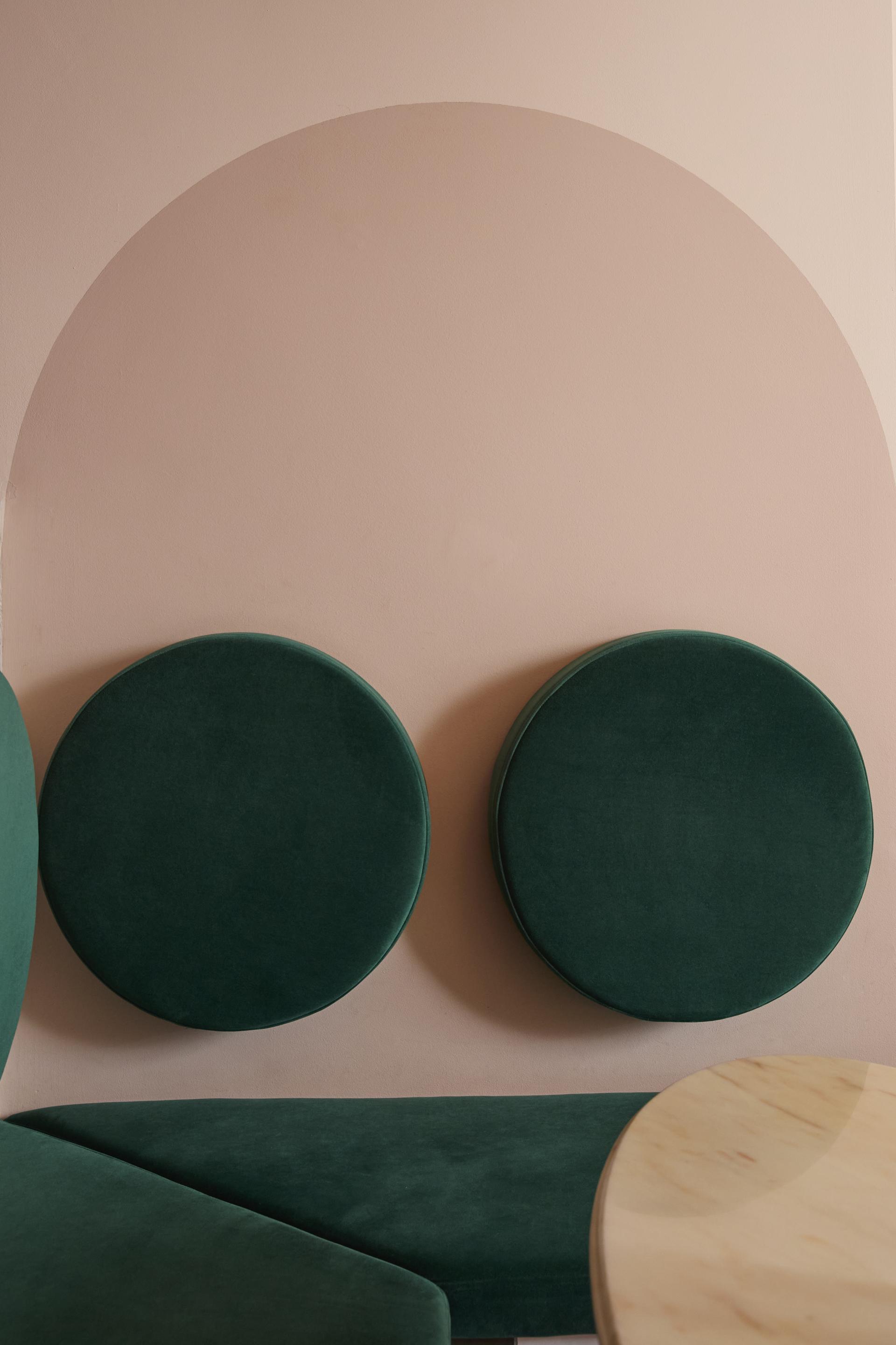
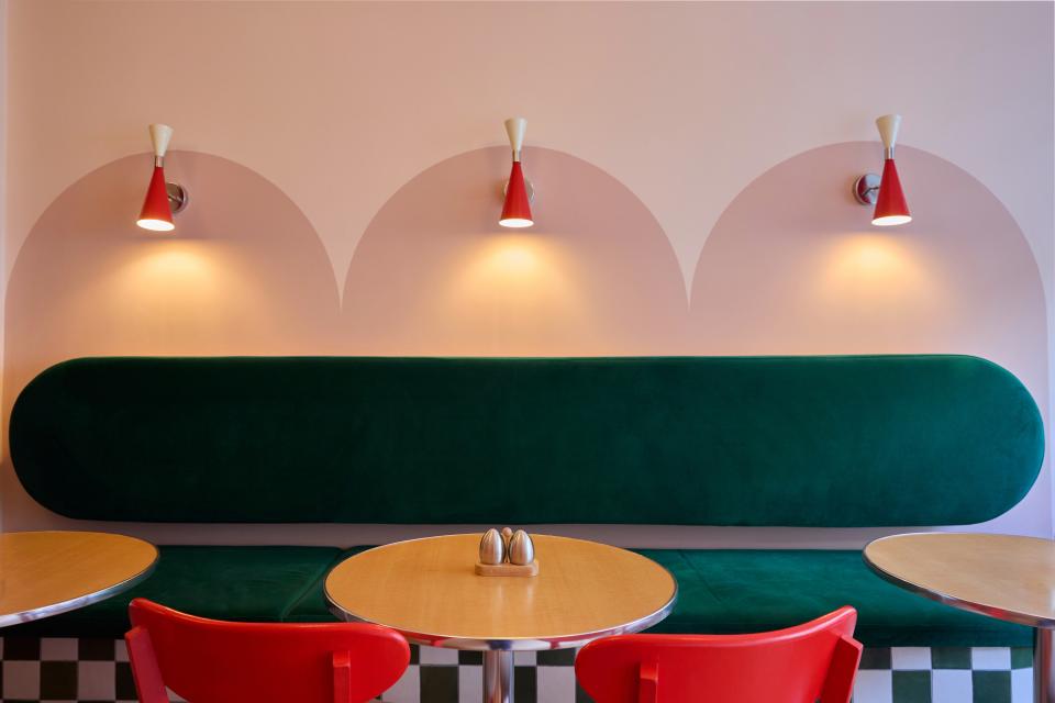
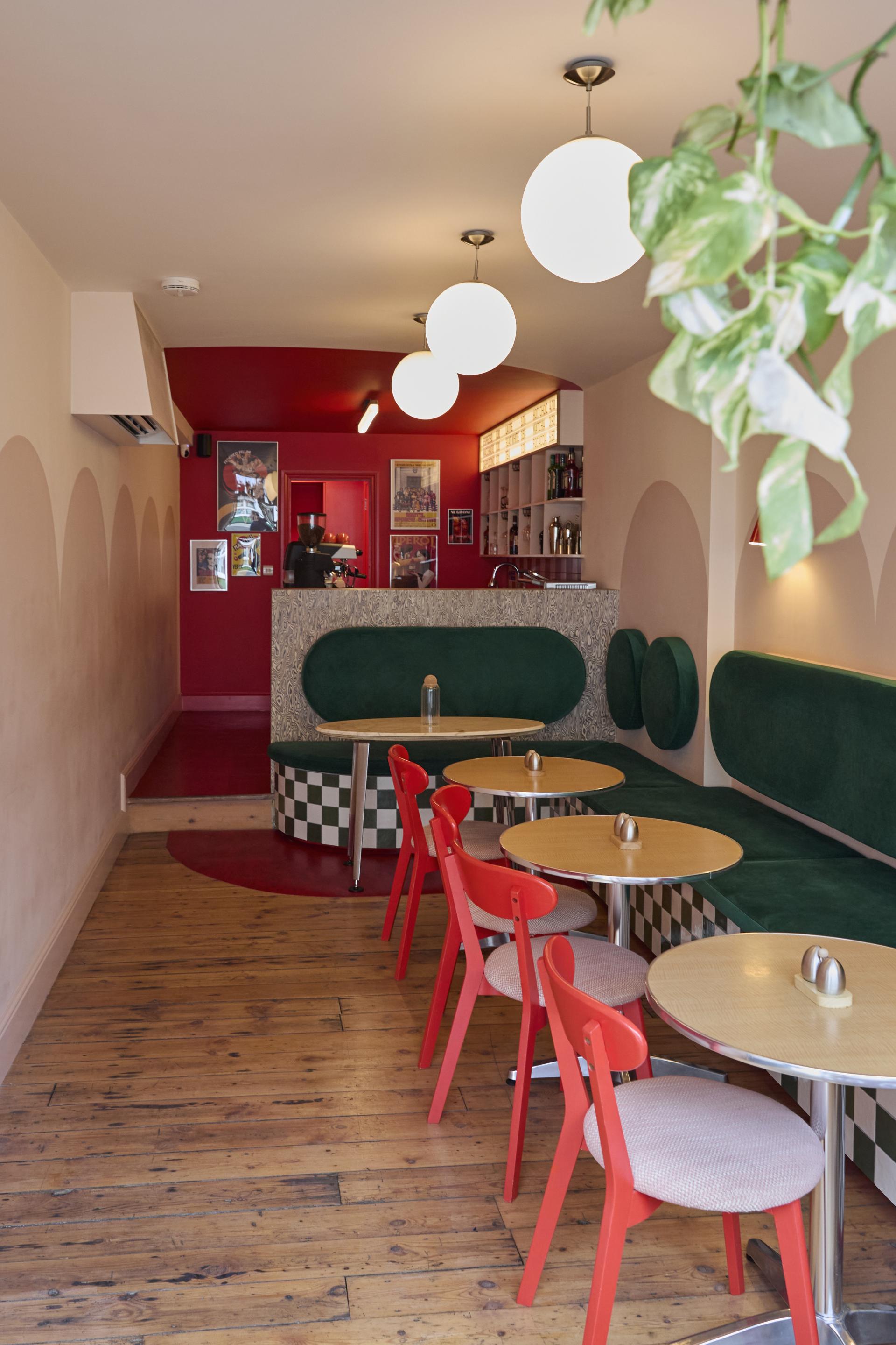
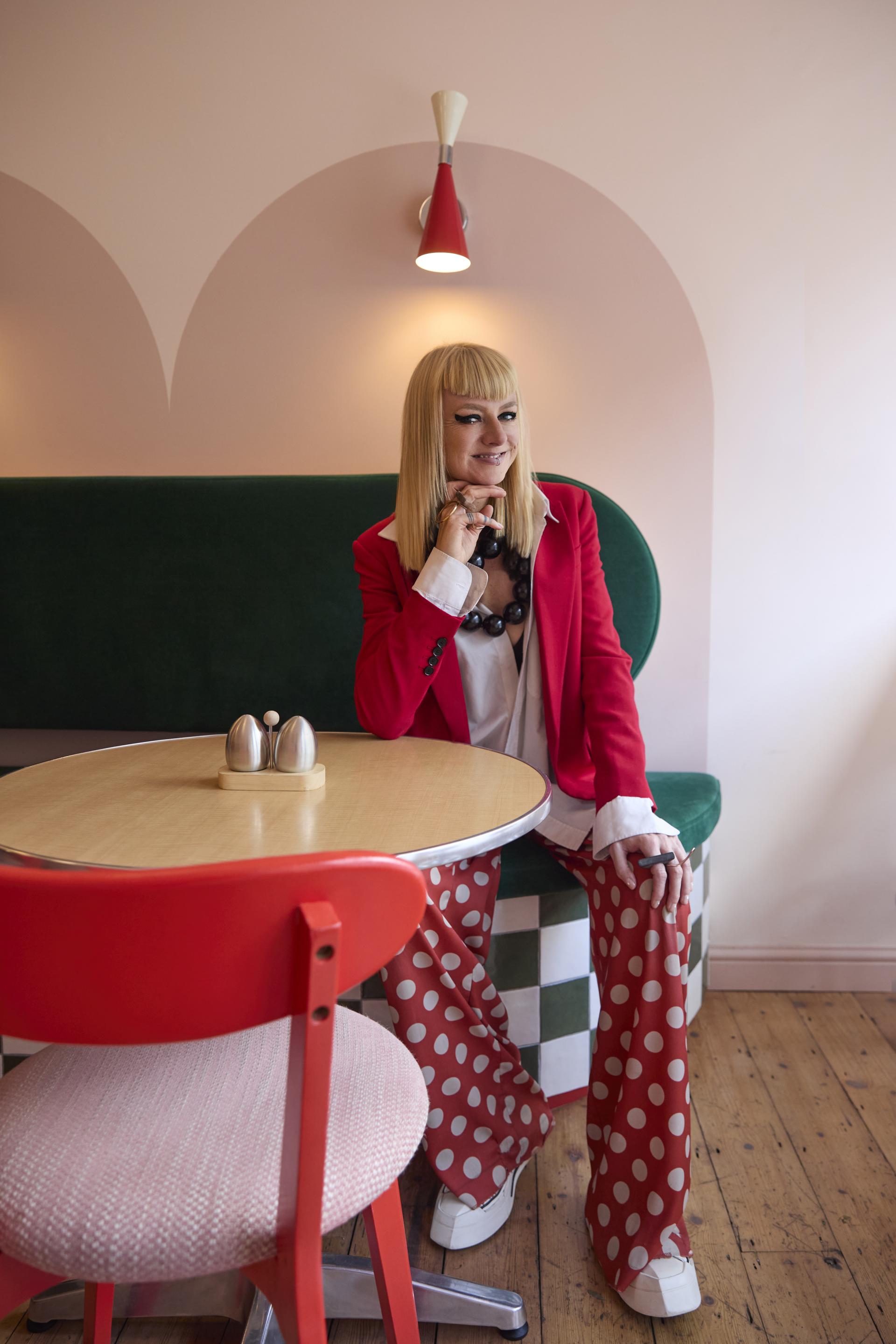
Along one side, bench seating upholstered in rich forest green plush velvet adds comfort and contrast, grounding the warmer tones elsewhere in the interior. The base of the bench is finished in green-and-cream checkerboard tiles, introducing a subtle graphic detail at low level that complements the palette without overwhelming the space.
Throughout the interior, circles, arches, and soft curves are repeated across walls, furniture, and joinery. These forms introduce a gentle visual rhythm, softening the narrow proportions of the space and guiding movement from entrance to bar. The result is an interior that feels vibrant yet relaxed, nostalgic yet modern.