SS22 colour trends from Crown Paints.
It’s no secret that colour engages with people’s emotions and trends often represent society’s collective emotional state.
In 2021 we saw trends for fashion and the home centred around ‘sanctuary’ palettes – colours known to be calming and relaxing – providing a sense of safety and serenity. Neutral hues and colours with little pigment were the favourites: warm shades of grey, white stone and taupe.
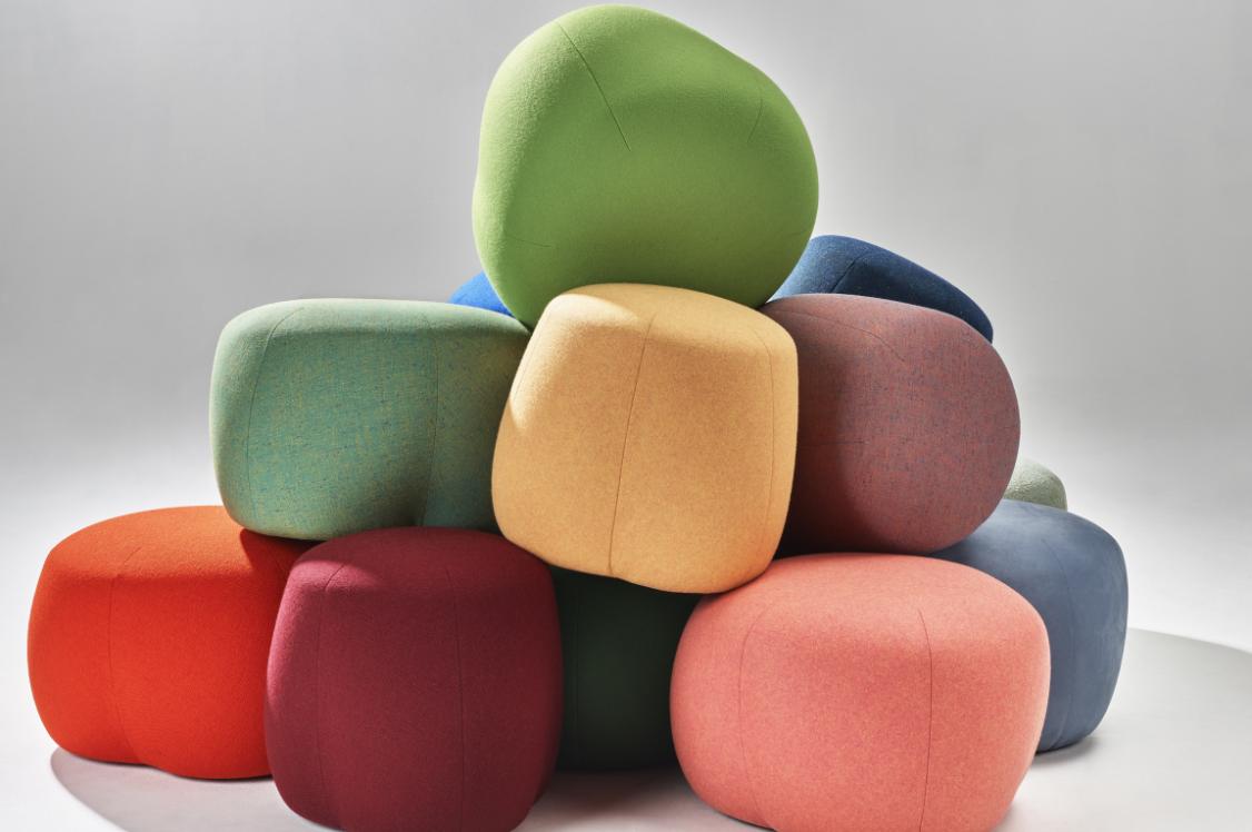
Moving into 2022 and beyond, we’ll begin to see stronger, more saturated shades emerge – especially in the world of fashion and design. After the global pandemic people are using colour to feel good. They’re bolder and braver and are excited about the possibility of re-engaging with the world. Catwalks of the most recent S/S 2022 shows were riots of colour.
Flowing fabrics in a kaleidoscope of different hues, with the most popular colours being citrus, acid pink, primary red and Persian blue. Our digital world seems to have heavily influenced designers – clothing was fluid, full of motion and almost looked animated, as the models performed, and ballet danced along the catwalks.
At London and Milan Fashion Week, deadstock or upcycled fabrics were everywhere; we’re talking billowing volumes of frills, tassels, sateen, chiffon, tulle and taffeta. Colour is making a comeback in the home too.
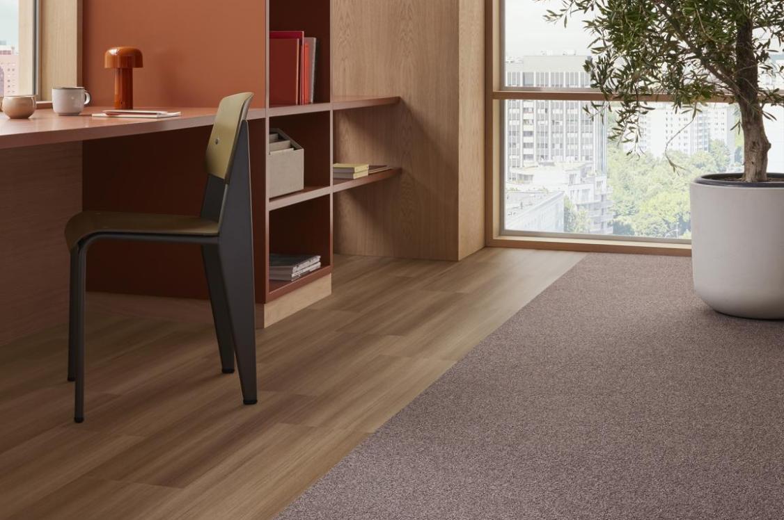
Design for the home is all about creating things which can be adapted; constructing buildings with some non-structural internal walls which can come down as and when needed; spaces to evolve; unfitted kitchen units suited to rental spaces which people can take with them when they move.
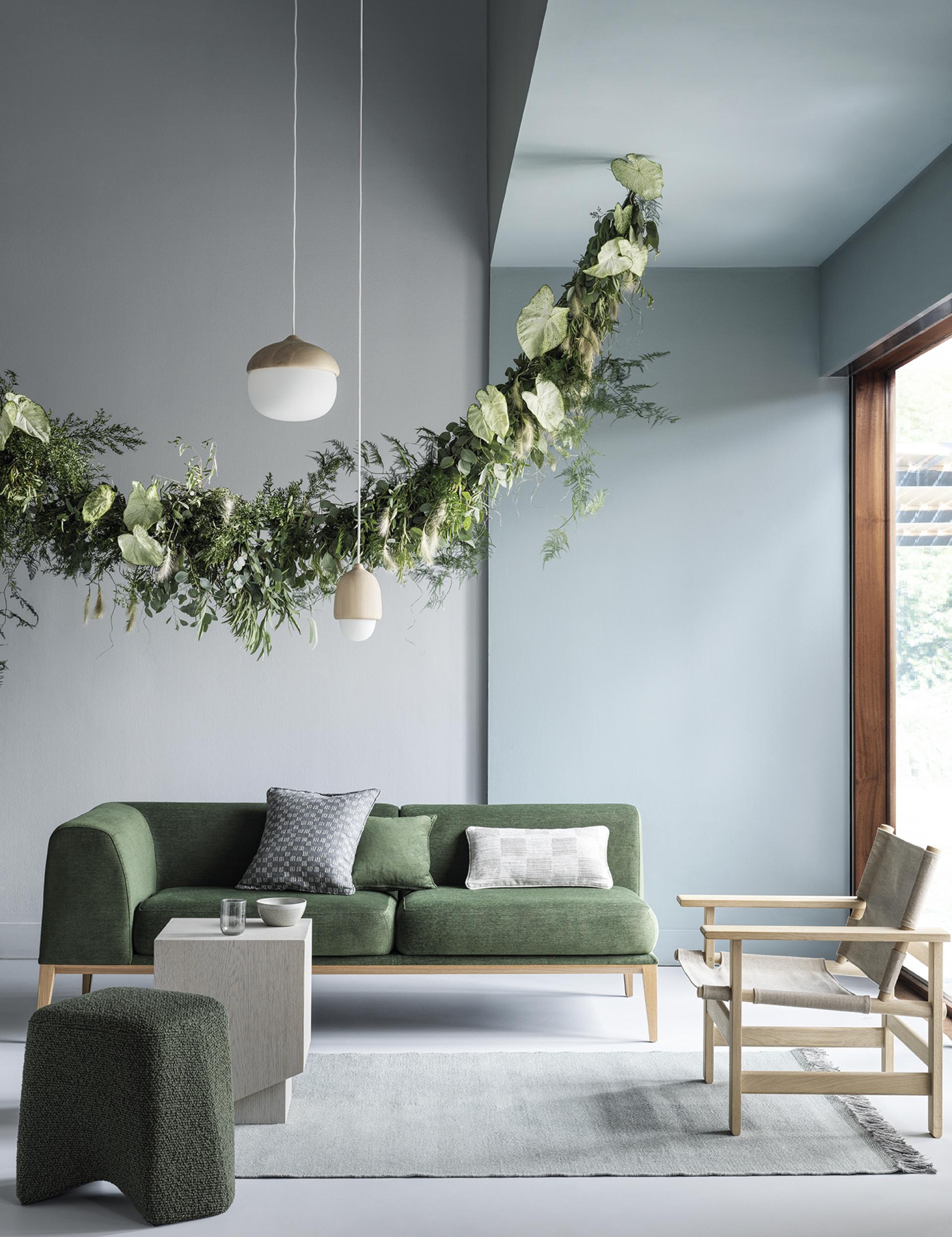
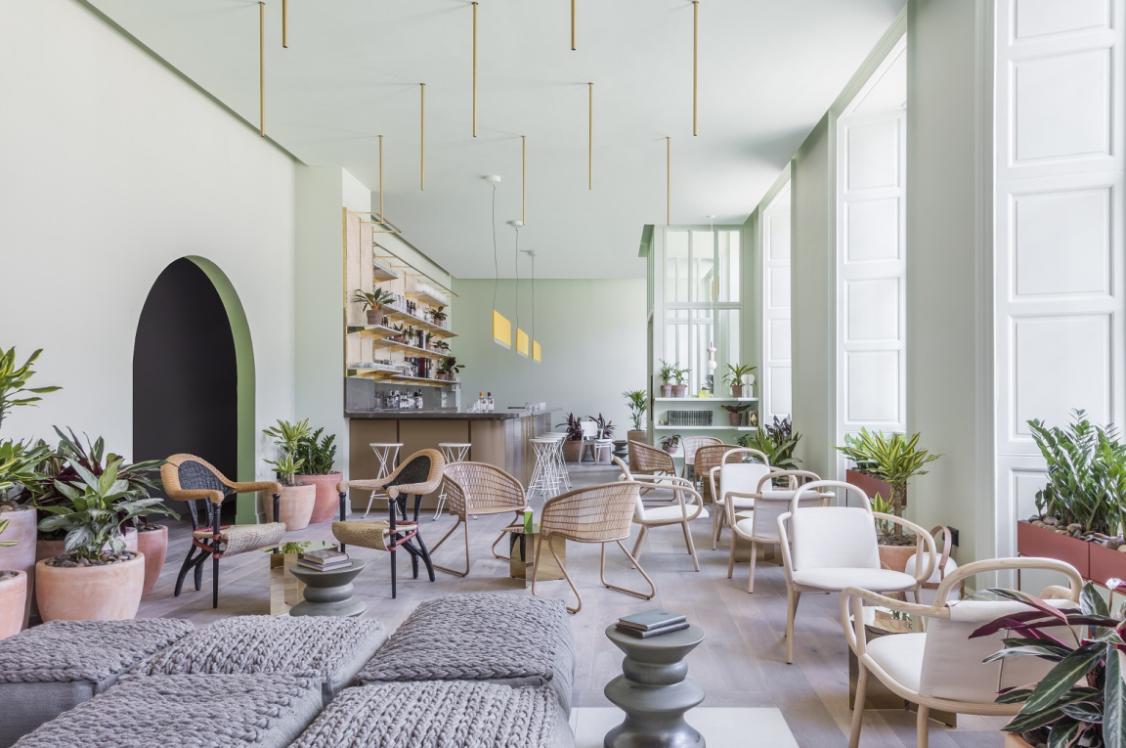
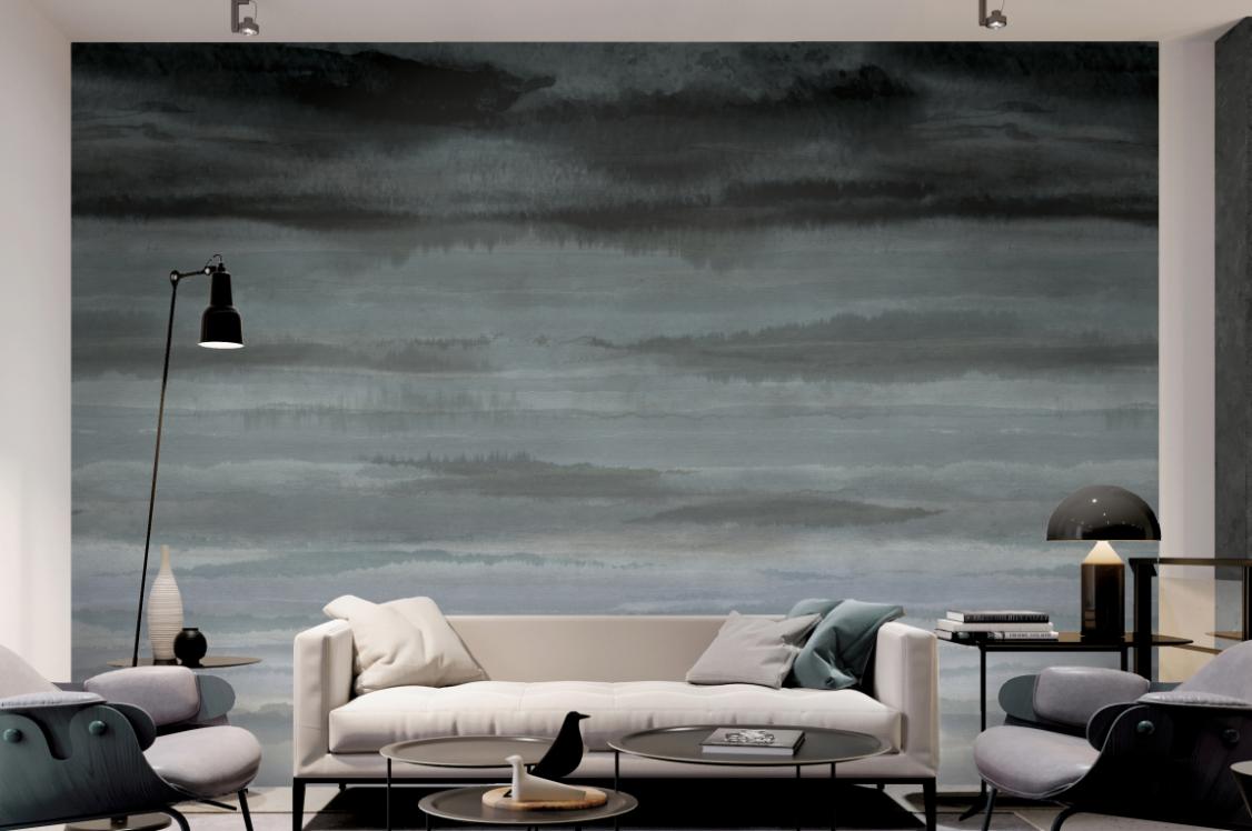
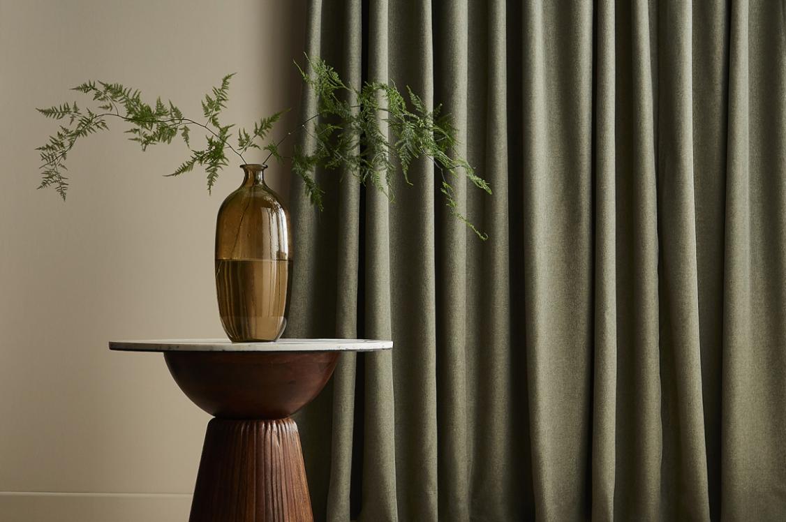
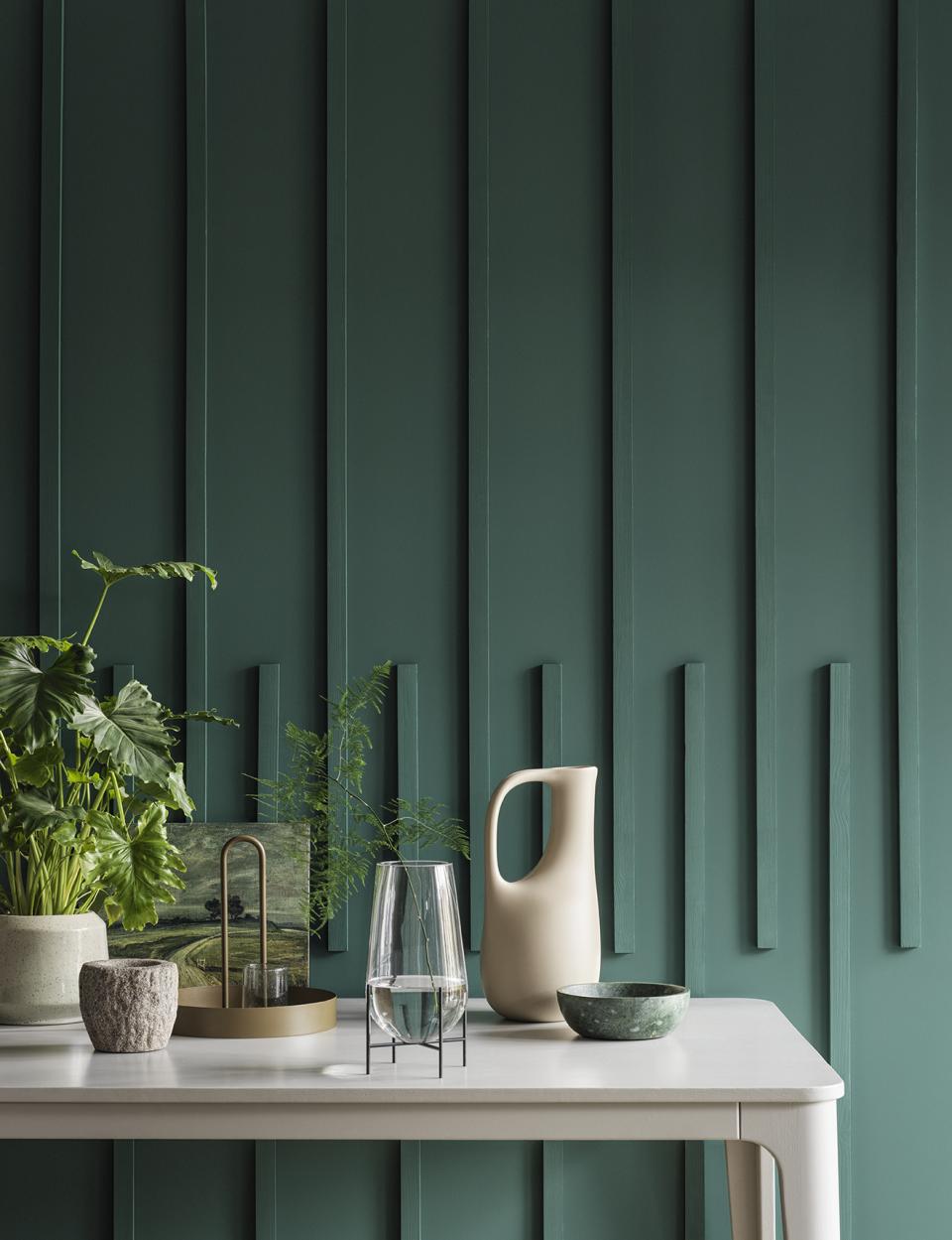
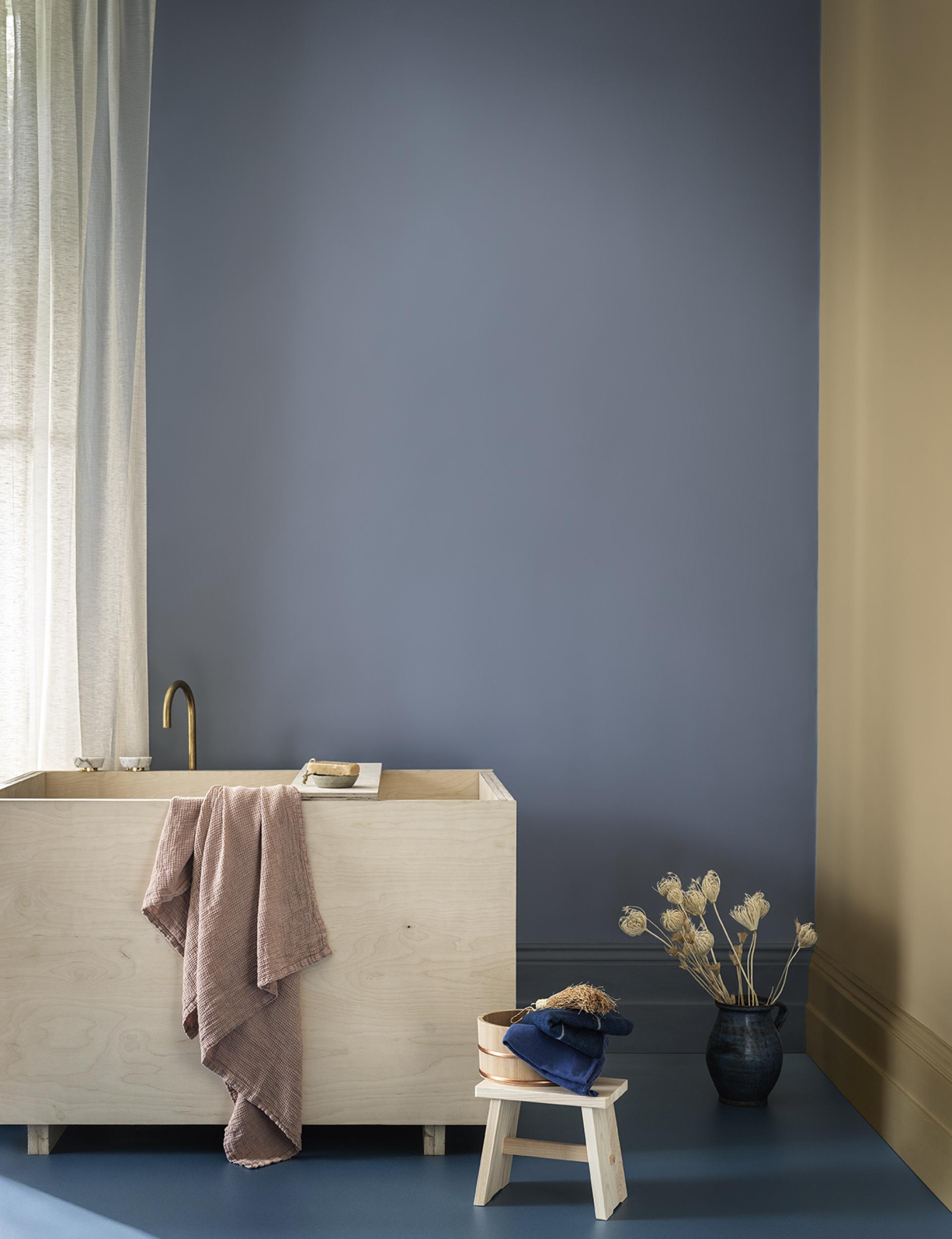
LIMINAL - Bring the outdoors in … and breathe
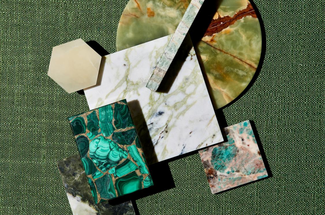
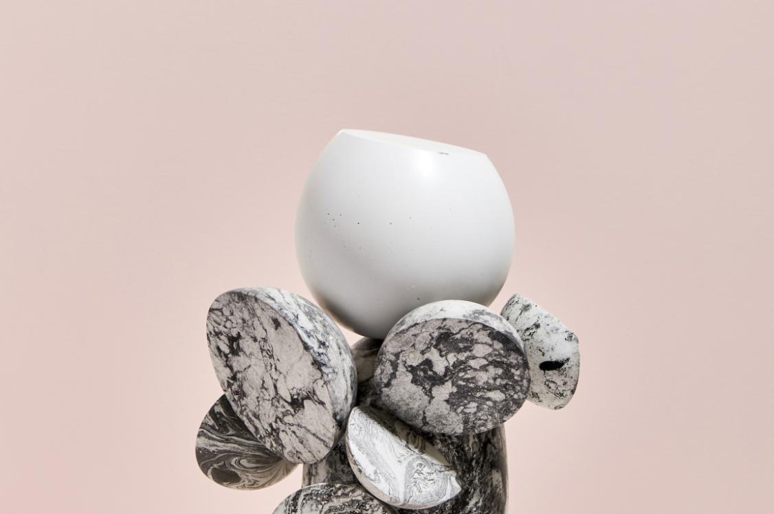
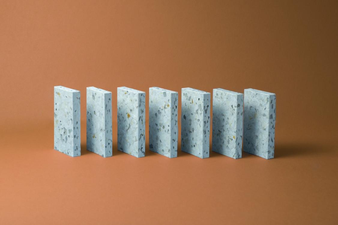
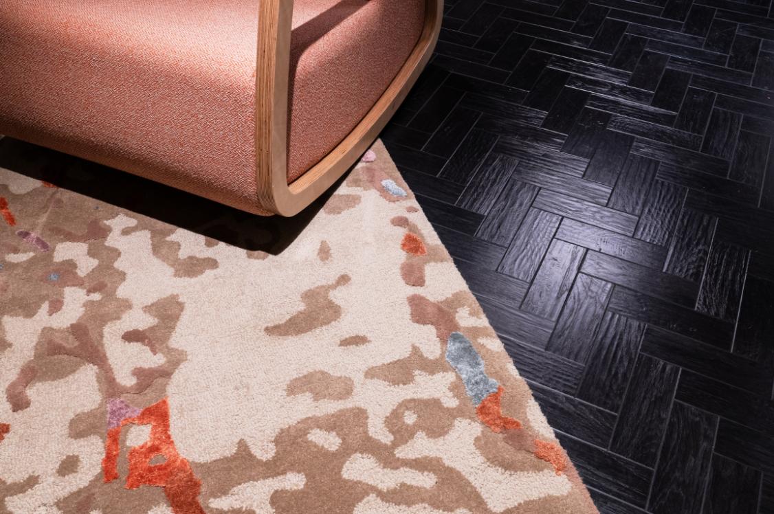
Liminal is an ode to the natural world, focusing on creating a space that connects us to nature. Clean lines, layered textures and muted, dusky colours are combined to blend the boundaries between the indoor and outdoor, creating a holistic place to soothe the mind and invite quiet contemplation and relaxed conversation. As the light floods in, the subtle tones of chalky aqua and soft greys embrace an airy openness, while the natural textures enhance the botanical greenery of indoor gardens and living walls.
A deeper green grounds the palette adding depth and definition. The result is a calming space to appreciate nature and boost our wellbeing.
"An appreciation of the natural world, Liminal showcases modern minimalism, with beautifully crafted furnishings and a quiet palette of neutral tonal colour. Homeowners are now wisely considering exactly what they place in a room, so much so that a space becomes carefully curated. The result is a retreat consisting of dry, chalky, comforting textures and single use, easy on the eye, colour.” - Kathryn Lloyd Crown Colour Consultant
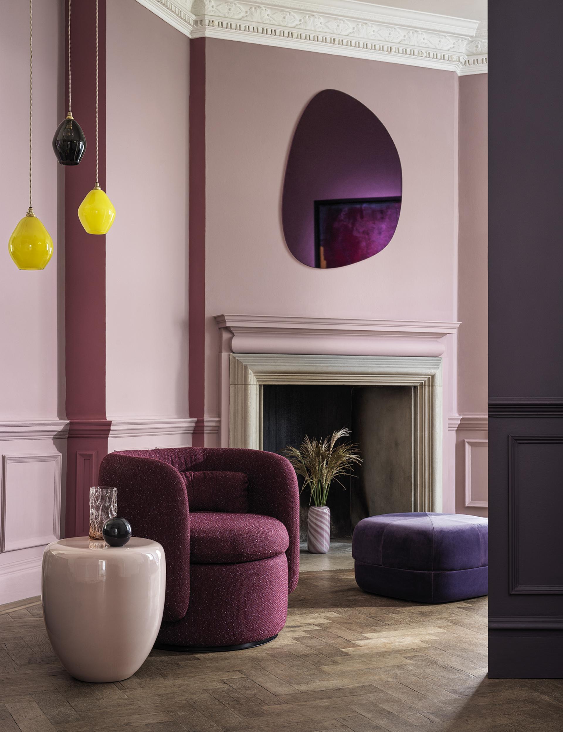
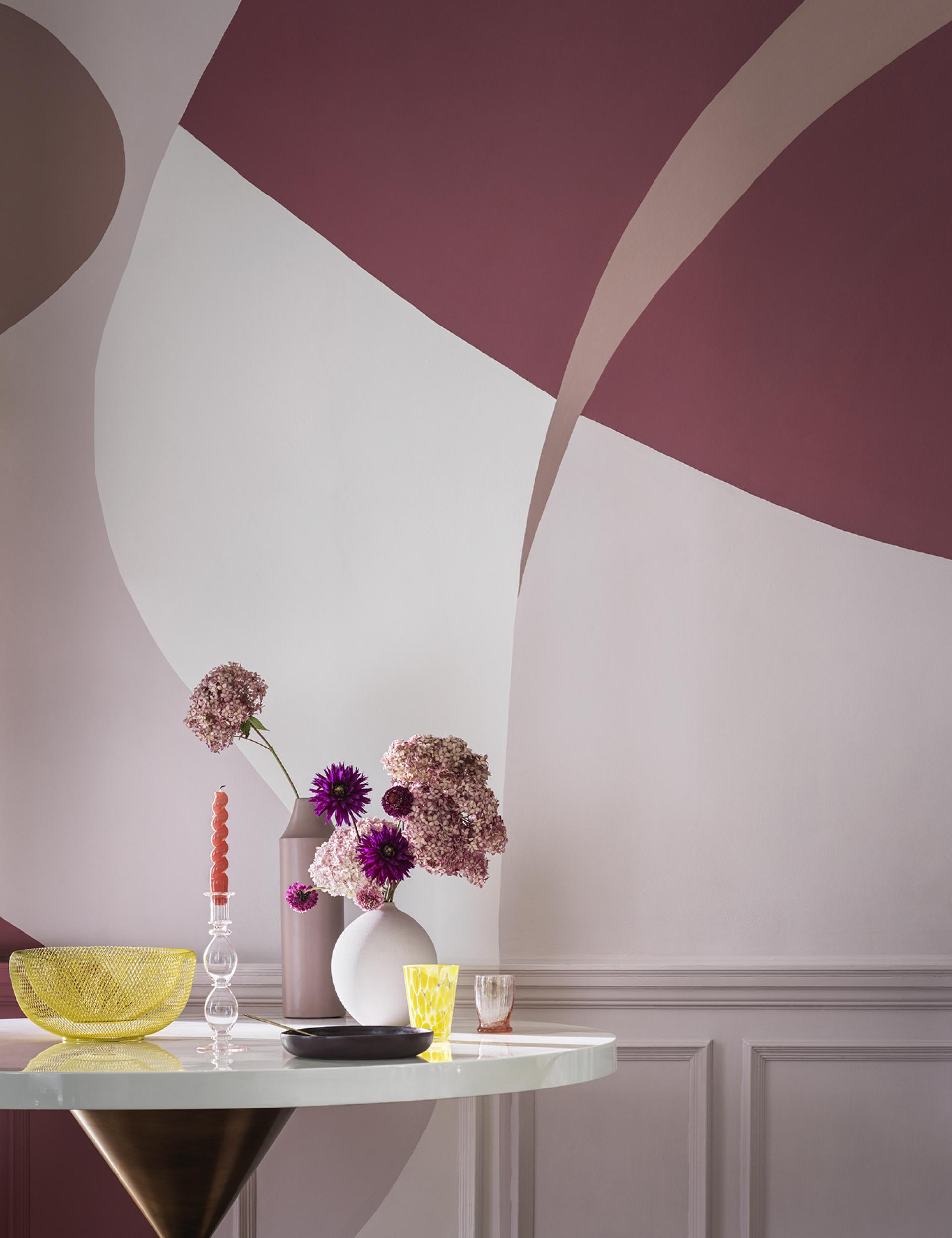
ILLUSORY - Where dreams meet reality
As more and more people find escape in a digital world with unconventional forms and explosive pops of colour, Illusory allows you to be inspired by all things surreal. A nod to the growing trend for digital reality and immersive technology being adapted to all industries, including fashion and interior design, Illusory is unexpected but refined. Shades of muted pink are key to creating contemporary murals in tonal colours, adding an element of surprise. Faded, dreamlike pinks harmonise, whilst a bright neon citrus and a deep muted amethyst add an unexpected punch and bring the palette to life.
“Dreamy and fun, Illusory curves between reality and the digital worlds of our imagination. Romantic hues of blush rose and raspberry swirl and layer colour upon colour. Inspiration is drawn from the free-flowing Surrealism art movement and the cute, stylised culture of Kawaii.” - Jemma Saunders Crown Colour Specialist
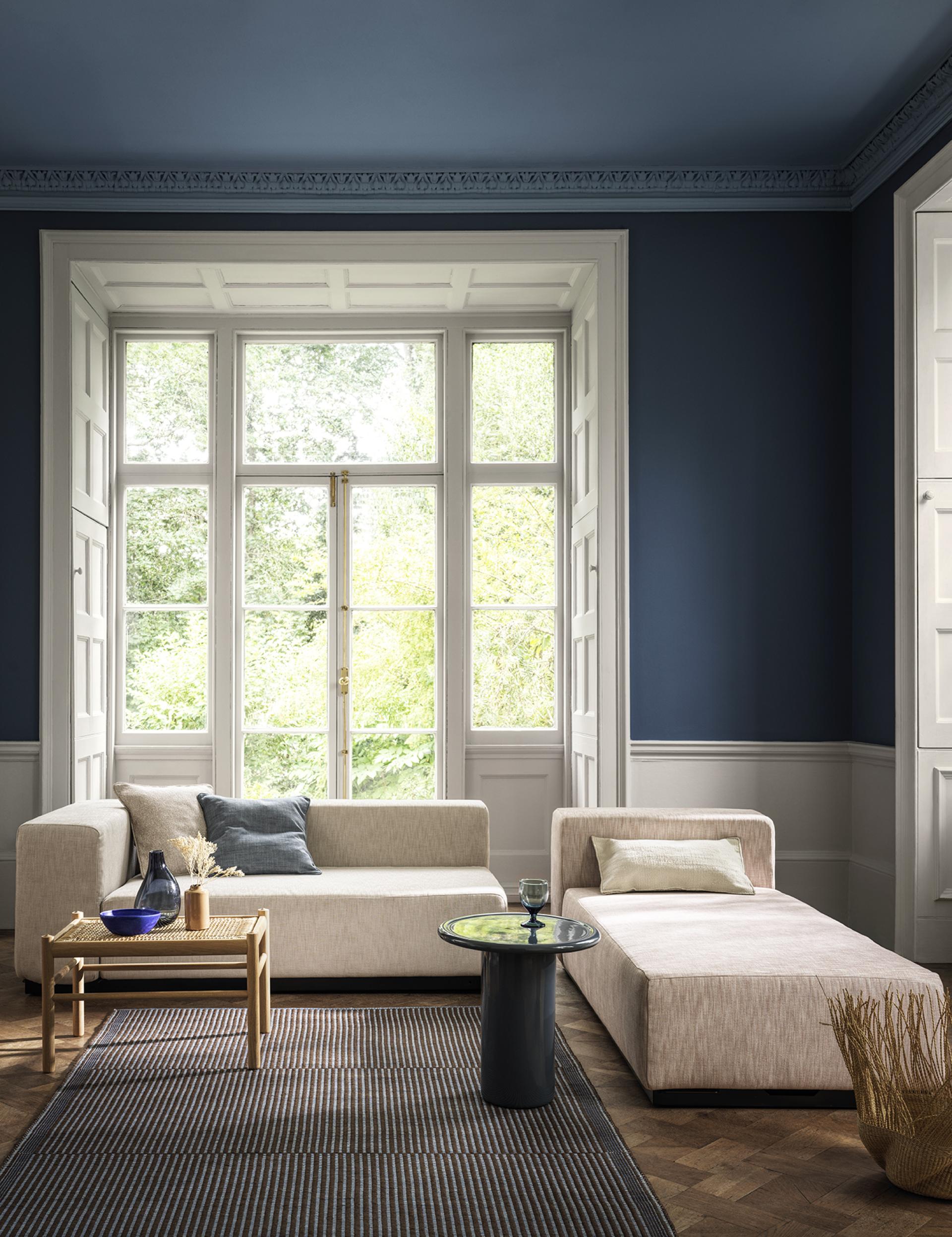
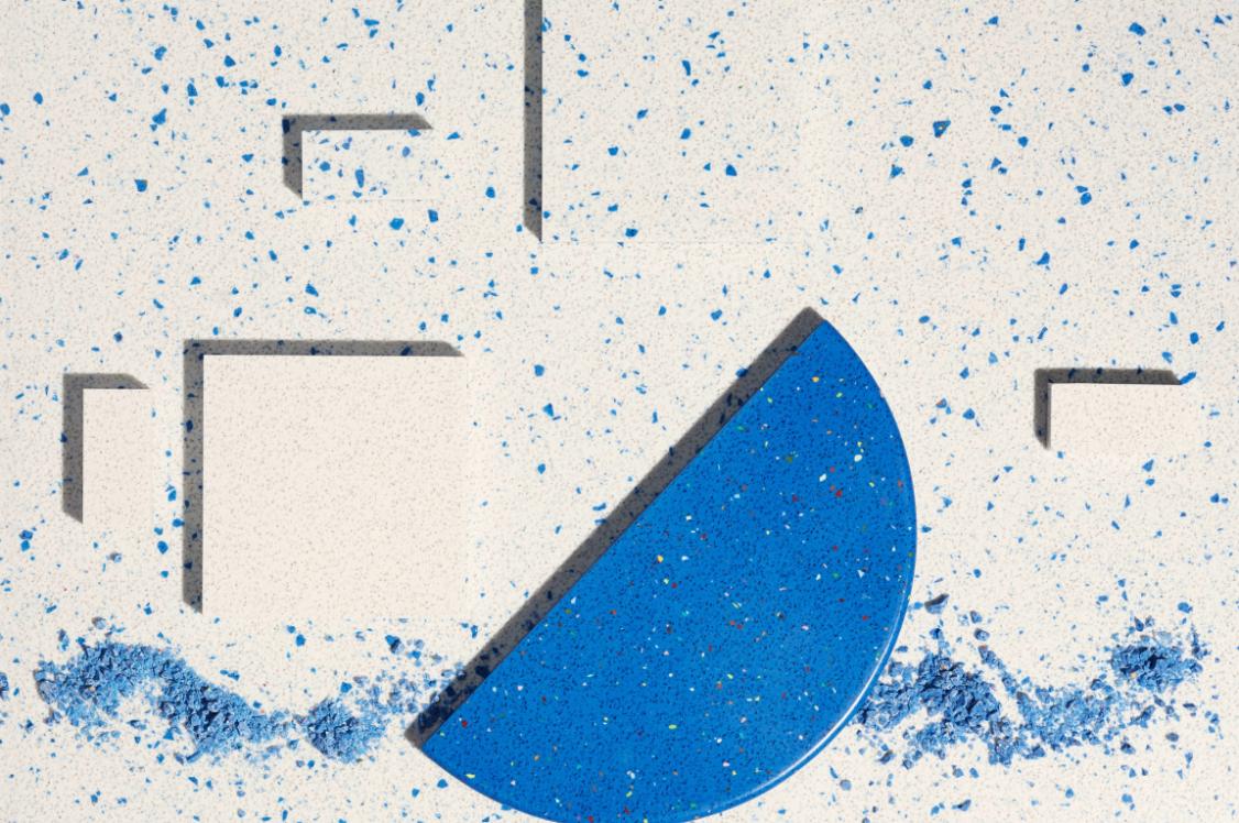
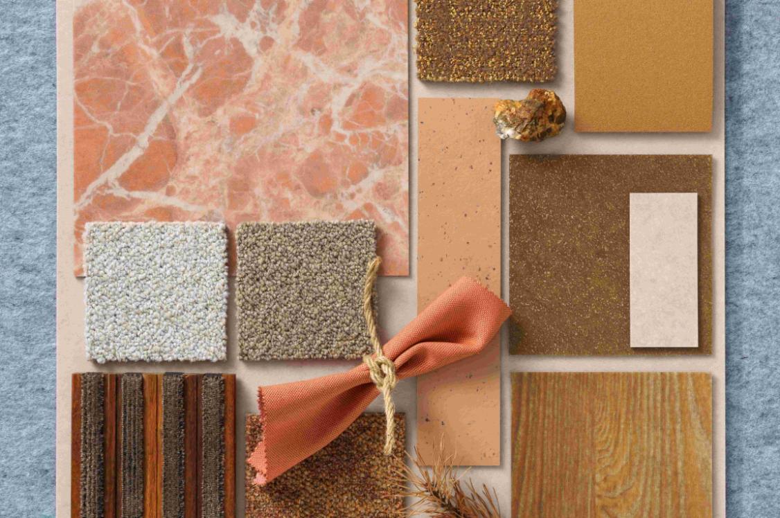
RESET - Immerse yourself in the big blue
Reset offers a chance to wind down, feel the warmth of the sun, absorb the scents of jasmine and lemon and drift with the ebb and flow of lapping water. Capturing the mood of the nation through the last few months, wanting to escape to sunny climates, Reset is evocative of the most breath-taking view in the most memorable of destinations. Poster art was one of the key drivers for this trend. More and more visual artists and illustrators are creating stylised and simplistic figurative illustrations with relaxing Mediterranean inspired themes and colour palettes, bringing a sense of calm on to people’s walls. The different blues drift from one to the next in this watercolour palette, which helps create a positive effect on our wellbeing. Warm ochres, sandy hues and hessian textures restore equilibrium with organic naturalness.
“Immersing ourselves in the big blue with all our senses can have therapeutic properties. Use this calming colour palette of soothing blues and gentle warm neutrals to reset yourself back to balance.” - Justyna Korczynska Crown Colour Consultant
In association with
We believe that every pot of paint is brimming with potential. And we want to put that in the hands of everyone. Because with paint, you can change a room, change a mood, even change a life.