Crown Paints unveils its Colour Insights for 2024/25.
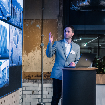
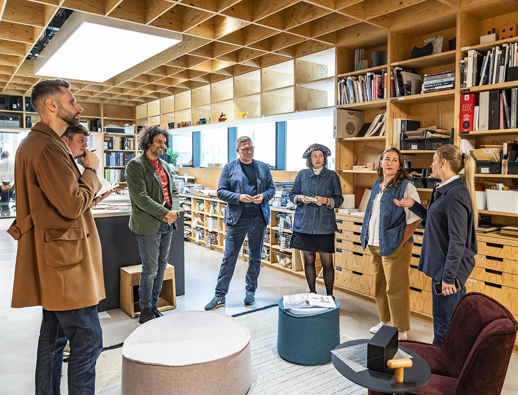
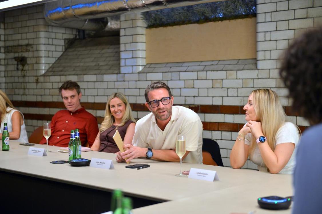
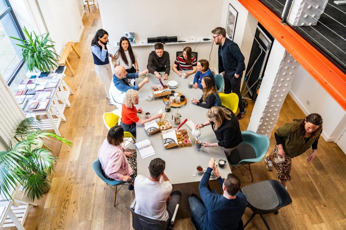
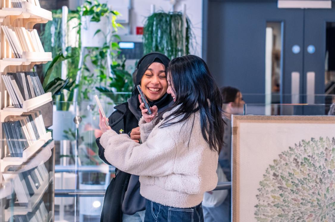
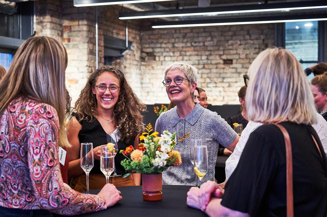
Following a fantastically inspiring afternoon at White Rabbit Studios, London, for the launch of Crown Paints 2024/25 Colour Insights, we can now share with you a more in-depth look at the carefully curated palettes.
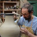
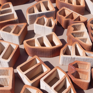
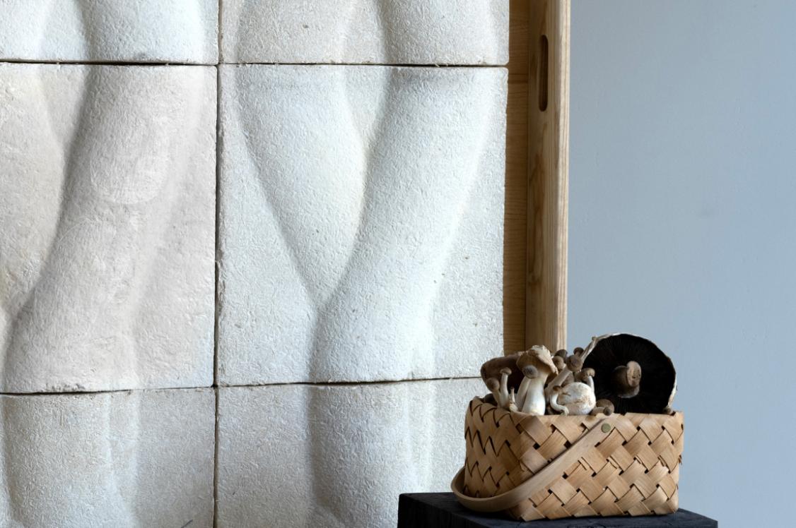
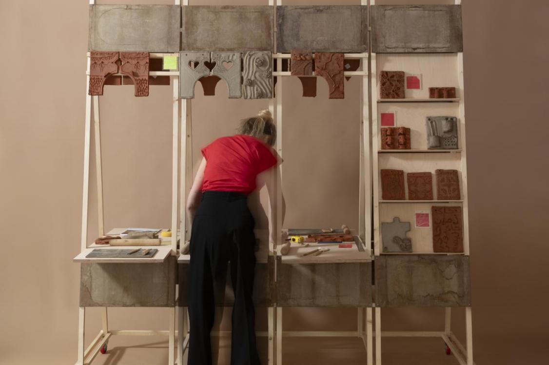
From Solutions - channelling the organic, almost accidental palettes found in new natural material innovations using the likes of algae and seaweed, to the more traditionally used terracotta and clay; to Community - offering an explosion of colour to energise spaces and bring people joy; Escape - packed with nostalgic-Wes Anderson-reminiscent references, suspending belief and evoking memories; to Pivot - fuelled by the fashion and furniture industry's lean towards 'slow fashion' and reuse/reclaim with Community Clothing and sixteen3 cited as being influential - each collection has its own unique narrative whilst intertwining with the next.
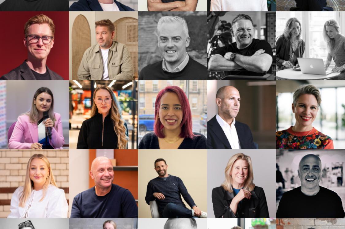
The four palettes were curated by a panel of colour and interior design experts, including Araitz Harmens of DAY Architectural, Hannah Warren of DV8 Designs, and Jessica Standing of Standing Space, working alongside the Crown team to bring the 2024/25 themes to life. Below are the beautiful results of the collaboration...
Solutions
Pivot
Escape
2024/2025 Colour Insights
Community
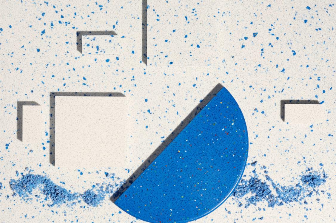
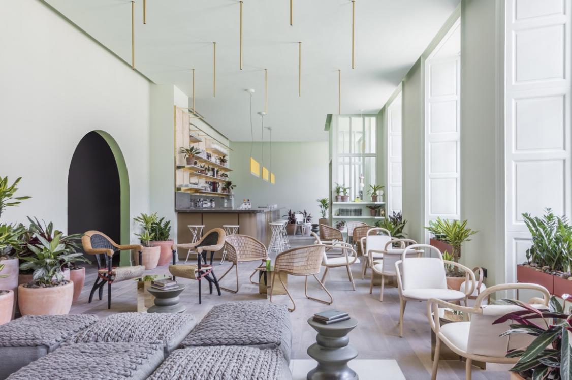
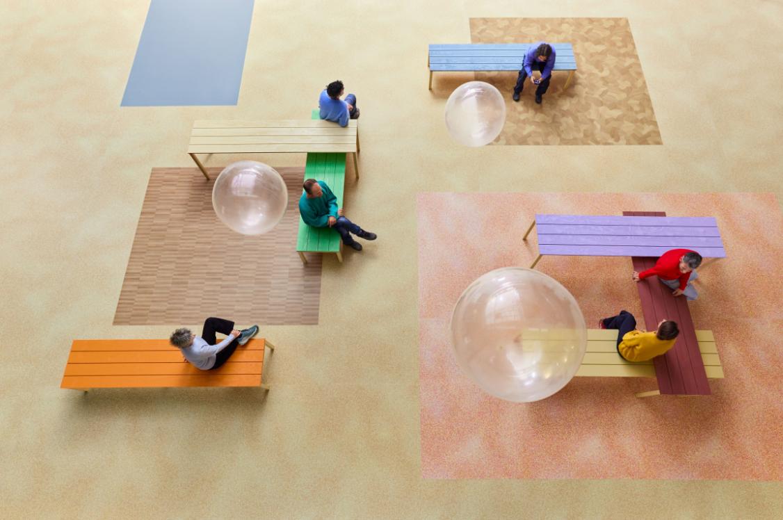
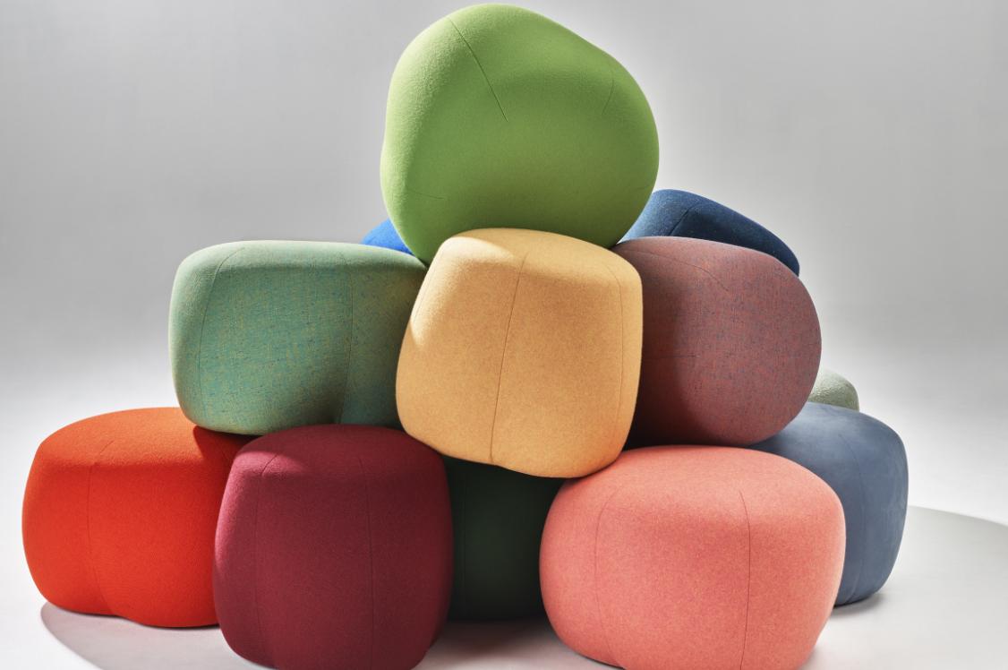
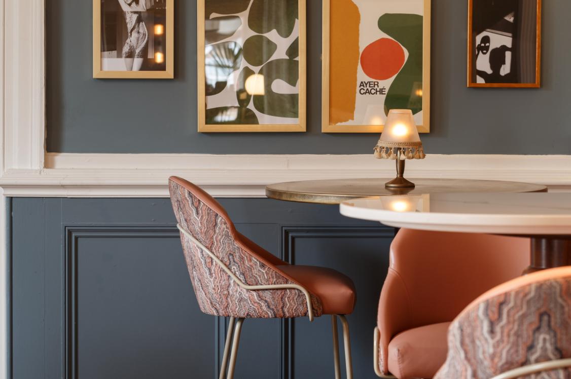
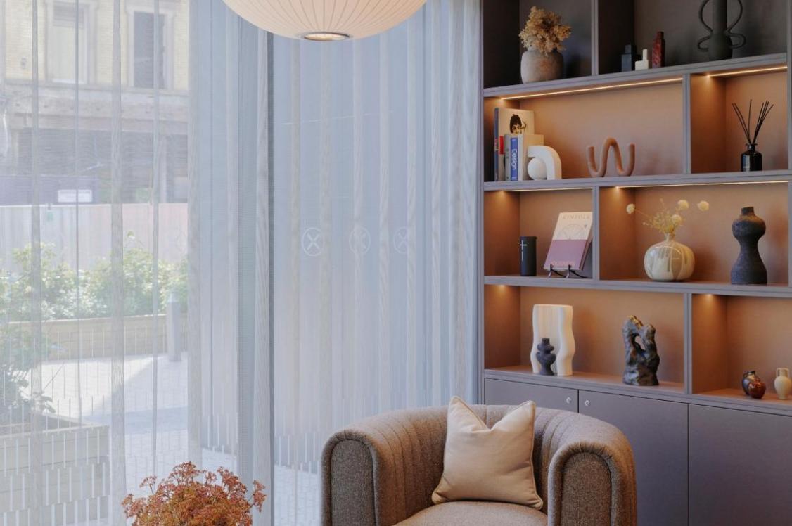
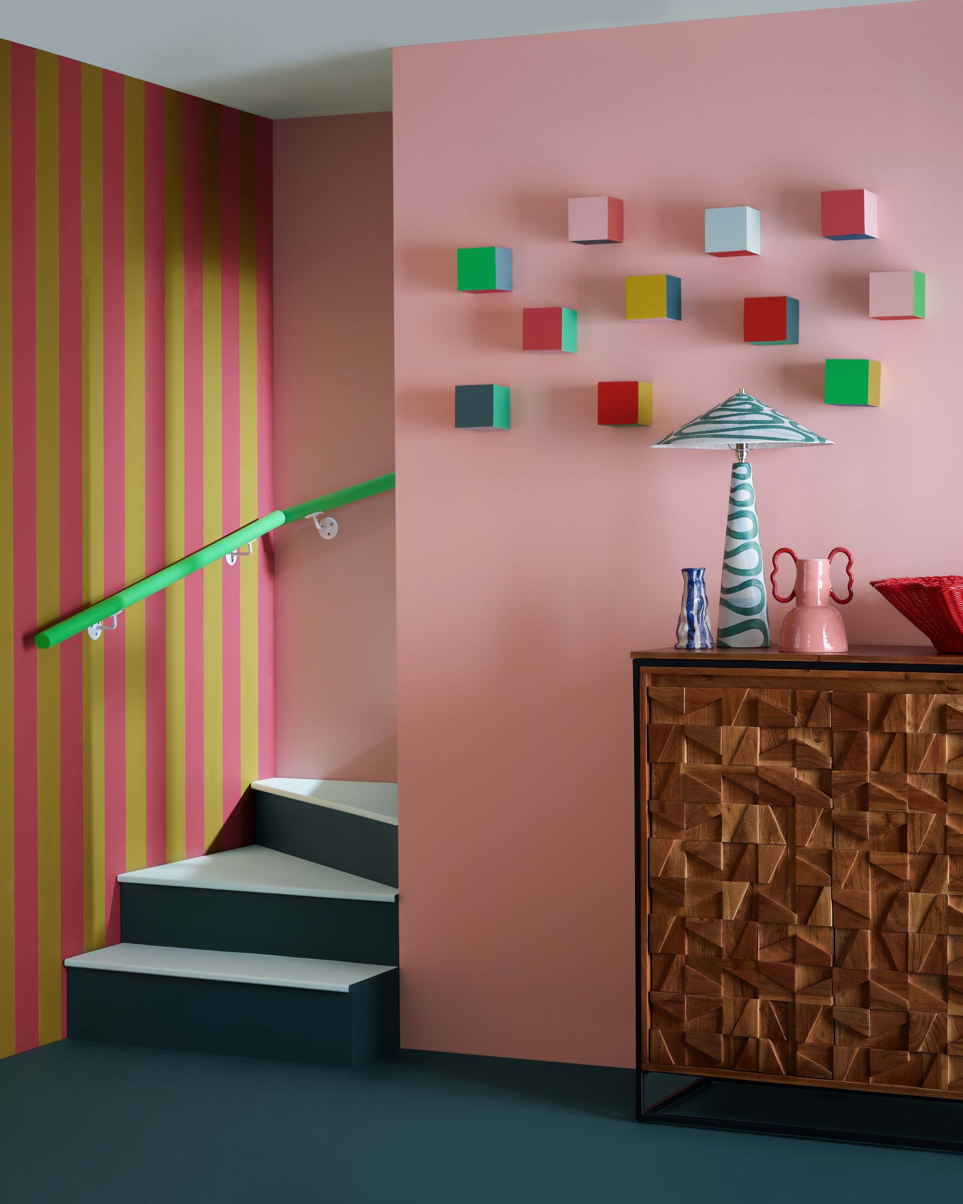
The Community palette is all about using colour to create joyful, invigorating spaces that bring people together.
Inspired by individuality, inclusivity and identity, the collection breathes life and excitement into any space by celebrating brave design choices, such as bold colours, high contrast, and colour blocking.
The palette includes an almost primary red, yellow, and green, as well as hot pink for bold accents. Combined with more gentle pink and blue pastel shades and a soft warm grey to provide balance and contrast.
Community
Solutions
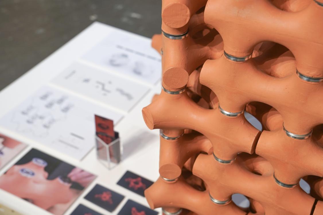
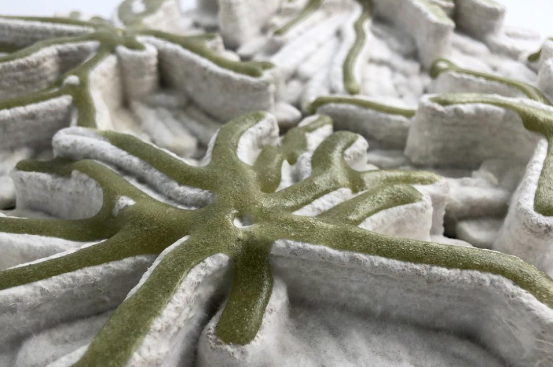
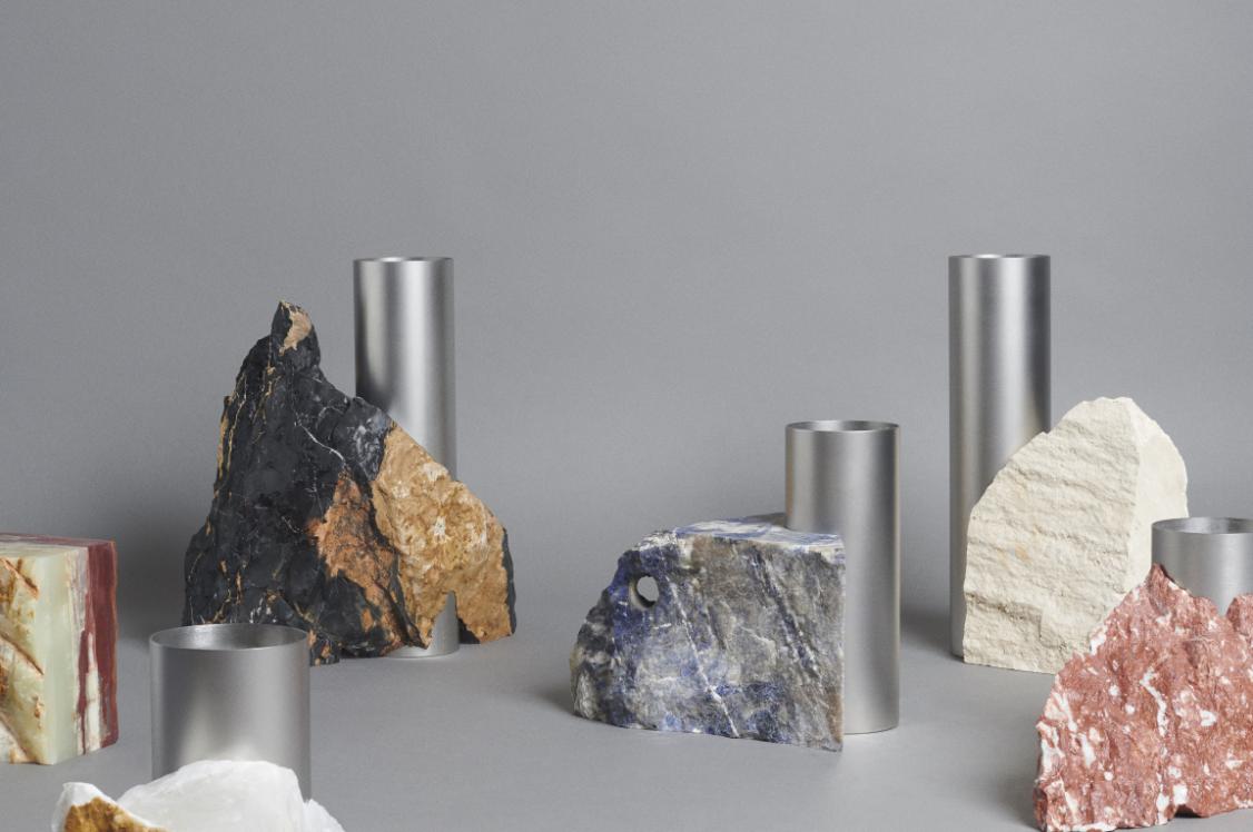
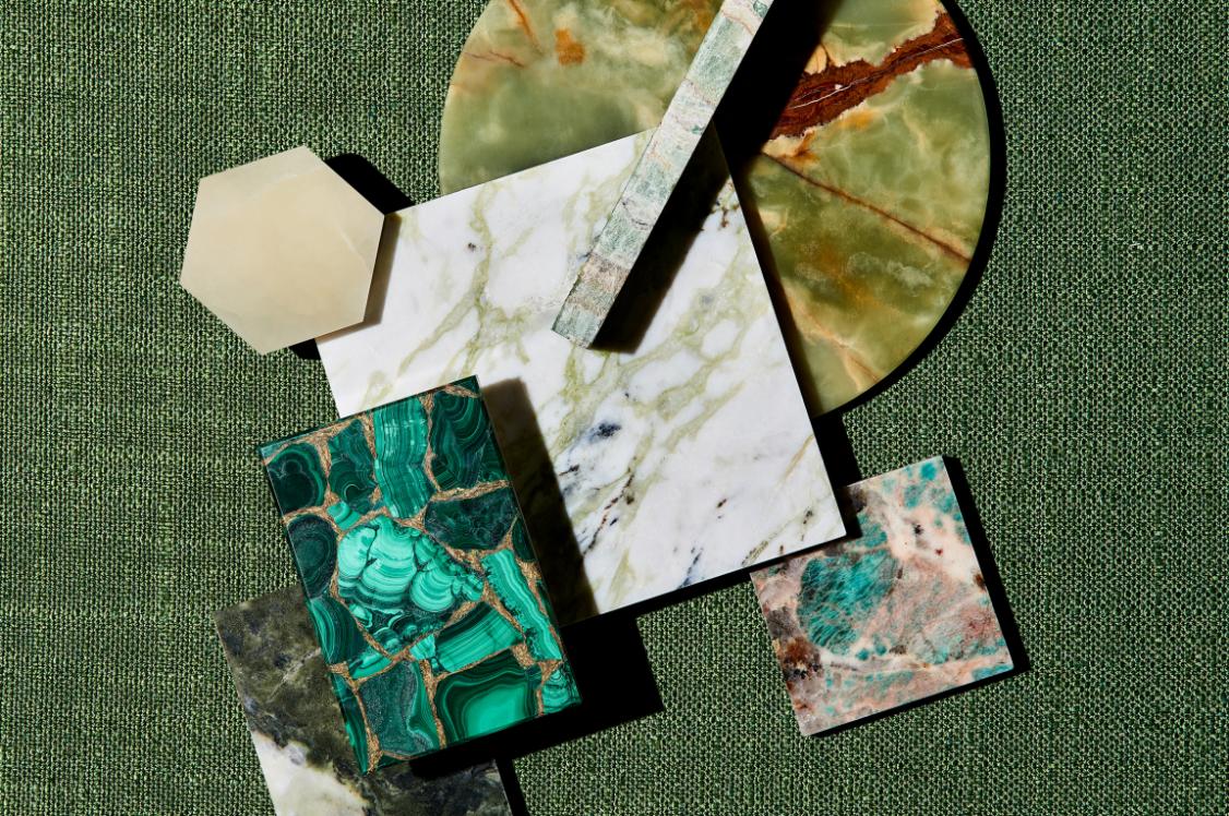
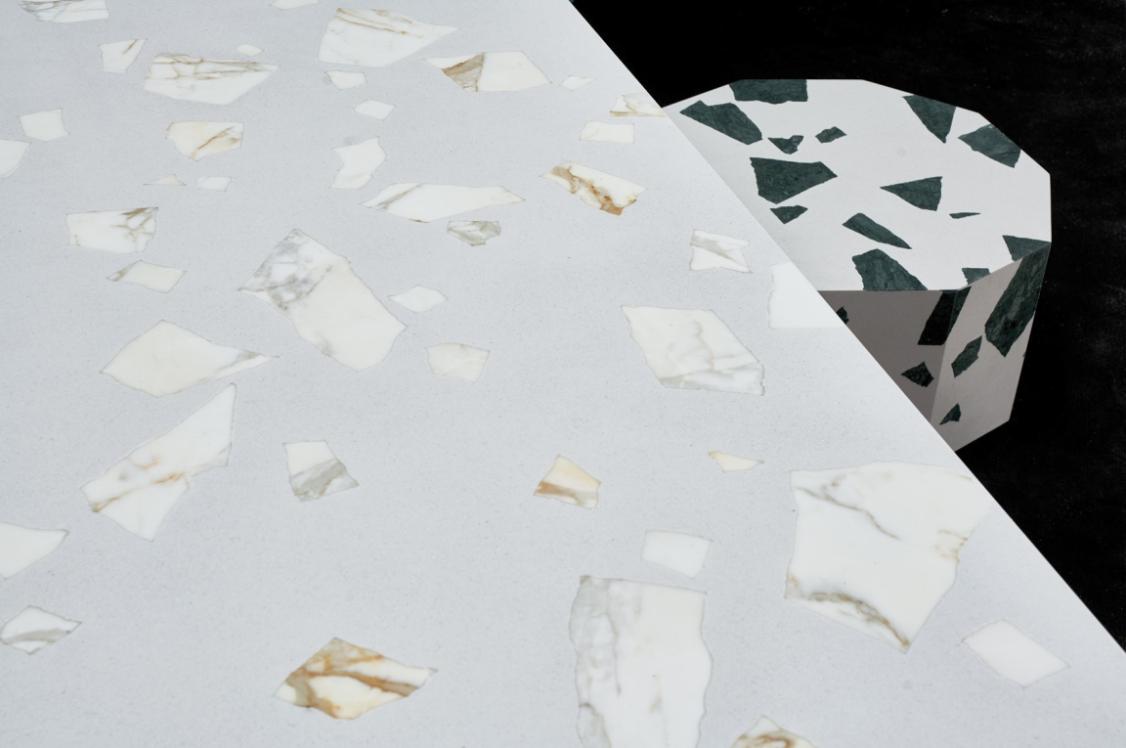
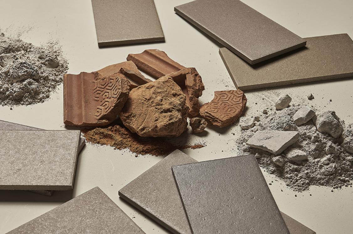
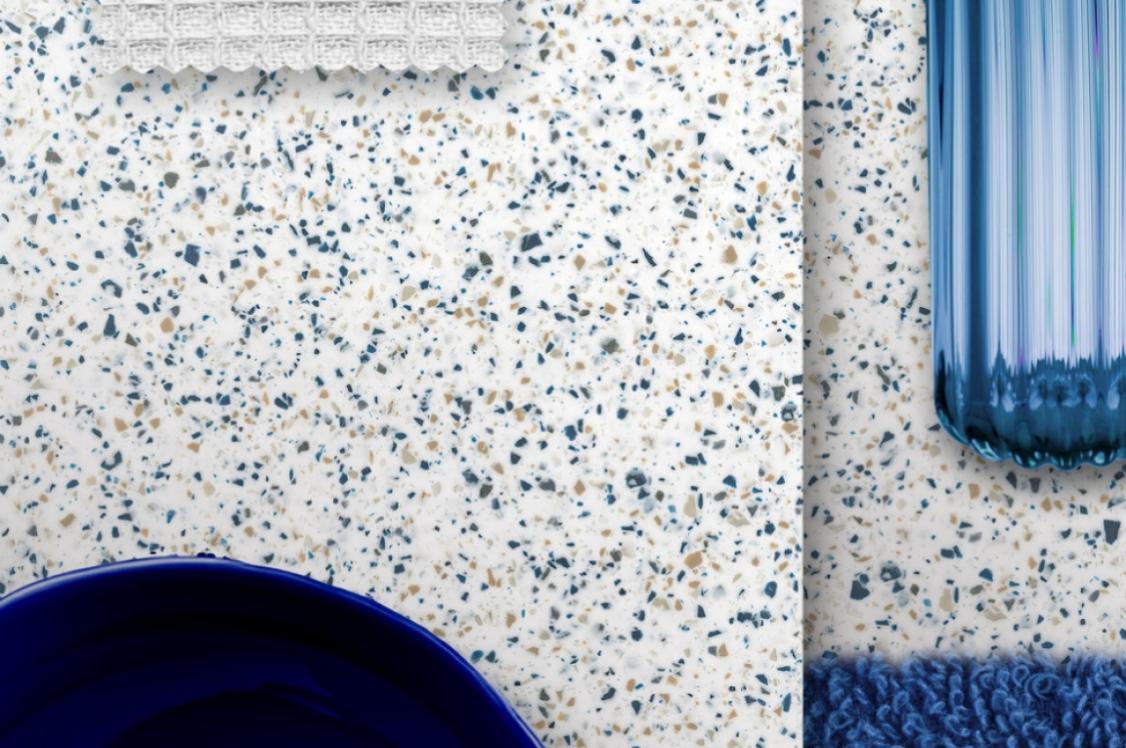
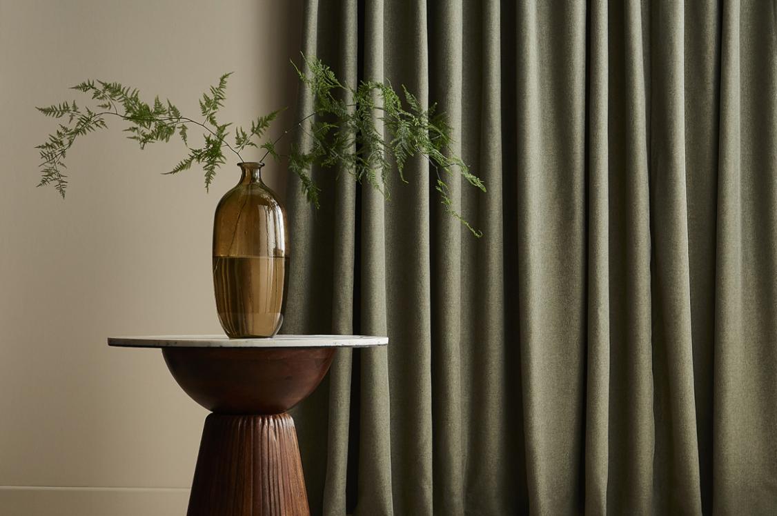
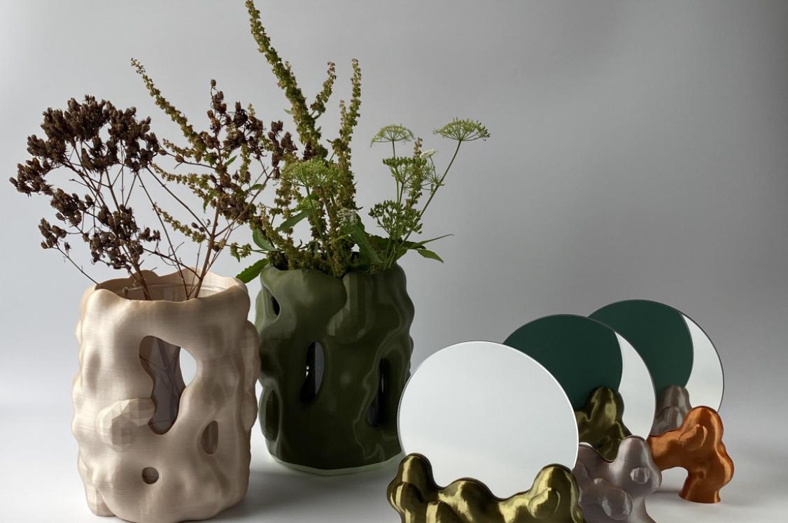
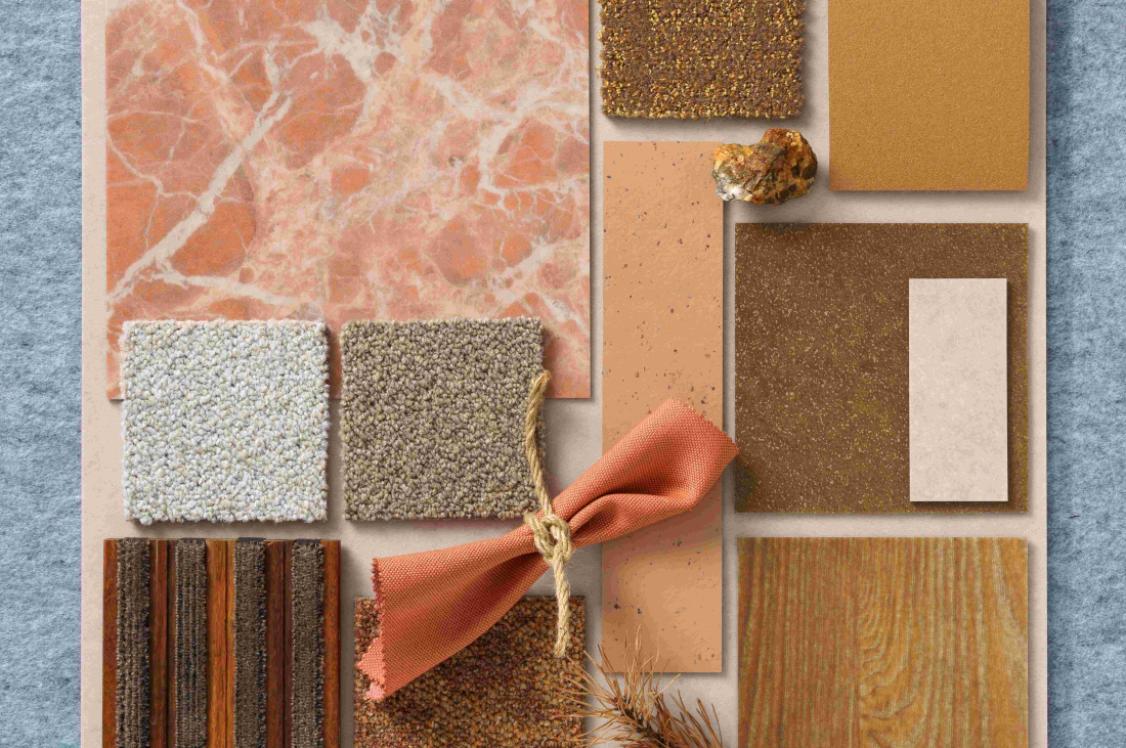
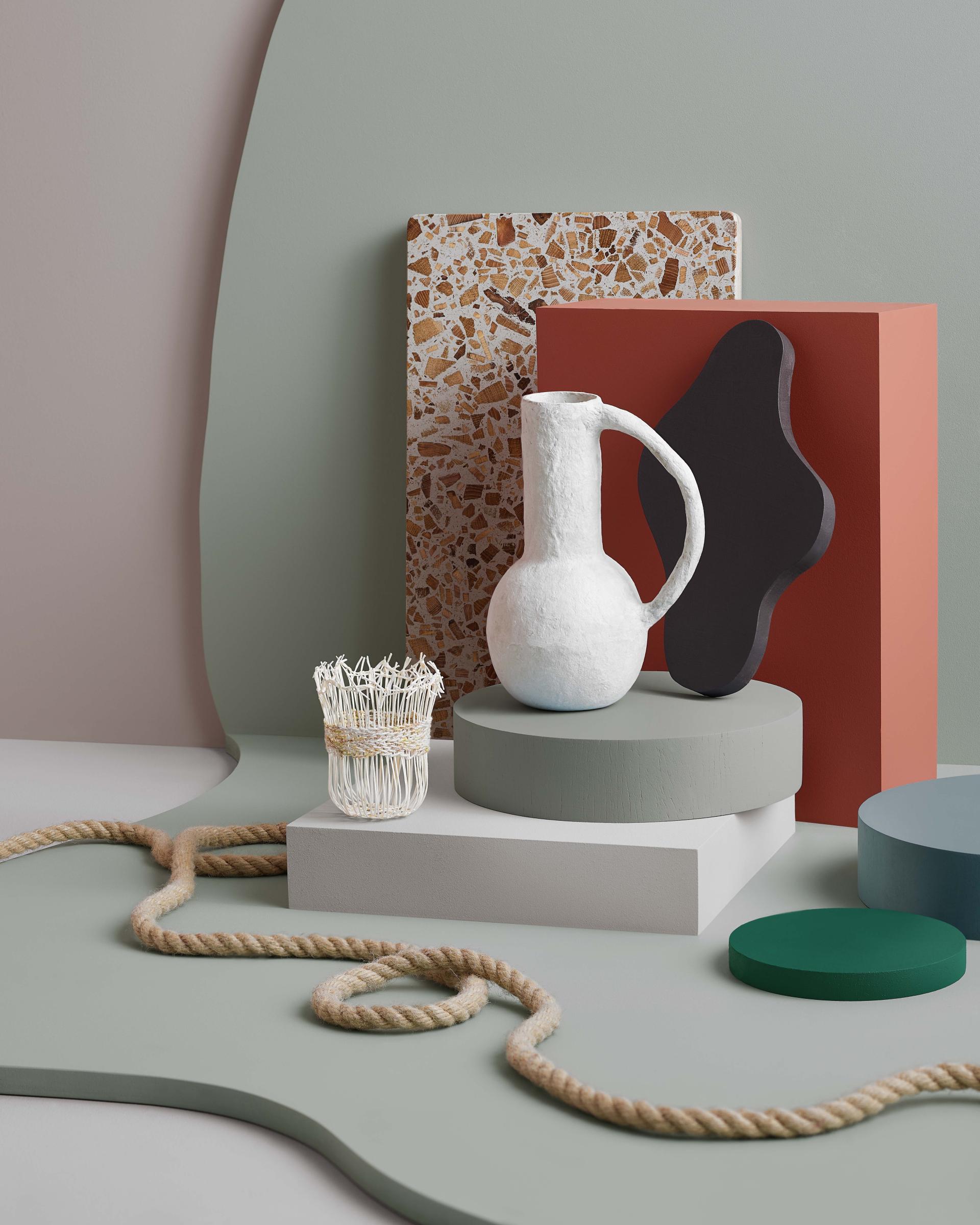
Showcasing how design can learn from the natural world, the Solutions palette embraces nature in all its forms, textures, and imperfections.
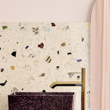
The palette – which takes its inspiration from re-purposing and the appreciation of the natural world – brings a broad cross section of both bold and soft tones, inspired by the accidental colour palettes often found in recycled materials.
Warm terracotta is paired with desaturated blues, greens and neutrals, alongside small accents of brighter blue and green shades, inspired by sea and river glass.
Solutions
Pivot
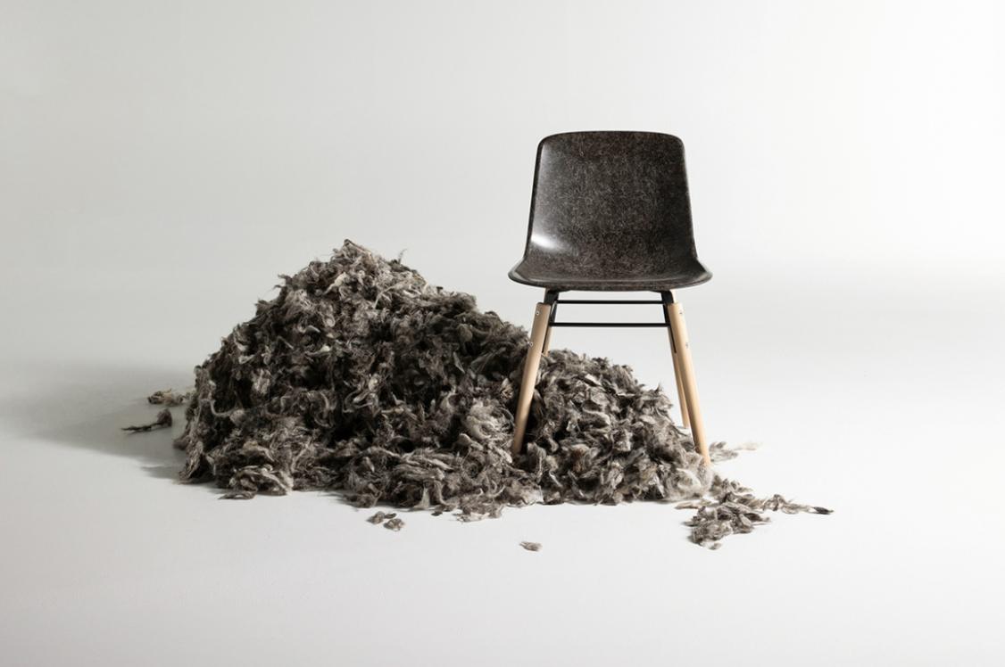
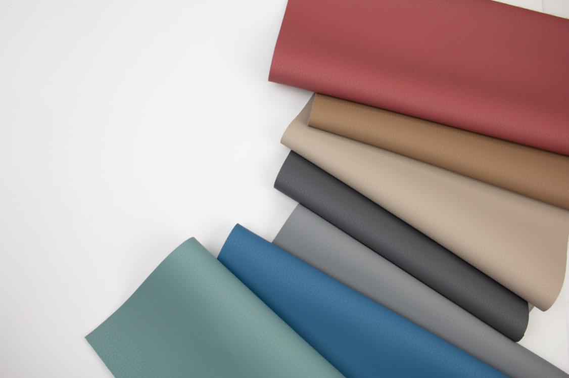
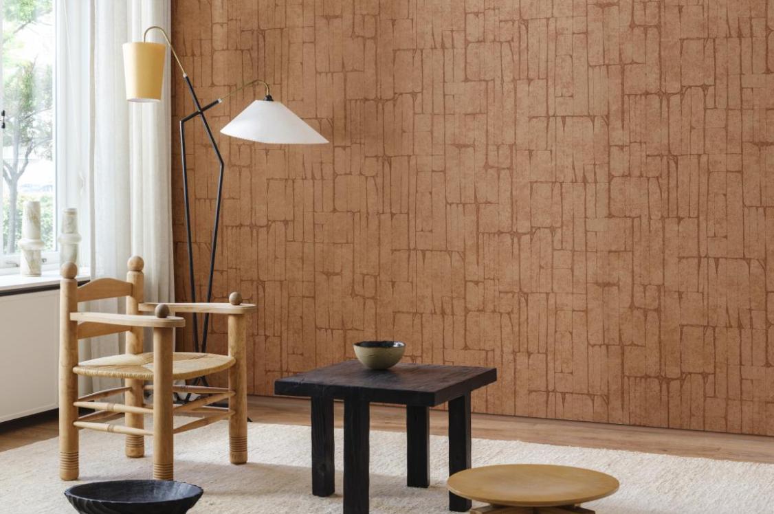
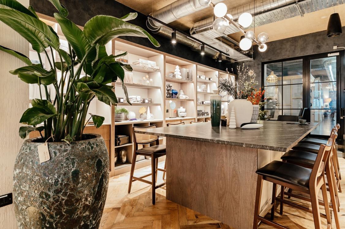
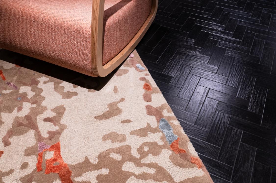
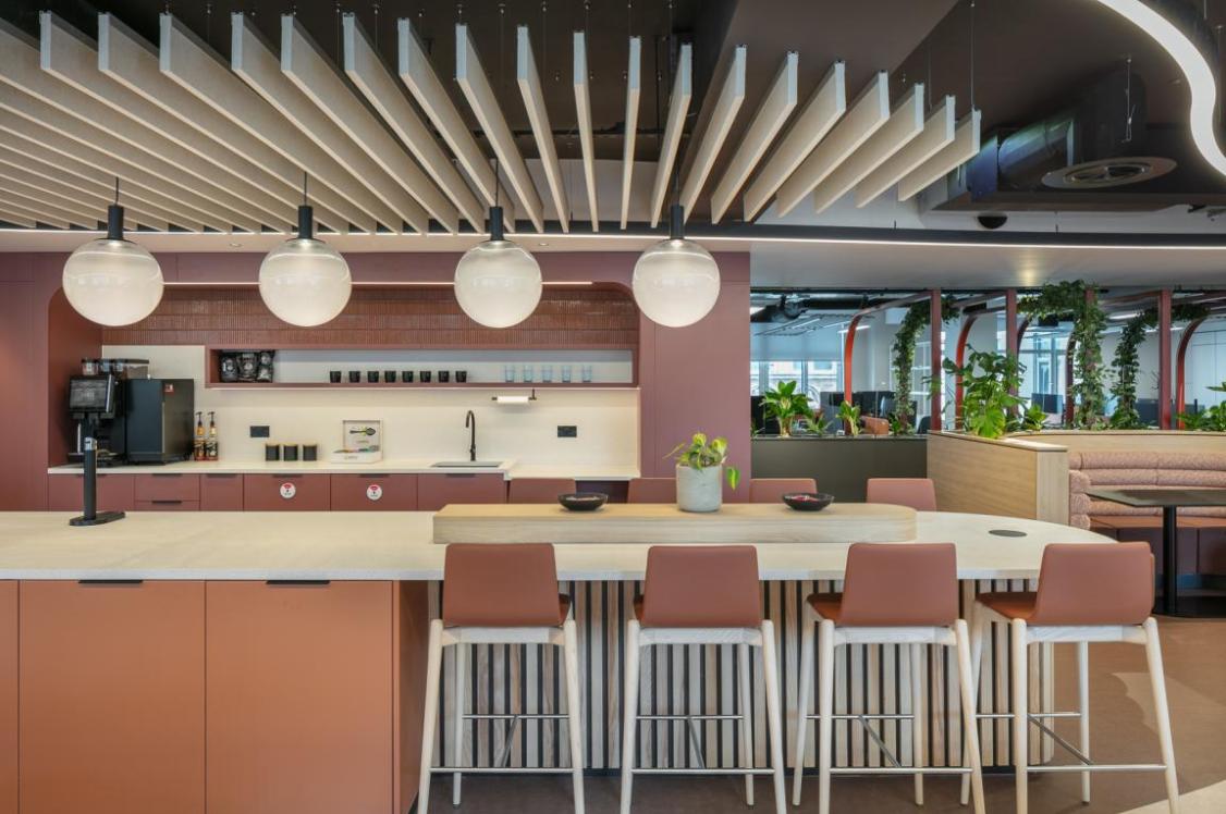
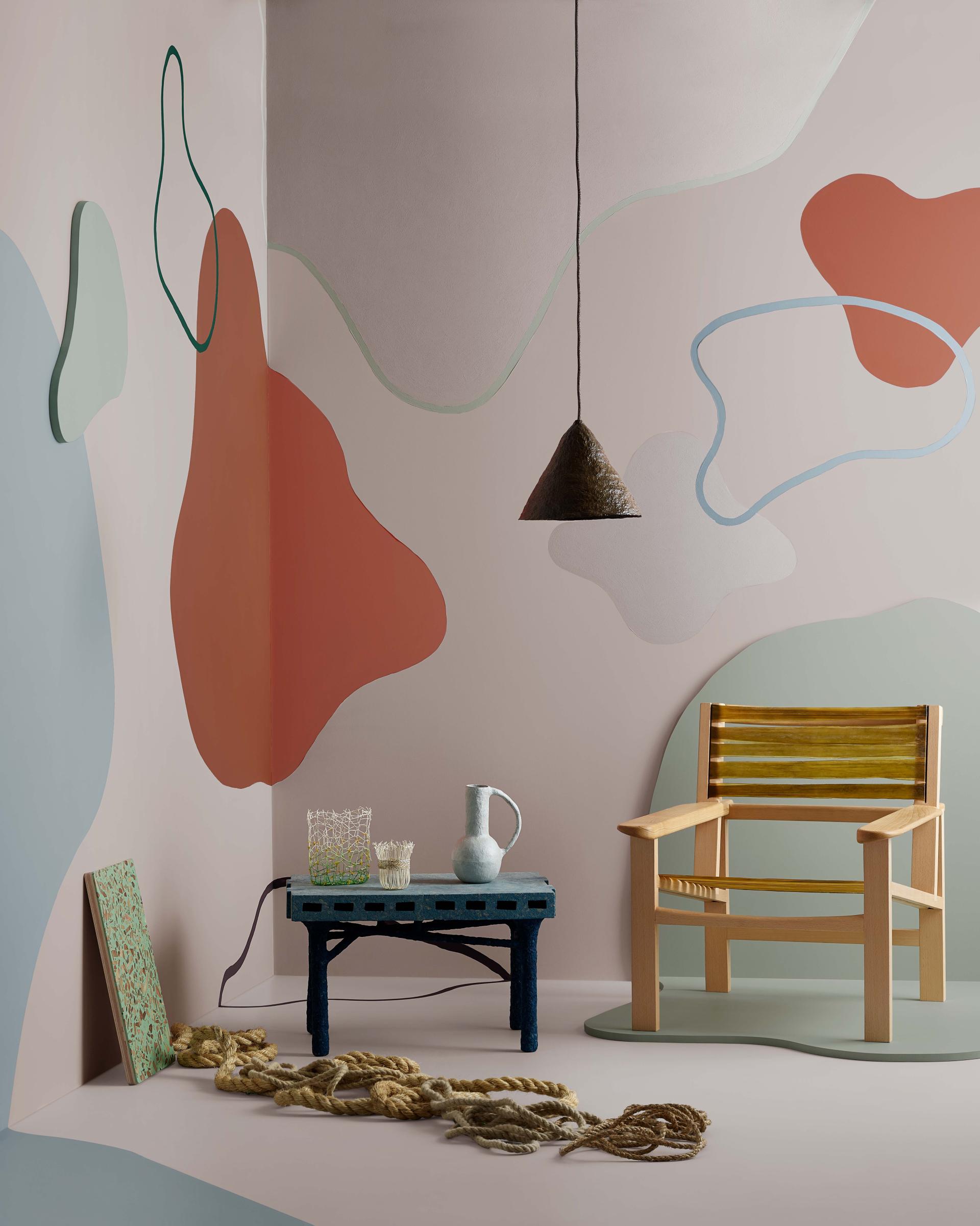
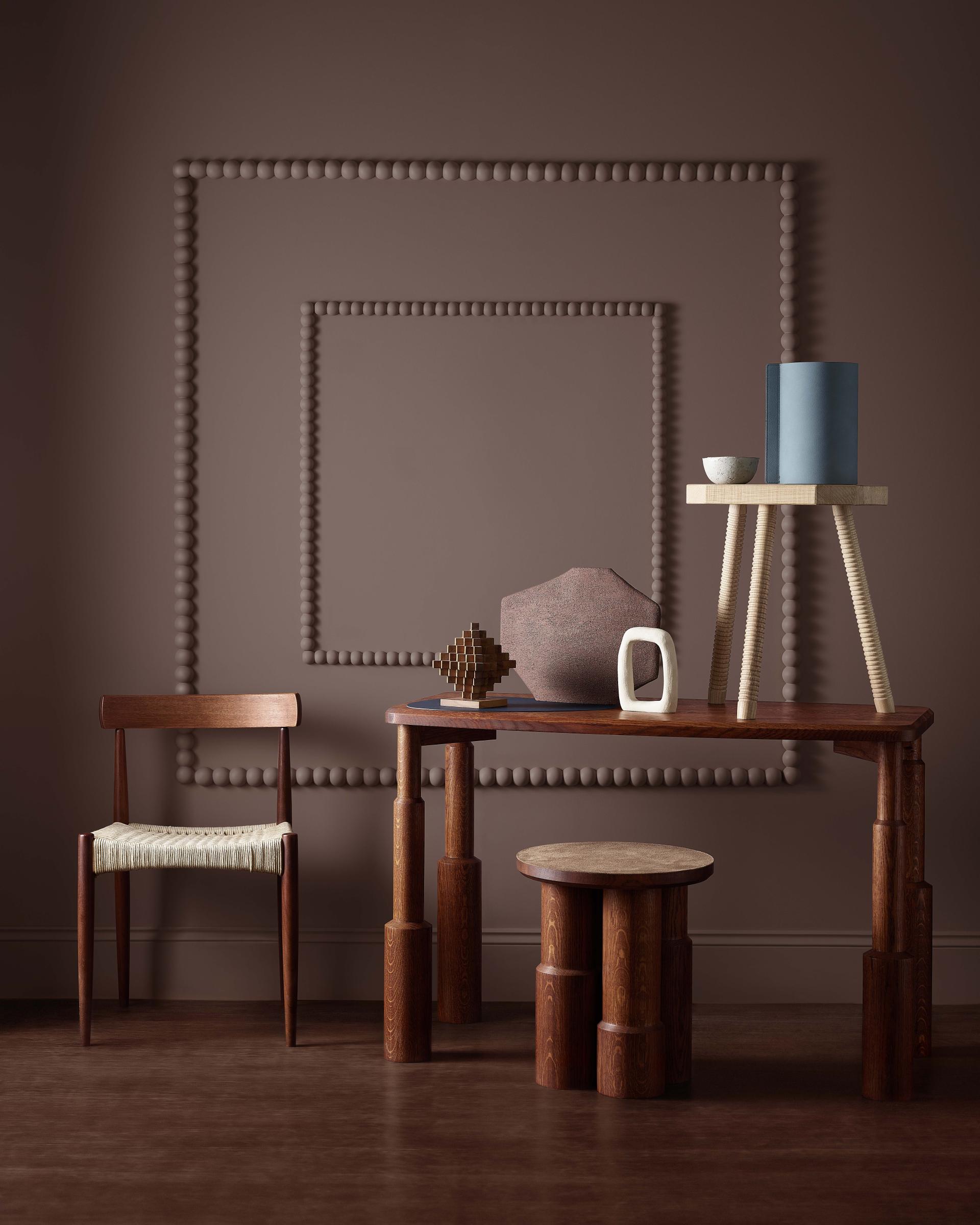
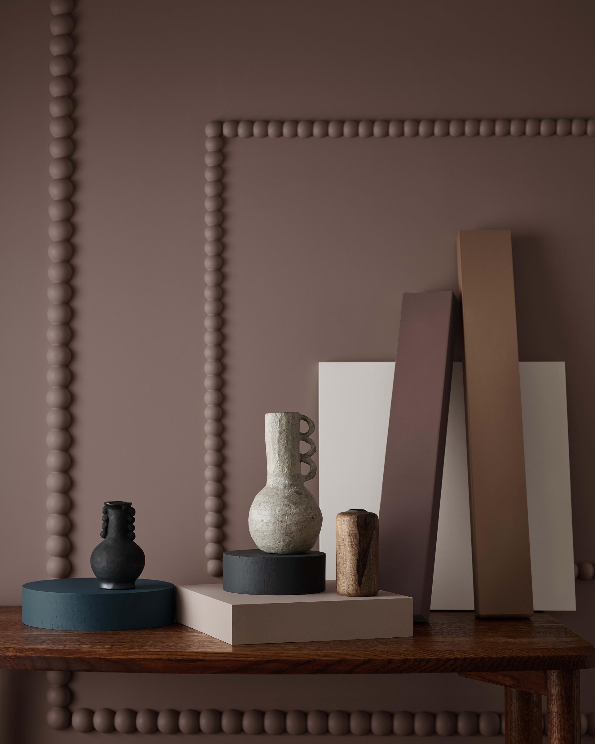
Intended to create a comforting environment, the Pivot collection is rooted in heritage and quality, aiming to act as an antidote to the contemporary fast-paced, high-consumption world.
The focus of this palette is on people, ethics, and harping back to older and better ways.
The well balanced palette blends calming, earthy tones such as tans and warm neutrals, with blue-greys and perfectly complements hand-crafted, salvaged, and reupholstered furnishings.
Pivot
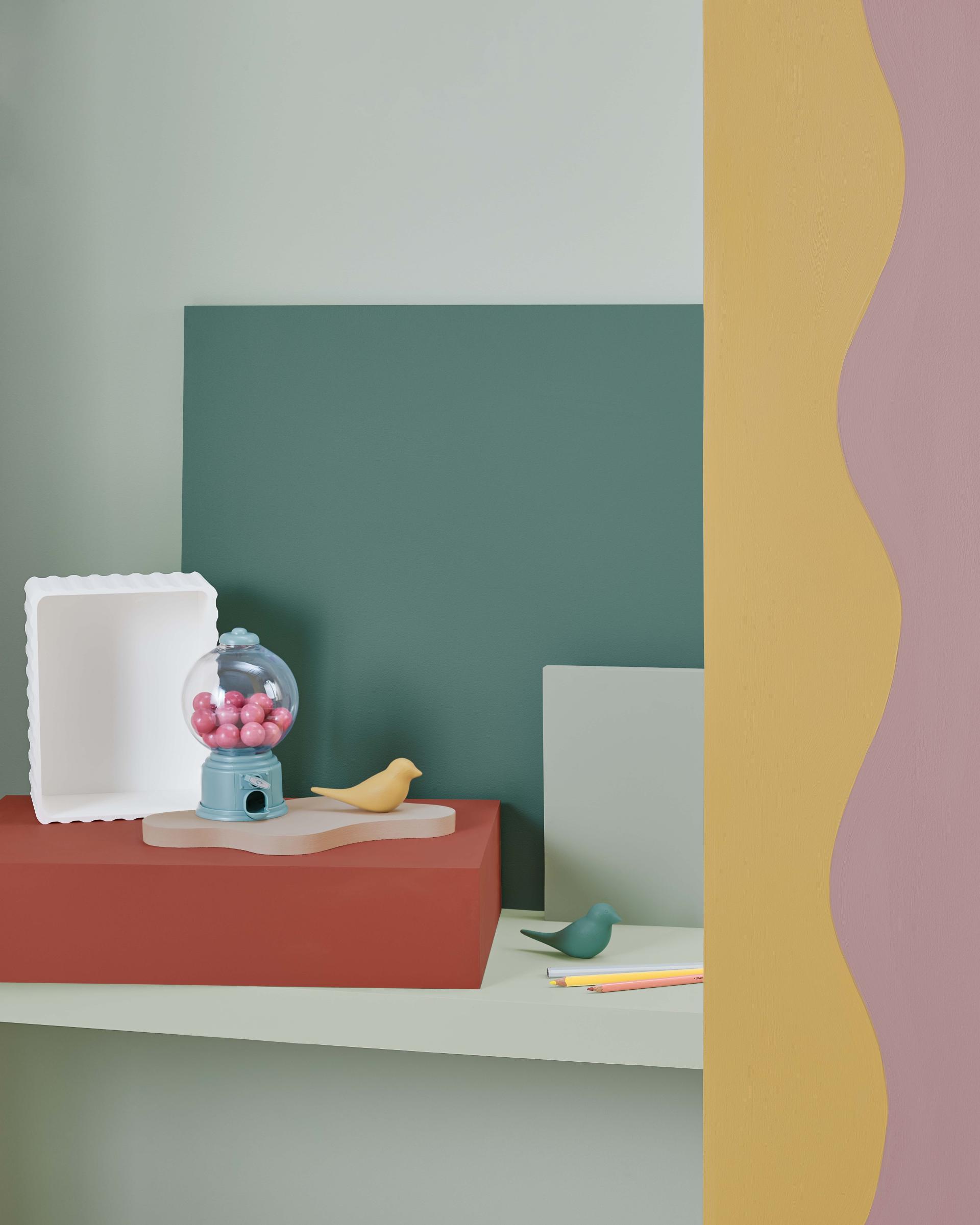
Escape
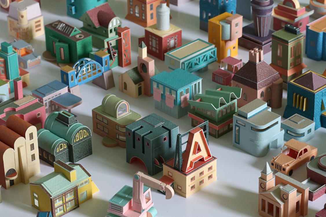
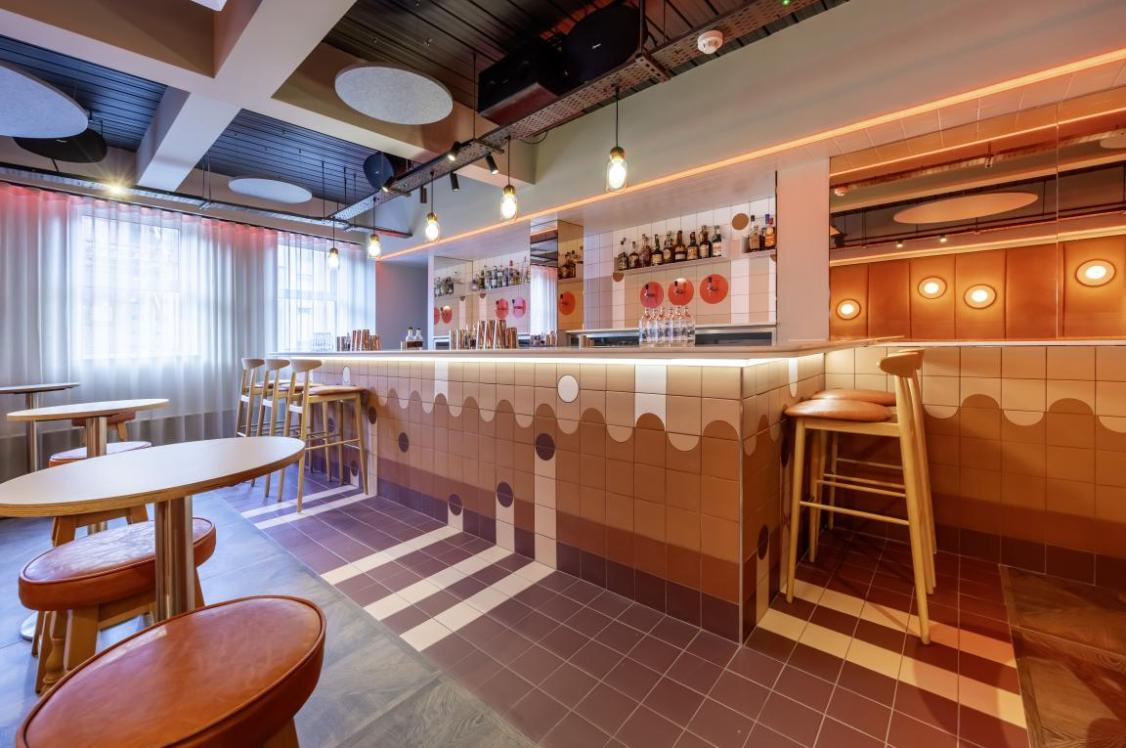
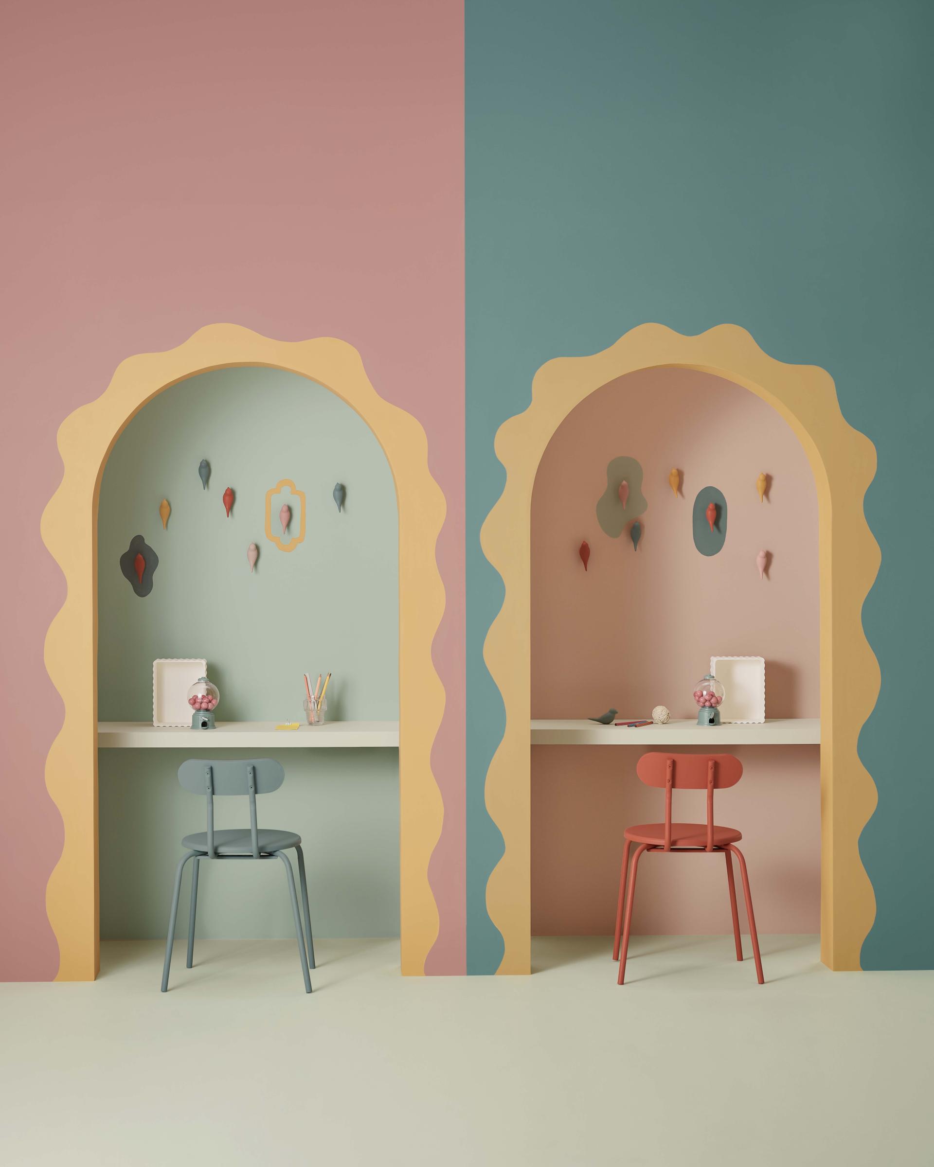
Candy colours such as mint green and vibrant yellow contrast with terracotta tones in the vibrant Escape palette, evoking a sense of nostalgia and playfulness.
Inspired by colours from old holiday photographs, keepsakes and vintage movie sets, Escape is a pastel-coloured sensory getaway for interiors.
The palette feels retro and quirky, but remains modern by creating a sense of the surreal, encouraging designers to break away from the mould and let their creativity run free.
"The thought of using colour and design to escape to another place and another time was the key driver for the Escape palette. To be immersed in almost surreal world of colour, treasuring it and treating it as a precious luxury" - Kathryn Lloyd, colour consultant at Crown Paints and Colour Insights panellist
Escape
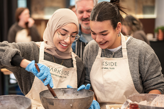
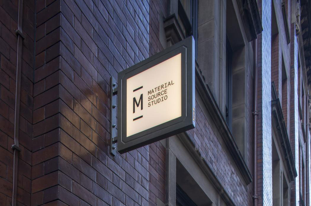
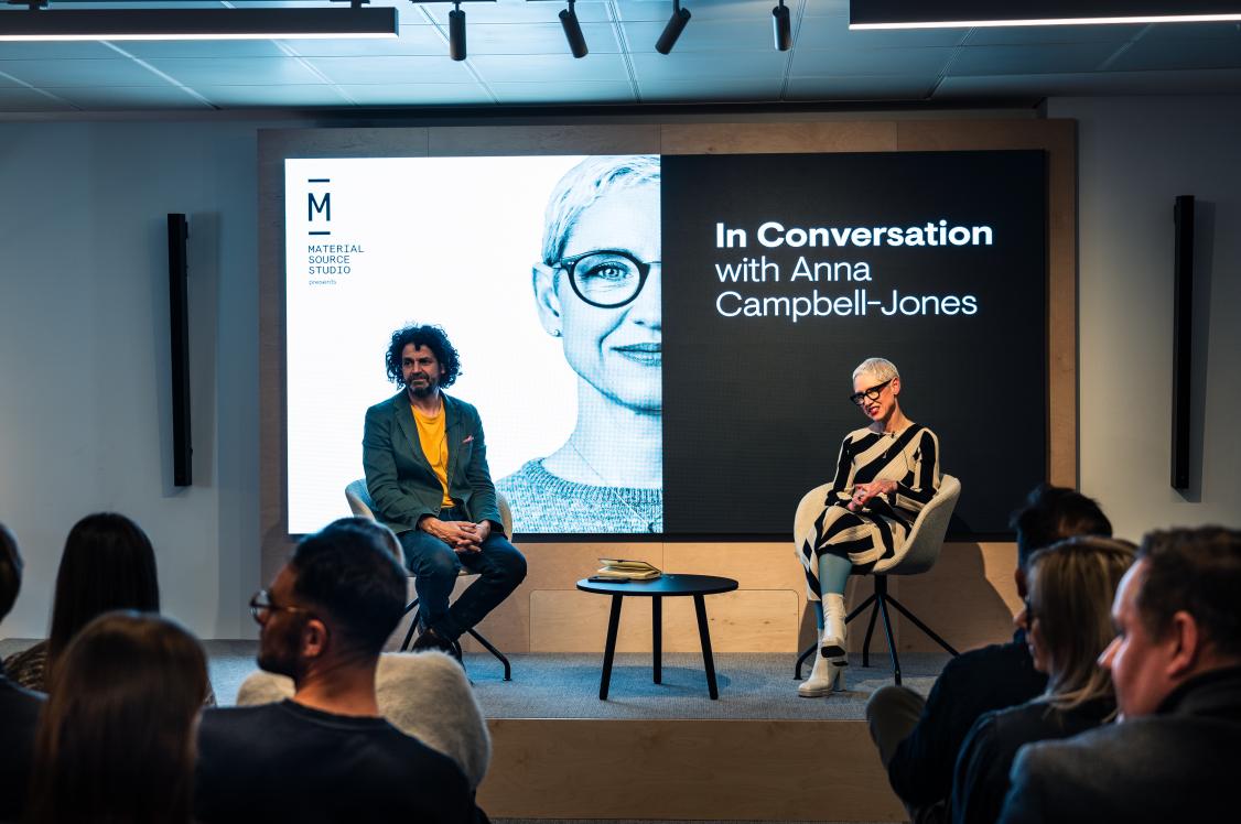
Find out more about Crown's Colour Insights here. And see the colours in situ at Material Source Studio Manchester & Glasgow.
In association with
We believe that every pot of paint is brimming with potential. And we want to put that in the hands of everyone. Because with paint, you can change a room, change a mood, even change a life.