


In Practice: With Manalo & White London.
In association with:

Alighting the tube at Wapping Station on a welcome, unseasonably warm day in March, we were immediately struck by the beauty of this area of the London borough, Tower Hamlets. A redeveloped former docks area right on the bank of the River Thames, Wapping Wall is the home of architecture practice, Manalo & White. And it has been for some time, Brian Greathead, Founder & Director, shared. 14-years to be exact.
Founded back in 1999, Manalo & White comprises a “diverse and cohesive team of designers collaborating on architecture and interiors, weaving pragmatism with playfulness to create rigorous, inclusive and joyful places.”
Fostering collaboration, inclusivity, and a good-humoured collective approach over individual ambition, in addition to being purposeful and practical, all underpinned by a focus on user needs over spectacle and showmanship, Manalo & White applies this approach to a wide range of sectors.
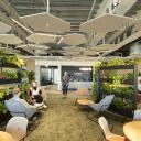
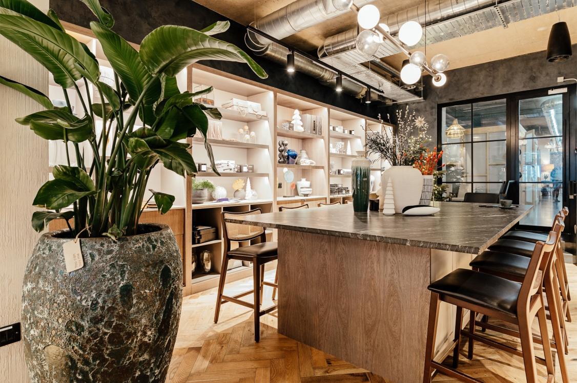
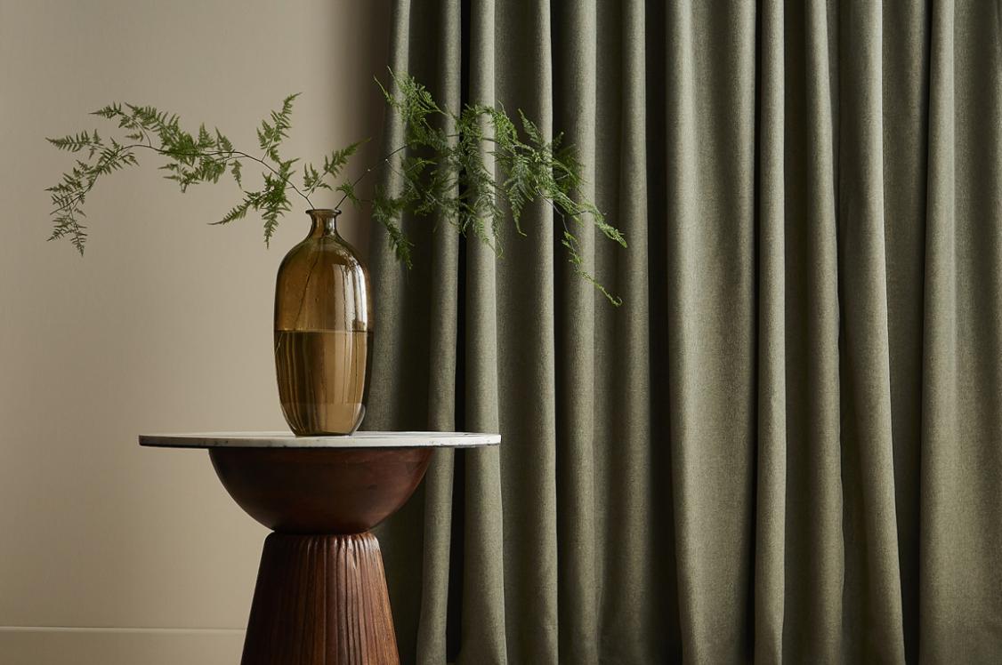
Their workspace reflects this. It’s not been crafted for show. Rather created to meet the needs of the team, while being usable – almost akin to a workshop. The elements that make up the Manalo & White studio have largely been acquired, as either ex-samples, materials repurposed from their previous office, or fixtures inherited from previous tenants Hawksmoor and reused. Everything feels purposeful though. It all has its place.
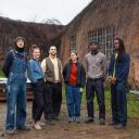
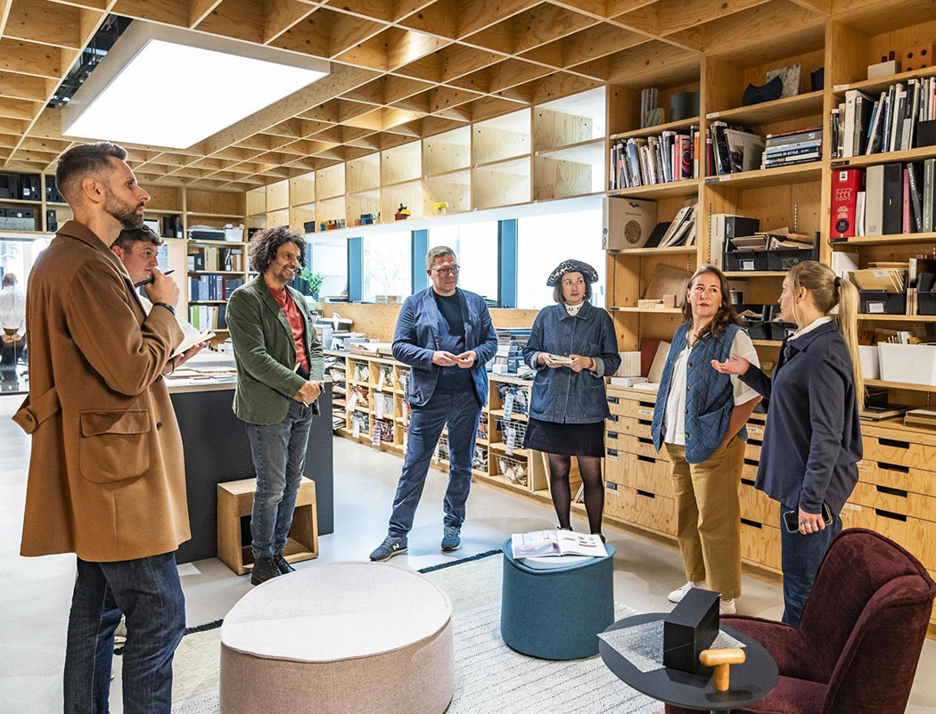
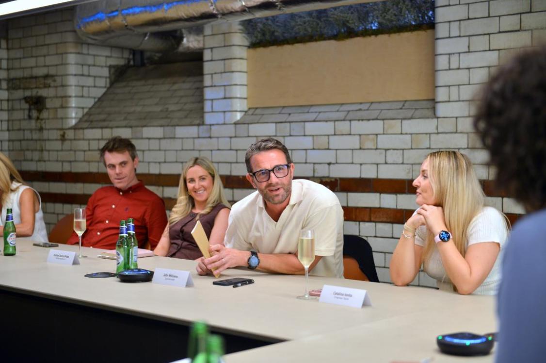
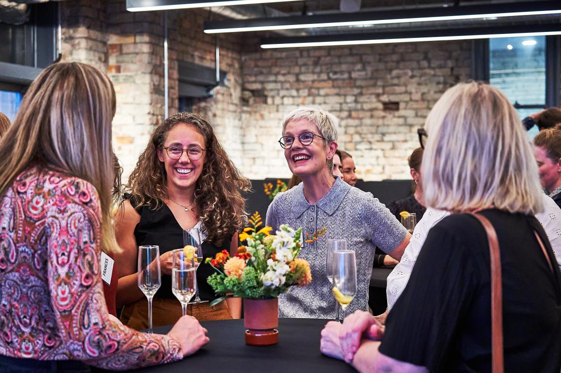
Taking Laura Connelly and David Smalley from the Material Source team, alongside Katie Hill and Karl Reeves from Parkside Architectural Tiles, for a walking and talking tour of the space was Brian Greathead, Founder & Director, alongside Lauren Li Porter, Associate Director, Manalo & White, giving us the stories behind every detail that bring the workspace to life.
Coming together
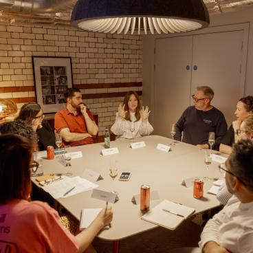
“The best design decisions sometimes start with something as basic as a table”, said Brian, as we stood towards the back of the studio admiring the view beyond. When “trying different heights of tables and chairs”, “doing what most people don’t bother to do”, Brian added, “sitting down and actually giving them a go for themselves before specifying”, an idea struck the team about what was needed for their own collaboration area.
A “proper” desk height would usually be around 750mm, Brian shared. But in this case, they wanted something slightly higher. Tall bar tables, though they look great, “don’t really hold up for a full day of thinking”, so were, quite literally, off the table, he said.
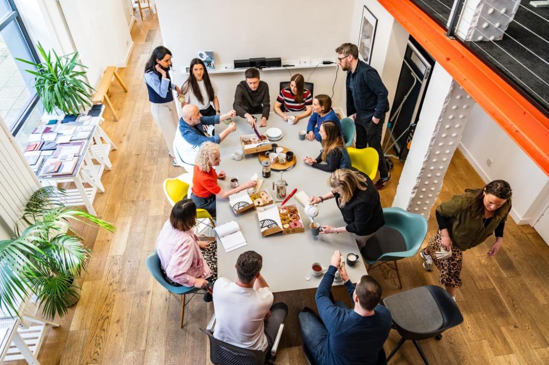
“Then we tried a 900mm-high table with the right chairs and had that rare moment where you instantly feel the difference in your body. Comfortable. Upright. Easy to talk. Easy to focus. So that was what we went with”, Brian commented of the 20-person table where everyone has access to the best seat in the house.
This experiment connects to the bigger belief: the “best seat” shouldn’t belong to one person, Brian explained. “If the common area is the best place to sit, nobody’s guarding it, and nobody’s stuck in a pecking order. Some days there are two or three of us up here, other days it’s four or more. People move around. I’m nomadic anyway, and I like a space that doesn’t force you into the same posture, the same desk, the same mood for eight hours.”
True of the workspace generally, Brian continued, “Chairs and tables quietly dictate behaviour. Benches, comfy seats, stools - they all nudge people toward different ways of working. Benches let you squeeze more people in. Sofas make it easier to perch for a quick chat. Stools and taller tables change the feeling of someone coming up behind you. At dining height, someone leaning over your shoulder can feel oddly intrusive. At the higher level, that same moment feels more like an easy conversation. It’s subtle, but it matters.”
Moving on up
“When we came out of lockdown, we’d grown”, said Brian. “We went into 2020 with 14 people in the office, and came out the other side with 20. Suddenly the old space wasn’t big enough. So we worked out a deal and moved from downstairs, up.
“The move wasn’t just about more room”, Brian added, “it was a reaction to how work had changed.”
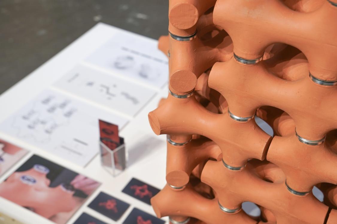
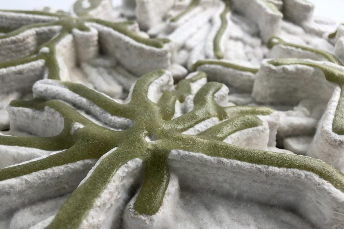
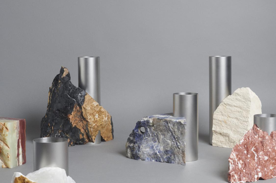
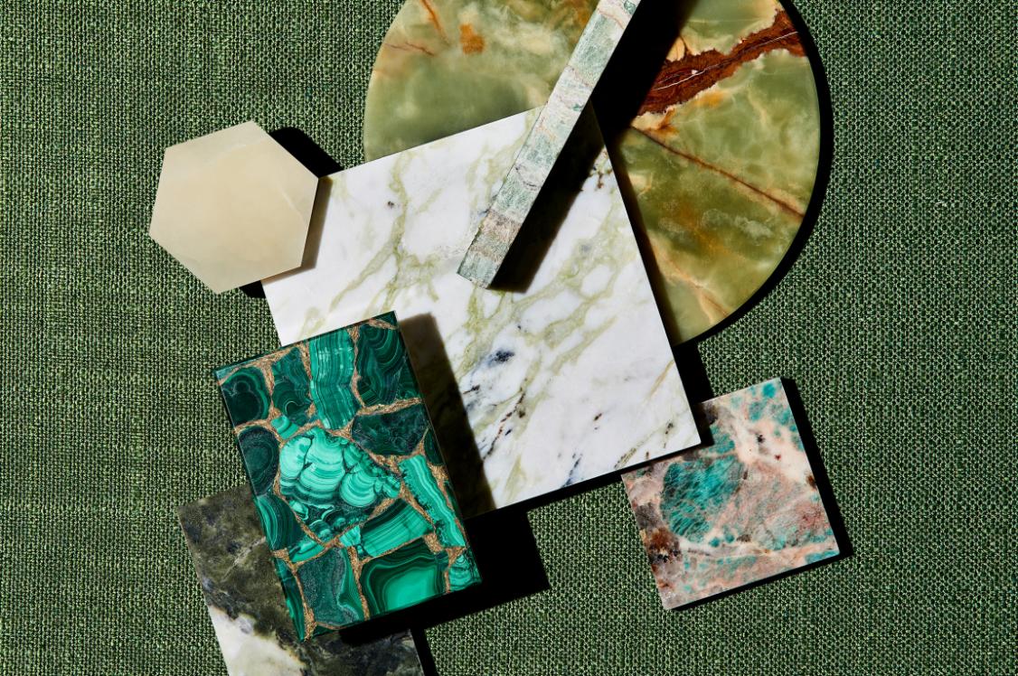
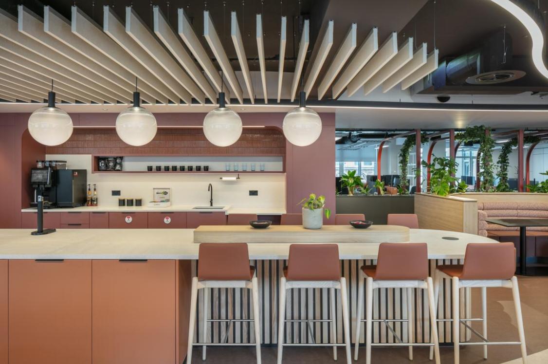
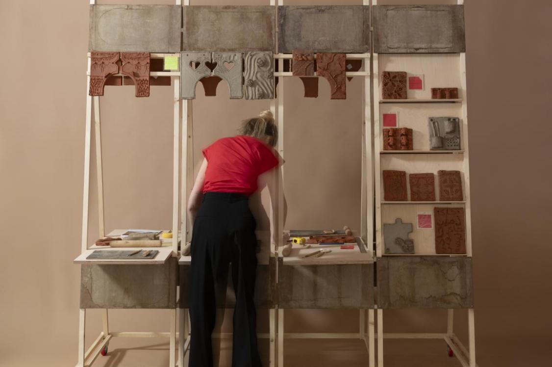
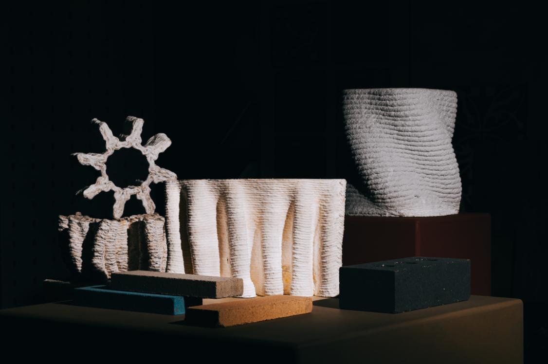
Part of this was a desire to include a material samples library in the space – it actually takes up half of the office. A clear indicator of how important tactility is to the team.
“During lockdown, like everyone else, we were choosing materials from images and PDFs. Deliveries were turning up at people’s flats, and homes were filling up with samples. But the bigger issue was that we were losing our connection to what things actually felt like.
“A tile can look perfect on a screen and be a horror show in real life. We had one that looked like terrazzo on a PDF, but in person it was clearly a cheap imitation. That was a wake-up call. So one of the main goals in the new studio was simple: get materials out where people can see them and touch them. Not hidden in boxes. Not buried in a sample library that nobody wants to dig through. If we’re designing real spaces for real people, we need to stay close to real materials. Texture, weight, shine, edges, how it ages - those things don’t come through on a screen”, Brian said.
While exploring this area of the office, Brian also pointed out some parts of the space that had been inherited - that didn’t entirely feel like them, Brian admitted, but that they didn’t have the heart to rip out for the sake of it. Of the meeting room, Brian said, “There was a screen with that slightly cobbled-together, found-object energy that I do like in principle, but it was made from different coloured doors, and it felt ‘noisy’. I didn’t want to rip it out because that felt wasteful, but I also didn’t want to live inside someone else’s design. The solution ended up being almost embarrassingly straightforward: paint it the same colour as the other doors. Suddenly it calmed down, made sense, and became ours.”
This notion of ‘owning the space you work in’ was a reoccurring theme of the chat. Every detail matters.
The art of experimentation
The office is split by a wall, and that’s not an accident either. “A big room can feel smaller and more usable when you break it down into zones. It’s also part of encouraging people to move. I’m always pushing the idea that you should get up, get off your desk, change position. The way you think changes when the way you sit changes. Sitting for eight hours, half-slumped, staring at a screen isn’t just bad physically, it’s bad for the work”, suggested Brian.
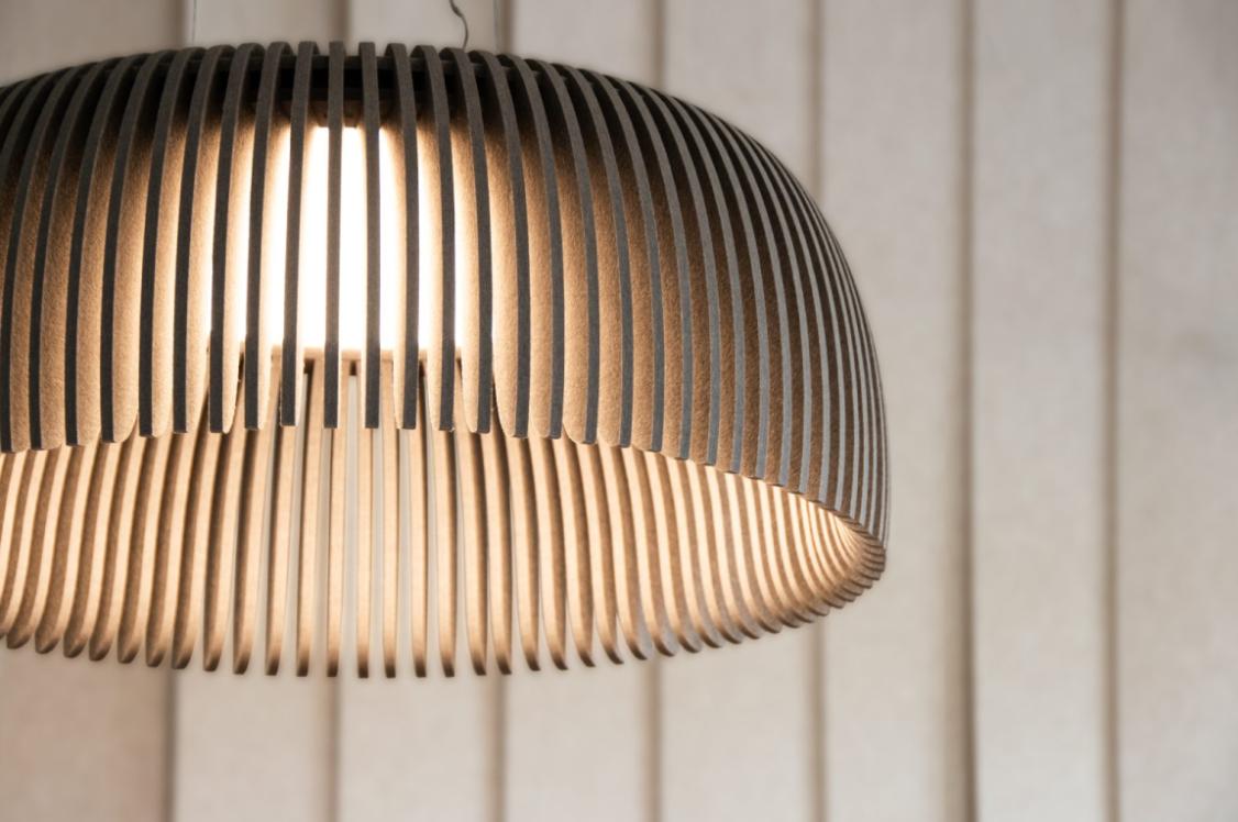
Lighting is another constant experiment. “We inherited lighting that isn’t great, but we’ve been swapping tubes, testing different LED options, and playing with colour temperature”, Lauren told us. “Daylight temperature matters when you’re reviewing finishes. In winter there’s so little actual daylight that you need a way to check materials in conditions that resemble real life.”
The workshop corner tells the same story. “We’ve got tools, bits and pieces for model making, and while I’d love to say we build models all the time, we don’t as much as we should. Time and budget always get in the way. But having that workshop energy in the studio still matters. It keeps things physical. It keeps the making mindset nearby”, said Brian.
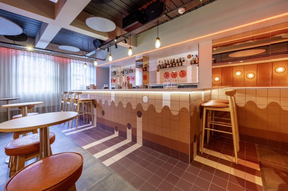
And then there’s the “secret second life” of the sample library: the cocktail bar. Hospitality, Brian said, is really integral to how the team works. “We want clients and collaborators to come in, feel welcome, have a drink, talk properly. Sometimes we open the bar just for ourselves as well, and office parties stop being that awkward thing you dread and become genuinely good fun.”
“Somewhere along the way I got into cocktails, properly. I used to think cocktails were expensive nonsense, why queue at a bar when you can just get a beer? Then someone taught me what to order and when: a Negroni before dinner, an Old Fashioned after. Once you see it as craft, you start paying attention. Like materials, it’s about the details: balance, timing, the right thing in the right context.”
Over in the corner flashes a neon sign. A good old fashioned American dive-bar style one. “I kept asking for it, and then one day it appeared: the most generic “bar” sign you can imagine, like something from an American dive bar in a film. It’s perfect. It gives the space permission to be playful”, said Brian, fondly.
Going right back to the beginning, Brian said it was playfulness too that fuelled the studio’s origin story. “We had this moment with ChatGPT where someone asked it about “Manalo & White” and it confidently invented an entire backstory about two architects who don’t exist. It was hilarious and unsettling at the same time. It reminded me that if clients use AI to find designers, you can’t ignore it. You have to teach the internet who you are, or it will make something up!”
The name Manalo & White actually comes from Brian and his DJ partner’s “two favourite Barry’s”. “He bet I wouldn’t name the practice after it. I did. It was meant to be a stopgap. Twenty-five years later, it’s still here. I keep asking if we should change it, and so far, nobody has voted ‘yes’.”
Style backed substance
Brian and Lauren shared that when it comes to projects, a lot of Manalo & White’s work sits within the hospitality and residential sectors: hotels, student accommodation, and the shared spaces that make those buildings work. “The last year has been tough across the industry”, shared Brian, “but we’ve felt something that also feels familiar: repeat clients calling with projects and asking to negotiate fees, rather than endless beauty-parade pitches. They’re not always big, but this keeps the engine running.”
For student accommodation (PBSA), the design challenge to solve there is not style-related, but operations, the pair said. “You can spend an hour and a half talking about parcel systems, because if the logistics of that don’t work, the reception staff spend 90% of their time firefighting, and residents get frustrated. It sounds boring until you realise that friction is what people remember. Remove the friction and the whole building feels better.
“There’s a line I love: to design for students, you have to become a student of students. It’s true. You have to understand how 18-year-olds live now, and how they’ll live two years from now. It changes the way you see priorities: privacy, safety, social space, quiet space, tech that works without drama”, Brian added.
Returning to the importance of ‘trying before you buy’, in projects, Brian said, “We made a rule internally: no one specifies a chair unless they’ve sat on it. It sounds obvious, but you’d be amazed how easy it is to pick something that looks great and feels awful. We have one chair that became the ‘naughty chair’ because it taught that lesson the hard way.”
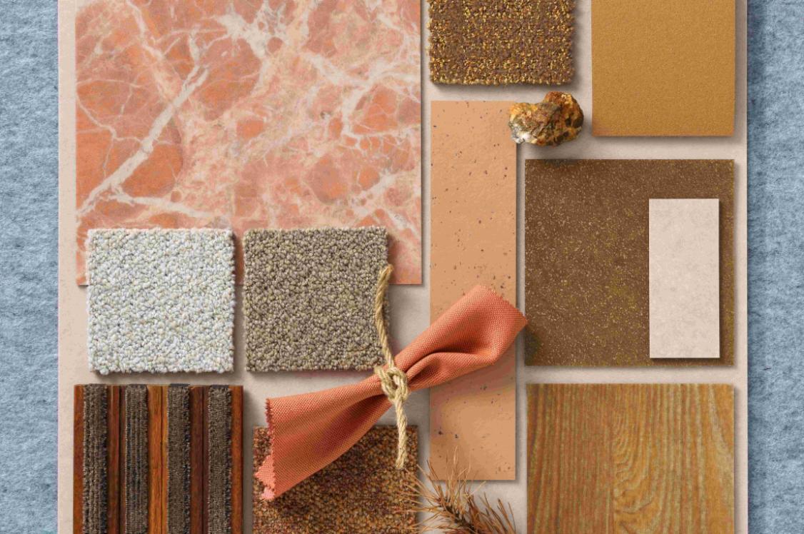
The same goes for finishes, he said. “It’s not only about cost, lifecycle, and provenance. It’s also about tactility, durability, how it ages, how it wears.”
“In many projects we’re trying to hit a “four-star hotel” feel on tight budgets, which means understanding where to spend and where to simplify”, added Lauren. “Tiles, for example, can be brilliant: durable, easy to maintain, and visually strong. But you have to deploy them with intention because labour adds up.
“We’ve also been pushing into the parts of design that people don’t photograph: acoustics, comfort, and sensory experience. We’re visually saturated as a culture, so the temptation is to design for the camera. But good spaces are fully sensory. When you start thinking about neurodiversity, or dementia-friendly principles, you realise those ideas don’t just help some people, they make spaces better for everyone.”
Testing, testing
For this reason, experimentation and creativity is central to the Manalo & White team’s practice.
For one particular project, Lauren is experimenting with acoustic products making them stand-out design elements, not hidden panels. “Taking shapes from something local, like Roman mosaic patterns, and scaling them up into large acoustic relief panels can turn function into artwork. It’s that sweet spot: visual joy, tactile quality, and practical performance, all at once.”
As we said our goodbyes, a lasting thought impressed that this, in summary, is exactly what the studio is: a working test bed. Tables and chairs that prove a point. Lighting that’s constantly being adjusted. Materials you can touch. A space that supports focus, movement, conversation, and hospitality. For Manalo & White, it was never about making an office that was outwardly impressive. It was about creating a place where the work is allowed to grow and get better because the environment is doing its job. And sometimes, that starts with acknowledging that opting for a slightly higher table can make all the difference in the world.
A huge thanks to the Manalo & White team for hosting us at your HQ. And thank you to our supporters for this instalment of In Practice, Parkside Architectural Tiles – Partners at Material Source Studio London, Manchester & Glasgow.
Manalo & White: At a glance
Founded: 1999
Location: Wapping Wall, London
Team members: 20
Sectors: Residential, Hospitality, Arts, Community, Education, Heritage, Industrial, Retail, Workplace
Website: manaloandwhite.co.uk