


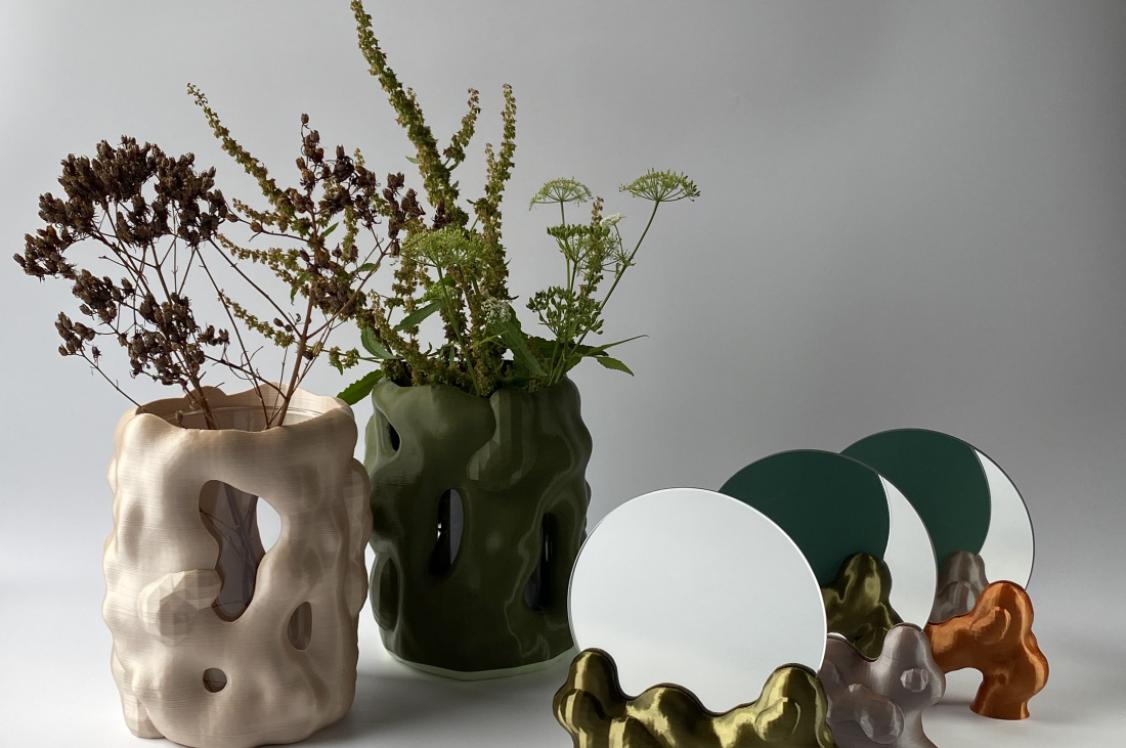

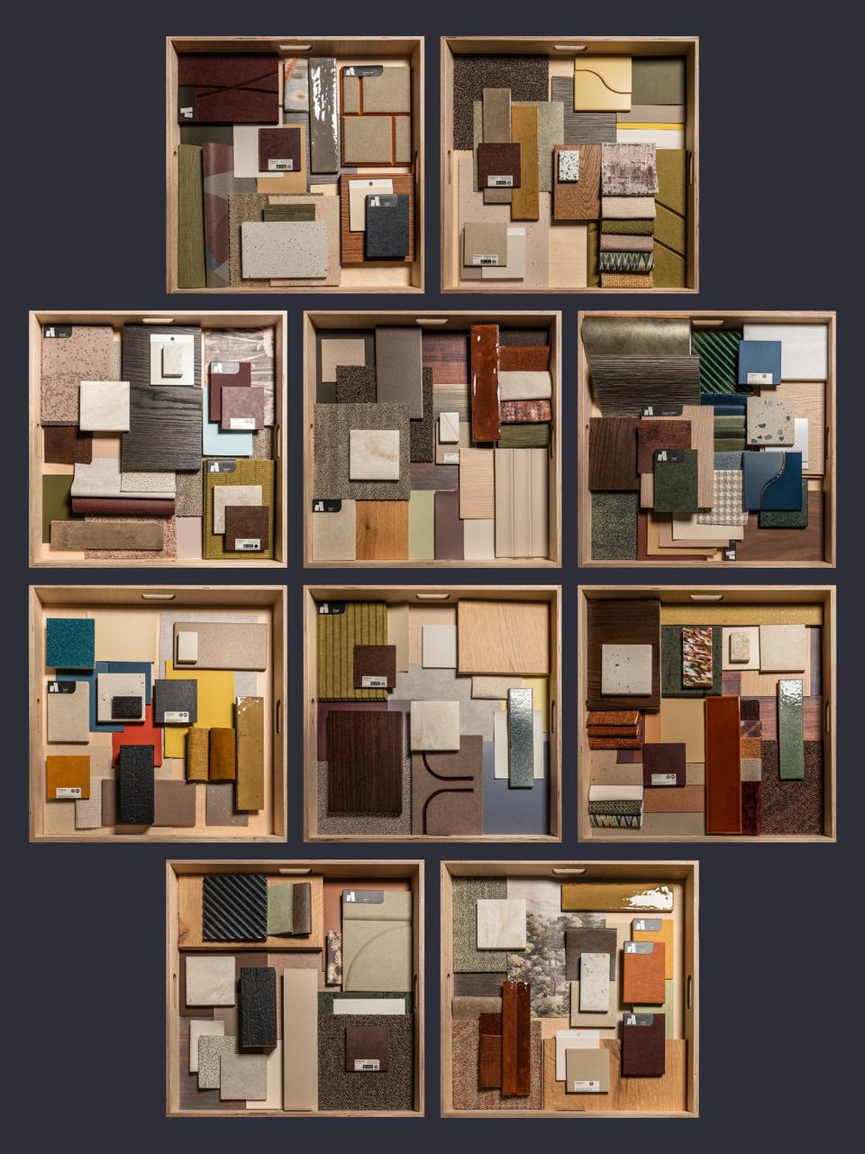
Material Moods: 10 creative expressions of Belonging.
In association with:


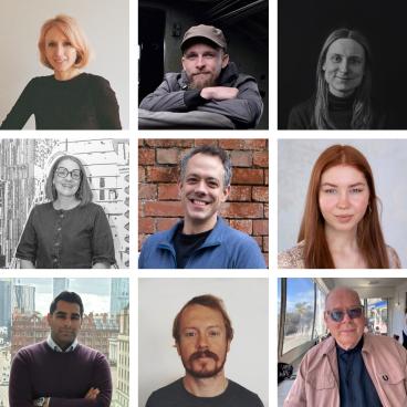
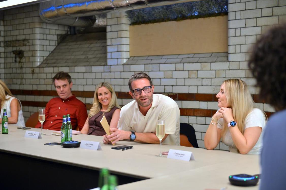
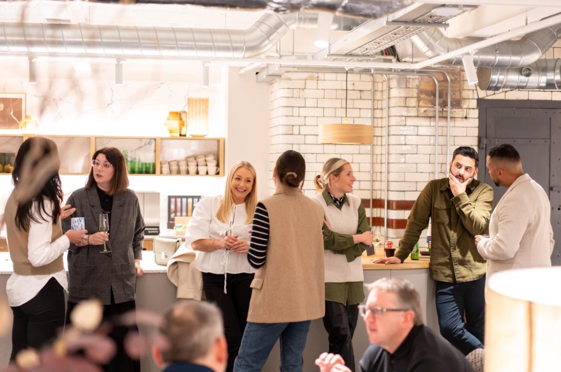
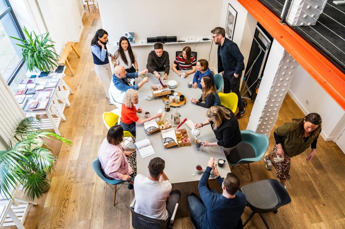
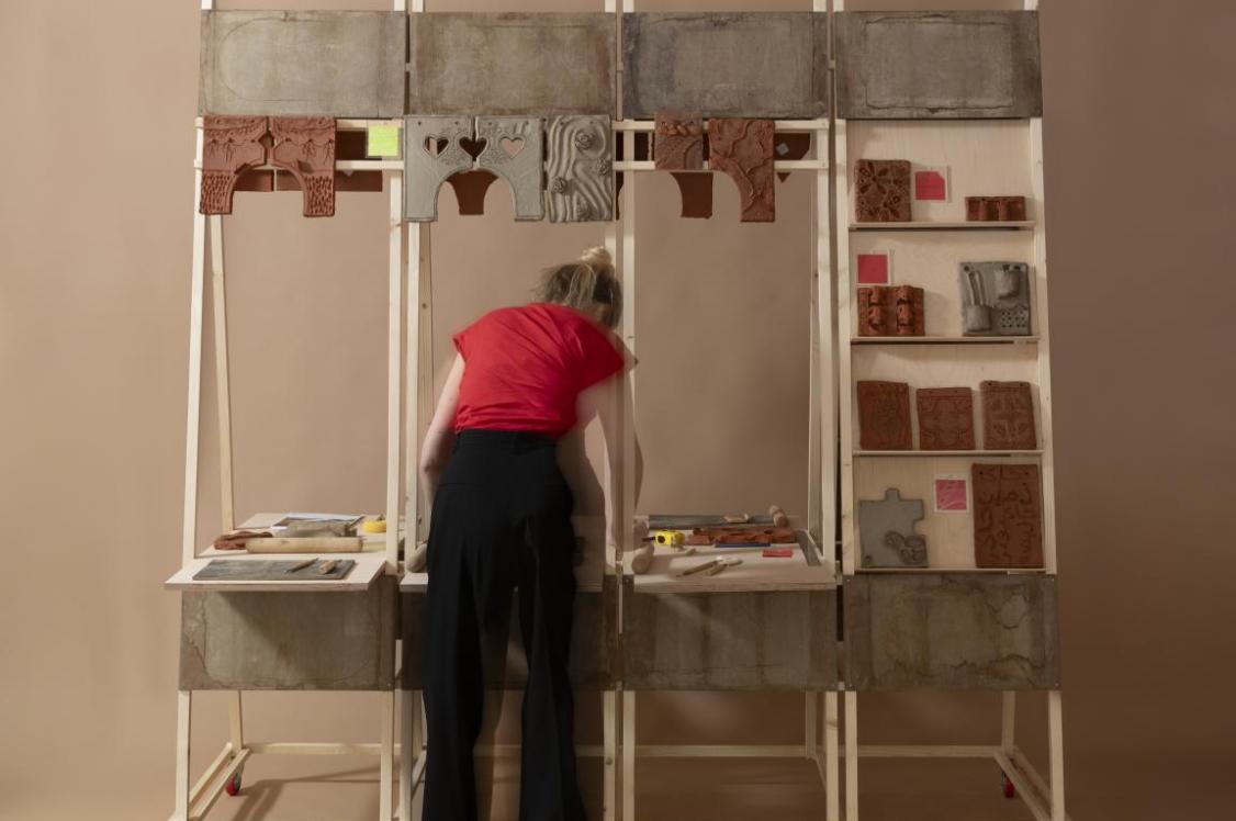
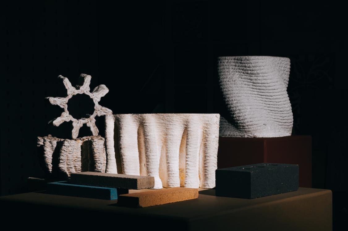
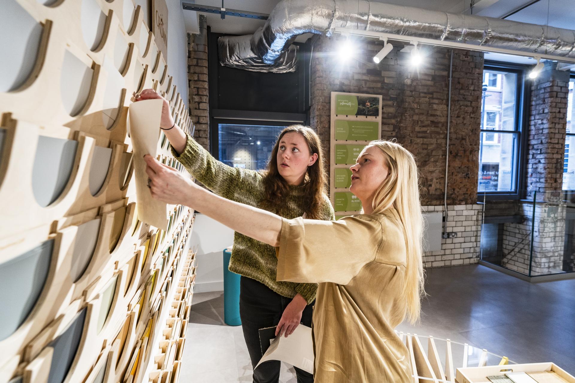
Through our workshop, the latest addition in the Material Moods set, we asked both design professionals and emerging next generation designers to interpret 'belonging', translating it through creative expression into a palette for an interior design scheme.
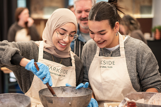
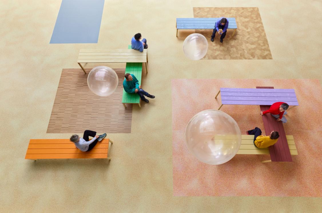
What became clear through each team's interpretation is that belonging has an individual meaning to us all. It might be an enablement of self-expression and individuality. Perhaps it's encouraging community and a sense of familiarity. Ultimately, belonging is a sensation that we believe can be nurtured in design. On the day of our workshop, a sense of it in practice could physically be felt in the room. And this empowered the people within to craft 10 very different narratives – no two the same.
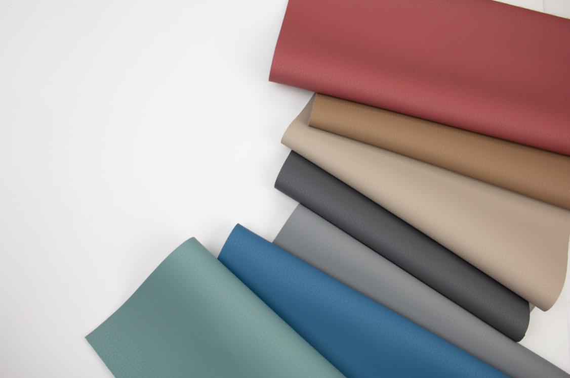
Though for some teams, a link to nature through the selection of neutral tones was favoured, for others tactility, warmth, and texture took the fore.
Take a deep dive into our group's interpretations and resulting creative expressions...
Louise Grimes, Director, M1NT Studio & Delaney Arias, Student, University of Salford
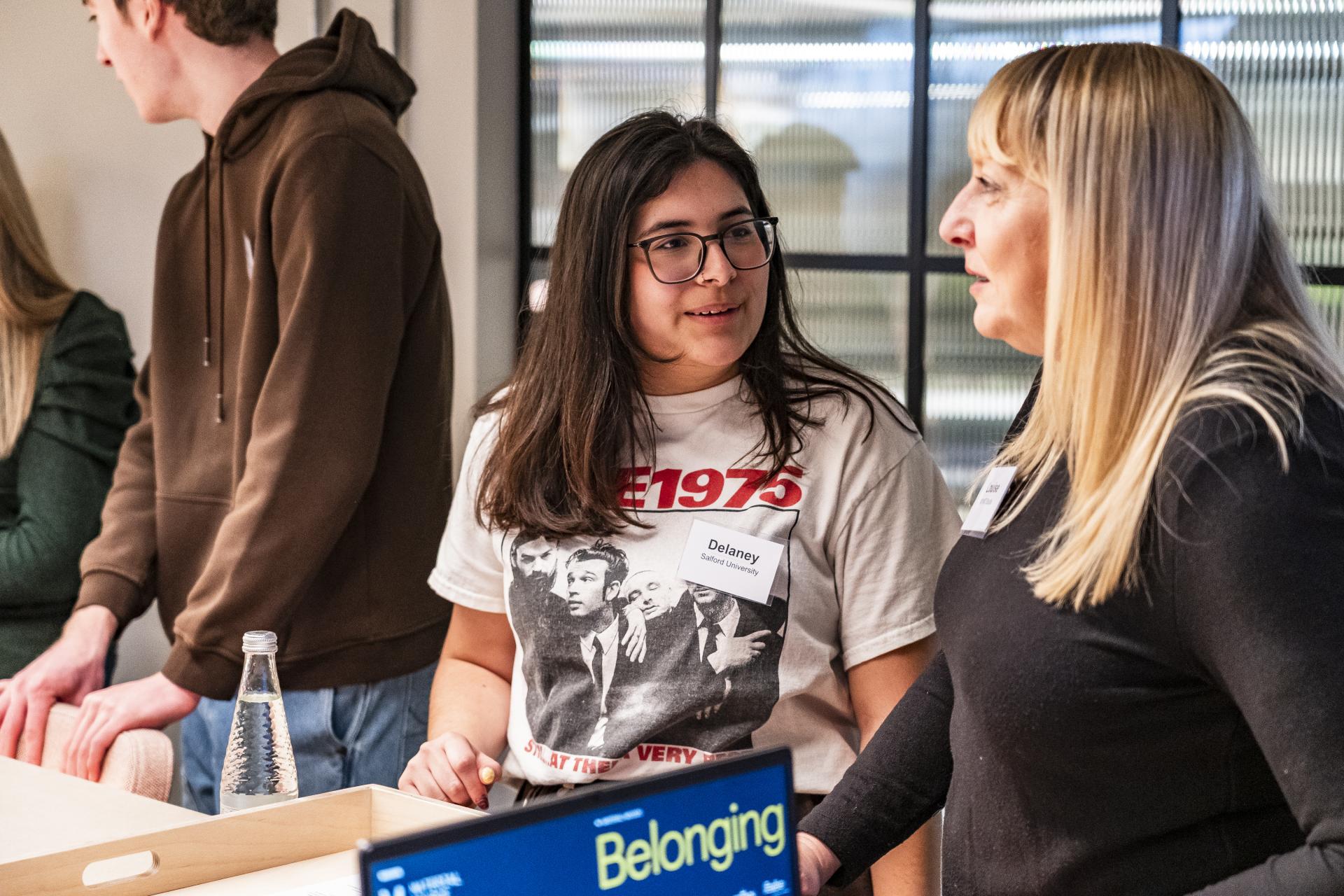
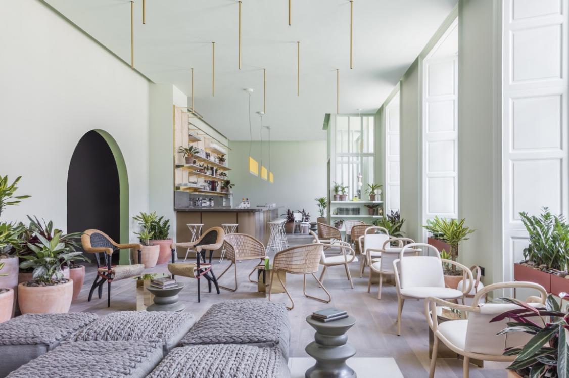
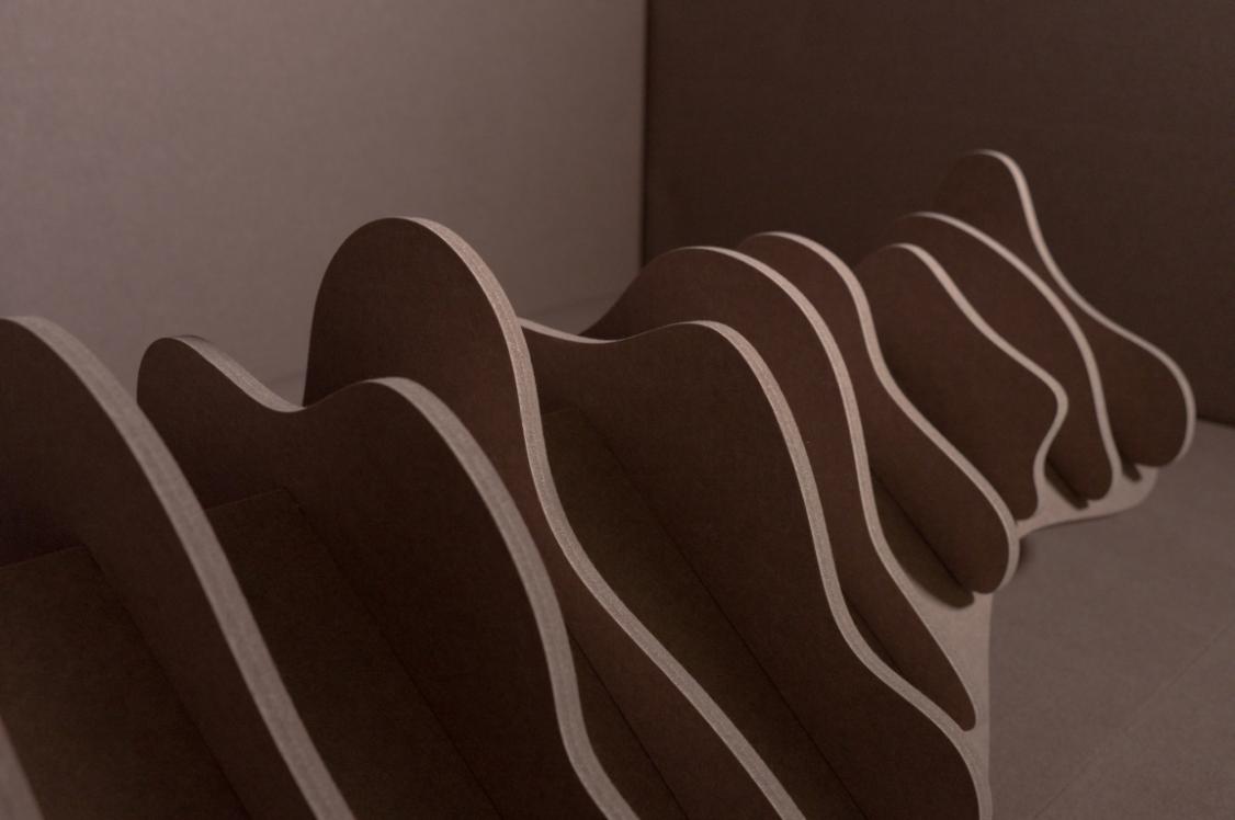
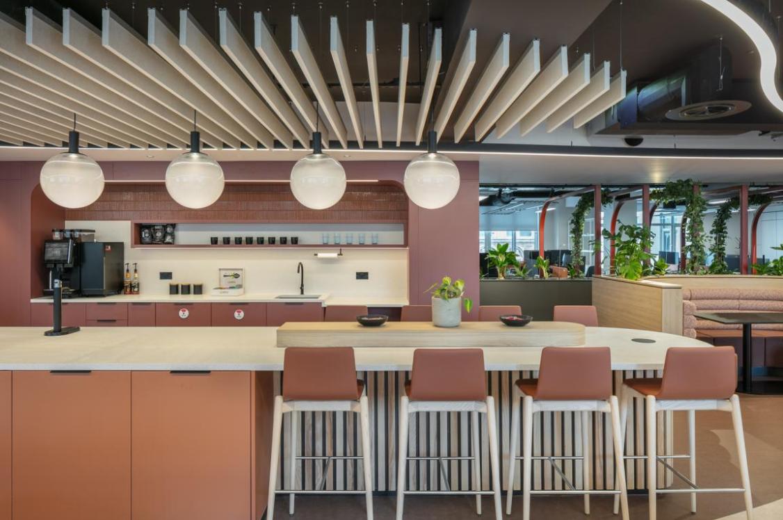
A hospitality scheme designed around the use of Autex Acoustics’ panels, Louise and Delaney set out to create a space that felt simultaneously rich and restorative.
Their concept balances the need for both sociable and solitary spaces - designing environments that are warm and inviting for connection, while also offering quieter pockets for reflection. Softness is central to their design thinking: the selected textures feel approachable.
The result is a palette that wraps occupants in comfort, fostering the kind of ease in which genuine human connection can take place.
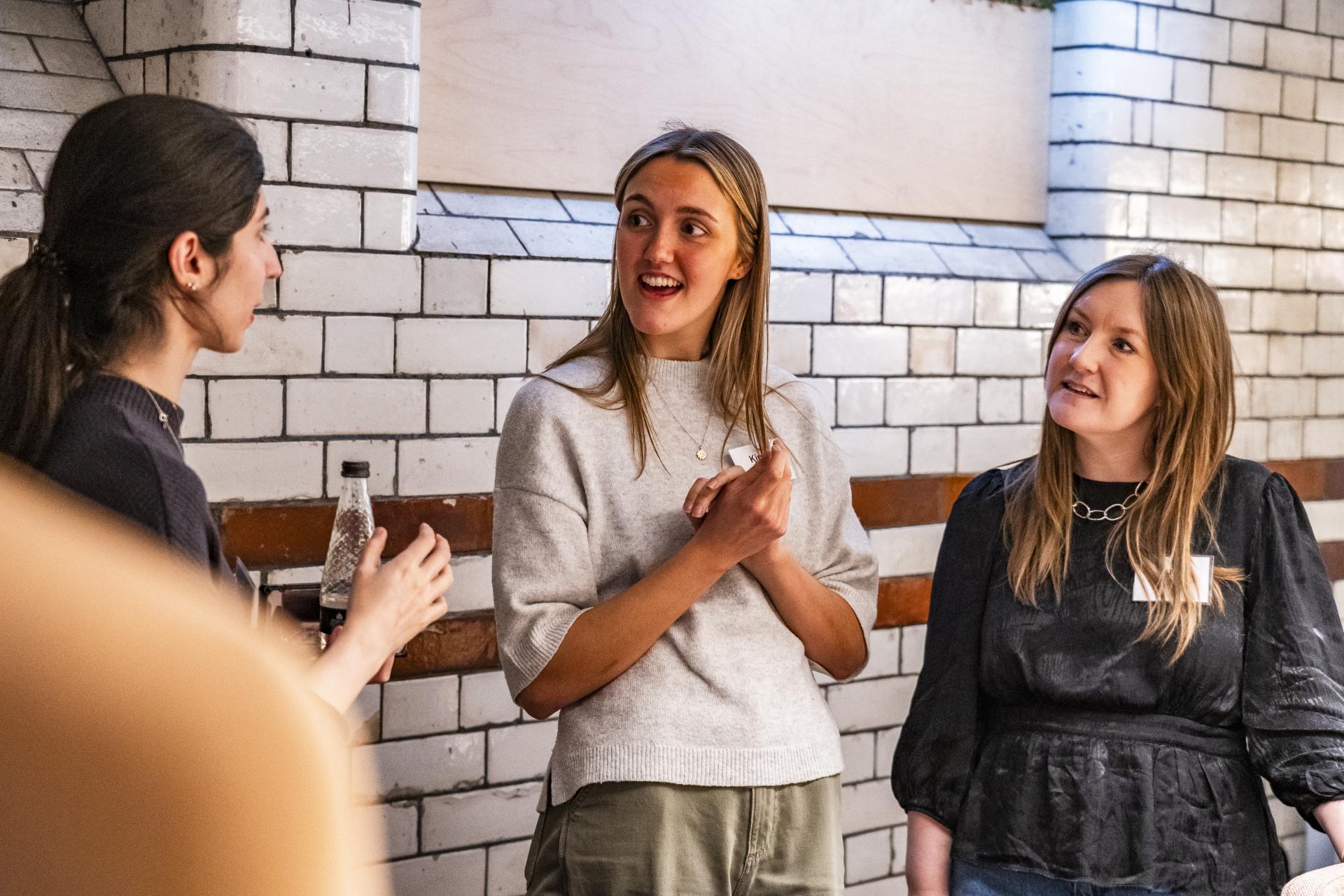
Sarah Syson, Director, Claremont & Jacob Bennett, Student, University of Salford
Sarah Syson, Director, Claremont & Jacob Bennett, Student, University of Salford
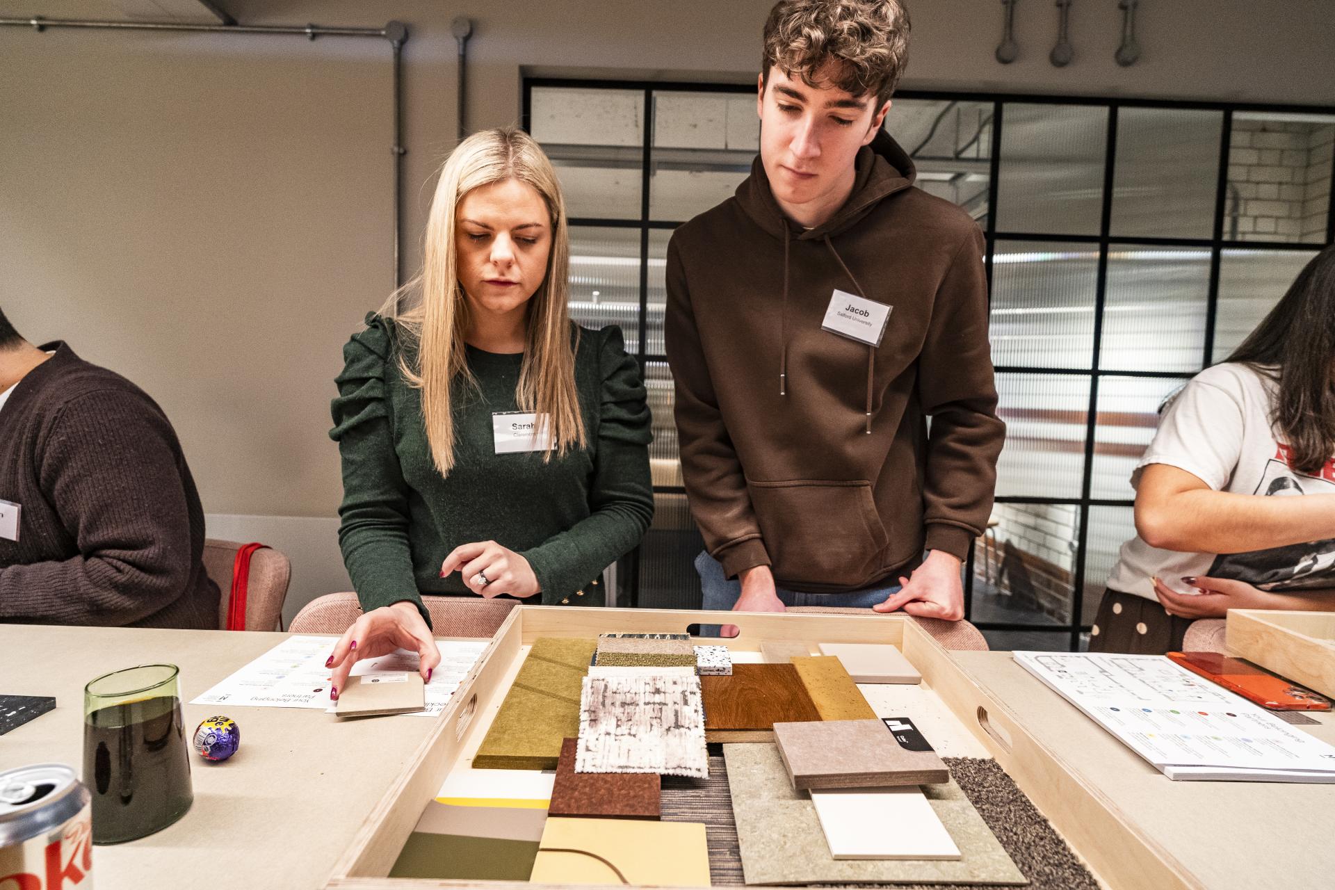
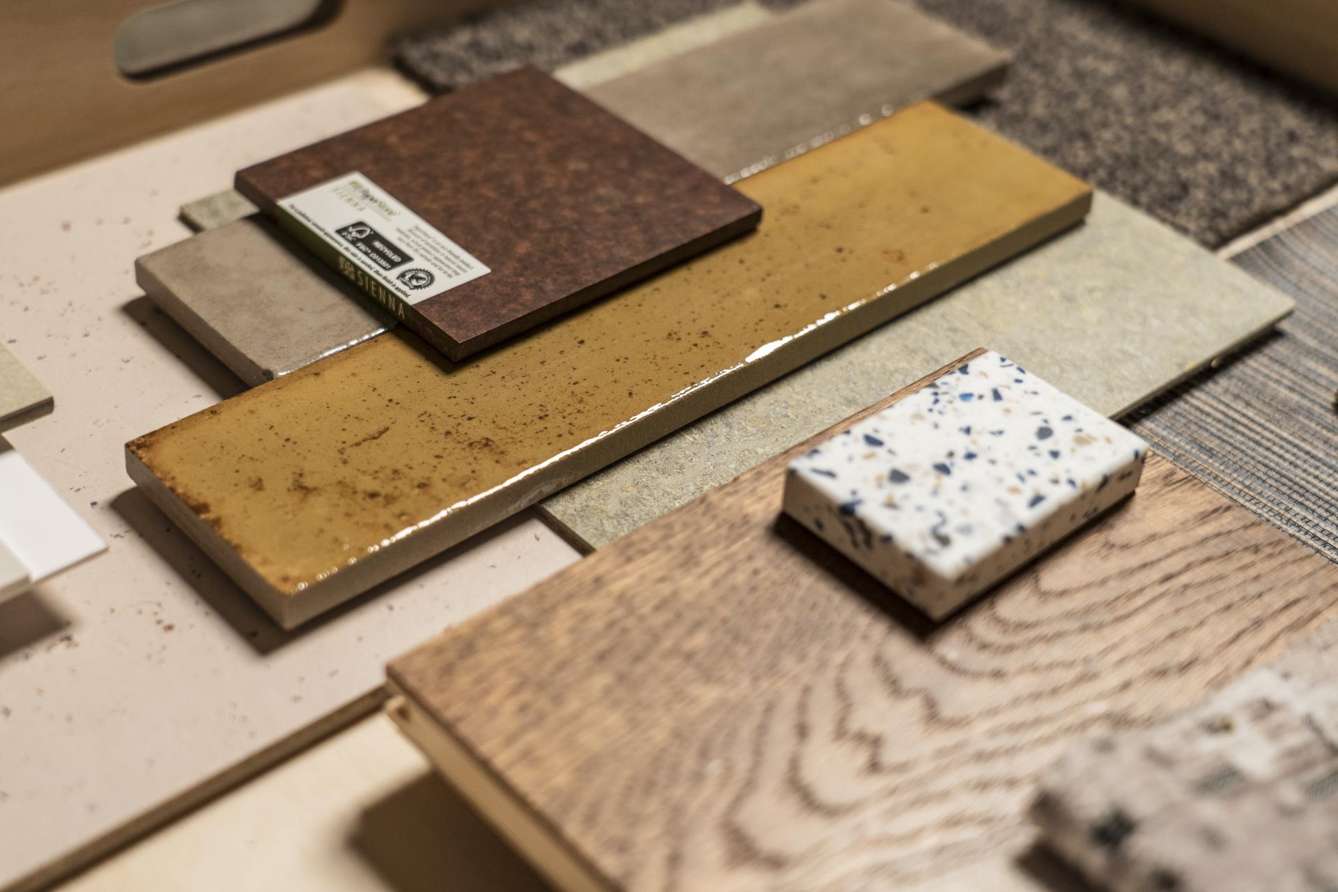
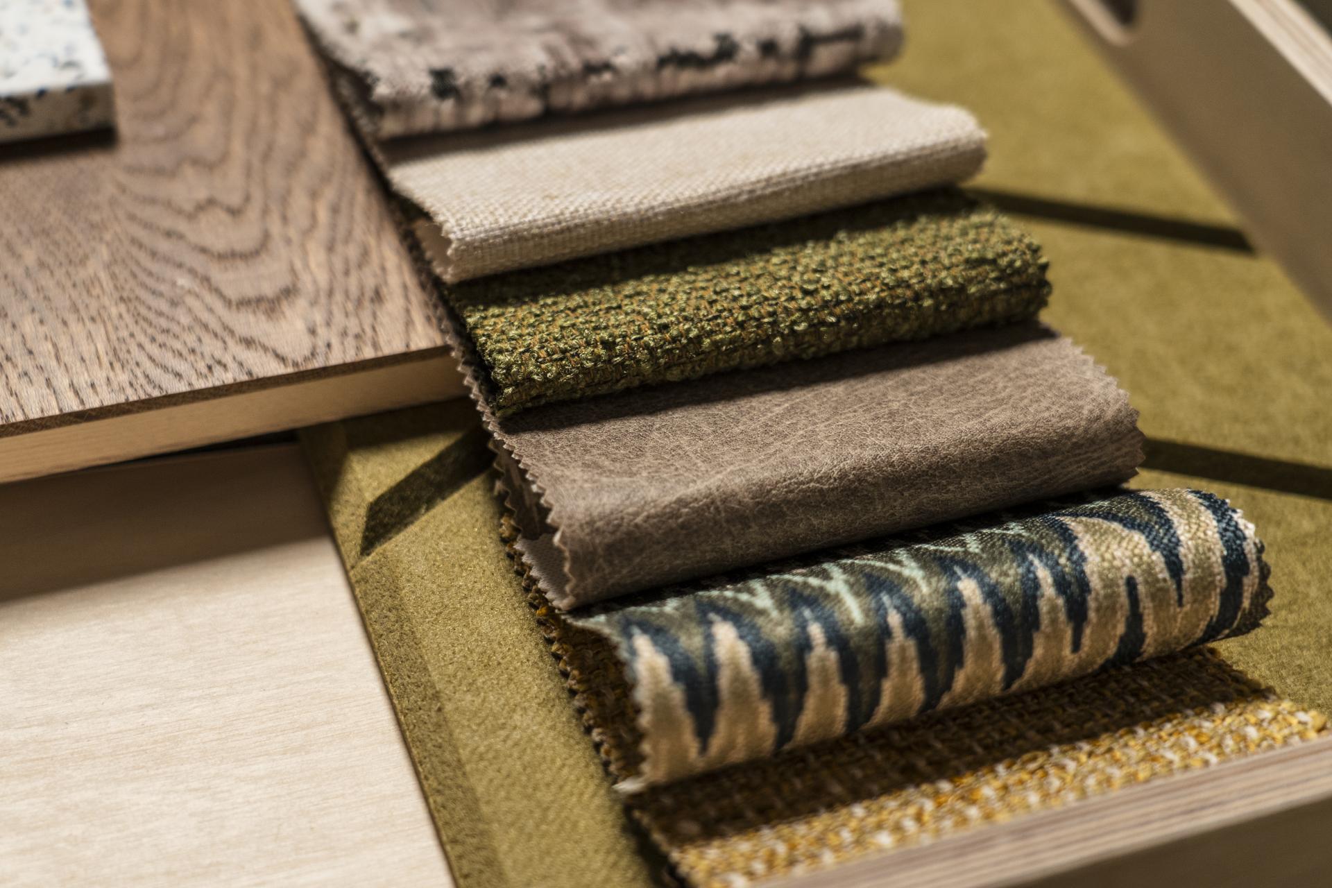
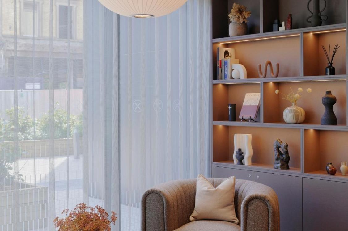
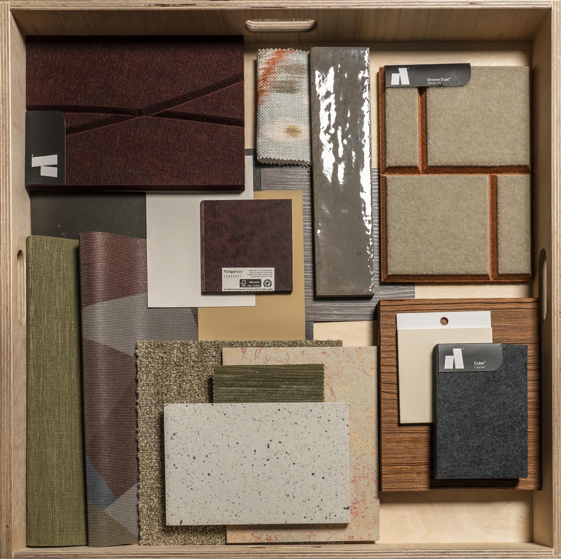
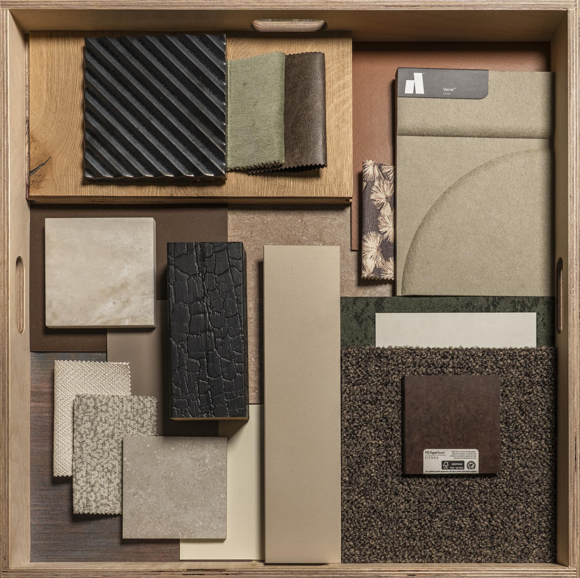
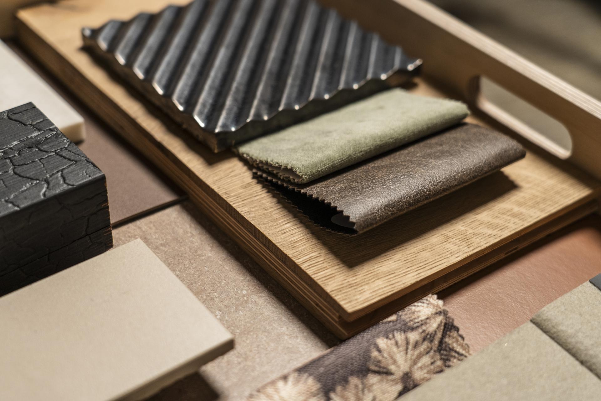
Belonging, in its most primal sense, is a survival instinct - a deeply ingrained human need to be part of a tribe and to feel secure within a group. Sarah and Jacob’s palette for the workplace responds to that impulse through material truth.
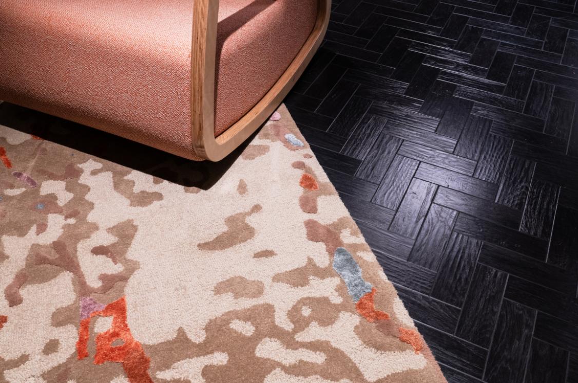
Earthy browns, sage greens, and grounding neutrals recall the natural world from which we all originate. Surfaces that feel instinctively familiar, unforced, and honest. The result is a workplace that doesn't perform belonging; it simply evokes it, cocooning occupants in the tones and textures of somewhere we have always, collectively, called home.
Video by Louis Marlowe
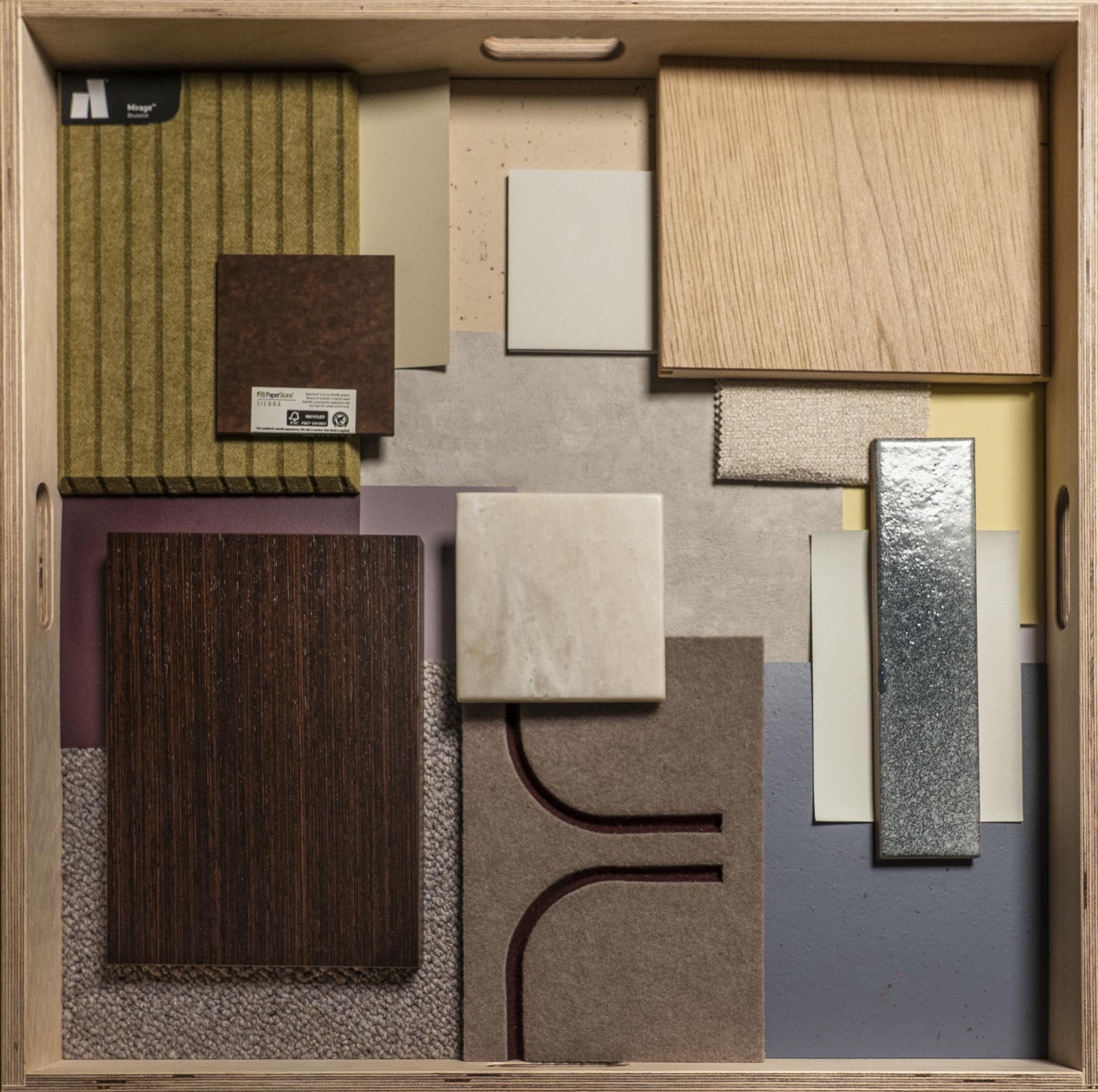
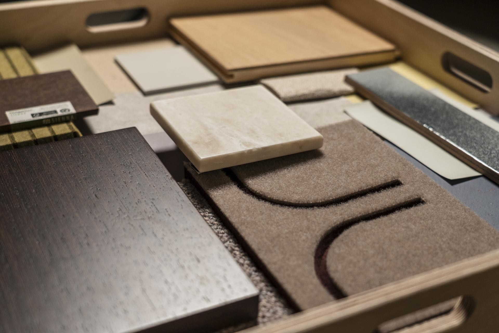
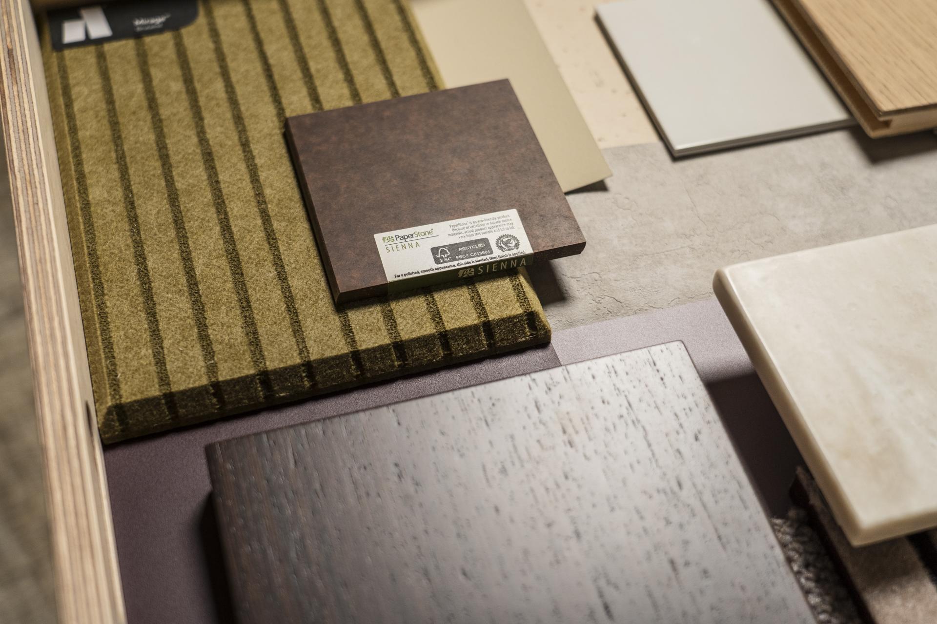
Quentin Petrykowski, Design Manager, Claremont & Tasnia Islam, Student, University of Salford
Quentin Petrykowski, Design Manager, Claremont & Tasnia Islam, Student, University of Salford
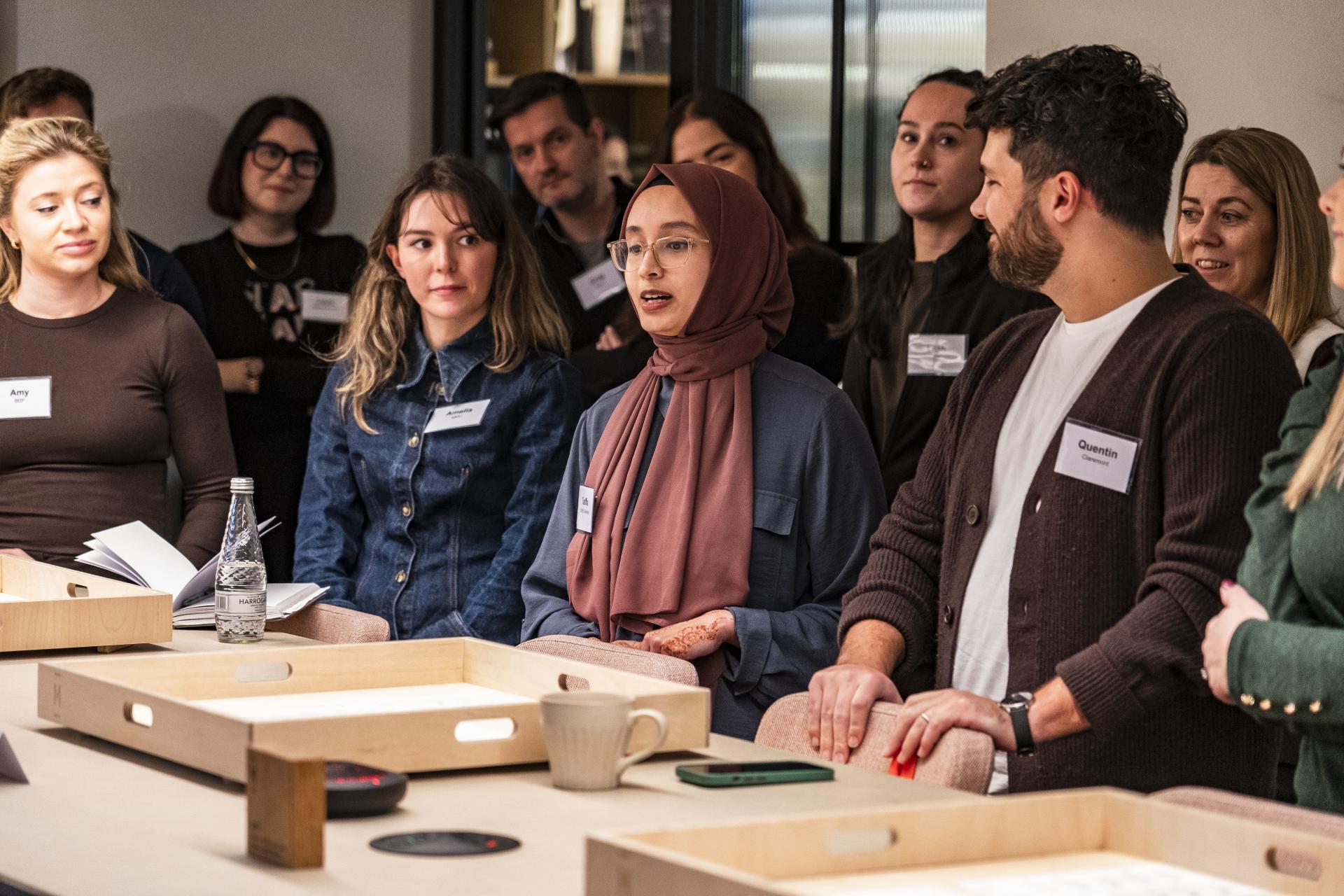
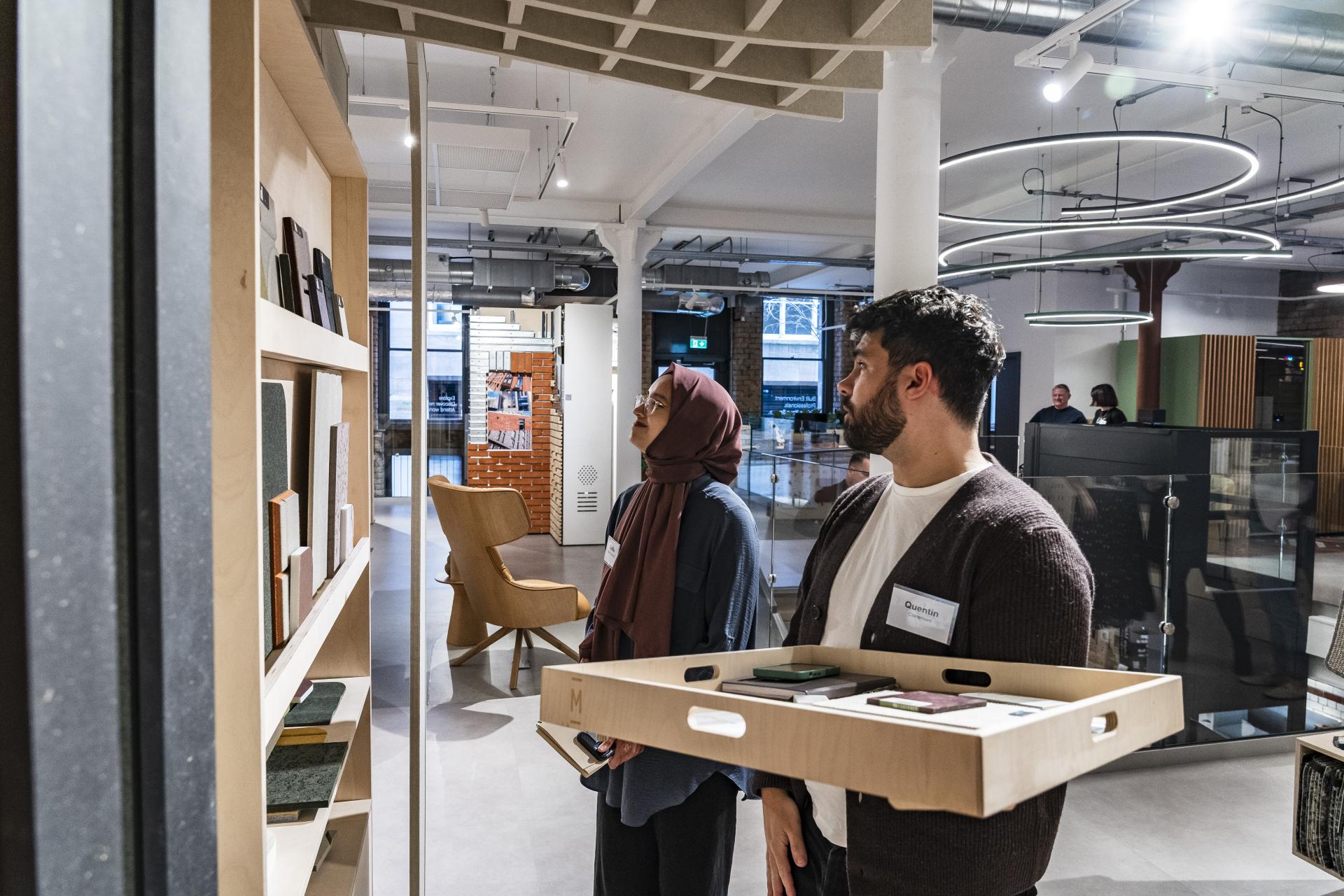
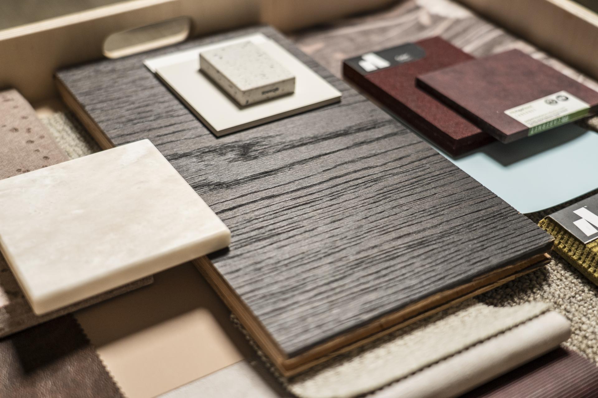
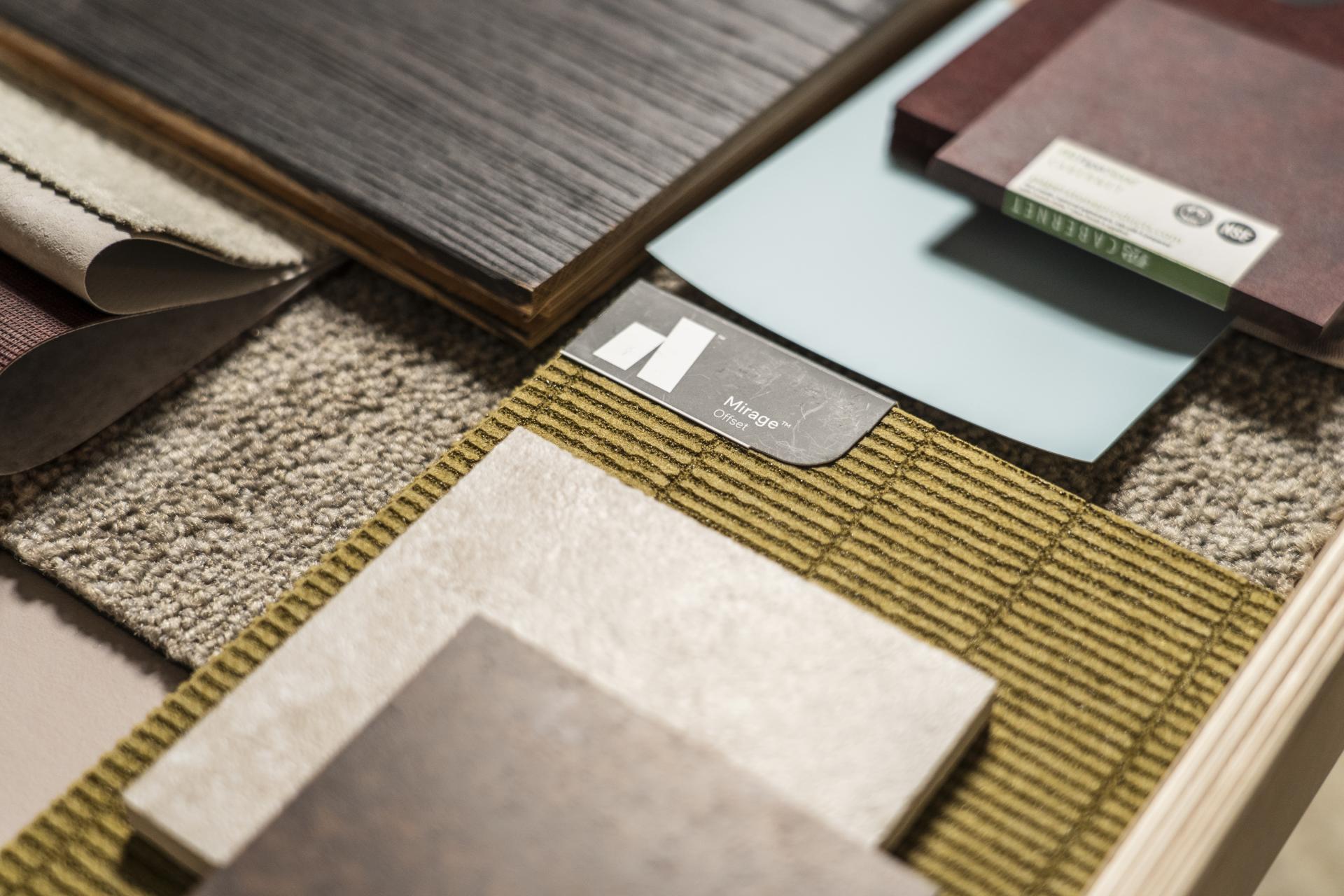
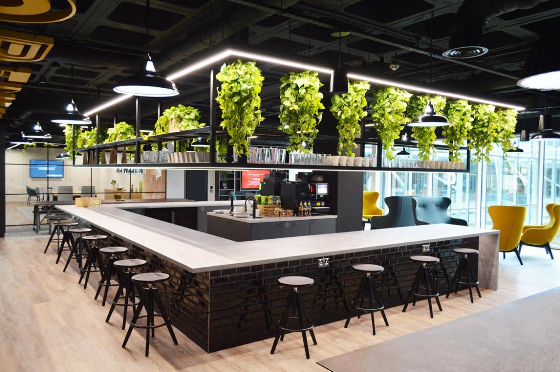
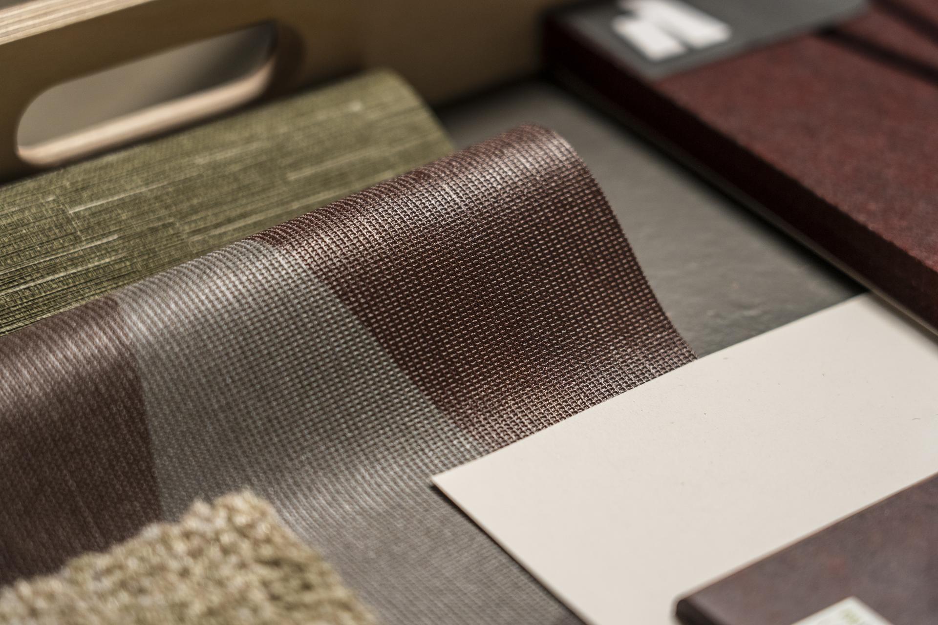
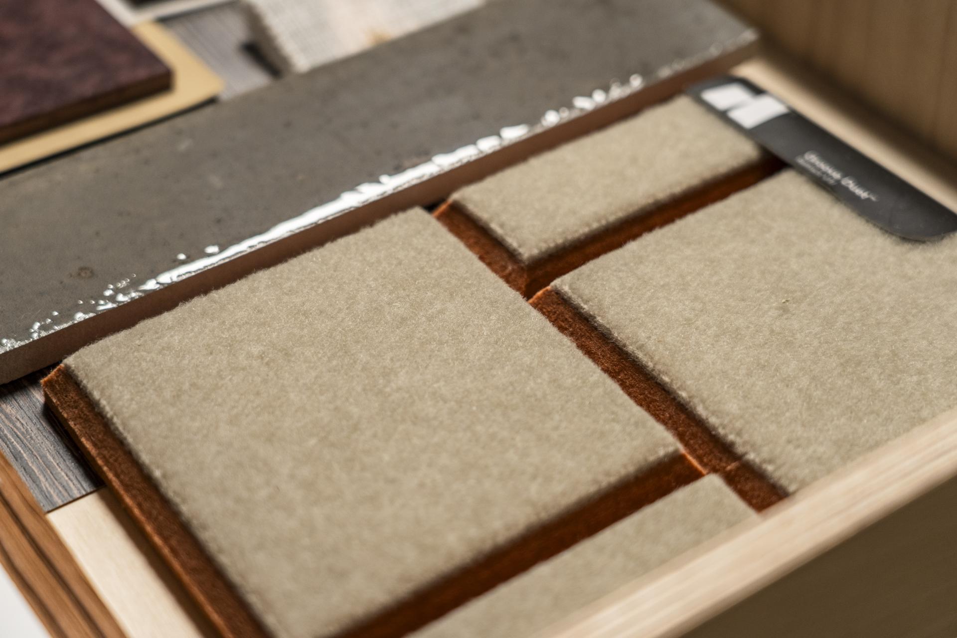
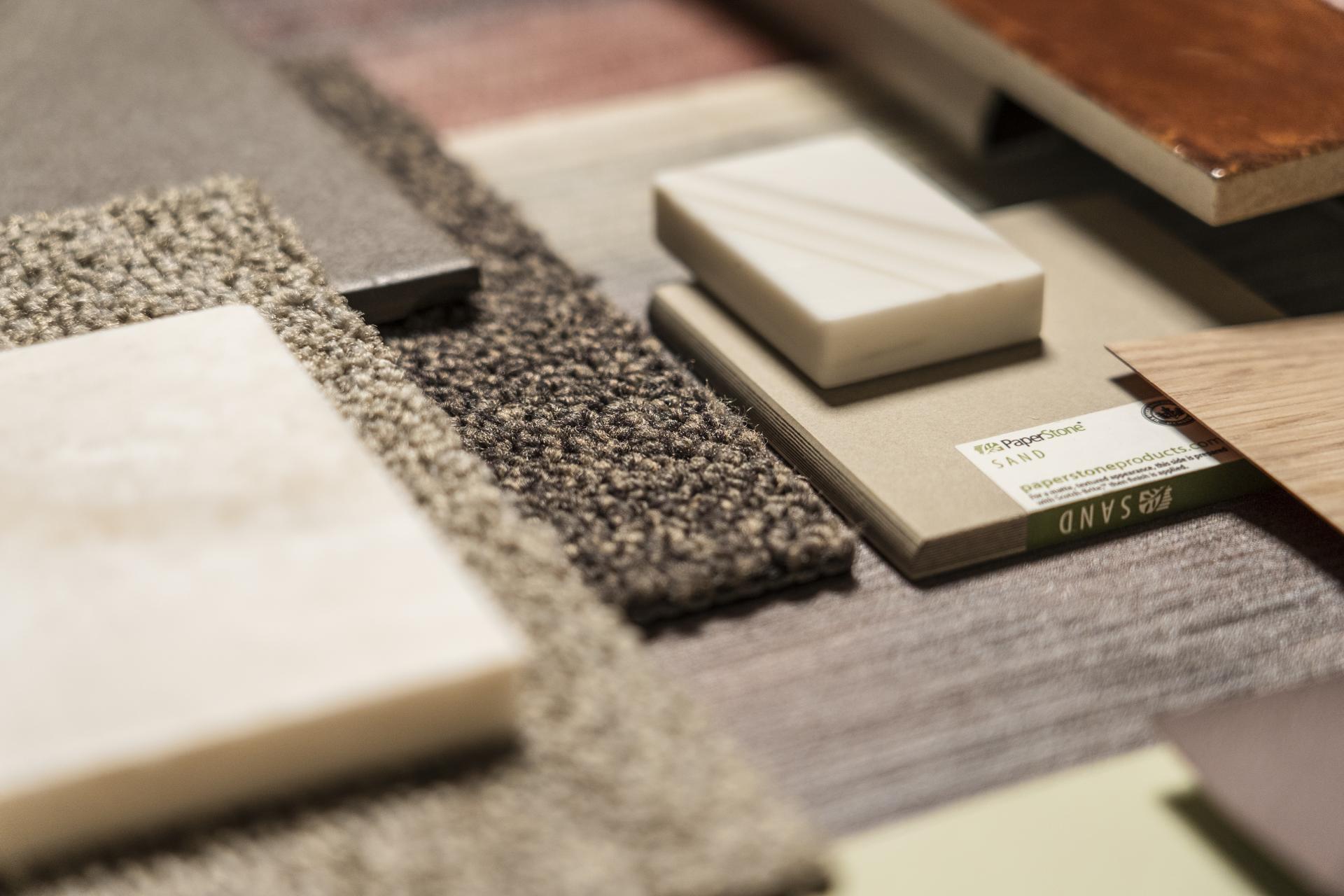
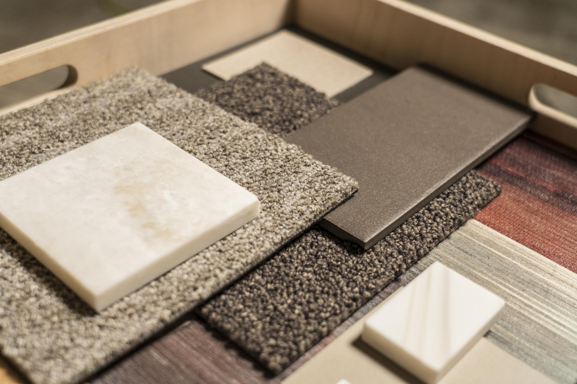
‘Unity’ and ‘functional comfort’ are how team members Quentin and Tasnia described ‘belonging’. For them, it’s a meeting point of inclusivity, comfort, and function. Their palette positions depth over delicacy, rich, dark natural tones are layered with matte Paperstone surfaces and stone-textured finishes. "We need to be mindful of the certain functionality of a space, while bringing in softer and more comfortable tones. Belonging is functional comfort."
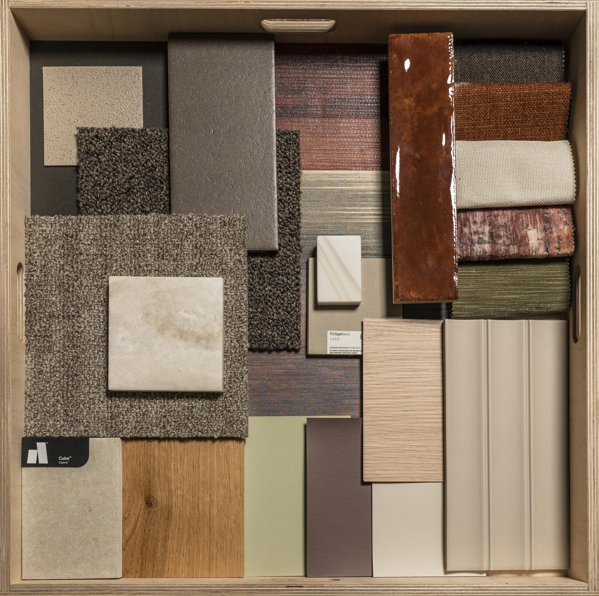
Amy Ackerley, Senior Interior Designer, BDP & Amelia Tillott, Student, MMU
Amy Ackerley, Senior Interior Designer, BDP & Amelia Tillott, Student, MMU
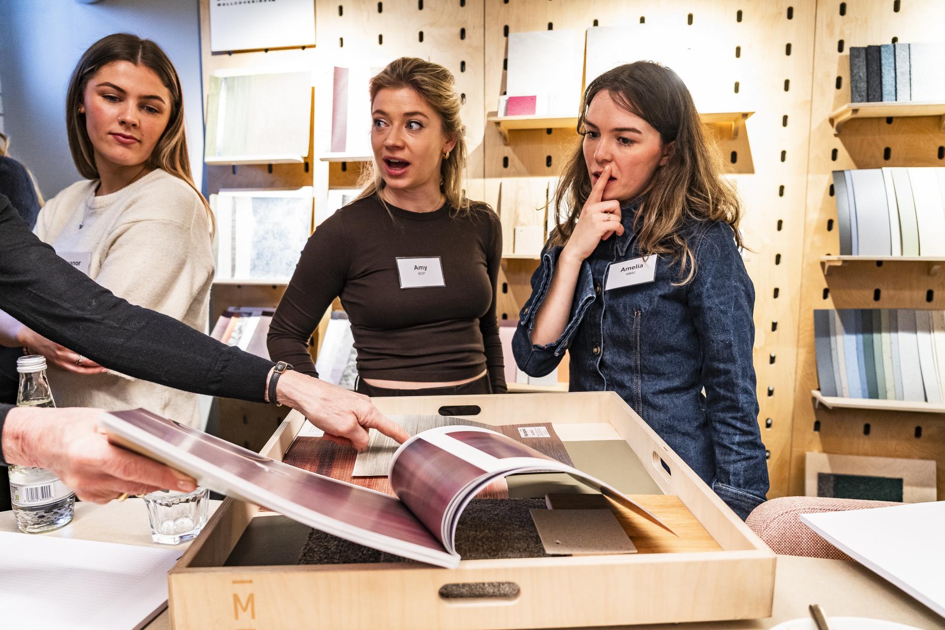
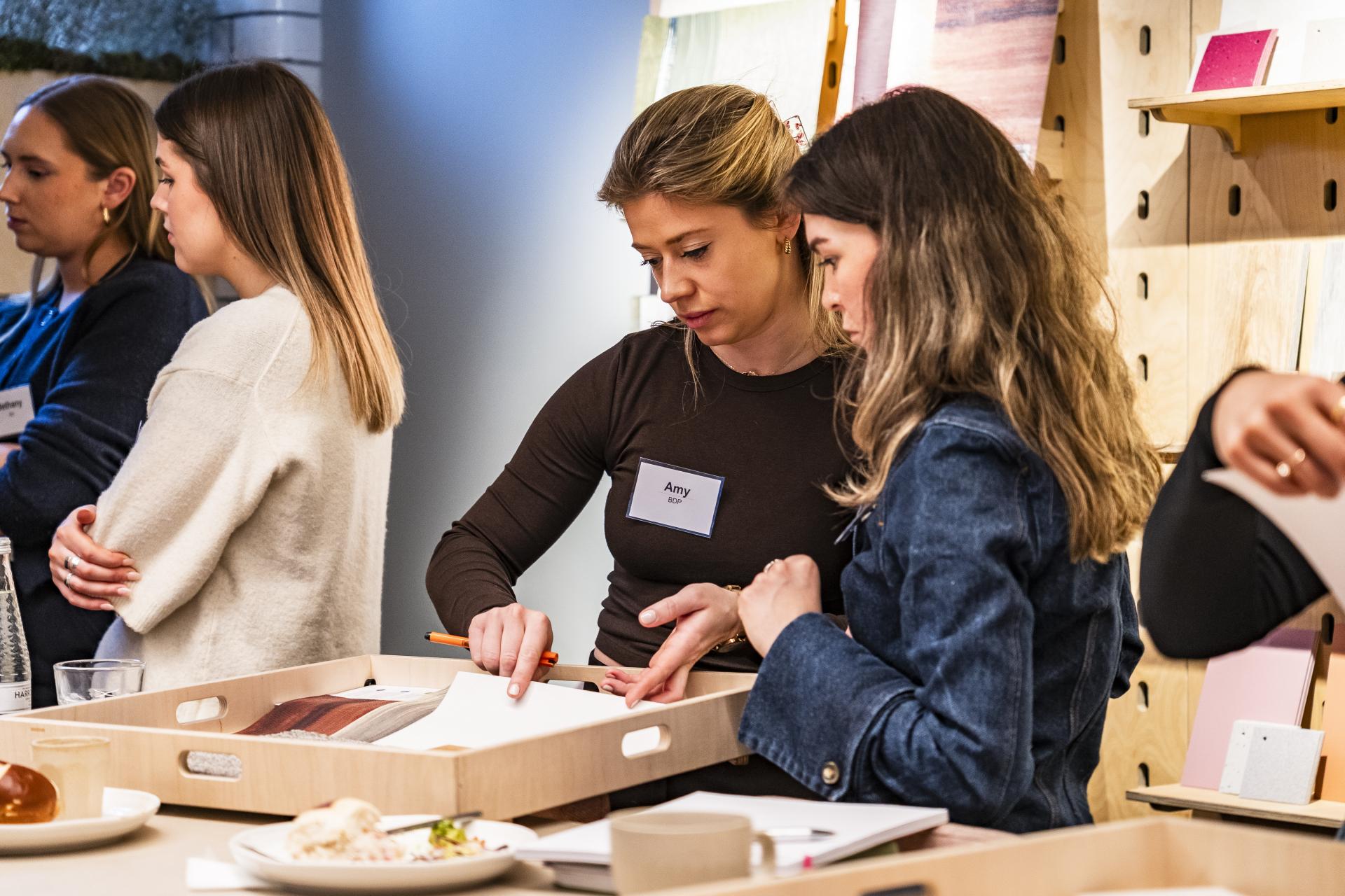
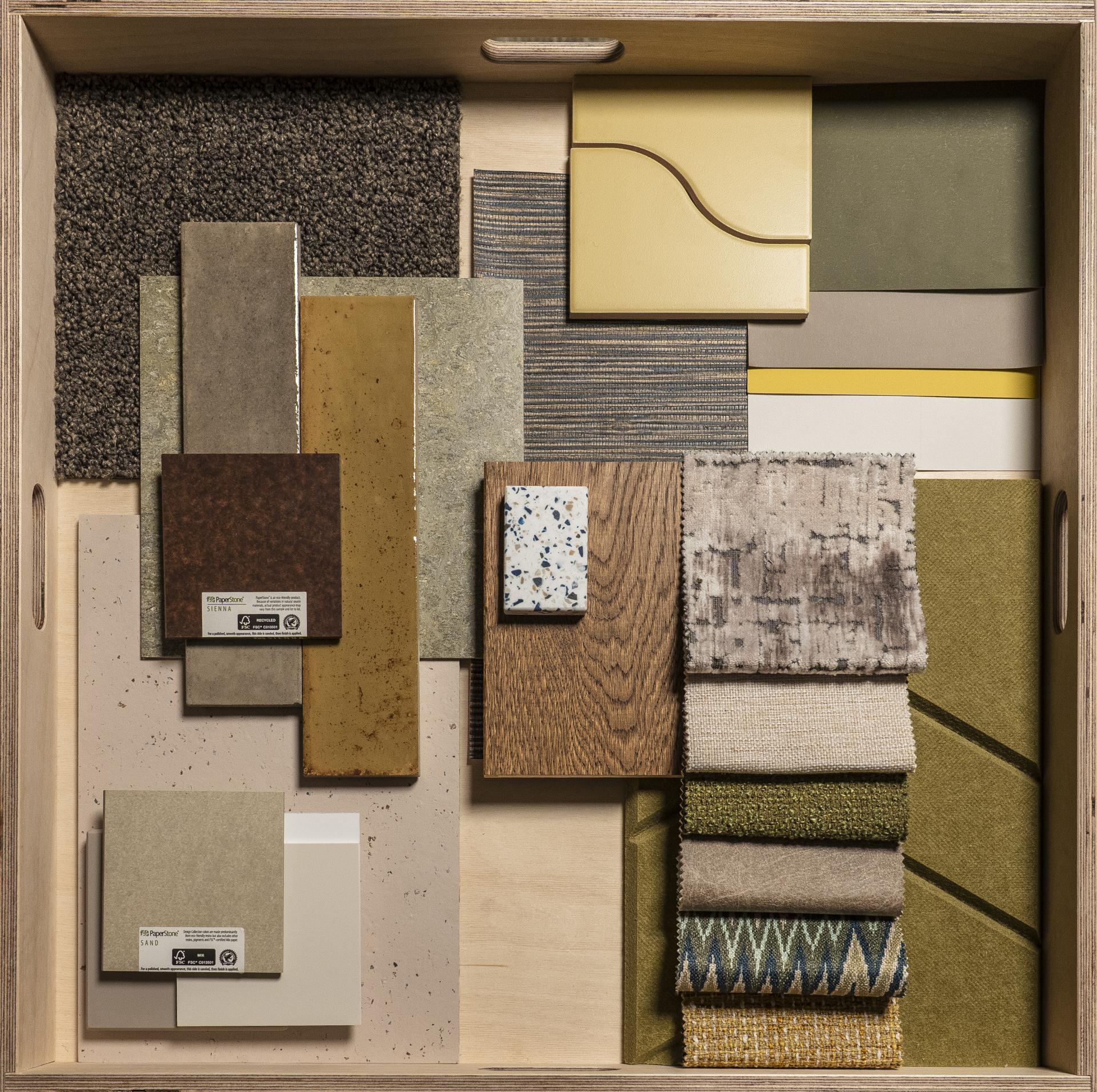
The natural world is the one environment we all have in common - and it is from here that Amy and Amelia’s palette takes its creative cues. Built from the ground up with flooring as its foundation, earthy muted tones are lifted by natural greens and purples, with tactile surfaces that mirror what might be found outside. Inclusive by instinct and familiar by nature - this is a palette that quietly aspires to work for everyone.
"Belonging is a sense of comfort. It's also inclusivity - catering for lots of different types of people from different backgrounds, and making sure that all users of the space feel comfortable using it, and feel like they can express themselves."
Video by Louis Marlowe
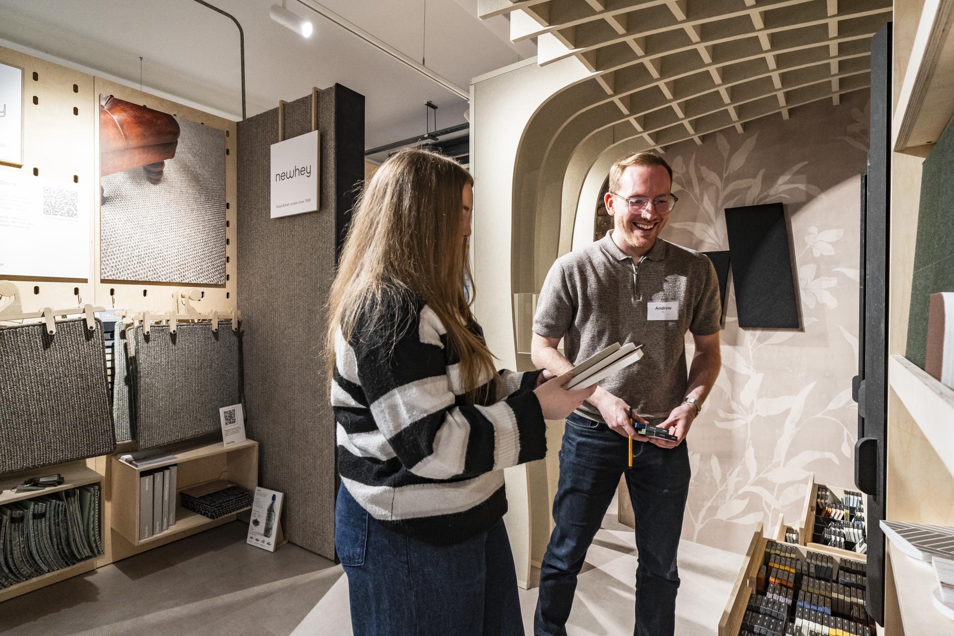
Andrew Murray, Senior Interior Designer, 74 & Ella Neary, Student, University of Salford
Andrew Murray, Senior Interior Designer, 74 & Ella Neary, Student, MMU
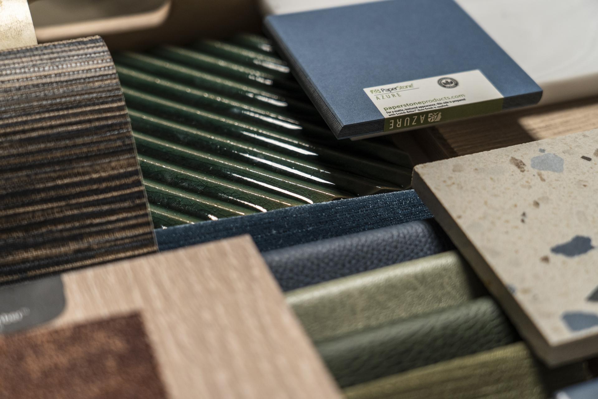
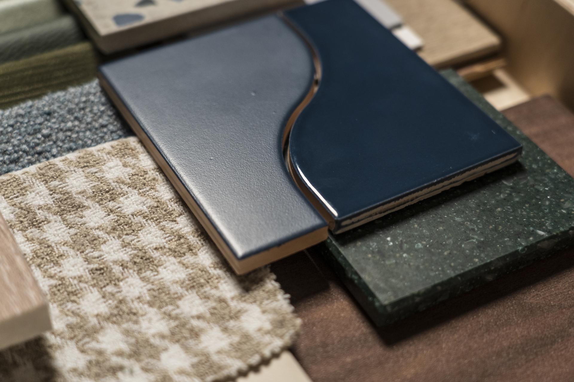
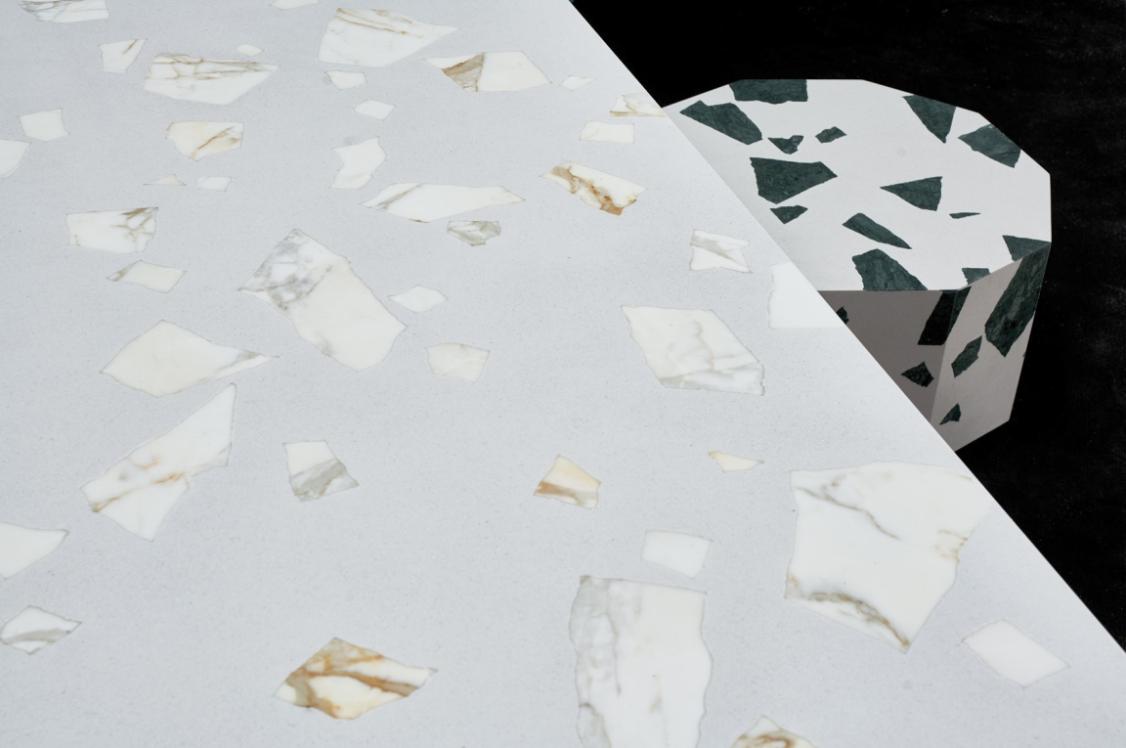
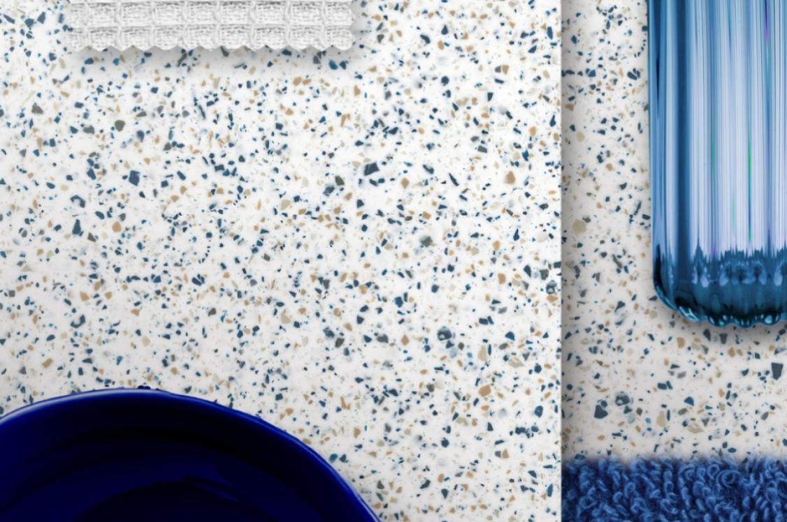
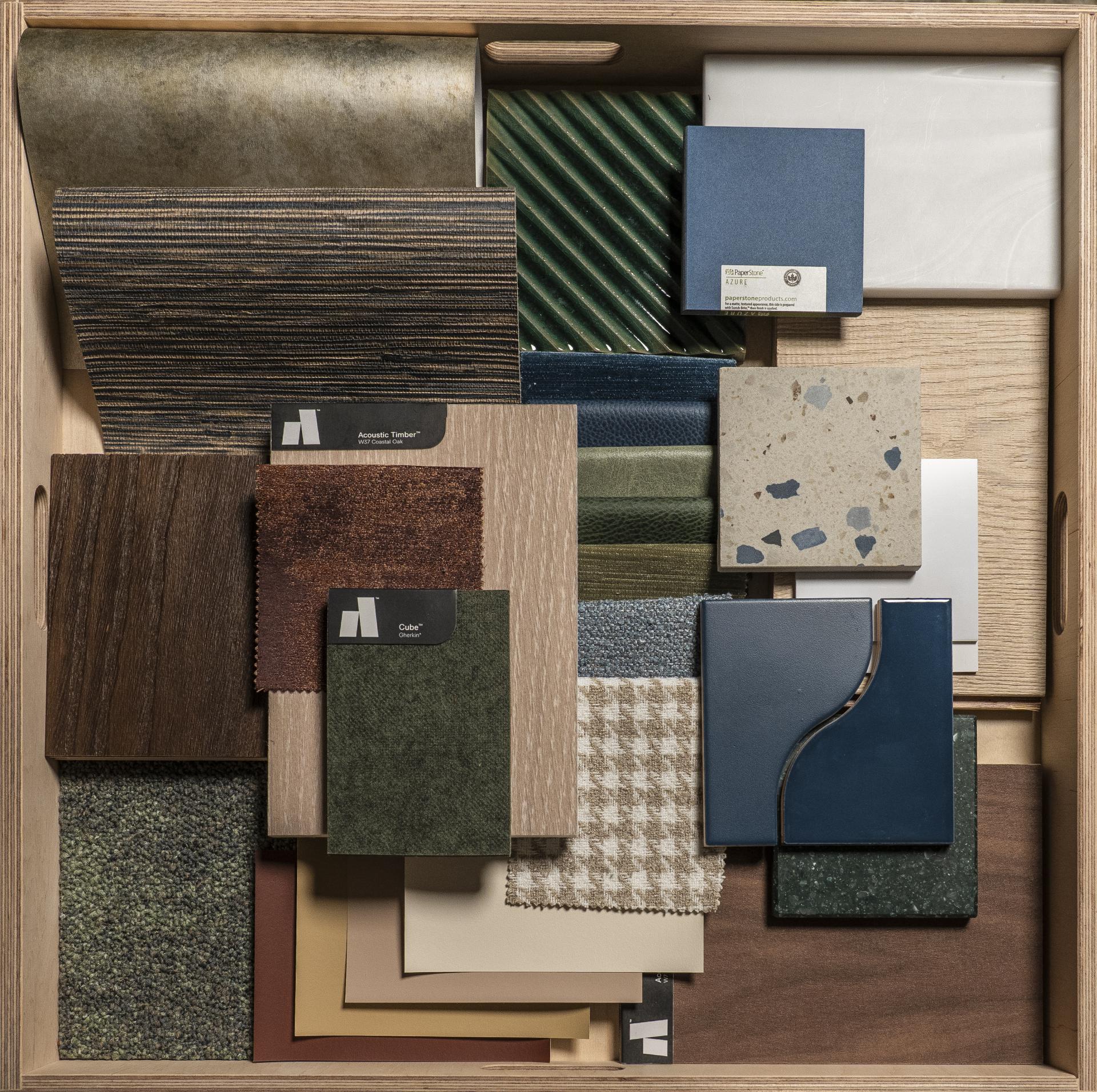
Conceived from Ella’s final year project of a destination for cultural music exchange amongst migrants, this palette is both conceptually and practically comforting. Considering different cultural perspectives of colour, deep and inviting blues and greens were chosen to craft the space, interlaced with a tactile mix of glazed and terrazzo tiles, real wood flooring, wallpaper, and soft upholstery. Each material is chosen to feel welcoming.
Even the tile profiles are deliberate: curves are selected over hard edges for softness. A palette designed to make everyone - from every background - feel at home.
Ellen Findley, Interior Designer, Sheila Bird & Emily Oakes, Student, MMU
Ellen Findley, Interior Designer, Sheila Bird & Emily Oakes, Student, MMU
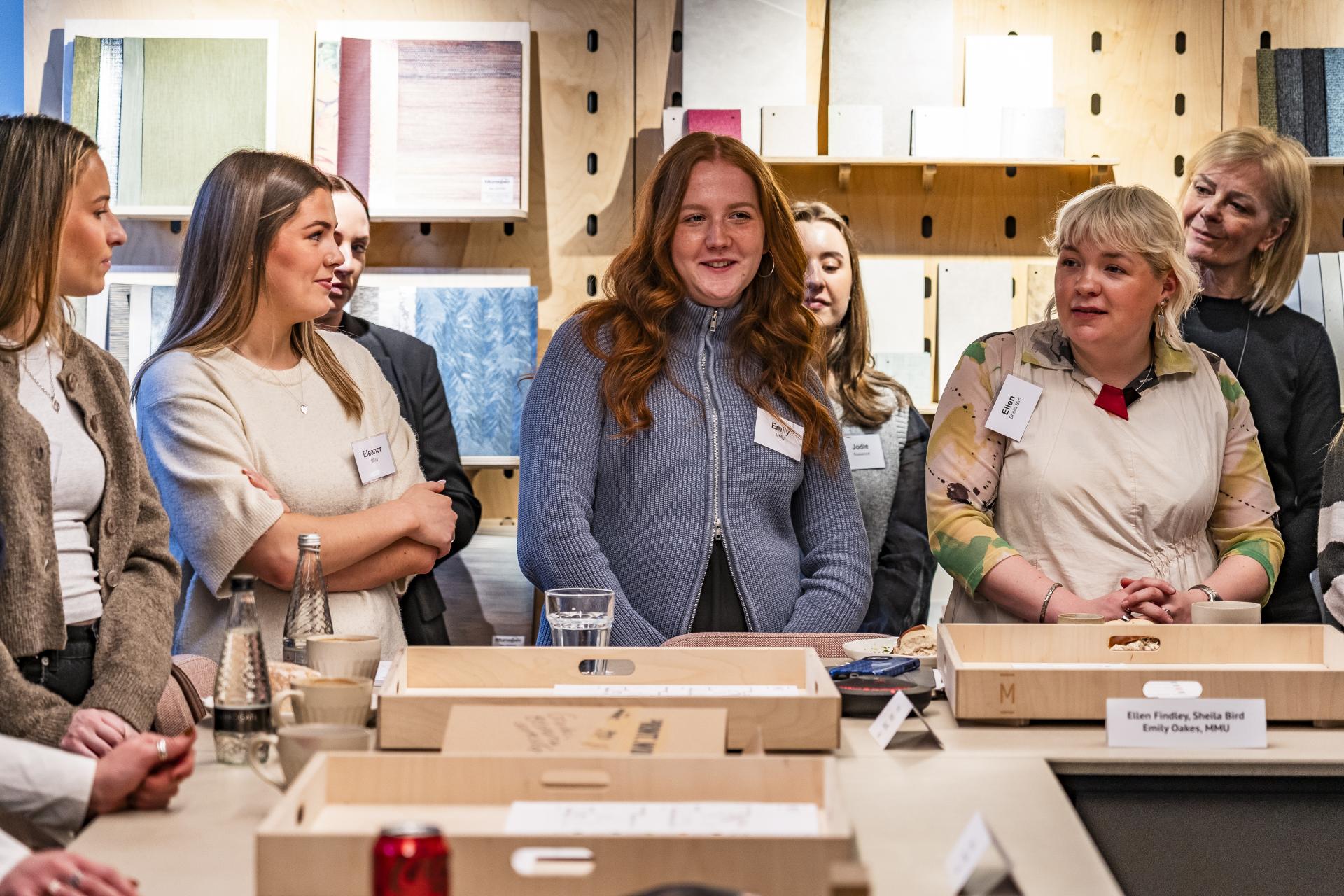
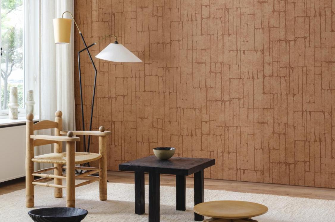
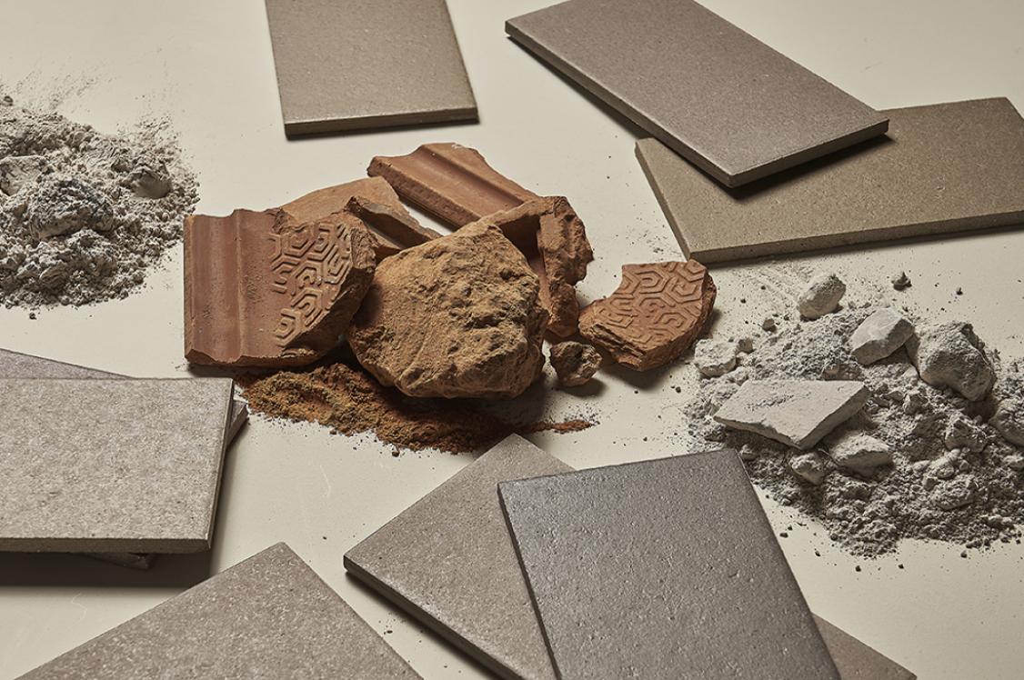
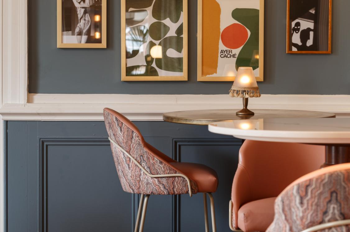
‘Nostalgia’ and ‘like-mindedness’ shaped how Ellen and Emily responded to ‘belonging’. Looking outward before looking in, the team have taken inspiration from Manchester's architectural heritage to inform a retail concept rooted in its location.
Heritage coloured tiles from Parkside Architectural Tiles - some sourced locally from Preston - form the backbone of a palette that is sympathetic to existing facades and the city's material history.
Drawing the street into the space through colour, texture, and material honesty, ILIV's products become integral to this approach. Its heritage-inspired fabrics provide the connective tissue between the building's past and the interior's present.
Video by Louis Marlowe
Emily Adams, Interior Designer, KIN, Bethany Nixon, Interior Designer, KIN & Eleanor Candlish, Student, MMU
Emily Adams, Interior Designer, KIN, Bethany Nixon, Interior Designer, KIN & Eleanor Candlish, Student, MMU
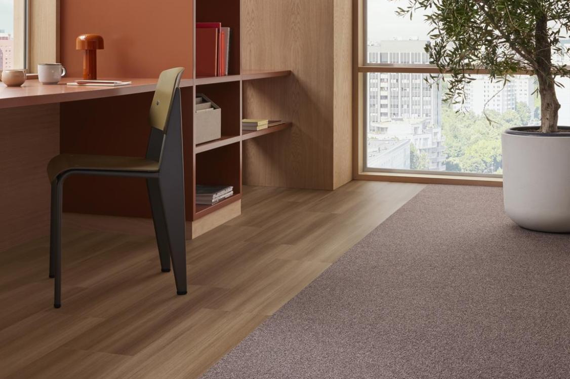
Design trio for the day, Emily, Bethany and Eleanor positioned their palette as a spatial metaphor for community itself. A neutral centre branches into three distinct zones, each with its own character, yet all bleeding seamlessly into one another - much like the individuals that make up a group.
Forbo's flooring solutions were pivotal to achieving this. Its multi-tonal specks carry colours across zones, merging spaces with quiet effortlessness.
The palette is simultaneously cohesive and individual, reflecting the team's core belief that belonging means having both a place in the collective and the freedom to stand apart. Texture and colour flow through the scheme like a shared language.
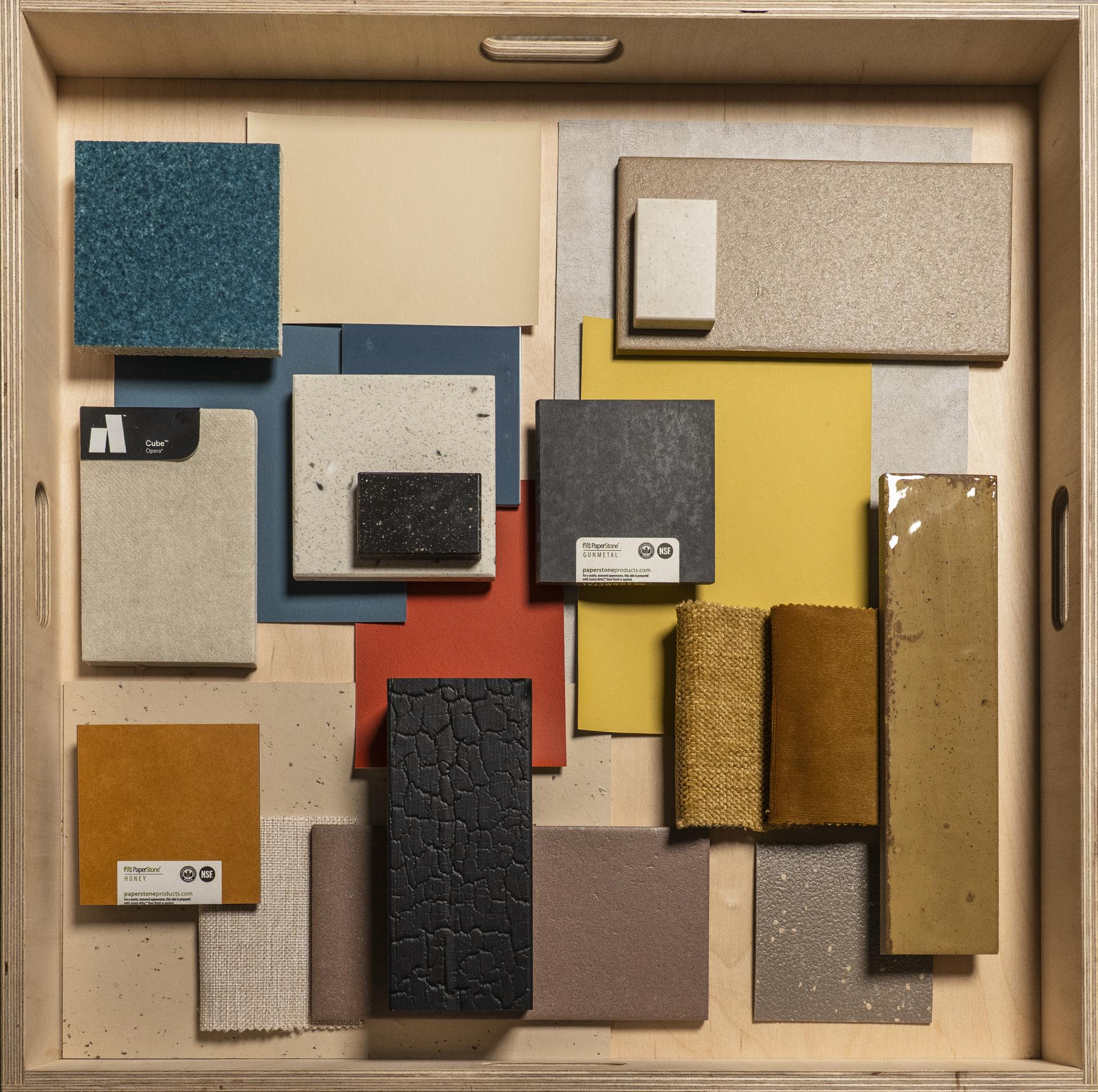
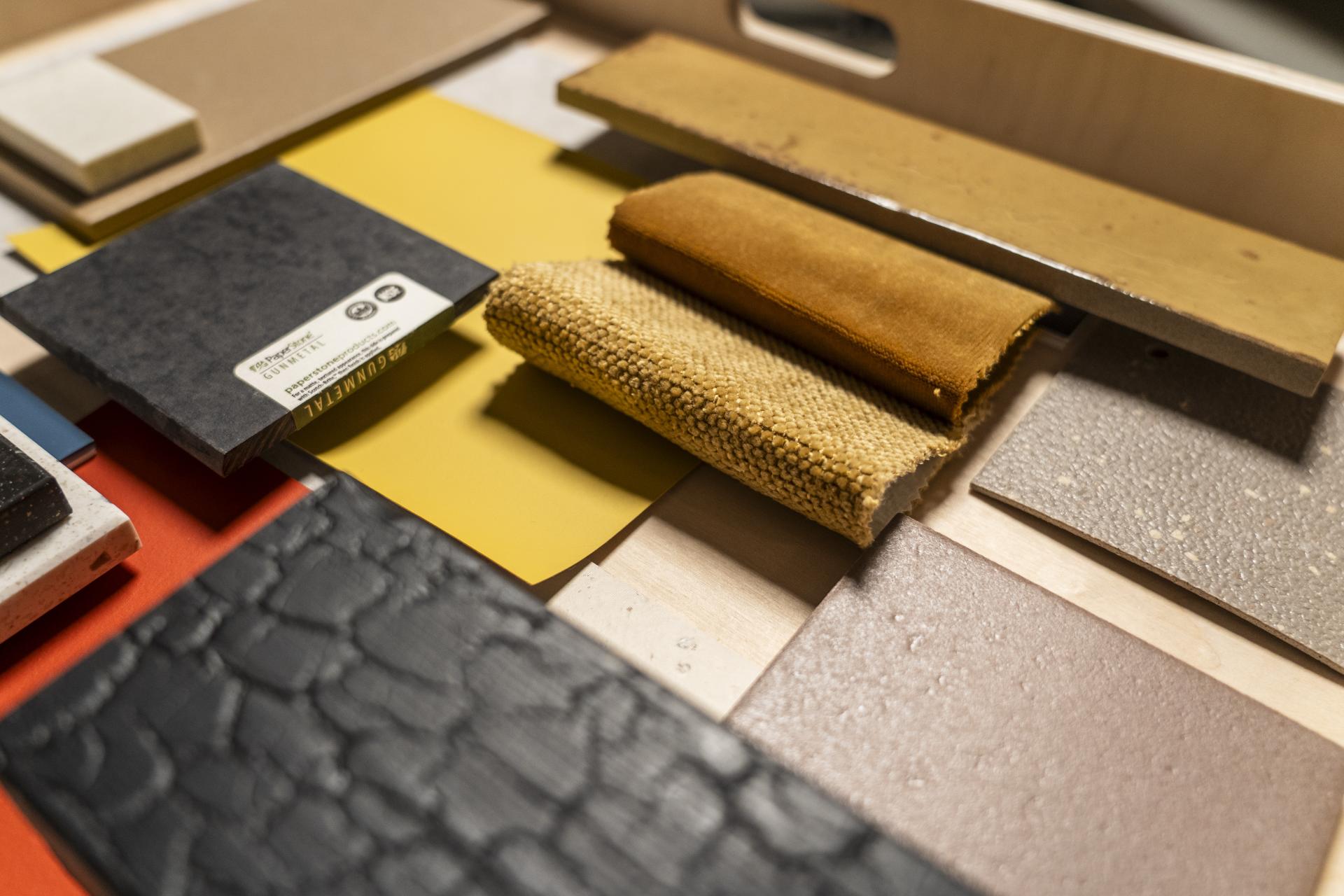
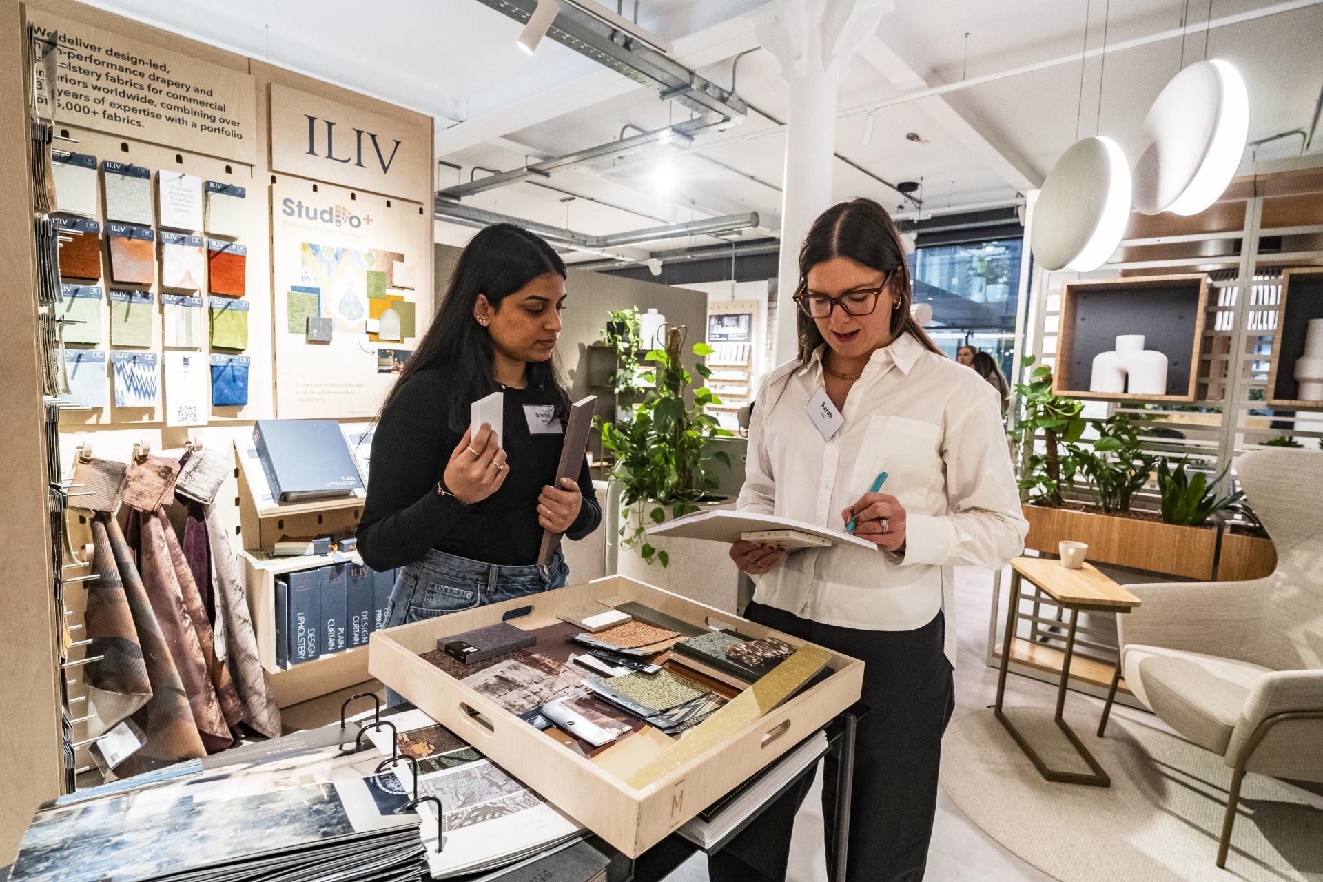
Sarah de Freitas, Creative Director, AXI & Sneha Nair, Student, MMU
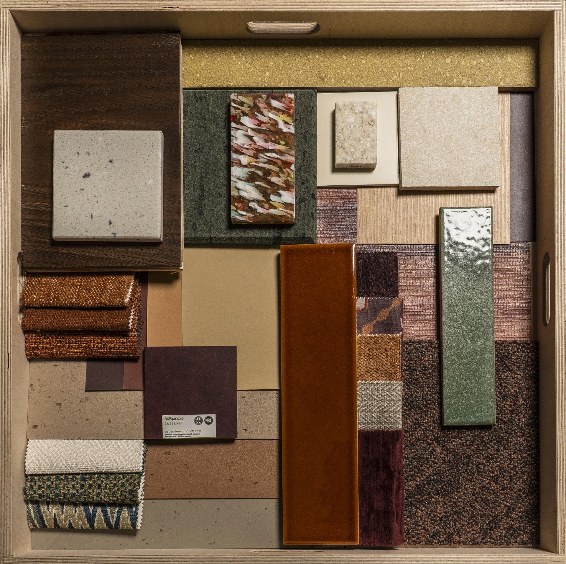
Sarah de Freitas, Creative Director, AXI & Sneha Nair, Student, MMU
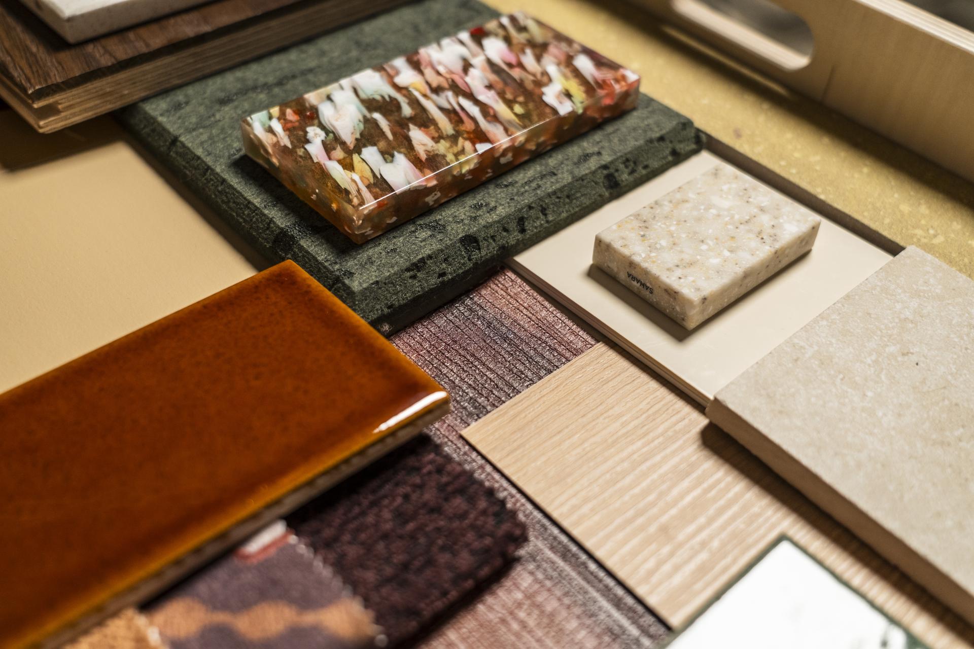
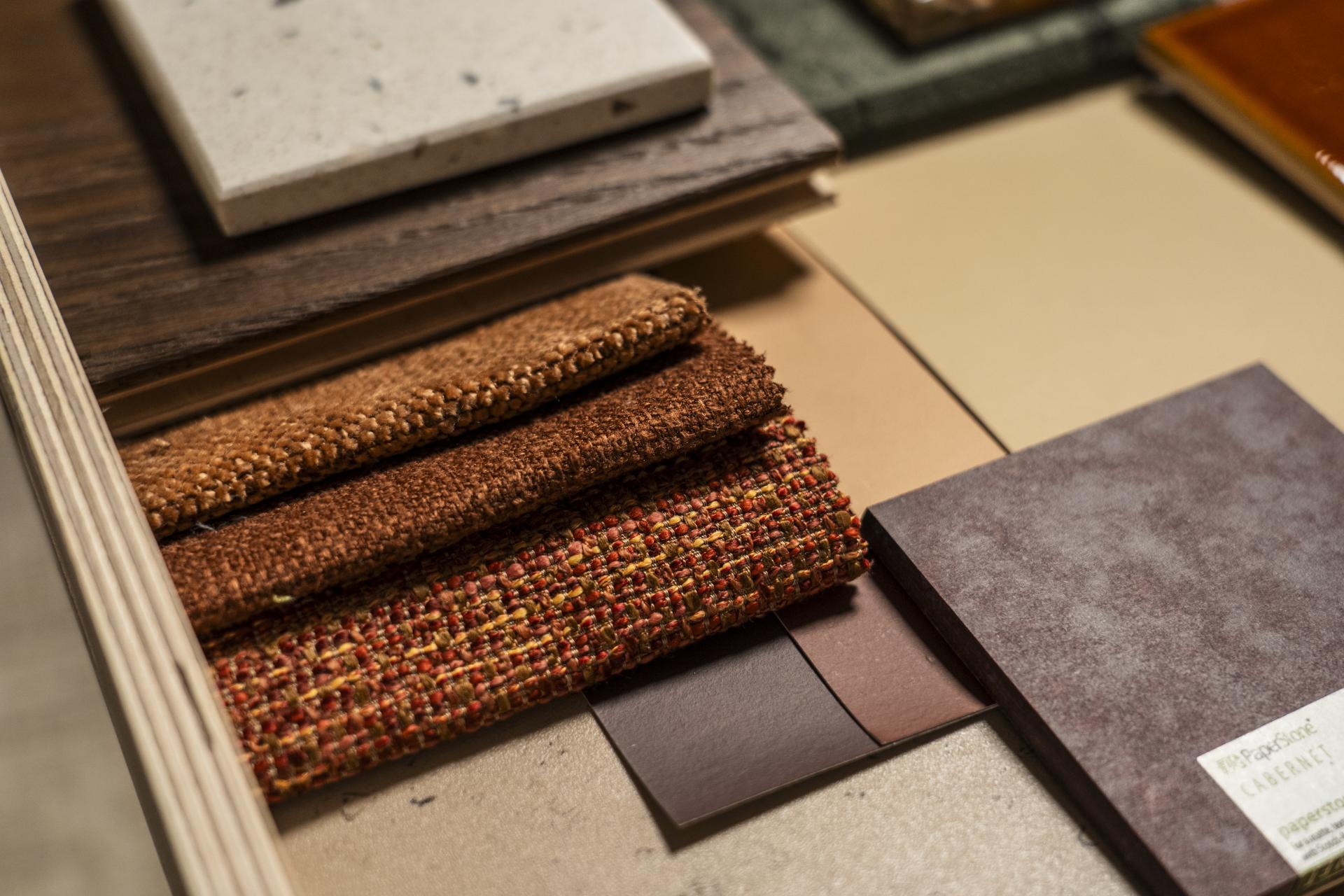
Built on the premise that belonging doesn't require perfection, Sarah and Sneha’s palette embraces imperfect pairings of colour and material - each surface distinct, nonrepeating, yet collectively harmonious.
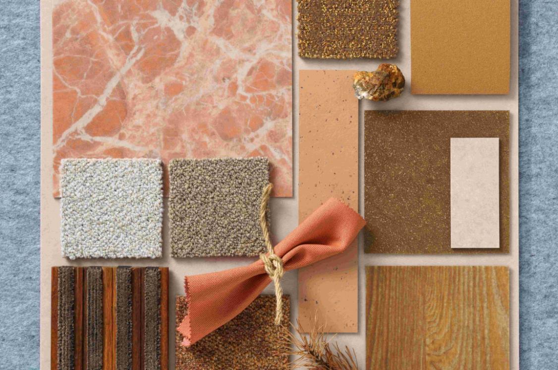
The palette is designed for an inviting hospitality bar and lounge scheme, interlaced with sustainable material choices. Warm amber-orange punctuates throughout, deepened by recurring purple accents, and grounded by creamy and earth-inspired neutrals.
Lucy Durkan, Associate Director, Chapman Taylor, Kirsty Barr, Interior Designer, Chapman Taylor & Niousha Mehran, Student, MMU
Lucy Durkan, Associate Director, Chapman Taylor, Kirsty Barr, Interior Designer, Chapman Taylor & Niousha Mehran, Student, MMU
Grounded in Niousha’s university research into how people experience comfort, this palette was built with the restorative qualities of the natural world in mind. Warm timber flooring and charred timber cladding from Russwood were chosen specifically to counter the cold that metal and stark neutrals can impose.
Natural surfaces are a timeless backdrop that subconsciously signal safety and stability. A quietly generous palette that induces occupants to feel exactly where they are meant to be.
Saskia Taitt, Creative Director, Studio Taitt, Miles Taitt, Director, Studio Taitt, & Leila Ratcliffe, Student, University of Salford
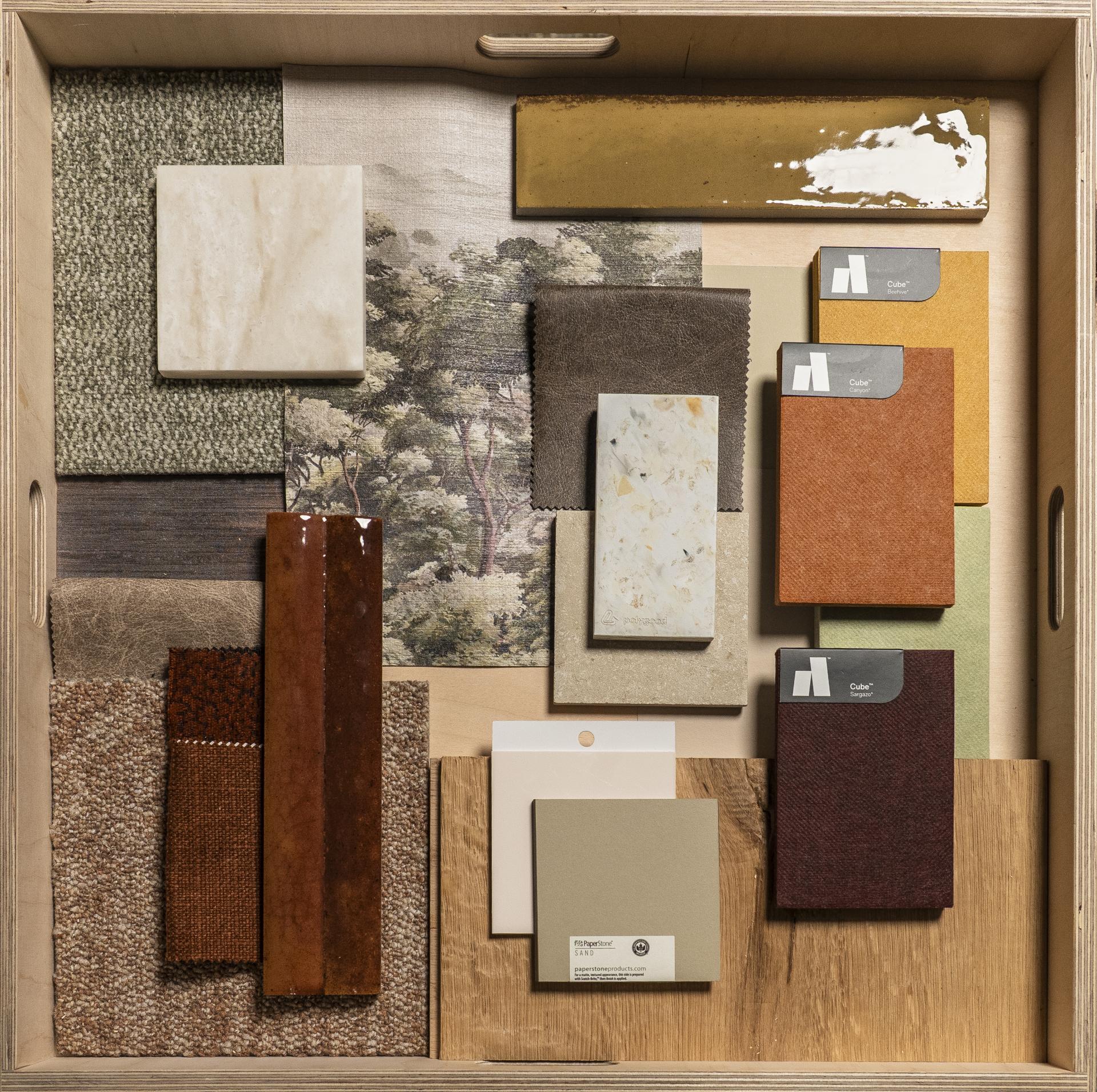
Saskia Taitt, Creative Director, Miles Taitt, Director, Studio Taitt, Studio Taitt & Leila Ratcliffe, Student, University of Salford
Safety and warmth are Studio Taitt’s and next generation designer, Leila's conditions for evoking a sense of belonging - and this residential palette is built entirely with these in mind.
Beginning with a Muraspec mural wallcovering of a forest-scape with unfurling mountains, the scheme draws outward to wood tones, pale naturals, and the rusty warmth of autumn foliage. Flowing across three distinct spaces in the home, the palette is unified by the colours of seasonal changes.
Discover more on how the concept of belonging was interpreted by our group.