

Tekla Severin and Ramona Macchi on playful colour palettes, tile combinations and collaborating together on the Färgblock collection.
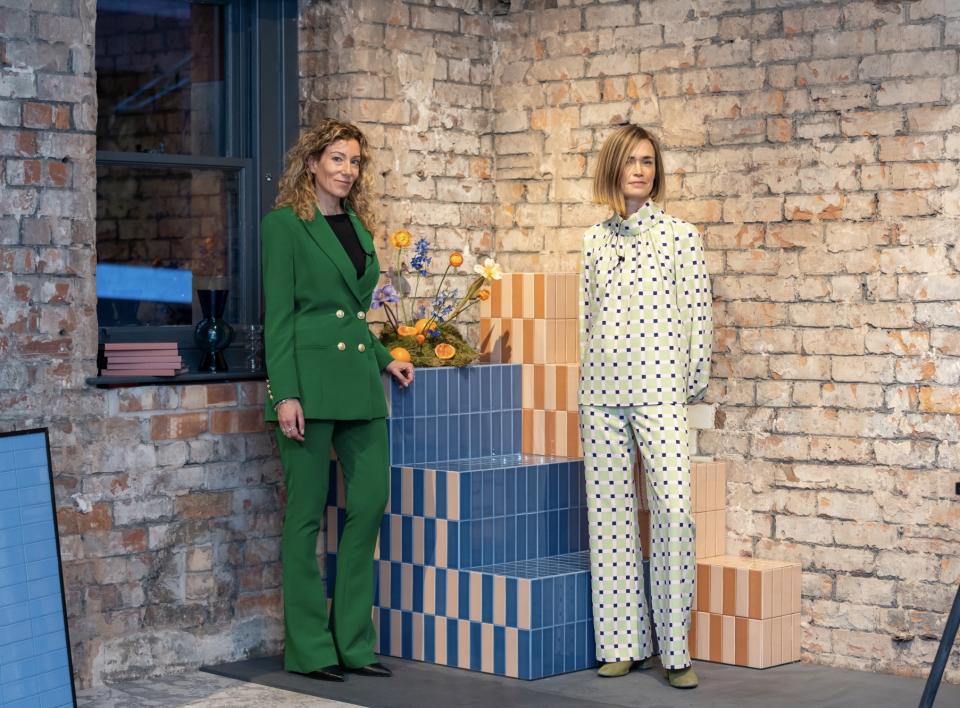
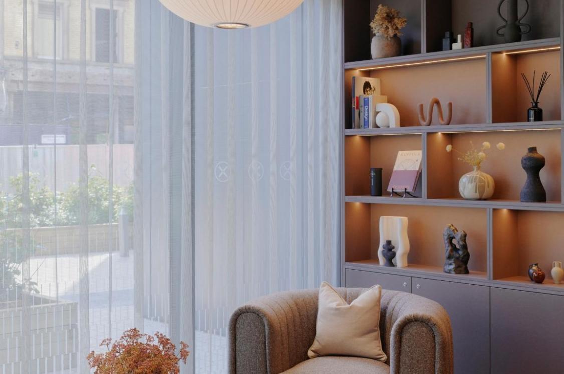
Credit: Wayne Myers
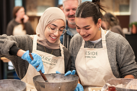
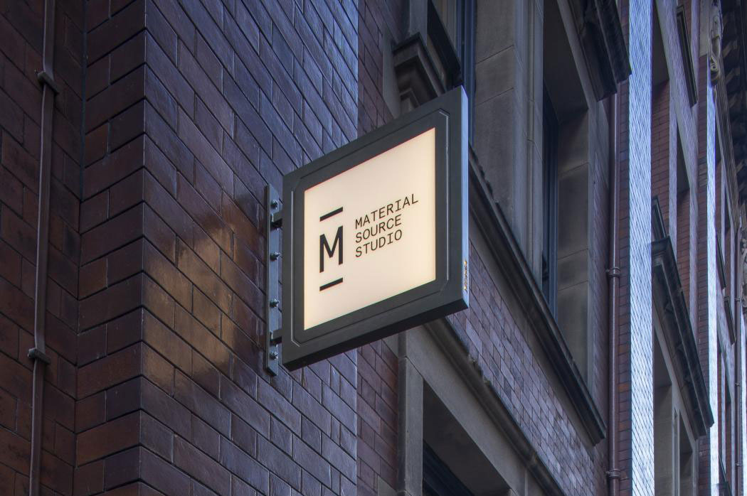
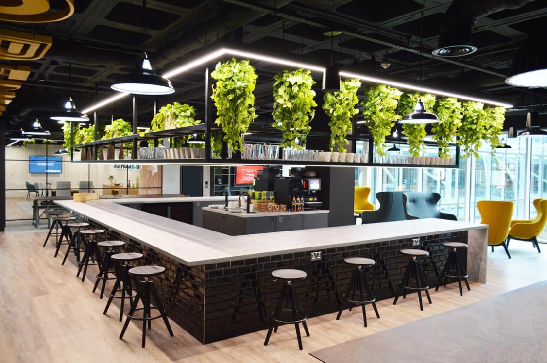
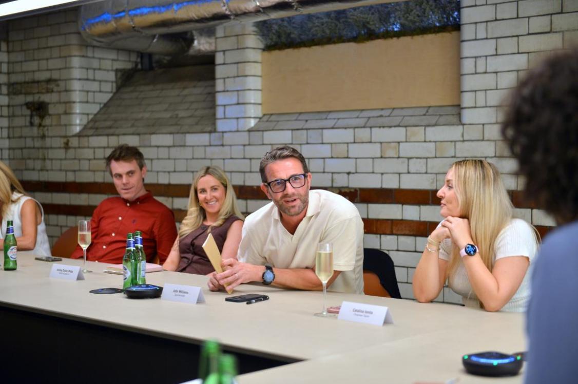
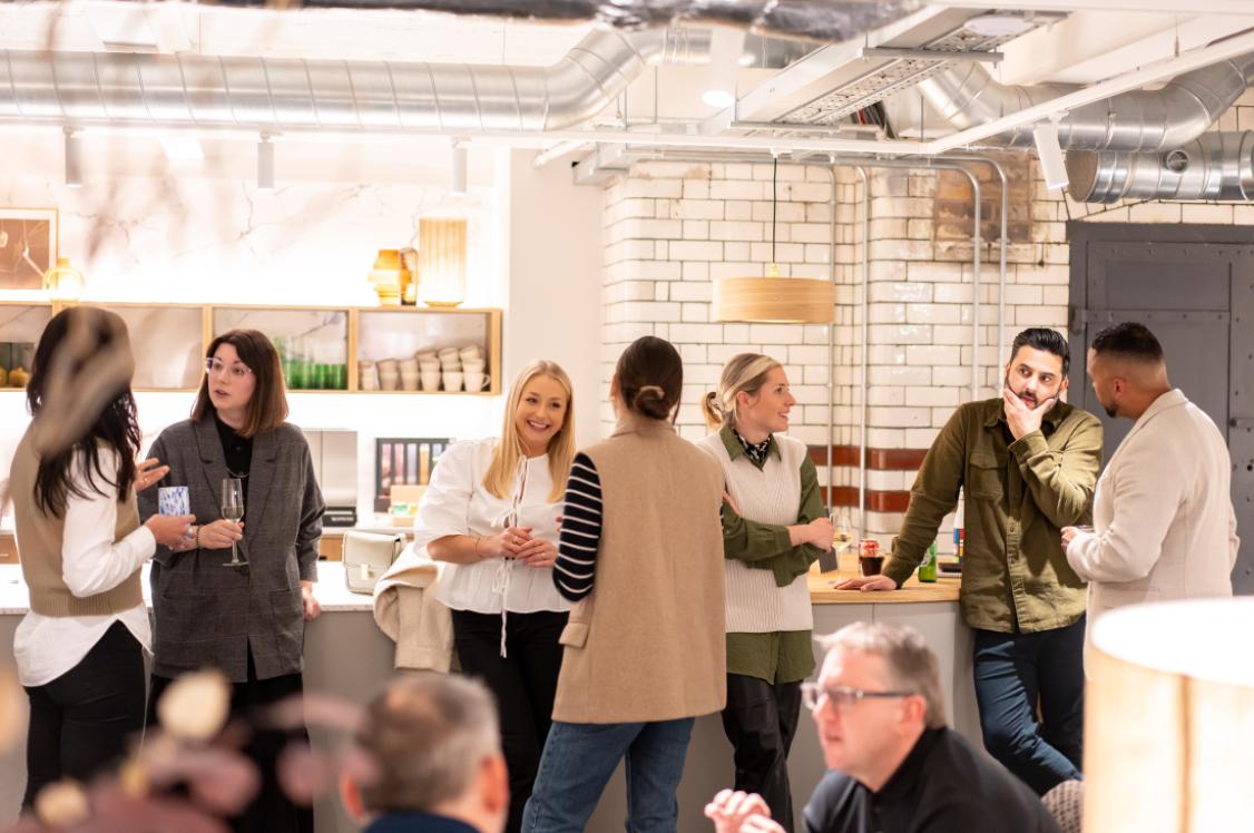
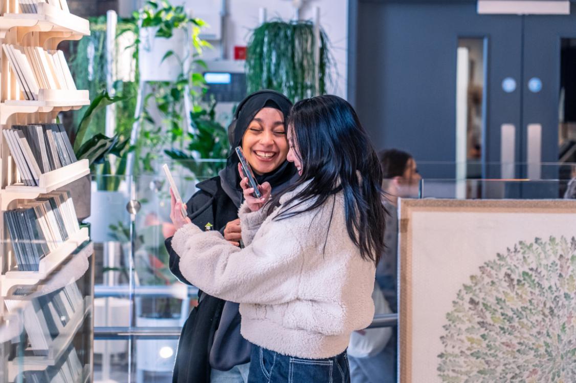
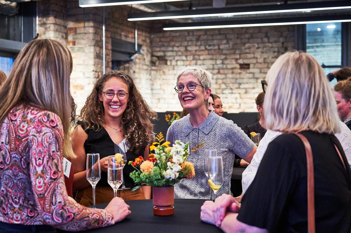
During March at Material Source Studio we had the pleasure of welcoming Tekla Evelina Severin and Ramona Macchi to the studio for the ‘Exploration of Colour’ event, organised by our partners Casa Ceramica and Crown Paints.
The hugely successful event was filled with inspiration and insights for designers and architects to take away. It was an evening which evoked many new design conversations and delved into colour, trends and new collections.
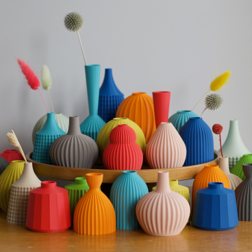
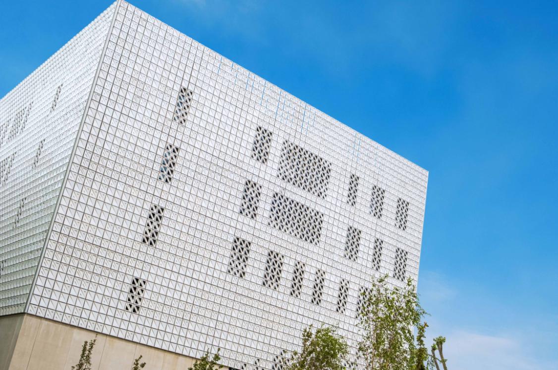
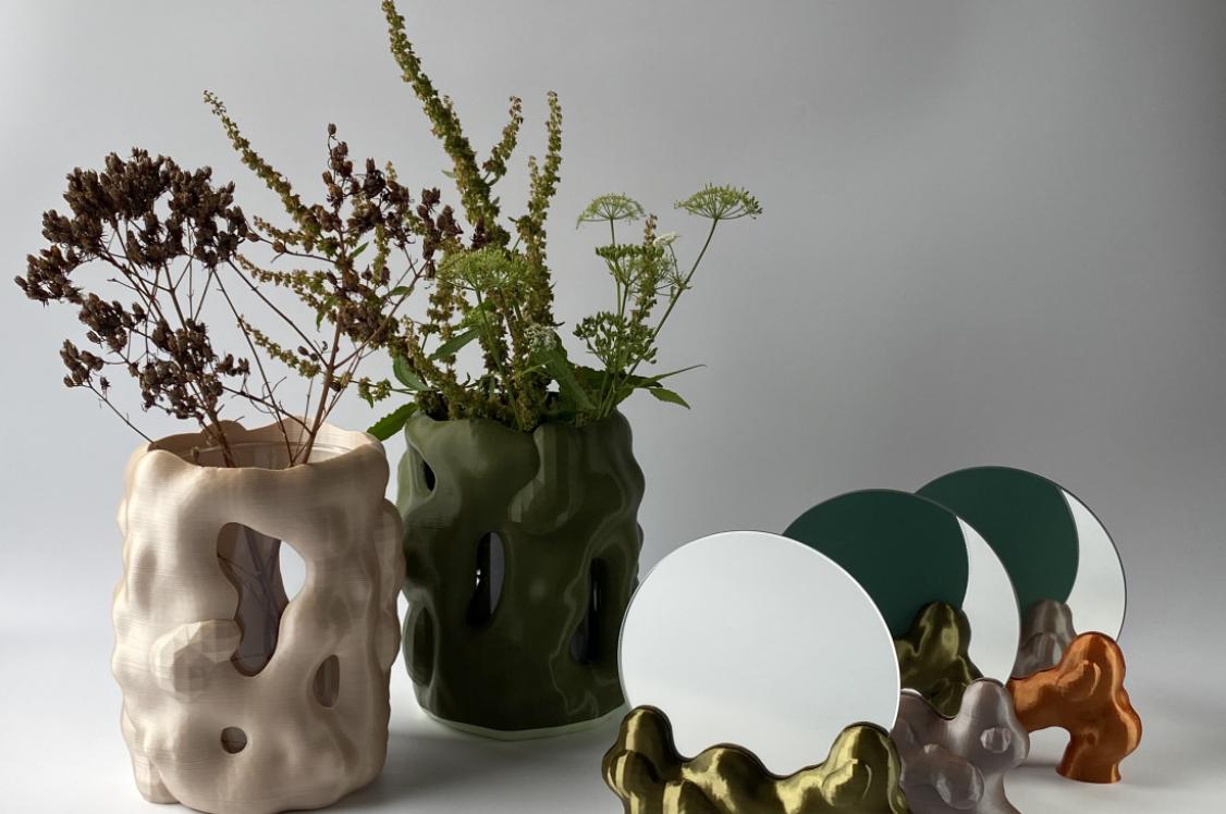
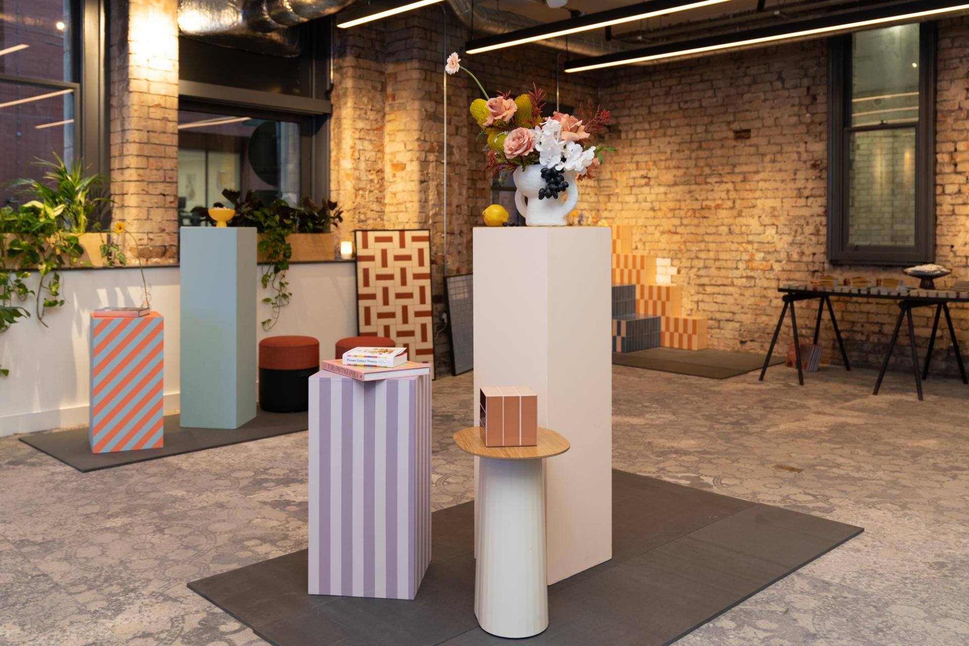
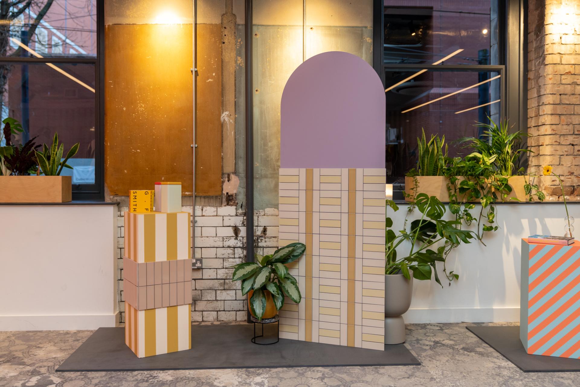
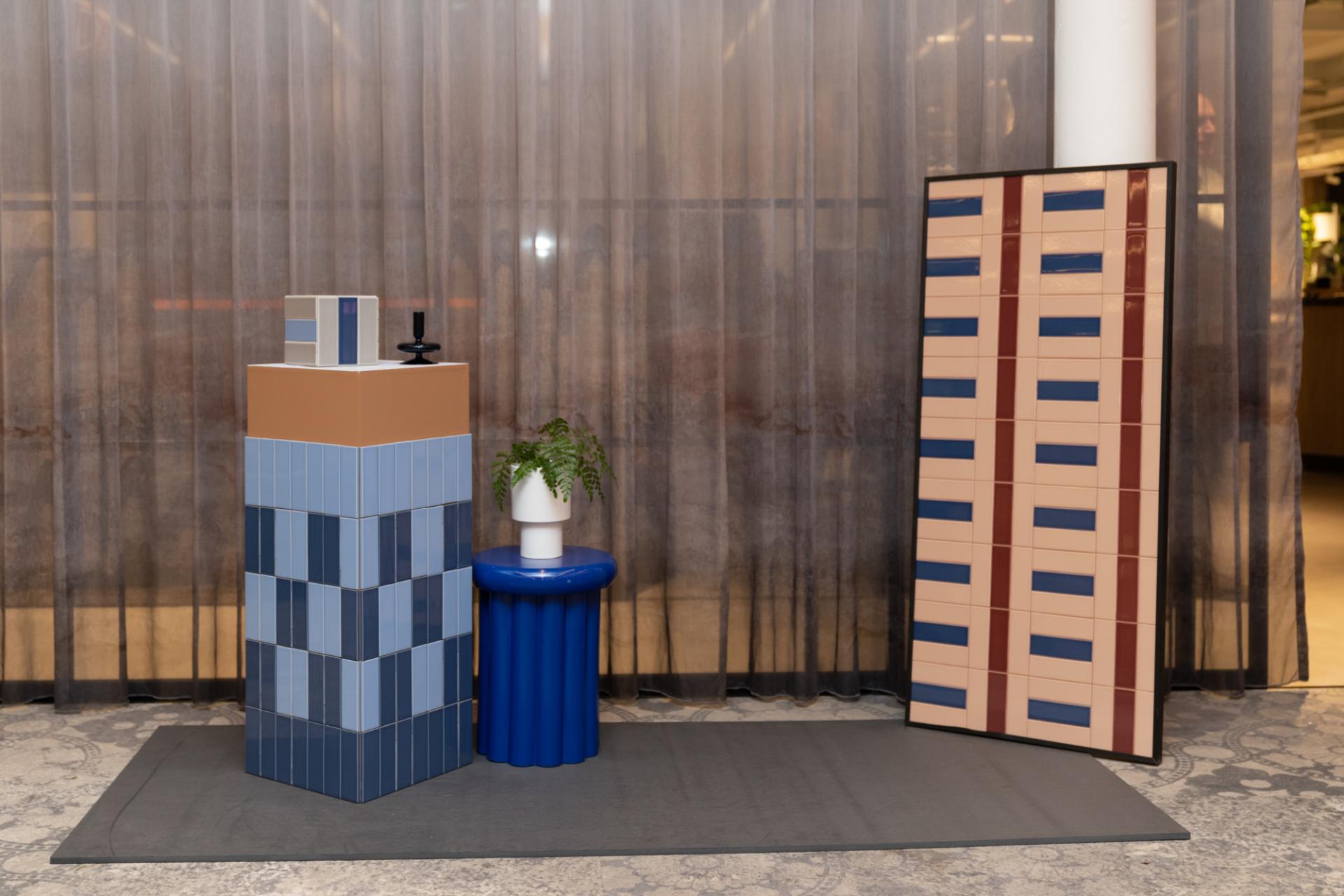
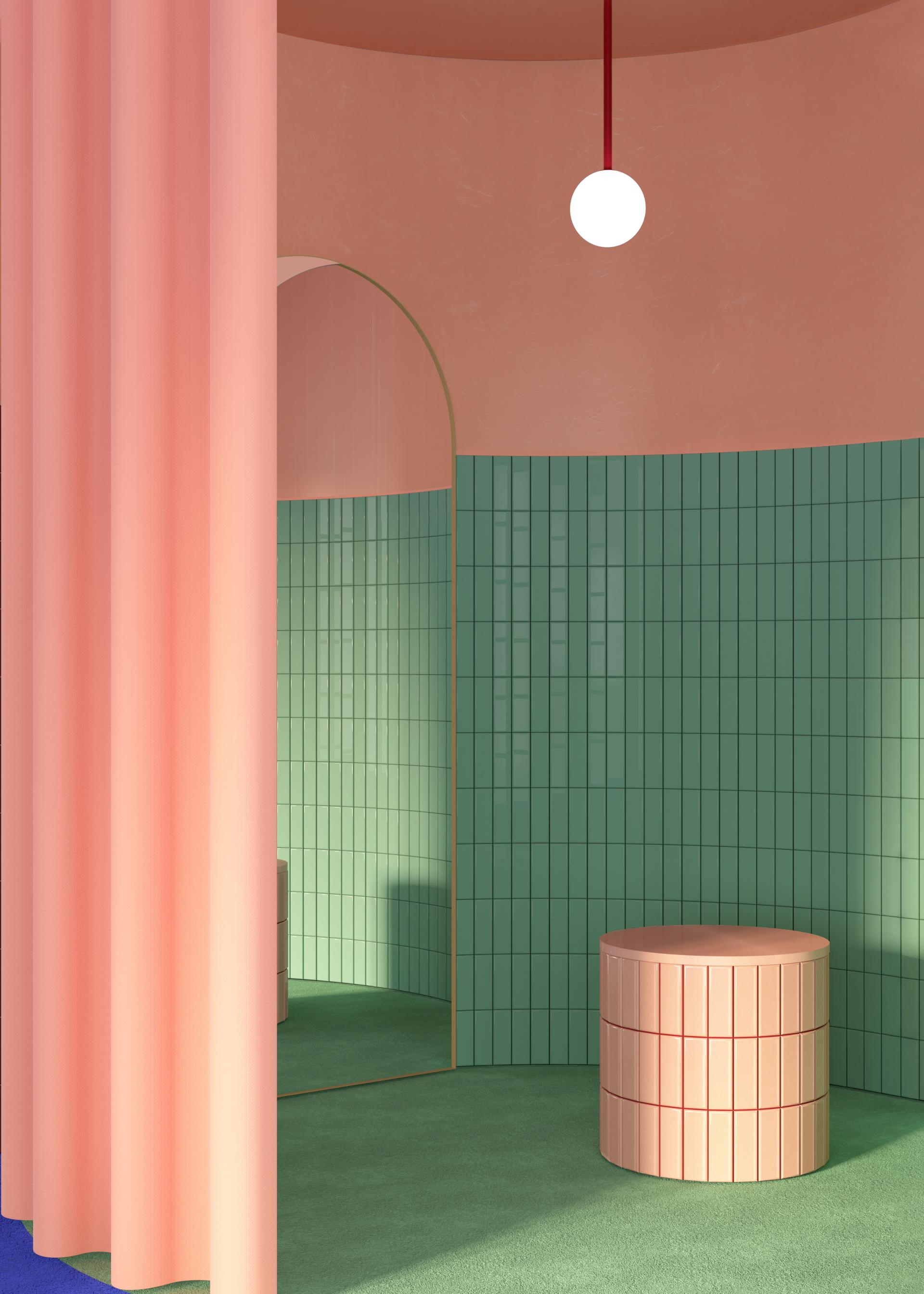
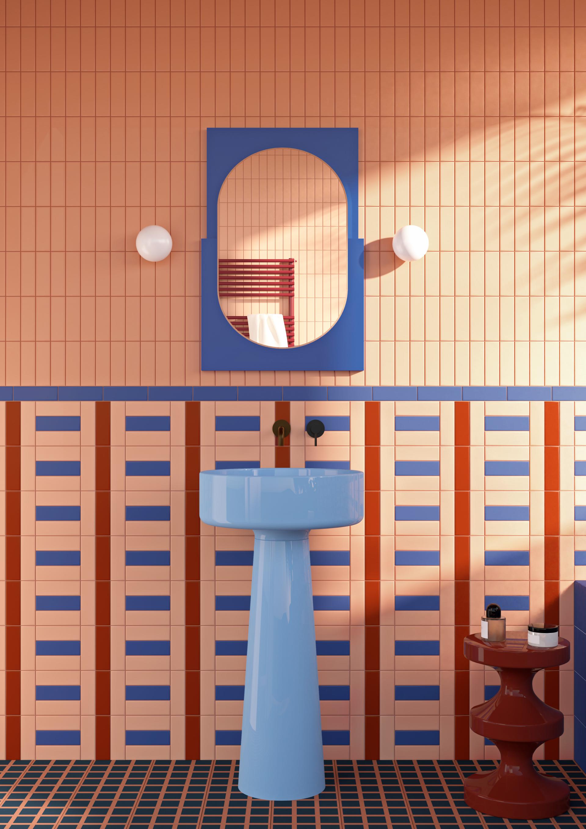
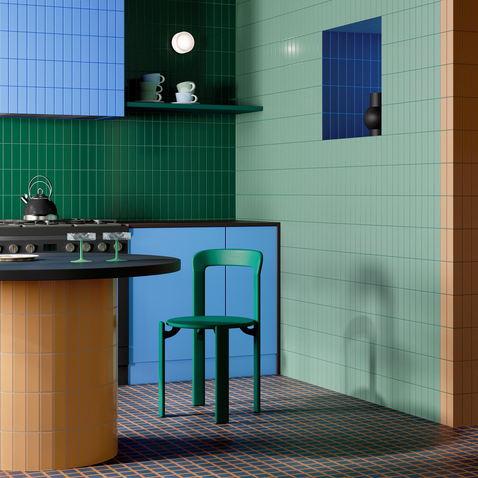
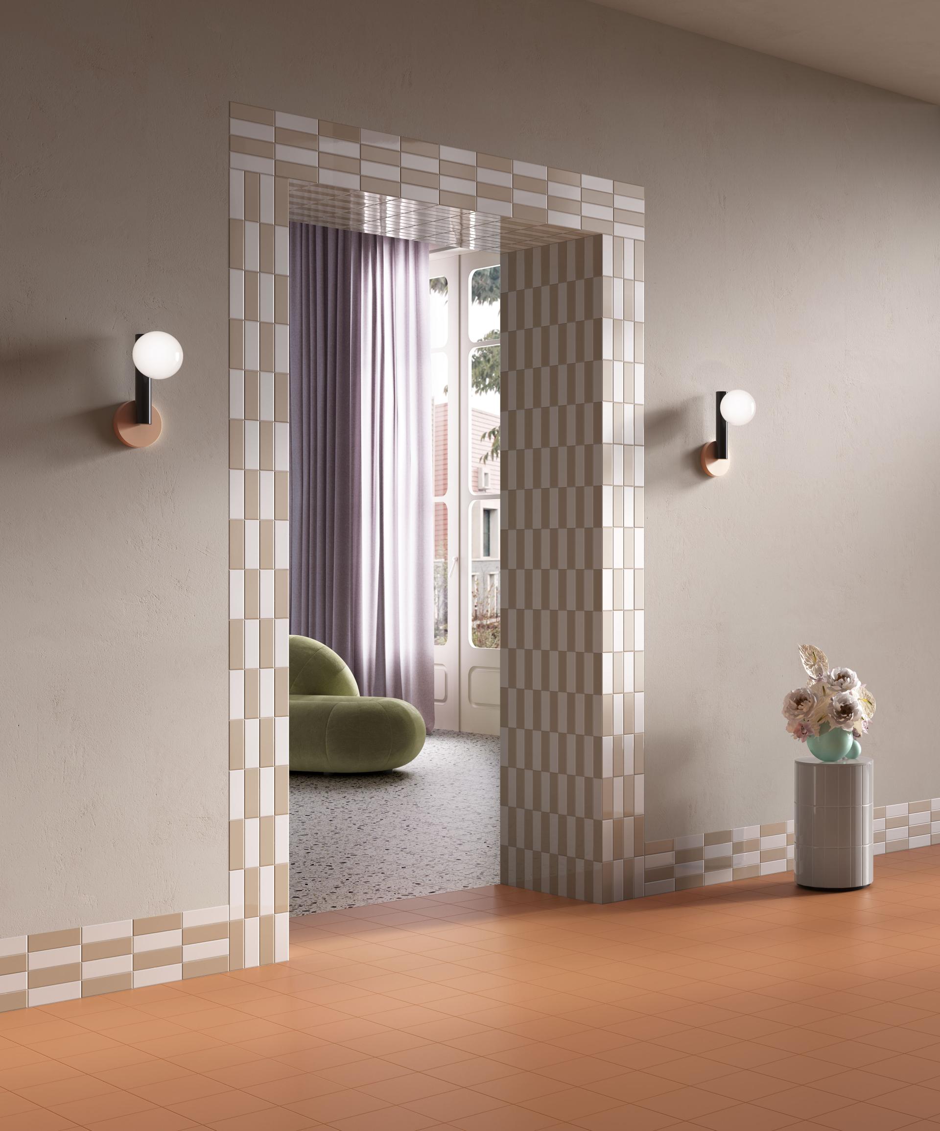
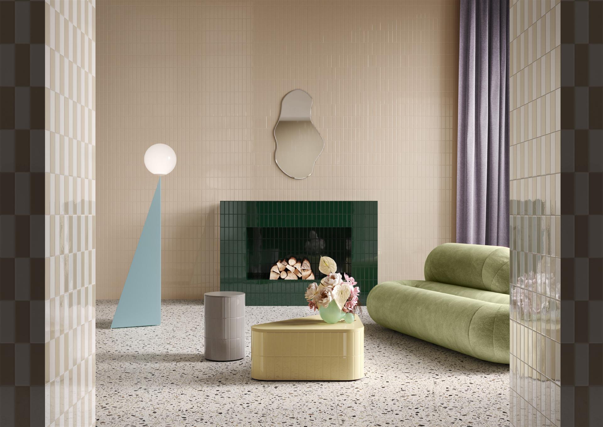
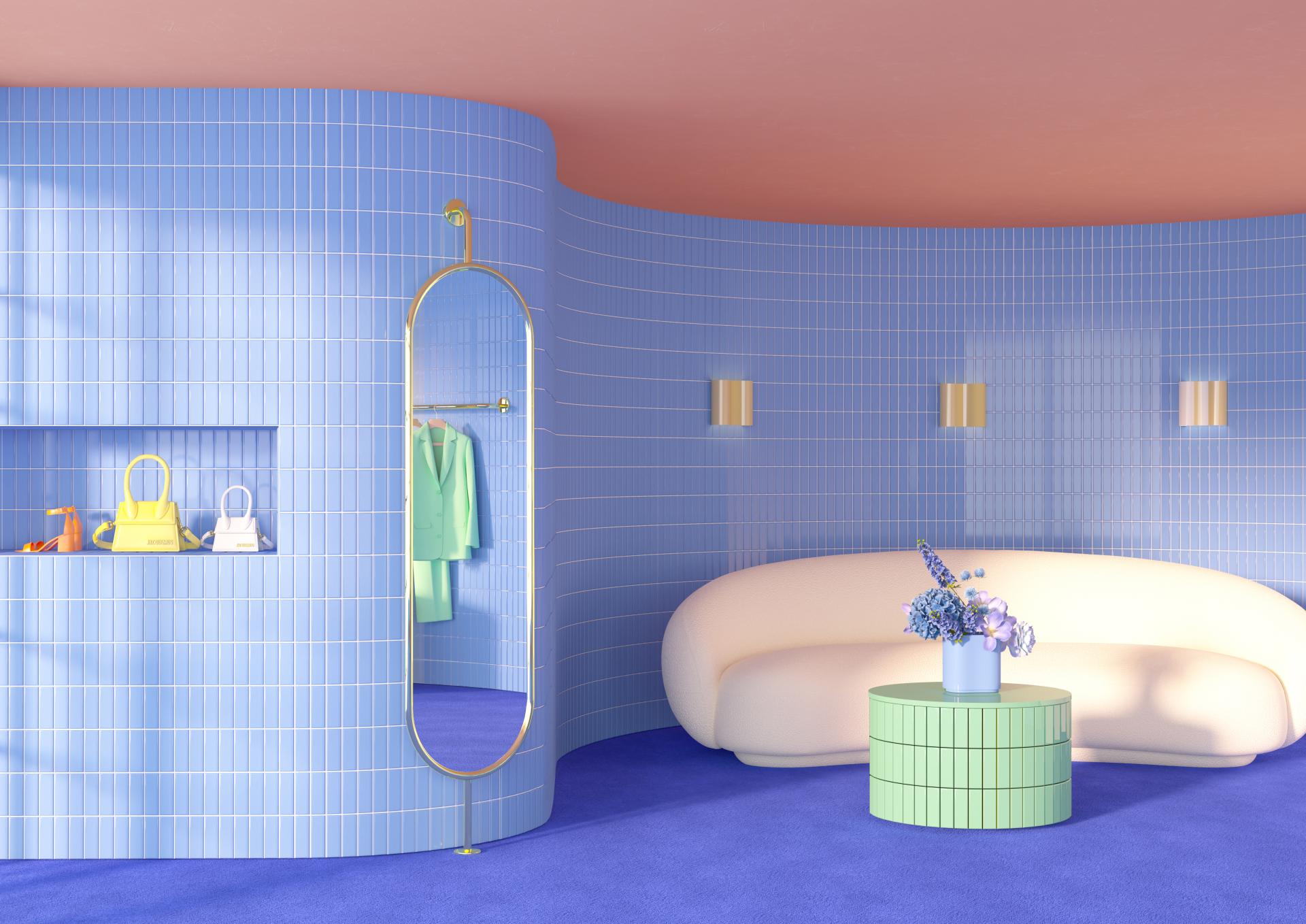
The showcase took over the theatre space and allowed designers and architects to fully immerse themselves in the new collection. The ceramic collection titled Färgblock, which translates to colour block in English, is Quintessenza Ceramiche’s first collaborative collection. Collaborating with Tekla because of her extraordinary ability to work with colour dynamics.
Credit: Wayne Myers
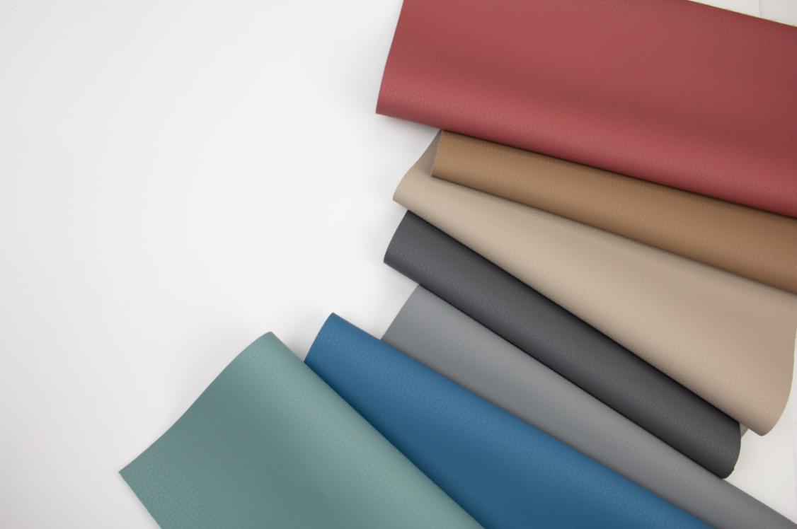
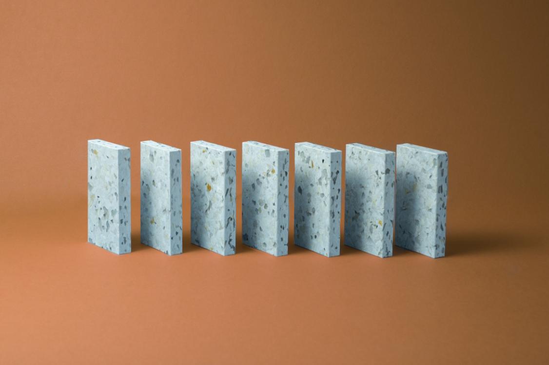
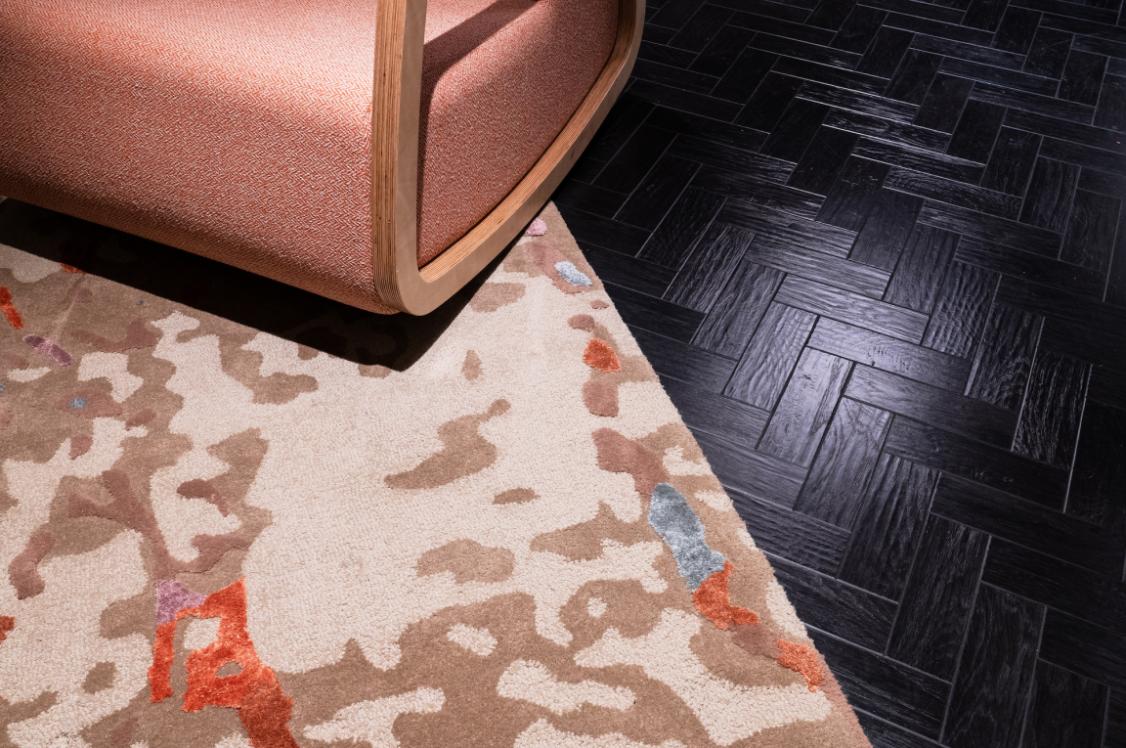
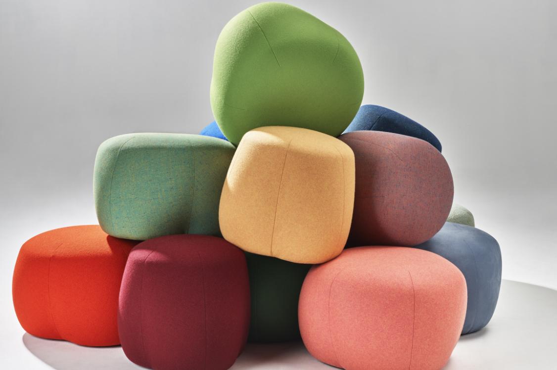
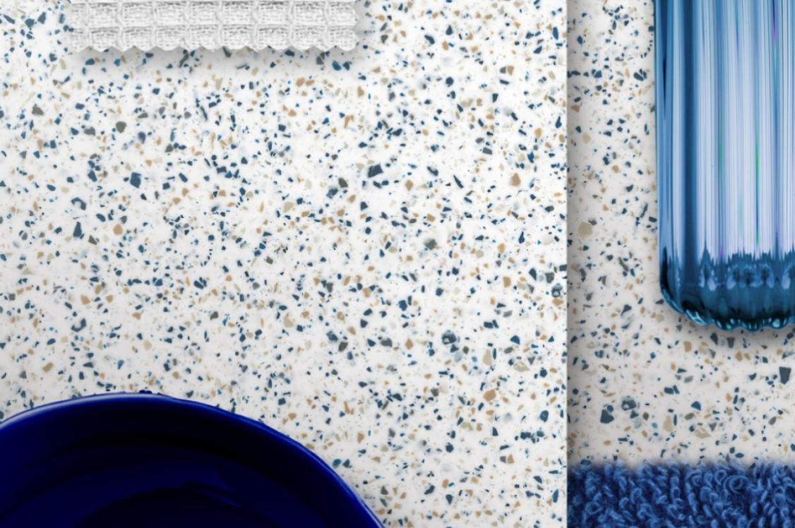
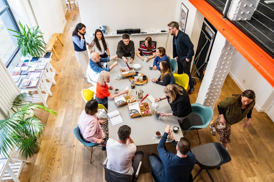
Colour is at the core of the collection and the tile designs work together to create playful colour effects, contrasts and tone on tone harmonies. The 13 tile colours have endless design possibilities, giving designers the ability to experiment with a variety of colour combinations and unique designs.
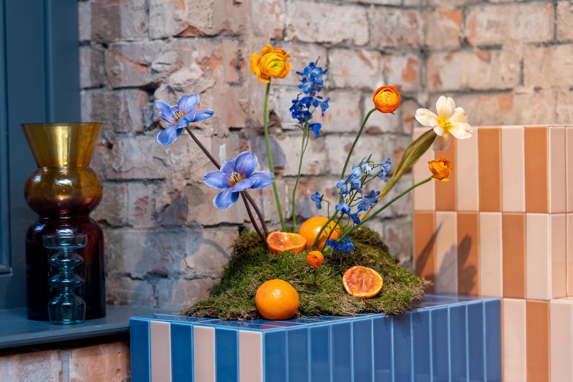
The exhibit displayed a selection of these possibilities, curated by Jade Watson, Creative Designer and Marketing Manager at Casa Ceramica. All elements tied together seamlessly. Crown Paint colours from the Joy trend were used within the designs, working harmoniously with the tile combinations. Each element had an attention to detail. The bespoke floral designs on display, by Manchester based florist The Bud and Pot, experimented with height, textures and complimenting colours. The delicious food served throughout the evening also took inspiration from the colour palettes of the collection.
Credit: Wayne Myers
Credit: Wayne Myers
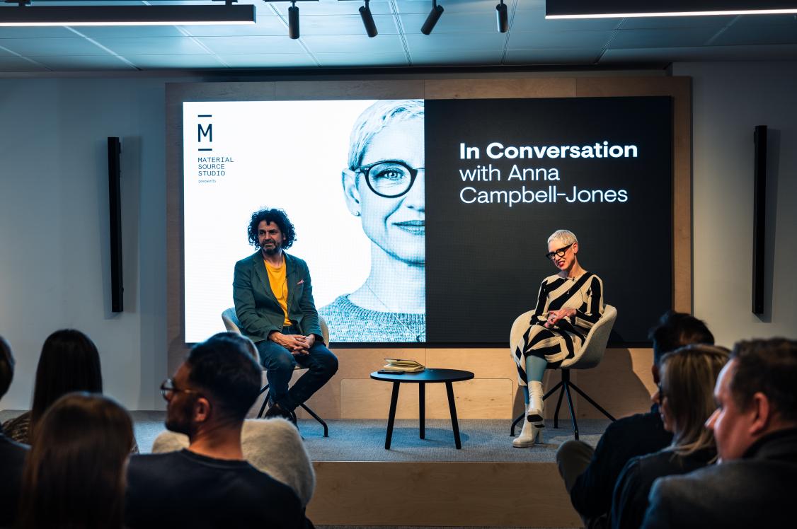
The event had an inspirational line-up of speakers: Jemma Saunders from Crown Paints, Ramona Macchi from Quintessenza Ceramiche and Tekla Evelina Severin. First, Jemma gave insights into Crown Paint’s Joy trend. Joy embraces a sense of humour and features contrasting colours, ranging from bold to bright and subtle to subdued. Within their Colour Insights Crown had included Tekla’s work in their original mood boards when forecasting the trend - tying in perfectly with the event.
Next up was, Ramona Macchi co-founder, product manager and art-director of Quintessenza Ceramiche who talked through founding the company, collections and working on their first collaborative project.
The talks ended with award winning designer and colourist Tekla Severin who explained all about her multi-disciplinary practice. She explored milestones in her career and how she worked with Ramona to discover new and exciting colour possibilities.
We caught up with Tekla and Ramona post event to further discuss their varied job roles and how they worked together to create a tile collection with colour at the heart.
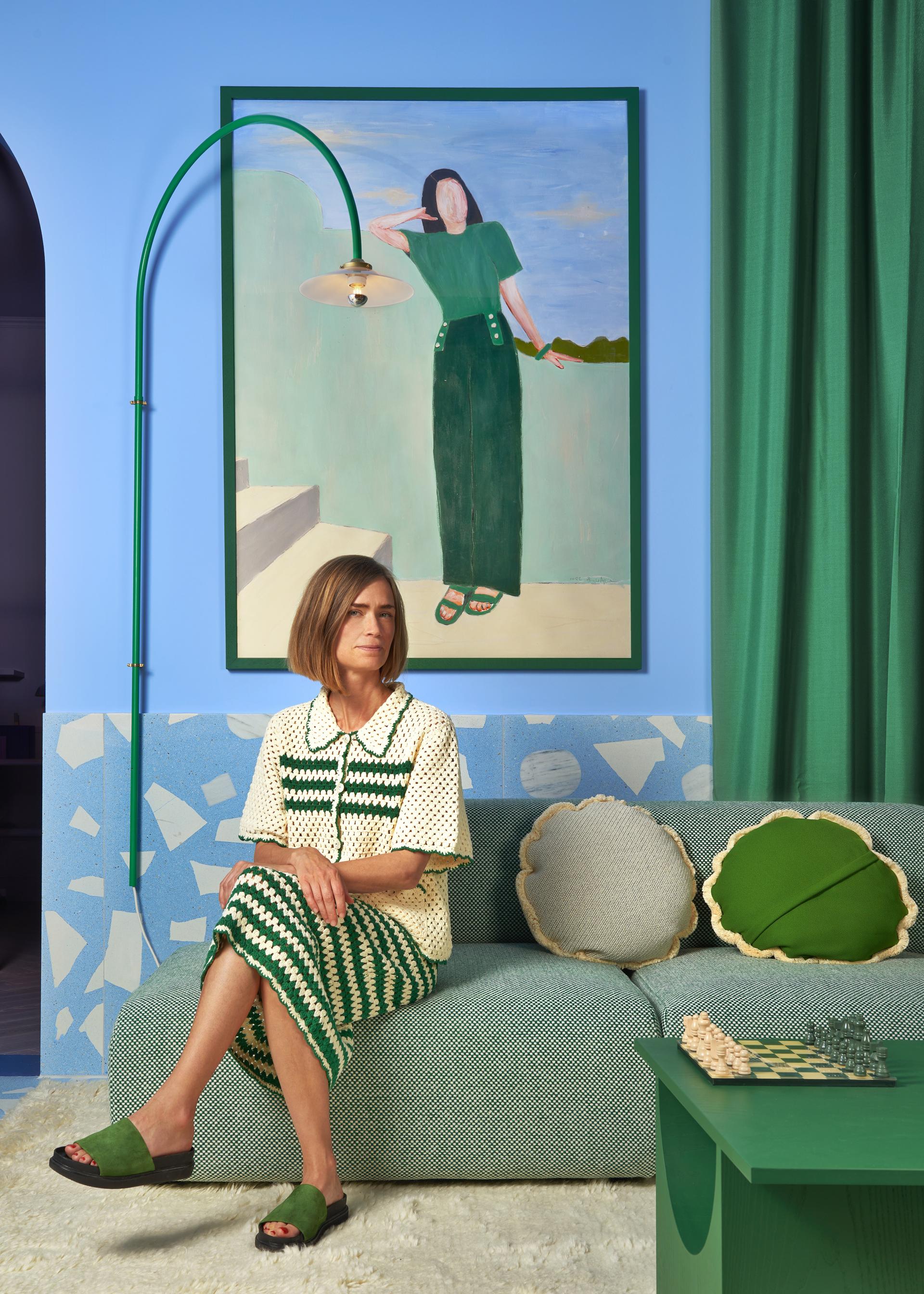
Tekla Evelina Severin
Firstly, can you tell us about how you got started in design?
“Well, where do things really start? Everything in life brings us to where we are today, right?
“So did it start in my early childhood, with a lost powder pink wall to wall rug, and that I unconsciously understood what colour and texture could do for a space, or did it start when I got escalating bad eyesight at nine, devastated I thought I might lose it or was it when I got so obsessed by everything that was visually appealing, because it felt so precious?
“I’m not sure, but I think it definitely plays a part. Career wise, it was around 2012, I had graduated two years earlier from Interior Architecture and Furniture Design at Konstfack University of Arts and Crafts in Stockholm and started as an intern and then became an employee at a great architecture studio in Stockholm. Here I slowly started to learn the profession, how to run projects, how to deal with clients, and about drawing architecture in general. However, I felt something was missing and it wasn’t just the creative freedom from art school, it was the conformity that bothered and bored me.
“I needed a creative space, and we had this amazing material library in the cellar which was filled with lots of materials and colours that sadly weren’t being used. I started to do some visual notes for myself, test different combinations of materials and colours. I explored other aesthetics which I captured with a very early smartphone and put it out on that new app called Instagram, not to reach out, I hardly understood I was posting stuff, hilarious enough, but I only wanted to take advantage of those vintage filters to save the pictures to my camera roll. Soon I started to get in contact and connect with other creatives and brands around the world.
“I took many baby steps towards fully freelancing in 2015 and starting my multi-disciplinary journey. First with photography, re-inventing and discovering shapes and colours from scratch. I created one component inspired images which featured, for example, one circle or one colour.
“One of my first commissions was content for a Canadian shoe brand. I was paid in shoes and did a photo series on the theme domestic science where I photographed a triangle made of red cabbage with lilac background and a cube in meat with a pink background.
“From these smaller scenes I moved my camera towards architecture and interiors. For a few years I focused on only architectural photography around the world; Guadeloupe for Ari France, Mauritius for a hotel designed by Camille Walala, iconic La Muralla Roja by Bofill architects in Spain. I thought it was really liberating, not to have to care about the function or construction when designing it but to just focus on strong visual elements, angles, shadow play, colours etc.
“But after a while I wanted to be more involved in the design in front of the camera, so I started to do set design. One of my first was for a colour collaboration for Montana furniture and through this I felt I could come back in a new way to interior design, be as free, deconstructed and abstract as I wanted. The circle is whole.”
As a multi-disciplinary designer can you briefly explain the different job roles you work within, including photographer, art director, interior architect, set designer, colourist and trend forecaster?
“I think the different professions speak for themselves in terms of what I concretely do. However, the big difference when working within photography or trend forecasting is I’m working in the role of the designer or an observer. One thing makes me discover another, especially when doing exhibition design, I have a lot of help through thinking like a photographer and vice versa for the visual effect.”
What does your job role as a colourist entail and how does it affect your work across different disciplines?
“I call myself a colourist since colour is at the core and the main subject no matter what kind of product, project or role, I work in. Similar to the colourist painters who made colour their main expression, no matter of the motif, it works the same for me.”
You recently worked in collaboration with Quintessenza Ceramiche to design the new ceramic collection Färgblock. How did this relationship begin and develop into the final collection?
“I first met Ramona when I was developing the colour concept, branding and everything for Toniton which translates to tone-on-tone in English, a new Swedish colour brand that I was the artistic director for during the start-up.
“The original idea was to curate and sell colour coordinated elements for every room in the home including all products, so of course tiles would be needed. Then after years of other things, it was last year during the Salone del Mobile in Milan which was in June that year because of covid. Ramona was there to exhibit her latest tile collection, Marea.
“She saw I was at Salone with the exhibition and interior design for Spanish furniture company Sancal, ‘An apartment of one’s own’. An apartment of 56 sqm consisting of four different rooms, all with different strong colour schemes. They each featured custom-made design including, sky blue terrazzo flooring and marbled sinks.
“We met in their exhibition space at Archiproducts in Milan and started to discuss the nature of the collaboration. Then three months later after a lot of colour samples back and forth the collection was ready and was shown at Cresaie Bolona, the tile and surface fair. I had the opportunity to design the show space for it, between the home interior design and more surrealistic realism, such as, the abstraction of stairs and their silhouettes.”
What was the inspiration behind the Färgblock collection colour palettes?
“The inspiration was the similarities and differences between Italy and Sweden. Also, there was much more to consider, for example, the other tile collections of Quintessenza.”
You have worked with many brands including, Very Simple Kitchen, Apple, Adobe Photoshop, Montana Furniture, Sancal and Heymat on a range of projects. How did working in ceramics compare to other mediums you work in, and did it challenge your design process in anyway?
“It was both easier and more challenging. It was harder because it’s less to work with and just one format. Even if we added more colours than general to the collection it's still only 13 colours compared to, for example, thousands of NCS colours, or textures or pattern.
“When working on projects you can’t control the full picture, the wholeness, the context of the space like you do when designing for interiors. However, it was also easier because of this reason, there was less to consider, you could be quite free and create your own universe.”
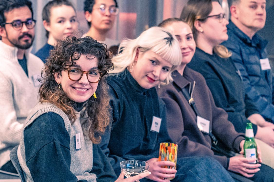
How did you find taking part in the event, ‘The Exploration of Colour’, put on at Material Source Studio by our partners Casa Ceramica and Crown Paints?
“It was so beautifully arranged, both the installation and the flowers. Besides that, I felt it went well, I’m actually an introverted person. I never normally give talks, usually only written interviews. I’m definitely not comfortable being on a stage talking about what I do, I just want to do.”
Did you take away any inspiration from your short trip to Manchester and the Material Source Studio?
“Definitely, it was my first time in town, and I really liked the vibe of the city and the people I met. I also had the pleasure of visiting the Victoria Baths and saw the great tile work from another time. The Material Source Studio was a great discovery and a reminder of different materials I had forgotten. I found out about Crown Paints, a company I hadn’t heard about before. I also really appreciated the sustainable approach which is very important right now.”
Ramona Macchi
Can you please tell us about Quintessenza Ceramiche?
“Quintessenza Ceramiche was founded in 2013 in the Sassuolo ceramic district, the cradle of ceramic culture. This year, we celebrate ten years.
“Our Mission: We offer a wide range of small size ceramic products, including both stoneware and white body surfaces that bring together minimalism and decoration, tradition and modernity, creative flair and geometric rigour.
“We have chosen the small format as our distinctive element as it allows us to reference past styles in a contemporary mood. I’m attracted by their proportions, by the balance of their parts, by the harmonious ratio of their measurements and the way in which they interpret space. Colour plays an import role; colour is used as a means of communication and acts as a common thread between the various collections.
“Each project is perfected down to the tiniest detail, as it is through details that we express our curious and receptive sensitivity. Combining shapes, colours, textures and surfaces is what we do every day. I like to say, that we use ceramics to stimulate emotions.
“Our Vision: Meeting the design and creative needs of architects and interior designers by offering a myriad of colour combinations for them to choose from, mixing shapes and surfaces that can be paired together."
Why the name Quintessenza?
“I’m proud of this name, it took a while to find the right name for the company. The name Quintessenza encapsulates the ancient mystery of a pure and subtle essence, the quintessence. During ancient time, in the Aristotle time period, it was quite common to say that there were four elements: Fire, earth, air and water.
“After all these elements there was the Quintessence, the fifth essence, the Ether; that continuous and vibrant tension to achieve the highest degree of style and beauty, for me the highest level of ceramic expression.”
What is your role within Quintessenza?
“I am co-founder, product manager and art-director. It's not easy for me to explain who I am, I am involved from the idea behind the design of a collection, followed by all stages of industrialization up to the merchandising and sales part. I have so many faces within the company.”
Why have you chosen to collaborate with Tekla on your new collection?
“The first time I met Tekla was a couple of years ago, when she was working as the artistic director of Toniton. QC together with Tekla developed with Toniton a custom colour for one of our Quintessenza ranges.
“Regarding Färgblock, we have to go back one year. At that time, I already had in mind to develop a new range in a small size with many colours. I was attending the Fuori Salone in Milan, during the Milan design week, and I realised that Tekla was also there, so I sent her a message, telling her that I had a proposal for her and if we could meet. The next day we met to talk about Färgblock.
“She was in charge of the colour palette, and it was really amazing because I love colour and I’m quite good with colours, but I learnt a lot from her because she sees colours in a completely different way to me.
“I am really happy about this collaboration, it’s the first ever for Quintessenza because it’s not easy for me to commission someone else to develop a collection, I am jealous of all my collections and projects, but with Tekla it was something different, we speak the same language, the language of colour.”
Colour is the highlight of the collection. How did you work with Tekla to develop the playful colour effects, contrasts, and tone on tone harmonies?
“It was really a tight collaboration between me and Tekla, we were bouncing inspiration, moods, references, personality, Italy vs Sweden and trends back and forth.
“We started with several mood-boards using NCS colours. In general, a colour range should include the full colour wheel and also neutral colours - white, beige and grey. I left it up to Tekla to decide on her vision of pink, green, blue, etc and then many colour samples were made until the final choice.
“At first, we thought we would have a range of about seven or eight colours, but then it grew to 13 colours. There were too many beautiful colours not to include. Once we had decided on the colour range, we devoted ourselves to possible colour combinations, tone-on-tone or contrasting. It was great, every day we discovered a new colour combination and there are really endless possibilities.”
What are the technical aspects of Färgblock - Where can the tiles be used and what finish do they come in?
“Färgblock is available in size 50x150mm, well it is exactly 48x148mm. It means that the two sides are modular together using a joint of 2mm. Three pieces lay down in vertical + 2mm of joint allow you to reach the longest size of 148mm.
“This modularity allows it to be very flexible, versatile and to create many laying patterns, including the basket one. Another important feature of this collection is that it is made of porcelain stoneware, so that it can be used for outdoor wall tile applications, as well as inside swimming pools. Färgblock is now only available in a glossy finish but stay tuned a new matt finish will be available soon.”
How was your experience taking part in the ‘The Exploration of Colour’ event here at Material Source Studio?
“It was definitely a great opportunity for us. The Material Source Studio location is amazing, so many different products coming together in harmony, unbelievable, you can really breathe design in all its aspects and faces. A place of great inspiration!
“Before the event I was honestly a bit anxious, I'm a shy person and I don't feel comfortable speaking in front of a lot of people, but the general atmosphere was familiar in a way. In the end I think my presentation was quite good.
“I hope I was a bit of an inspiration to the people who attended the event and that I was able to transport them into my world of small things, but of great value. It is incredible how ideas are born, quite often I’m influenced by what is around me and the things I love!”
To check out the upcoming events from our partners, head to our What's On page.
To find out more about the Färgblock collection contact Casa Ceramica.

In association with
Casa Ceramica brings cutting-edge designs to architects, interior designers and home owners.