


Workplaces that work: Designing offices around comfort, clarity and inclusivity.
Insight from Kathryn Lloyd, Colour Specialist, Crown Paints
"Historically, workplace design was shaped by efficiency, with offices planned to support output and minimise distraction. Often, that led to the creation of spaces defined by hard lines, with little flexibility.
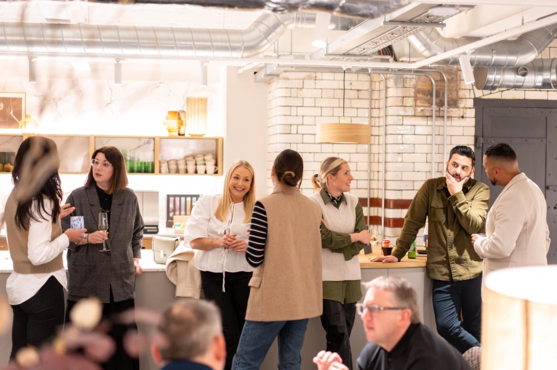
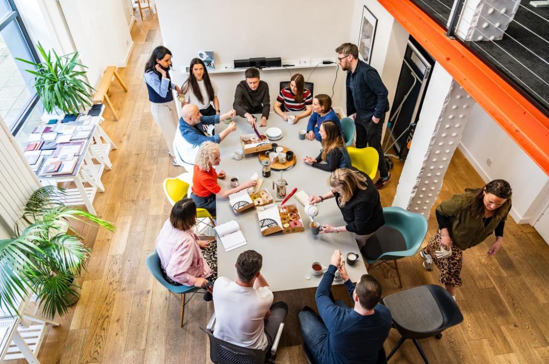
"That is, of course, changing. Offices are no longer expected to support just one type of task or one model of productivity. They need to accommodate concentration, collaboration, moments of pause and social connection within the same environment. Workplace design is becoming more human as a result, with greater emphasis on comfort, inclusivity and how a space actually feels to use day to day.
"A core consideration is a growing recognition that colour has a much bigger role to play than simply finishing a scheme. Used strategically from the outset, it can shape mood, define purpose, support navigation and help create environments that are genuinely easier to inhabit."
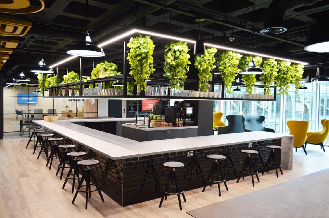
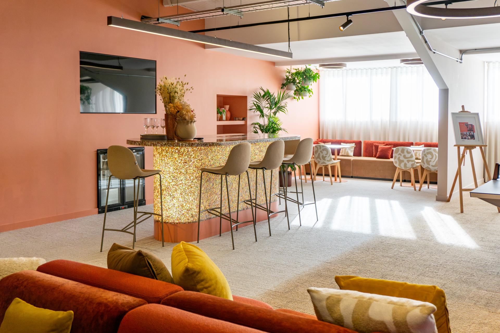
Designing offices for multiple ways of working and the needs of everyone
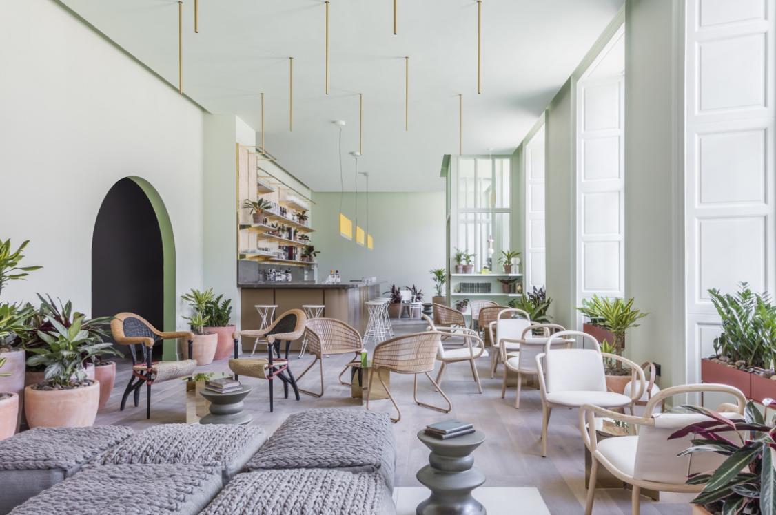
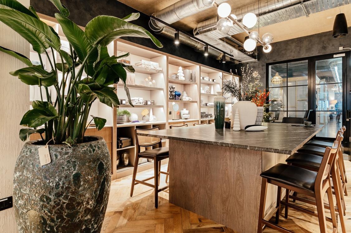
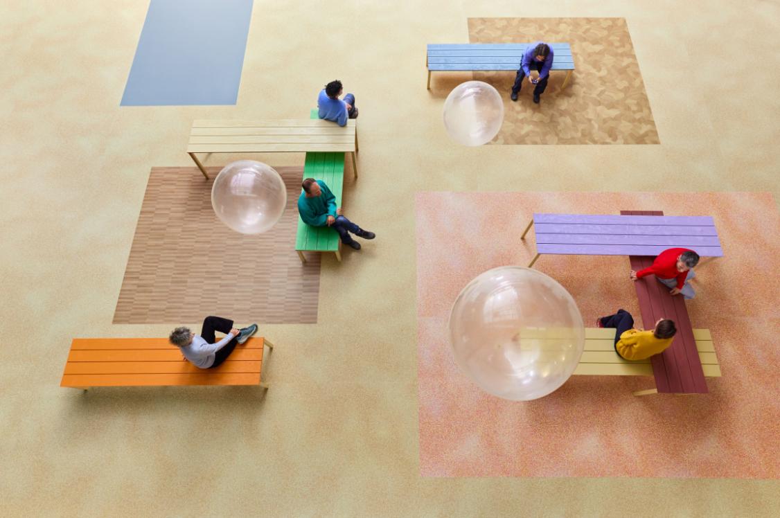
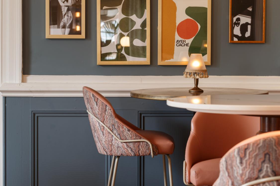
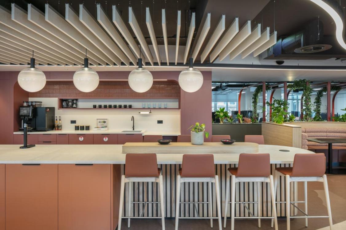
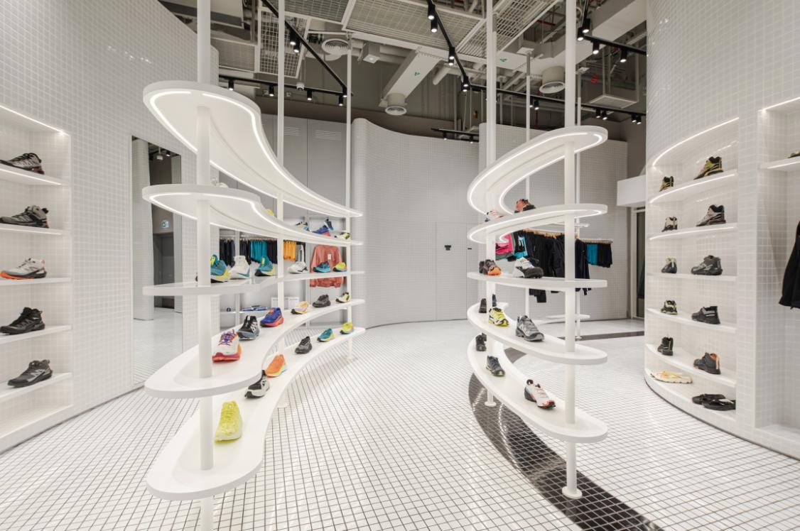
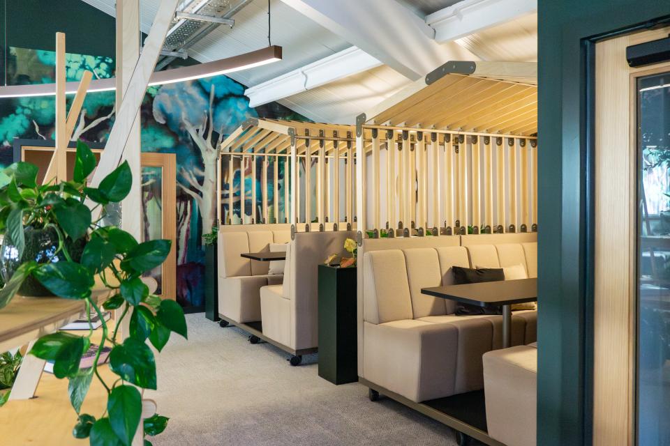
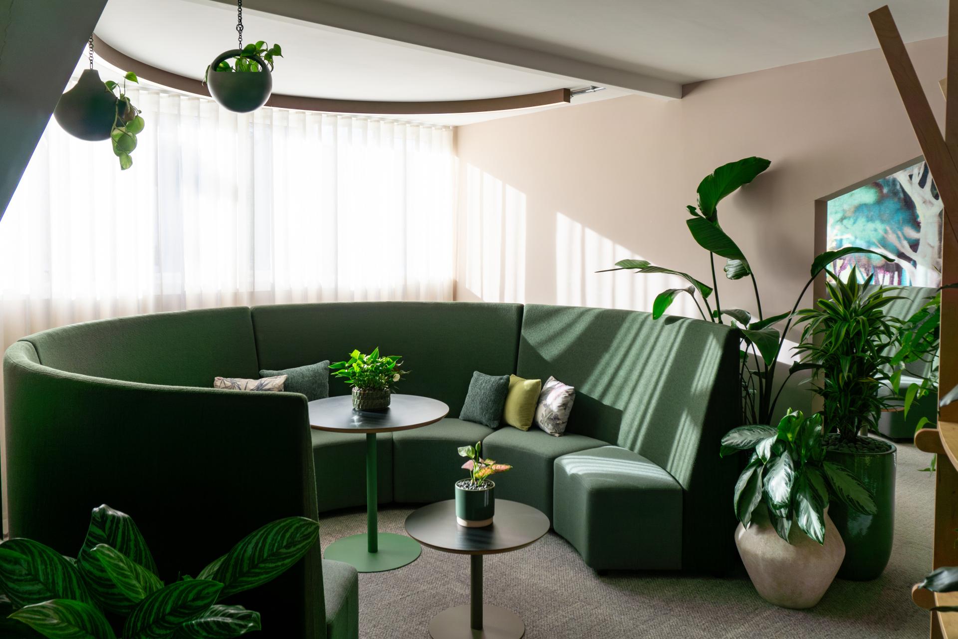
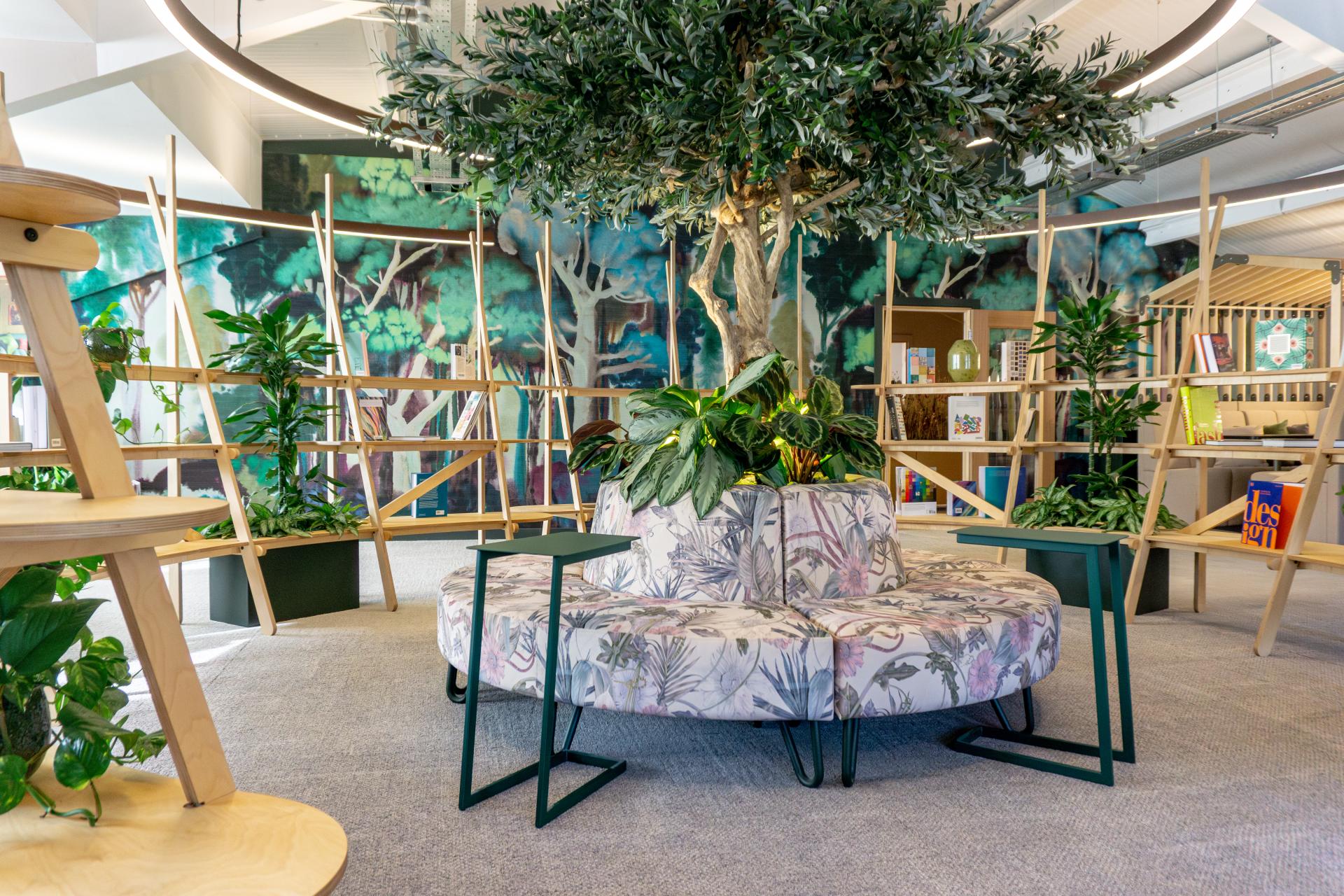
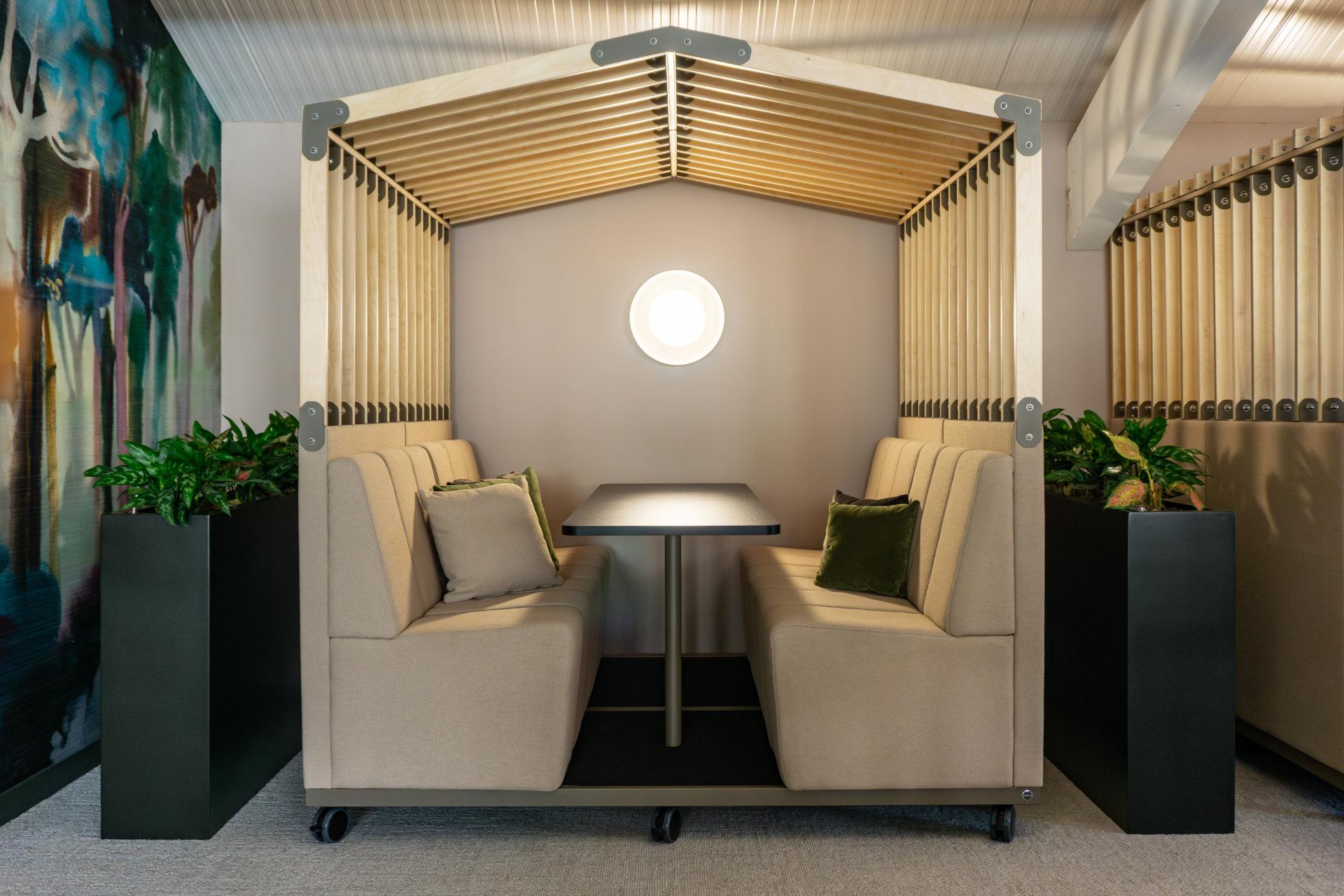
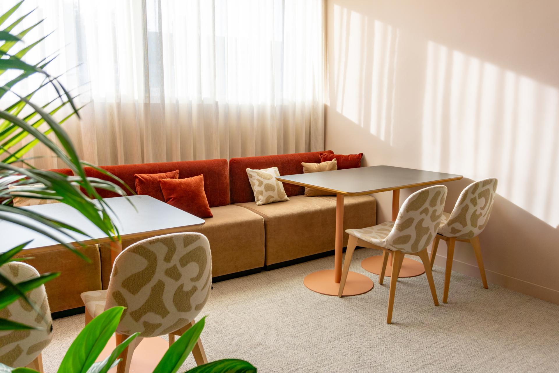
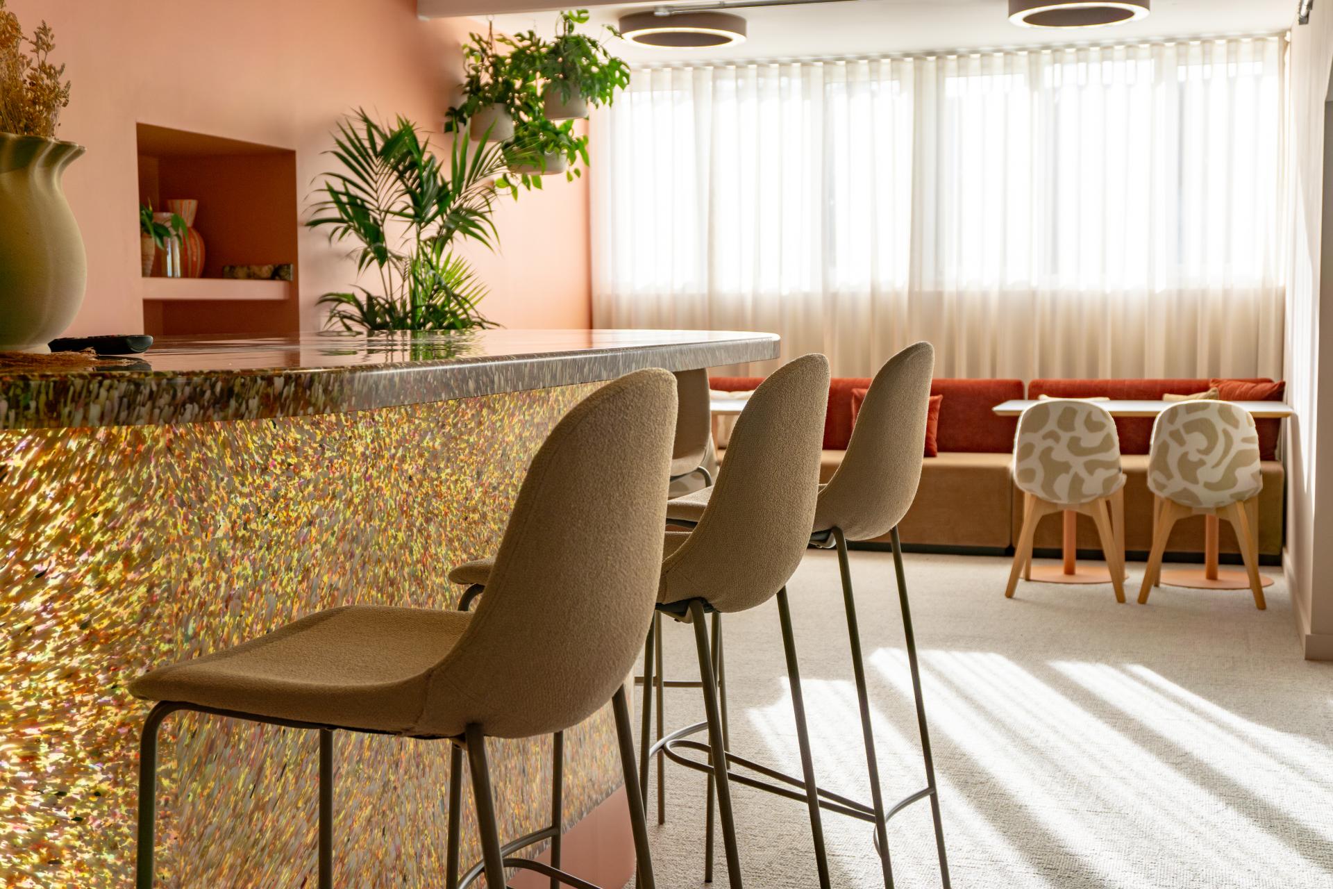
"One of the clearest examples of this is the move away from uniform environments. A single open-plan floor with one overarching palette simply doesn't reflect the reality of how people work. Instead, successful workplace design now involves creating varied settings that support different activities – quiet zones for concentration, collaborative spaces for teamwork, areas for creative thinking and moments of pause.
"Colour becomes a strategic zoning tool in this context. It helps people understand the purpose of a space at a glance and creates natural transitions between different modes of working.
"The choice of palette requires more consideration of individual needs than it once did."
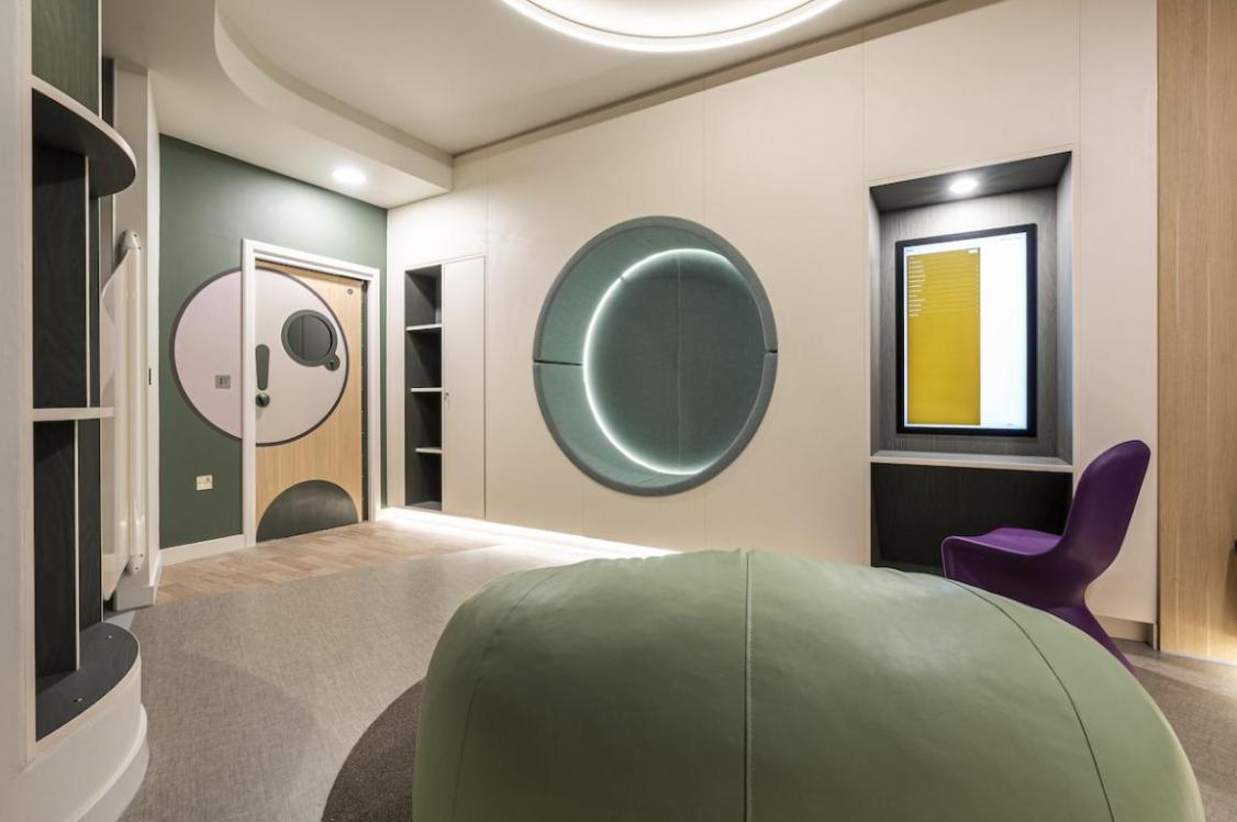
"Offices are not experienced in the same way by everyone. Sensory factors such as colour, contrast and visual stimulation can have a meaningful impact on comfort, concentration and wellbeing. Crown Paints' Designing for Neurodiversity report found that 92% of architects and specifiers believe neurodivergent-inclusive design is becoming increasingly important, while 79% report a knowledge gap around the impact of these elements within their own organisations.
"So, what does neuro-inclusive colour scheming look like? We know that people respond to colour differently; a colour that is considered calming by one person may be overstimulating to another. I believe the key to successful workplace scheming is defined zones to support areas of collaboration or deep focus and concentration. The colour scheme should support these different zones with a palette that works harmoniously while incorporating a variety of hues, chroma, and tones to support the different ways in which people work best.
"The key is recognising that highly saturated palettes or strong visual contrast may energise some users while increasing distraction or discomfort for others. This doesn't mean creating bland spaces – it means understanding when a space needs to stimulate and when it needs to calm."
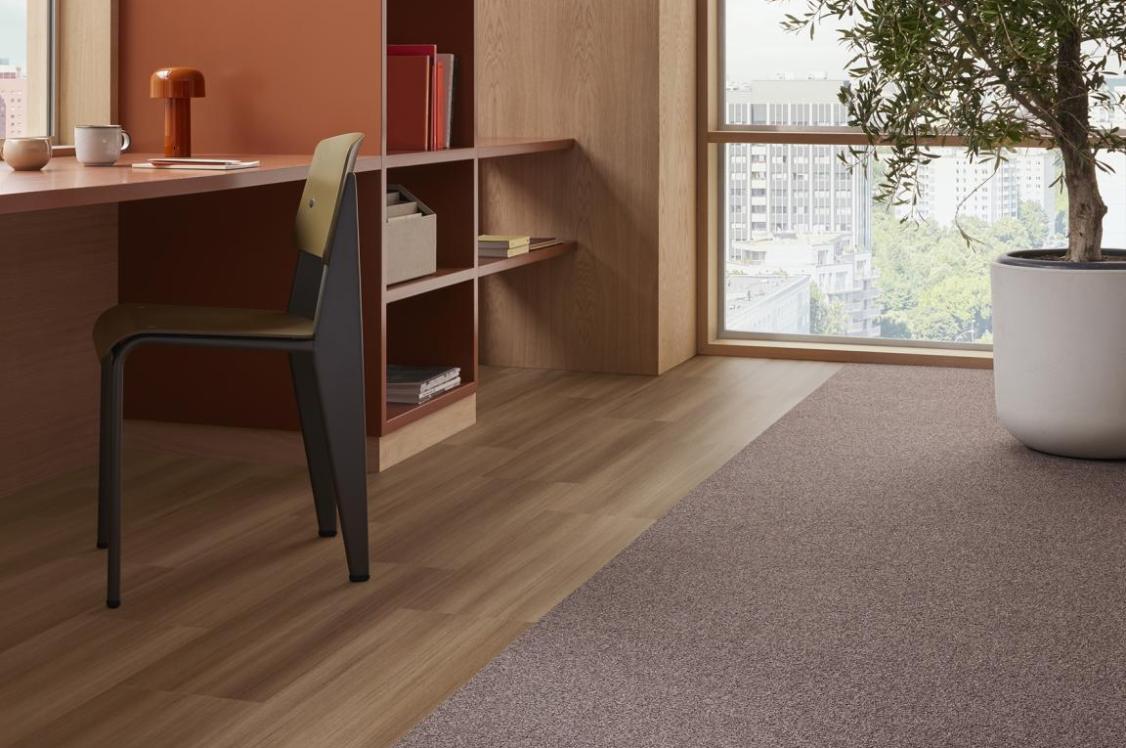
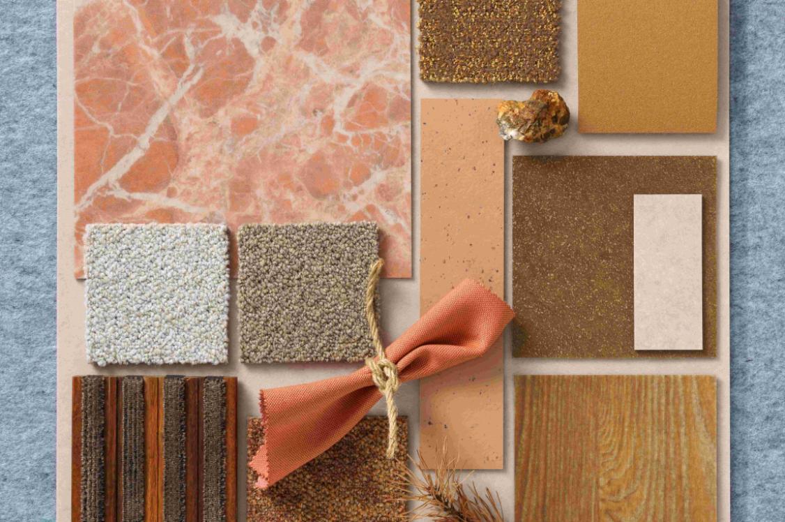
The value of softer, earthier palettes
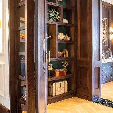
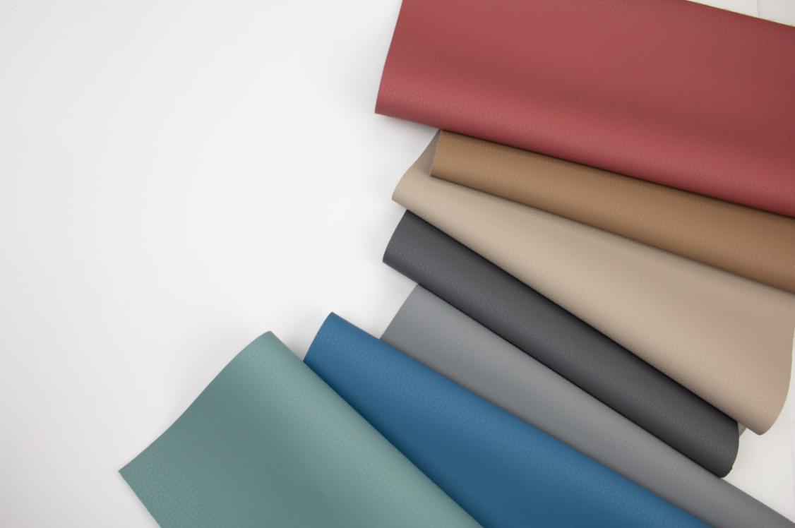
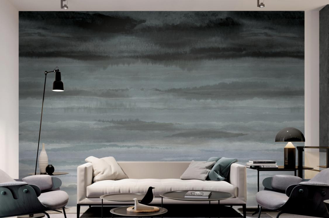
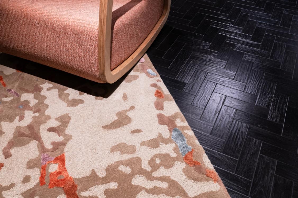
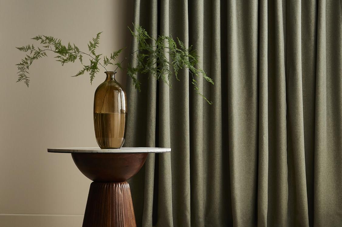
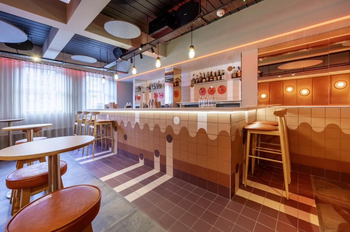
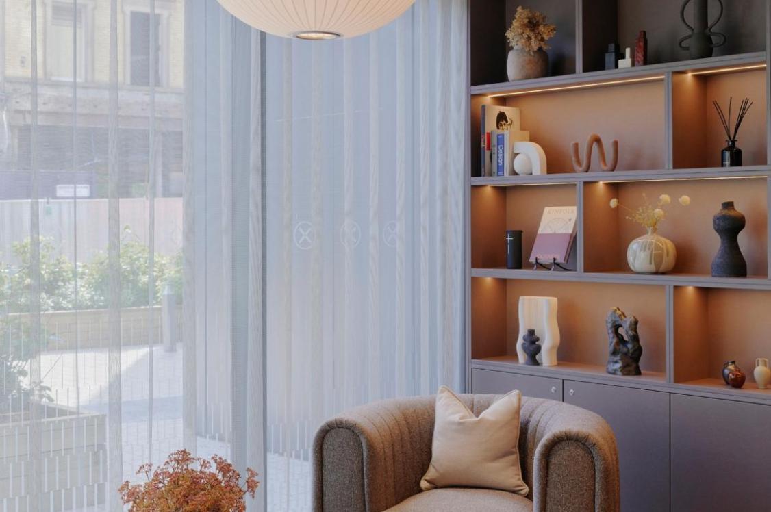
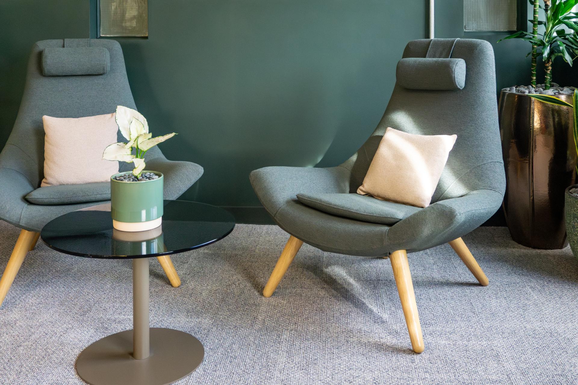
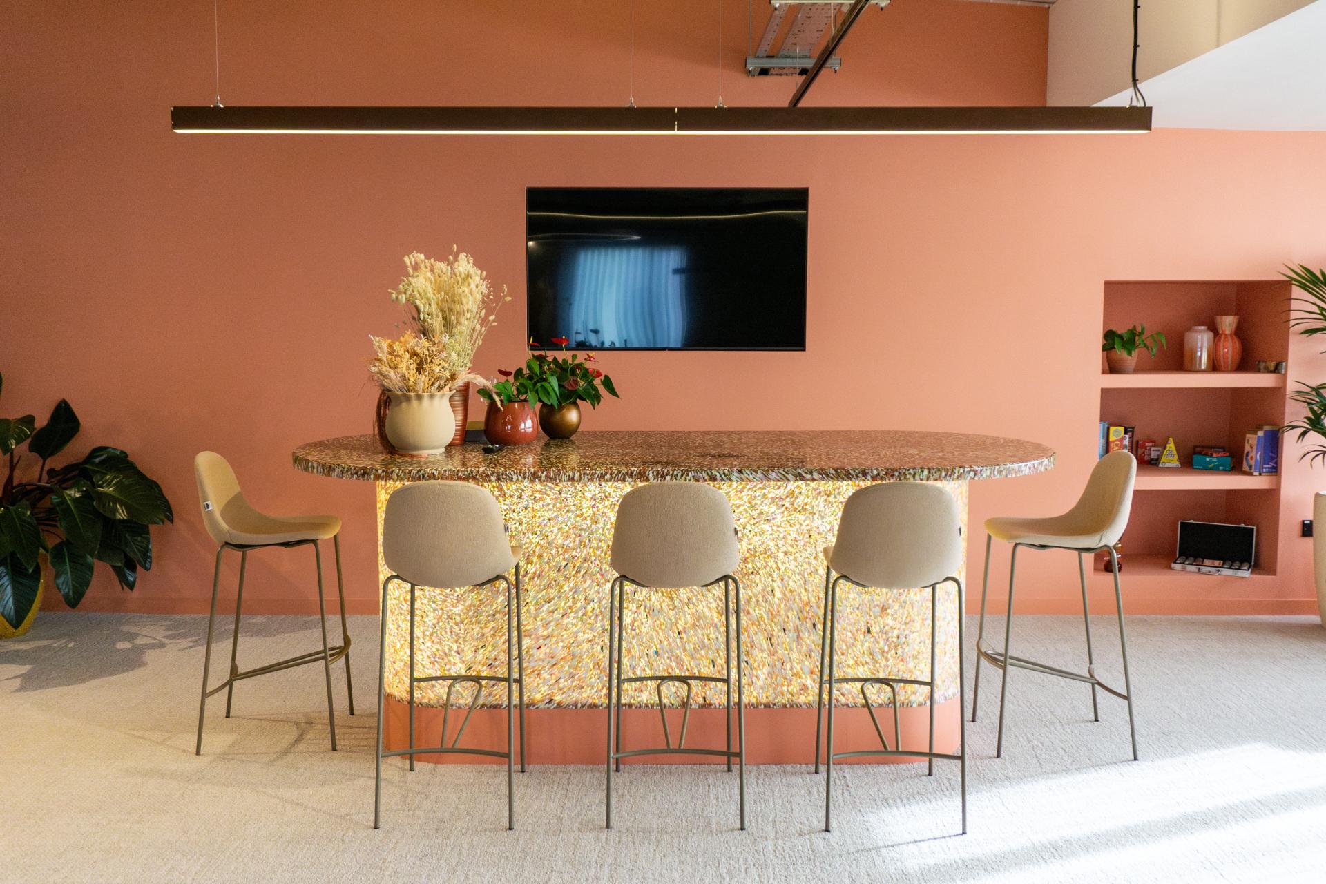
"As office environments become more focused on wellbeing, there is growing relevance in palettes that feel grounded and natural. Browns, muted greens and gentle mid-tones can help move workplaces away from a harder-edged, more clinical feel while maintaining professionalism.
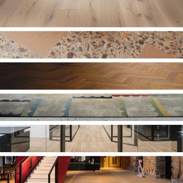
"These tones are effective because they create a quieter visual backdrop that doesn't compete for attention. This approach is supported by Crown Paints’ wider Colour Insights, a future-facing forecast that draws on cultural, design and lifestyle trends to create practical palettes for different types of space.
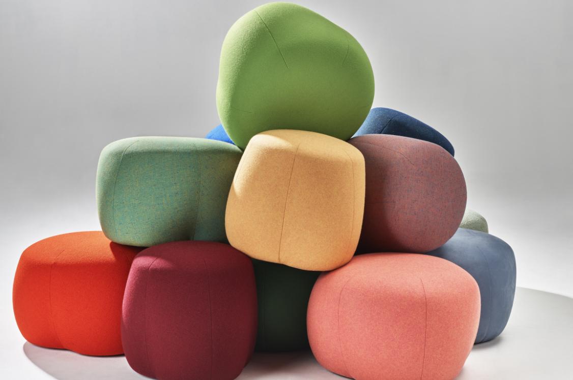
"Within this framework, the Choreography palette uses a variety of muted warm & cool hues to suit those workers who are easily over-stimulated.
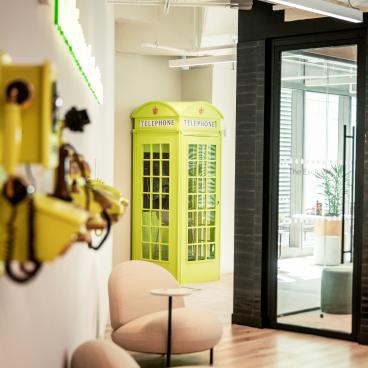
"The more energising Disrupt palette – including electric blues, vibrant orange and yellow accents – can then be introduced selectively to bring vitality into social areas or collaborative spaces, creating clear distinctions between different zones."
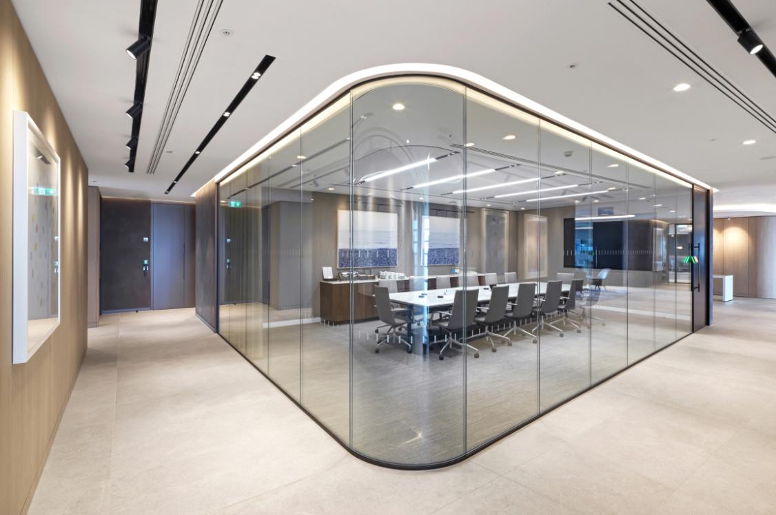
Practical considerations: designing with colour from the outset
"For architects and designers, all of this points to the importance of thinking about colour strategically and early in the process. It should not be something applied at the end once the layout is resolved. In offices, colour plays too important a role in zoning spaces, supporting different user needs and influencing how people feel within the environment.
"It also needs to be considered in relation to light.
"Colours look very different depending on the light in which they're seen: reds and yellows will appear more vibrant and energetic in a west facing space, whilst they'll appear quieter and less saturated in an east or north facing space."
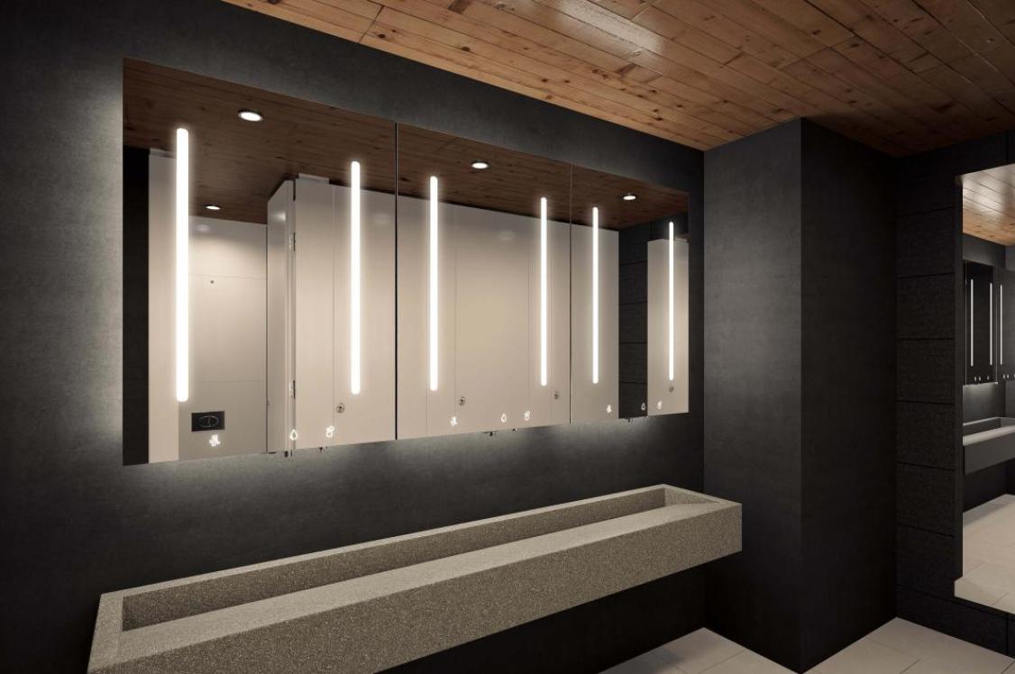
"Just as importantly, colour choices need to be supported by coatings that can meet the practical demands of busy workplace environments. Crown Trade Clean Extreme offers architects and designers the flexibility to specify from thousands of colours, while also delivering a highly durable, cleanable and scrubbable finish. This makes it particularly well suited to high-traffic areas, shared spaces and environments where walls need to retain their appearance over time, helping to extend maintenance cycles without compromising the overall design intent.
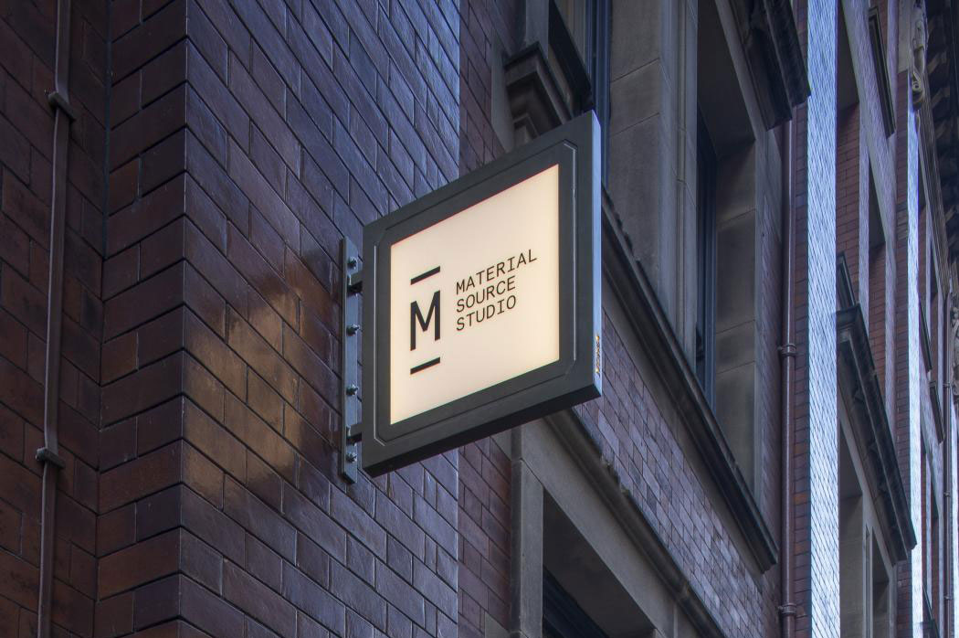
"Testing colours in context and understanding how they interact with artificial lighting are essential steps in creating schemes that genuinely support how the space will be used. You can visit our dedicated presence at Material Source Studio in London, Manchester and Glasgow, where you can see our colours in person using our lightbox – experiencing how they respond to different lighting conditions before specifying, as well as collecting a fan deck or Pure Paint Samples to support project planning.
"Ultimately, the most thoughtful office design is moving away from one-size-fits-all environments towards workplaces that support a broader range of needs. Colour has a central role in that shift – helping to define different zones, support neuro-inclusive design, create comfort and strengthen a connection to the natural world. For designers, it represents both a challenge and an opportunity to create environments that work better for everyone."
For more information, download the Crown Paints Designing for Neurodiversity report here

In association with
We believe that every pot of paint is brimming with potential. And we want to put that in the hands of everyone. Because with paint, you can change a room, change a mood, even change a life.